
Terry Border’s Animated Old Books
Terry Border’s Wiry Limbs, Paper Backs series turns vintage paperbacks into wire-limbed characters—Bent Objects craft, literary humor, and how the photos stage each title.
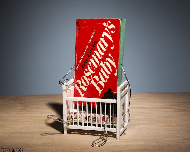
Terry Border spent years as a commercial photographer before he began giving ordinary objects a second life. In 2006 he launched the Bent Objects project: bendable wire limbs attached to food, tools, and household things, then photographed as if those objects had quietly become characters. The joke lands because the craft is careful. Wire becomes gesture. A prop becomes plot. The camera holds still long enough for the punchline to feel inevitable.
His series Wiry Limbs, Paper Backs applies that method to vintage paperbacks. Old covers already carry mood—pulp color, classic type, the scuffed dignity of books that have been read hard. Border adds wire arms and legs, a suitcase or a window or a small prop, and suddenly the book is performing its own story. Homer’s Odyssey carries luggage. A Room with a View peers through glass. The title is no longer only on the spine; it is acted out in miniature theater.
You can browse more of the series on his site at terryborder.com. What follows is a closer look at why these animated old books work as sculpture, photography, and literary humor at once.
From Bent Objects to paperbacks with posture
Bent Objects taught Border a useful rule: the object should stay recognizable. The humor fails if you bury the banana, the book, or the tool under so much armature that the thing disappears. Wire is the verb; the object is the noun. In the paperback series, that rule is especially sharp. Readers already know the covers. Recognition does half the comedy. The wire limbs do the rest by choosing one precise action—walking, watching, carrying, lurking—that matches the book’s reputation.
Paperbacks also bring texture that food sculptures cannot. Clothlike wear on edges, faded orange spines, embossed titles, and slightly warped boards become costume. Border does not fight that age; he stages it. The books look like actors who have toured too long and still know their lines. That slightly tired physicality makes the wire limbs feel less like toys and more like improvisation by a traveling company of classics.
Photography remains central. These are not installations you circle in a gallery alone; they are scenes composed for a lens. Lighting is clean, backgrounds quiet, props sparse. The frame behaves like a stage mark. Remove the careful photograph and the sculpture still exists, but the joke loses timing. Border’s commercial photography background shows in that discipline: one idea per image, no clutter competing with the title’s punch.
How a book becomes a character
Anthropomorphism usually starts with a face. Border often skips the face and still gets personality. Arms akimbo, a stride, a suitcase angle, or a body leaning toward a window are enough. The cover illustration becomes the “head” by default. That choice keeps the design honest to the object. You are never asked to pretend the book is a doll; you are asked to accept that stories want bodies.
The best pieces choose an action that is both literal and metaphorical. A spy novel that watches. An epic that travels. A romance that looks outward. A horror title that approaches. Because the books are famous, the audience fills in lore automatically. Border only needs to supply the gesture that unlocks that lore. Economy is the craft lesson: one prop, one pose, one clear read from across the room.
Scale matters too. Wire limbs are thin enough to feel improvised and strong enough to stand. If the wire were chunky, the books would look armored. If it were flimsy, they would look broken. The line weight sits in a sweet spot—comic-strip energy without cartoon overkill. Shadows of the wire on the tabletop become part of the drawing.
Literary humor without spoiling the shelf
Book humor can turn smug: jokes that congratulate the reader for recognizing a reference. Border’s tone is warmer. The pieces celebrate pulp and canon with equal affection. A classic does not need academic footnotes to earn a wire suitcase. A genre paperback does not need apology. The series treats the paperback rack as a democracy of stories waiting for bodies.
That affection shows in material respect. The books remain readable objects in spirit even when they have become sculptures. Titles stay legible. Covers stay central. Nothing is spray-painted into anonymity. Collectors of mid-century covers will notice how much of the original graphic design survives. Designers will notice how little Border needs to add once a strong cover is already doing character work.
There is also a quiet joke about reading itself. Books are portable theaters. We carry them on trains, leave them on nightstands, argue with them in margins. Giving a paperback legs is only a slight exaggeration of what reading already feels like: the story gets up and walks around in your head. Border externalizes that private animation with wire and a camera.
What makers can steal from the method
If you make still-life photography, miniature scenes, or object sculpture, the series offers a checklist more useful than a mood board. First, pick an object with an existing public identity—brand, title, or archetype. Second, invent one verb that fits that identity. Third, build the minimum armature that communicates the verb. Fourth, photograph with restraint so the object remains hero.
Props should pass a simple test: if you remove the prop, does the joke collapse? If yes, keep it. If the prop is only “cute clutter,” cut it. Border’s suitcase, window, or small accessory usually earns its place because it completes a sentence begun by the title. That editing instinct separates clever object play from craft-table noise.
Lighting should flatter print and paper. Harsh glare erases cover art; dead flat light kills dimensional wire. Soft directional light that catches metal edges and cover varnish tends to win. Neutral seamless backgrounds help titles read as cast members rather than products in a catalog.
Why old books make perfect actors
New hardcovers can look too pristine for this kind of comedy. They shine like merchandise. Older paperbacks arrive pre-charactered: cracked spines, soft corners, color shifts from sun. Those flaws become performance history. The Odyssey that has traveled through many hands already looks ready to travel again. A mid-century thriller already looks suspicious before a wire arm lifts binoculars.
There is nostalgia here, but it is not misty. It is graphic and physical. Border is not mourning the death of print; he is casting print in a new show. In an era of endless digital covers that vanish with a swipe, a battered paperback with wire legs feels stubbornly present. You could almost trip over it.
The series also reframes the bookstore bargain bin. What looks like surplus inventory becomes a casting call. Titles that once competed for shelf attention now compete for pose. That reframe is generous to readers who still buy used books for the cover alone. It says the object’s visual life does not end when the plot is known.
Looking longer at a single frame
Spend time with one image and secondary jokes appear: how the wire hand grips, whether the stance is confident or tentative, how the cover illustration lines up with the implied gaze of the sculpture. Border’s best work rewards that second look without requiring it. The first look is enough for a smile; the second look reveals staging craft.
Compare the paperback series with earlier Bent Objects food characters and the continuity is obvious—wire as gesture language—but the emotional register shifts. Food jokes are often about appetite and absurdity. Book jokes are about narrative and recognition. Both are funny; the paperback pieces also feel like footnotes written in three dimensions.
For readers who collect art photography that sits near illustration and design, these images occupy a friendly middle ground. They are conceptual without coldness, handmade without preciousness, literary without lecture. That balance is harder than it looks. Many object-animation projects tip into either precious craft display or one-note meme. Border keeps the tone of a dry storyteller who happens to own pliers.
If a paperback on your shelf already seems to have opinions, you are halfway to understanding the series. Border simply gave those opinions limbs, a stage, and a shutter click—and left the rest of the story where it belongs, between the covers and in the viewer’s memory of having read, or meant to read, the book standing there mid-stride.

Comments
Continue reading
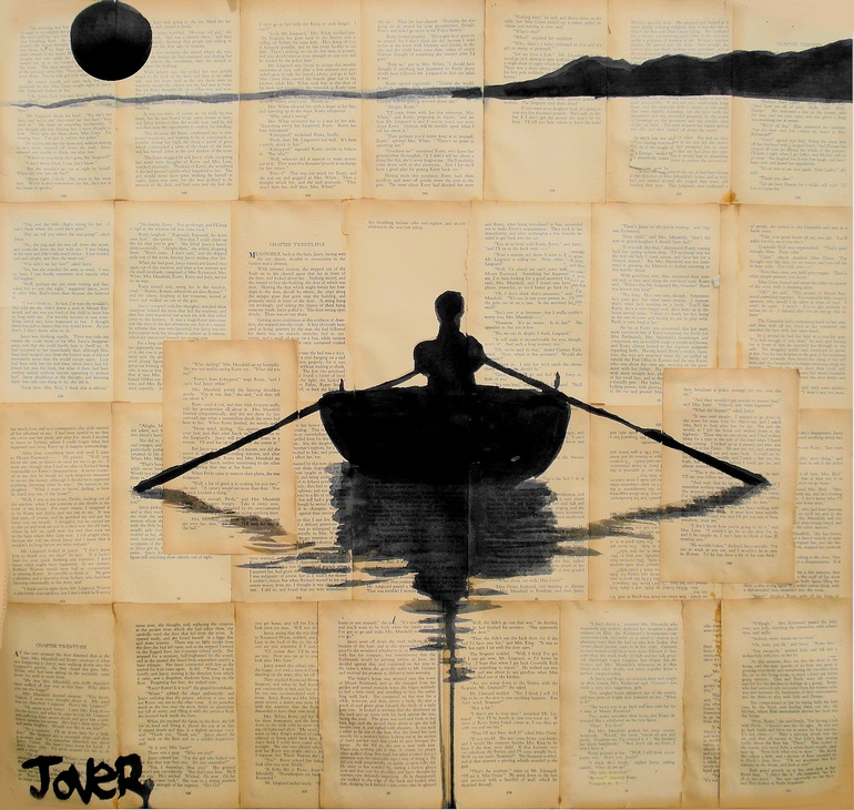
Ink Drawings on Vintage Book Pages by Loui Jover
Queensland artist Loui Jover draws in ink on collaged vintage book pages, letting printed text, fragile seams, and chance pairings deepen faces, embraces, and solitary figures.
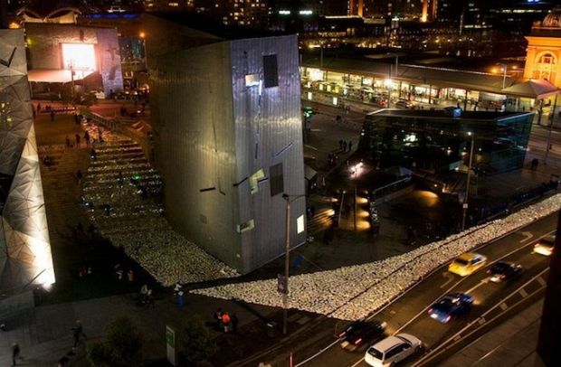
River of Books
Luzinterruptus flooded Melbourne’s Federation Square with 10,000 LED-lit discarded books for Light in Winter 2012—Literature Versus Traffic, donated via the Salvation Army.

Still-Life Photography by Margareth Perfoncio
São Paulo photographer Margareth Perfoncio’s still lifes of food and flowers—Old Master light, dark wood, and tables that feel inevitable.