
Ink Drawings on Vintage Book Pages by Loui Jover
Queensland artist Loui Jover draws in ink on collaged vintage book pages, letting printed text, fragile seams, and chance pairings deepen faces, embraces, and solitary figures.
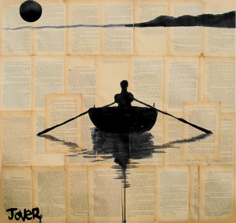
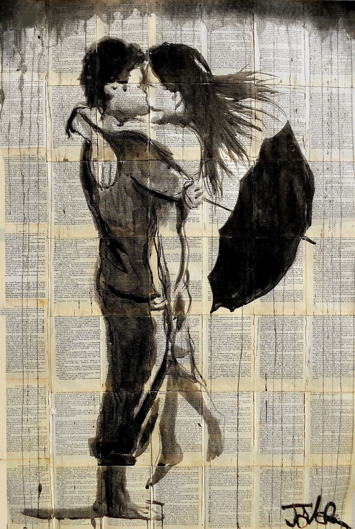
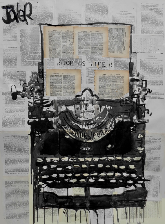
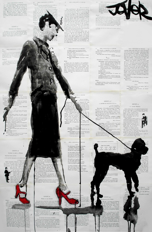
Loui Jover draws in ink on sheets of vintage book paper, and the choice of surface is not a decorative afterthought. The printed words, yellowed margins, and fragile seams of adhered pages become part of the picture. From a small studio behind his house in Queensland, Australia, he has built a practice that treats discarded literature as both ground and atmosphere. Faces, embraces, and solitary figures arrive as stark black lines; the page supplies a quiet chorus of type that never quite agrees to stay in the background.
Jover has said he draws obsessively every day, filling books with ideas, cartoons, and studies. That daily habit shows in the ease of his line: confident enough to look spontaneous, careful enough to hold emotion without tipping into melodrama. The book pages matter because they introduce chance. He does not engineer a perfect match between subject and text. Image and print collide, and any story that emerges belongs as much to the viewer as to the artist.
Who Loui Jover is
Born in April 1967 in what was then Yugoslavia, Jover moved to Australia as a small child and grew up in Queensland. Drawing stayed with him when many childhood habits fall away. He studied commercial and graphic art, earned training in visual communication, and later worked as an illustrator and photographer in the Australian Army—experience that sharpened his eye for reproduction, darkroom process, and disciplined output. Solo and group exhibitions followed. Today he works as a self-represented full-time artist, primarily in ink on paper, with additional practice in oils, acrylics, and collage.
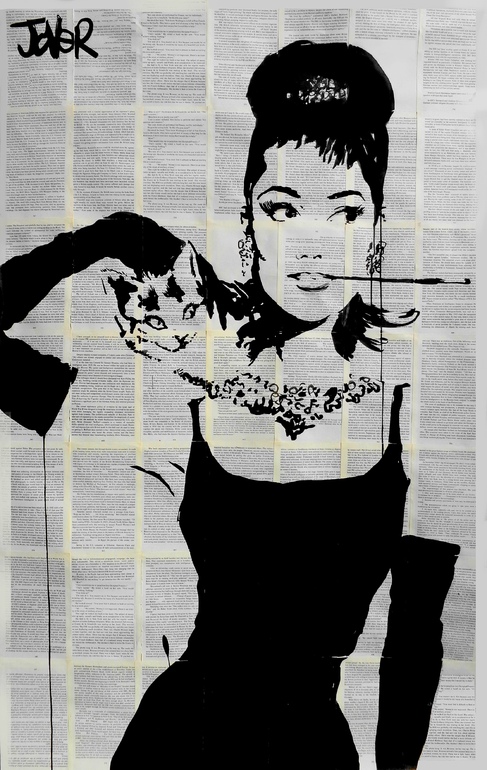
Collectors and galleries know him best for the ink-on-book-page works: figurative and abstract images built on collaged sheets from damaged or discarded books. The method has a practical poetry. Pages headed for destruction become a canvas with history already printed into it. That history is rarely literal. A face drawn across columns of text does not illustrate the chapter beneath it. Instead, the printed matter behaves like weather—texture, tone, and a suggestion of narrative that the drawing can lean into or ignore.
Why vintage book pages change the drawing
Plain paper asks ink to carry everything: contour, mood, space. Vintage book pages arrive already busy. Type creates a second rhythm under the figure. Edges of glued sheets interrupt the field. Age stains and foxing add warmth that no wash needs to invent. Jover has described a fragility in these images, as if wind might blow them away—an apt metaphor for work that looks both solid and temporary.
He has also noted the strange fusion of stark black lines against intricate printed words: a depth that seems to give the pictures meaning and backstory even when the pairing is uncontrived. That is the engine of the work’s appeal. Viewers read faces against language they cannot fully resolve, and the unresolved quality feels intimate rather than confusing. Melancholy, tenderness, and quiet drama sit comfortably on surfaces that once belonged to someone else’s reading life.
Common visual signatures in the widely shared pieces include:
- Ink wash and drip — controlled spills that can read as tears, weather, or pure mark-making.
- High-contrast contour — faces and bodies defined with graphic clarity against busy type.
- Romantic silhouette — couples and solitary figures reduced to essential shape.
- Collaged page grids — seams and columns that break the rectangle into literary architecture.
- Chance juxtaposition — text and image meeting without forced symbolism.
How to look at a Jover book-page piece
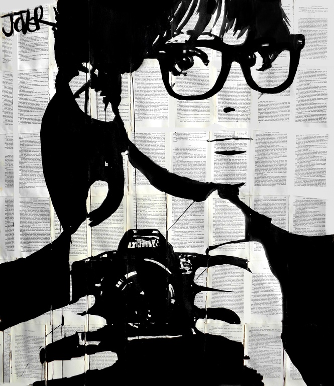
A slow pass through one of these drawings rewards more than a scroll-stop glance. Start with the figure: where does the heaviest ink sit, and what emotion does the face or posture propose? Then drop your attention into the type. Do you catch fragments of words, or only texture? Notice seams where pages meet—those joins are structural and compositional. Finally, ask what the page’s age does to the mood. New white paper would make the same ink feel sharper and colder; aged paper softens the drama into something closer to memory.
This looking method helps whether the subject is a close-up of a woman’s face, a kiss reduced to silhouette, or a more abstract arrangement of line. Jover’s range includes both emotionally direct portraits and quieter romantic scenes. The through-line is not a single subject but a relationship between drawing and found print.
Studio habit and emotional register
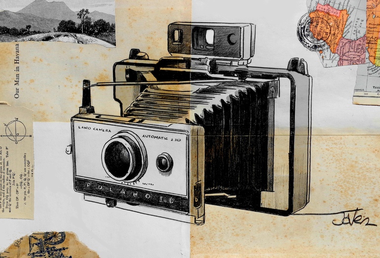
Working from a backyard studio, Jover keeps the practice close to daily life. Obsession, in his case, is not branding language; it is schedule. Filling books with cartoons and ideas keeps the hand fluent, so the exhibition pieces can afford to look inevitable. He has spoken of returning to works in segments, channeling whatever emotion is present that day into different parts of a picture. That piecemeal finishing suits ink, which records decision and accident with equal honesty.
Melancholy and nostalgia appear often in commentary on his work, and for good reason. Old books already carry the feeling of lives lived elsewhere. Drawing on them is a way of collaborating with residue. Even joyful subjects—lovers, gestures of care—arrive with a slight ache because the substrate remembers other stories. Viewers who respond to “negative nostalgia,” the bittersweet pull of history that is not entirely yours, tend to find these pages especially persuasive.
Where these images sat in the early-2010s web
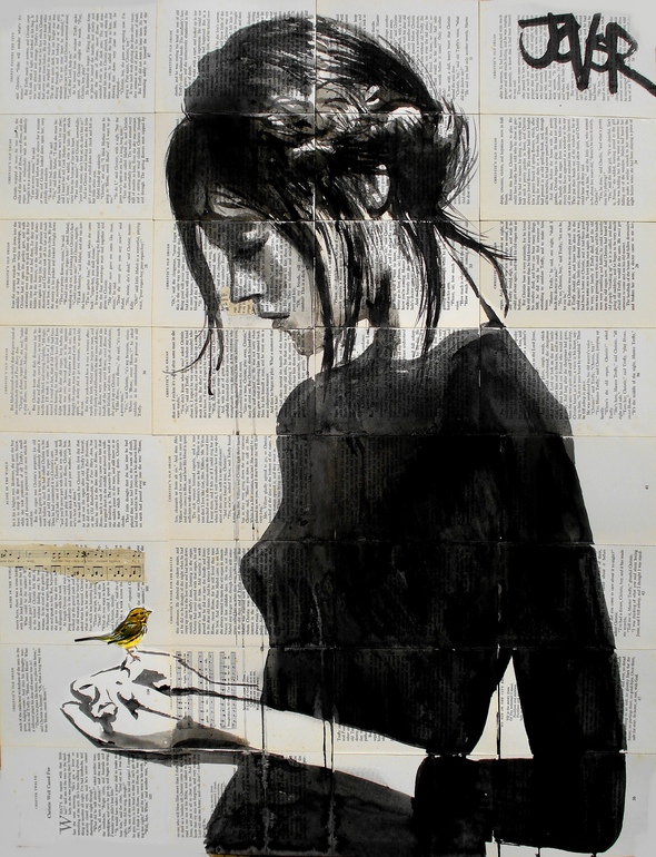
Inspiration blogs of the early 2010s loved work that photographed well as a vertical scroll: high contrast, readable faces, a one-sentence craft hook. Jover’s book-page drawings fit that format perfectly. Short posts often framed him as the Queensland artist who draws on vintage paper, then offered a gallery and a social link. The brevity was not a judgment on the work’s depth; it was a distribution habit. A fuller feature can keep the same topic—illustrations on vintage book pages by Loui Jover—while giving the method and mood room to breathe.
What those posts got right still matters. The images do communicate quickly. A dripping line across a printed column reads as emotion before you finish the caption. The deeper pleasure comes later, when you notice that the “background” is language, and that the drawing never fully conquers it.
Craft notes for artists who love found paper
If you work with collage grounds or reclaimed text, Jover’s practice suggests durable choices rather than a recipe to copy:
- Let chance pairings stand; over-matching text to image kills mystery.
- Protect fragility as a visual idea—thin paper, visible seams, and light washes can be strengths.
- Keep line confident; busy grounds punish hesitant mark-making.
- Use drip and wash sparingly enough that accidents feel intentional.
- Remember the viewer’s imagination is part of the composition.
None of this requires army training or a Queensland backyard. It does require respect for materials that already speak. Blank paper is a stage; a book page is a conversation partner.
What stays with you
Loui Jover’s illustrations on vintage book pages succeed because they refuse a clean hierarchy between drawing and print. Ink claims the figure; type claims the field; neither fully wins. The result feels literary without becoming illustration-of-a-novel, and emotional without becoming a poster. From the backyard studio outward, the work has traveled into private and public collections as something recognizable at a glance and richer on a second look—exactly the bargain a good ink drawing on a found page should offer.
If you leave with one practical takeaway, make it this: when a surface already contains history, your job is not to erase that history. It is to draw in a way that lets history keep whispering while the image speaks.

Comments
Continue reading
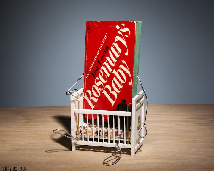
Terry Border’s Animated Old Books
Terry Border’s Wiry Limbs, Paper Backs series turns vintage paperbacks into wire-limbed characters—Bent Objects craft, literary humor, and how the photos stage each title.
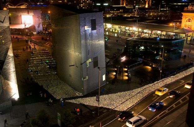
River of Books
Luzinterruptus flooded Melbourne’s Federation Square with 10,000 LED-lit discarded books for Light in Winter 2012—Literature Versus Traffic, donated via the Salvation Army.

Still-Life Photography by Margareth Perfoncio
São Paulo photographer Margareth Perfoncio’s still lifes of food and flowers—Old Master light, dark wood, and tables that feel inevitable.