
Namaste Tower, Mumbai: Architecture of a Greeting
Atkins’ Lower Parel mixed-use skyscraper concept—two wings clasped like namaste, mehndi facade patterning, and a W Hotel–led program from the early 2010s.
When renderings of Namaste Tower circulated in the early 2010s, the idea felt instantly legible: a Mumbai skyscraper shaped like the traditional Indian greeting, two building wings brought together like palms. Architecture rarely communicates hospitality this literally. That clarity—gesture as massing—is why the project became a favorite of design blogs and why this page still points to it as architecture, not as a hotel booking pitch.
The tower was planned for Lower Parel, on mill-era land being remade into a denser, more vertical district. Developer Jaguar Buildcon and designers associated with Atkins (with Shaun Killa later continuing related work through Killa Design) proposed a mixed-use landmark roughly 310 meters tall across about sixty-three floors. The program mixed a large W Hotel with office and retail space—an urban machine wrapped in a culturally specific silhouette.
In design culture of that moment, cities competed for icons. Glass boxes were efficient; greeting towers were memorable. Namaste Tower bet that Mumbai’s skyline could carry a vernacular gesture at skyscraper scale without becoming a cartoon. Whether you love literal symbolism or distrust it, the proposal remains one of the clearest “form equals meaning” experiments of that decade in India.
Gesture as structure
Namaste is a greeting of respect: hands joined near the heart. The tower translates that posture into two symmetrical wings that lean toward each other, creating a clasped profile on the skyline. Between the wings, vertical voids and atriums open the section, so the building is not a sealed slab. Daylight can travel deep into the mass; views of Mumbai can be framed through tall slots of air.
That diagram does more than brand the project. It organizes circulation, shared volume, and the emotional experience of arrival. Guests and office workers would move through a building that continually reminds them of welcome—an unusual ambition for a tower usually optimized for floor plates alone. The void between the “palms” is not wasted space; it is the architectural equivalent of breath between pressed hands.
At ground level, a podium was meant to complete the metaphor: a base that reads like sleeves or cuffs beneath the “hands,” with water features and cascades reinforcing ceremony. Reception, ballroom, and service spaces would sit in that civic-scaled foot, while the greeting form rose above as the public image. The podium matters because icons fail when they ignore the street. A memorable silhouette still needs a place to arrive, check in, and gather for events.
Mehndi on the facade
Beyond the silhouette, the design called for decorative facade graphics inspired by mehndi—henna patterns traditionally applied for celebrations. On glass and cladding, those motifs were intended to give depth, shade, and cultural texture rather than a blank curtain wall. In Mumbai’s light, patterned glazing can soften glare and add thermal performance while still reading as ornament from the street.
This is architecture as storytelling: local ritual translated into high-rise envelope technology. Critics of literal symbolism sometimes dismiss such moves as logo-buildings. Supporters argue that in a city of intense visual competition, a tower that can be recognized and named from a distance earns its place. Namaste Tower was designed to be that kind of silhouette—photogenic in drawings, memorable in conversation, and detailed enough that close-up views would not collapse into a flat logo.
Facade pattern also hints at hospitality culture. Mehndi marks celebration and guest honor. Wrapping a hotel tower in that language is a design bet that travelers and locals would read the building as welcome rather than as anonymous luxury glass.
A mixed-use skyline instrument
The planned hotel portion was large—on the order of 380 rooms—positioned as a W Hotel entry for India at a moment when global lifestyle brands were expanding into South Asian metros. Offices and high-end retail filled out the mixed-use brief, tying hospitality to the daily economy of Lower Parel rather than isolating the tower as a sealed resort.
Internal gardens at plant levels and atriums at the ends of corridors were meant to bring greenery and oxygen into the vertical section. Energy concepts discussed in early coverage included canopies and solar thermal collectors intended to offset a meaningful share of hot-water demand. Whether every performance claim would have survived detailed engineering is a separate question; the design intent was clearly to pair spectacle with environmental ambition.
LEED Gold targeting and all-concrete structural language appear in skyscraper databases for the project, placing it among the ambitious mixed-use proposals that defined Mumbai’s early-2010s vertical push. The building was not only a greeting; it was a stacked city fragment: sleep, shop, work, gather.
Lower Parel and the mill-land chapter
Context matters. Lower Parel’s mill lands were a major redevelopment frontier: industrial plots becoming commercial towers, residences, and entertainment districts. Namaste Tower belonged to that chapter—an attempt to put a culturally coded landmark on a skyline that was rapidly internationalizing. The site’s industrial past and hospitality future sit in productive tension: old labor geography meeting global brand architecture.
Location near Senapati Bapat Marg and the broader Mahalaxmi–Lower Parel corridor mattered for visibility and access. A building that greets the city needs a street and a skyline audience. The namaste form was meant to work both as distant icon and as close-up facade experience, where mehndi patterning and atrium light would reward people who approached on foot or arrived by car.
For Mumbai watchers, the tower also sits in a longer conversation about what “Indian modern” can look like at height—neither pastiche temple crown nor interchangeable international slab, but a contemporary diagram rooted in a gesture everyone already understands.
Reading the design historically
This page treats Namaste Tower as a design object from that era of proposals and early construction starts—not as breaking real-estate news. Construction began around 2011; the project later stalled and is widely described as on hold or never completed. Those facts belong to Mumbai’s difficult ledger of ambitious towers slowed by finance and regulation. They do not erase the architectural idea that made the project famous in design media around 2012.
For students of form, the lasting lesson is how a vernacular gesture can organize a skyscraper section. For students of branding, the lesson is how hospitality culture sought an Indian-specific icon rather than a generic glass prism. For students of cities, the lesson is how mill-land redevelopment invited global hotel brands into local myth-making—and how hard it is to finish myth at 310 meters.
What to notice in the concept
- Symmetry with a void: two wings, one greeting, a corridor of air between.
- Cultural cladding: mehndi-inspired graphics as both ornament and environmental filter.
- Program stacking: hotel rooms, offices, and retail sharing one symbolic body.
- Podium ceremony: water and arrival spaces completing the “hands and sleeves” image.
- Atriums and gardens: vertical light and greenery as antidotes to deep-plan darkness.
- Skyline readability: a silhouette you can describe in one sentence after one glance.
Design blogs of 2012 circulated the Atkins imagery because it photographed well even as a drawing. That is fair. Iconic architecture often begins as a memorable diagram. Namaste Tower’s diagram—palms joined in welcome—remains one of Mumbai’s most eloquent unfinished skyline sentences.
If you stand in Lower Parel today and look for what the city chose to finish instead, the question still hanging in the air is simple: which new towers greet the street as clearly as this one was meant to?

Comments
Continue reading
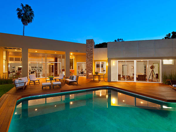
Beverly Hills Villa by William Stephenson
A renovated 1956 William Stephenson villa in Beverly Hills—four bedrooms, five baths, gallery hall, garden pool—documented from its early-2010s listing era.
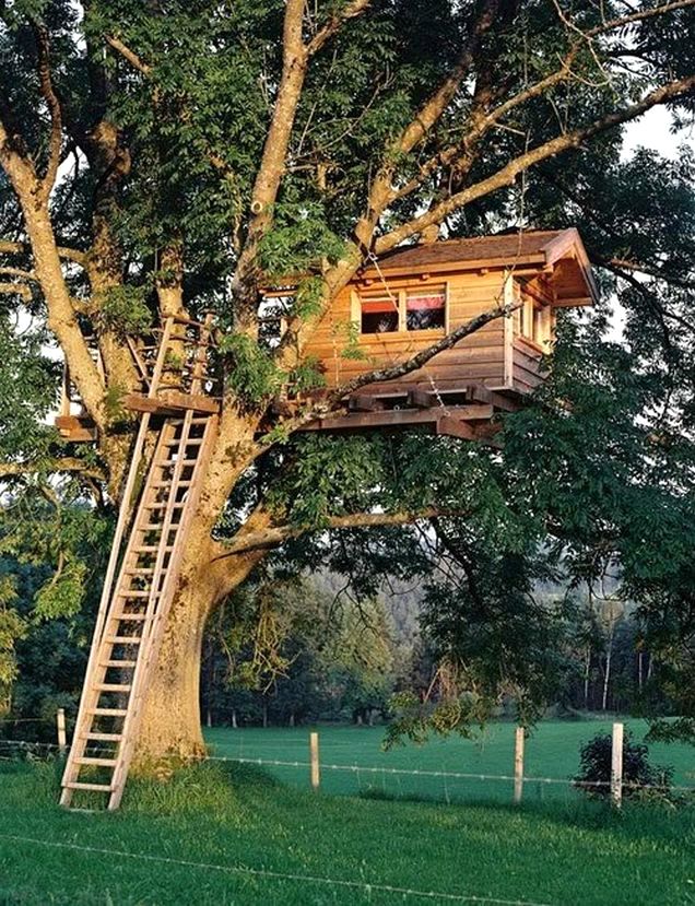
Tree House Designs: Elevated Cabins, Pods, and Canopy Rooms
From classic platform forts to architect pods in the canopy—how tree-house designs balance wonder, structure, and care for the living trees that hold them.
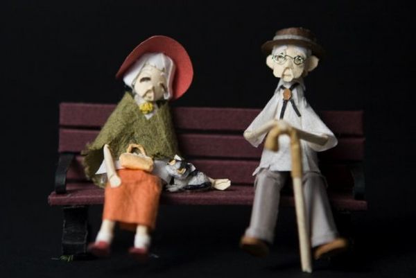
Yumiko Matsui’s Adorable Miniature Paper Tokyo
Paper artist Yumiko Matsui folds coloured sheets into detailed Asakusa streetscapes—miniature Tokyo rebuilt shopfront by shopfront.