
It’s Coffee O’Clock: Cups, Foam, and the Everyday Pause
A visual tour of coffee’s daily ritual—latte art, quiet still lifes, and design details that turn a simple cup into a moment worth noticing.
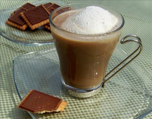
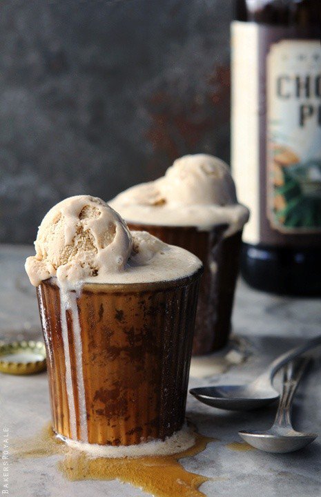
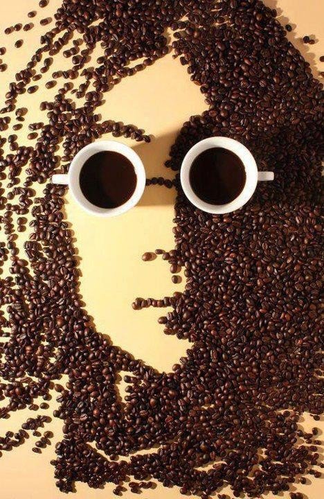
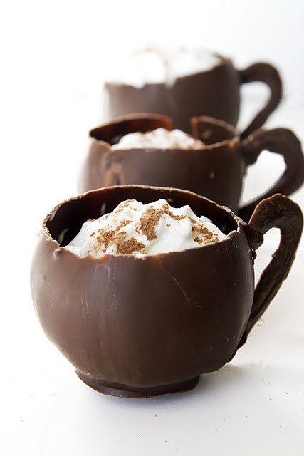
Coffee absolutely rules our days, doesn’t it? “Coffee o’clock” is rarely a literal time on the clock. It is the permission slip we give ourselves—before work, between meetings, after school pickup—to hold something warm and pause. The drink is chemistry and agriculture; the moment is design. Cups, foam, ceramic, wood grain, and window light have become a shared visual vocabulary. The photographs collected here are not a product roundup. They are a gallery of how coffee looks when someone bothers to notice: latte art frozen mid-bloom, quiet table still lifes, steam catching backlight, the geometry of a saucer and spoon.
Long before specialty menus listed farm names and roast dates, coffee was already a ritual object. Morning brew, afternoon reset, late-night study companion—each slot asks something different from the same bean. Designers, baristas, and photographers keep returning to that ritual because it is both ordinary and theatrical. A cup is a stage the size of your hands. In a noisy century, that small stage still reads as calm.
Why coffee photographs so well
Coffee offers ready-made contrast. Dark liquid sits against pale foam. Matte ceramic meets glossy crema. Steam moves while the cup stays still. Brown is not one color; it runs from honey-colored filter coffee to near-black espresso. Foam adds white calligraphy that disappears with the first sip. Wood tables, marble counters, linen napkins, and notebook edges supply textures cameras love. Even a plain mug becomes graphic when side light cuts a highlight across the rim.
There is also narrative compression. A half-drunk cup suggests time already spent. Two cups suggest company. A laptop corner in soft focus suggests work that will resume. Viewers finish the story without a caption. That is why coffee imagery travels so easily through magazines and feeds: it is lifestyle shorthand that still feels intimate, closer to a letter than to an advertisement.
Stylists know the traps. Too many props turn a drink into a catalog page. Harsh overhead bulbs flatten brown tones into mud. Shooting only from directly above can erase steam and depth. The stronger frames on this page usually pick one hero—foam pattern, glass condensation, or hand and handle—and let the rest fall away.

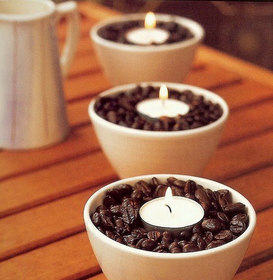
Kinds of coffee time worth noticing
The espresso pause. Small volume, high intensity. The clock seems to shrink to the length of a sip. Visually, espresso loves tight crops—crema texture, demitasse handles, the thin shadow of a spoon. Standing at a bar for ninety seconds is a different culture from nursing a huge mug; both count as coffee o’clock.
The milk-drink canvas. Cappuccinos and lattes turn foam into a drawing surface. Hearts, rosettas, tulips, and free-poured patterns are temporary by design. Photography freezes the second before the spoon breaks the surface. Fine microfoam reads like velvet; large bubbles read like haste.
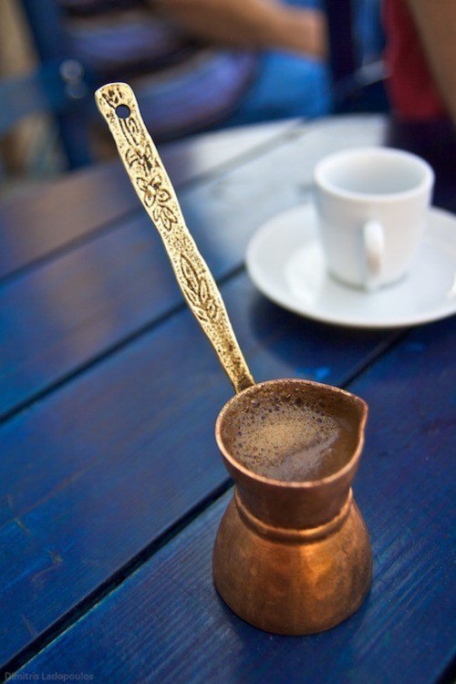
The slow filter hour. Pour-over, drip, or French press stretches time. Kettle necks, bloom, paper filters, and glass carafes read as craft. These scenes feel quieter than espresso bars—more kitchen table than crowded counter—and they reward patience in both brewing and framing.
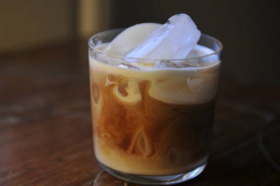
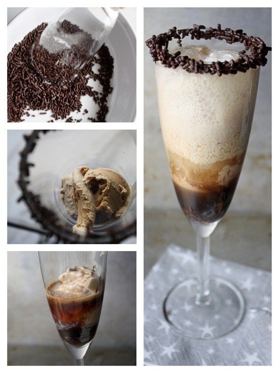
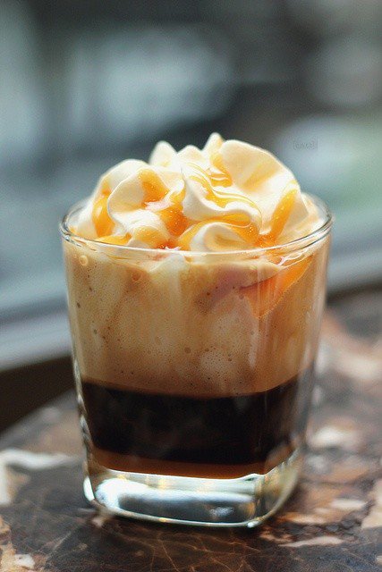
The iced reset. Condensation, clear glass, and melting ice introduce motion and cooler light. The drink becomes architecture: layers, straws, citrus, or simply black coffee over ice with a hard specular highlight. Summer coffee o’clock often looks louder on camera even when the ritual is the same pause.
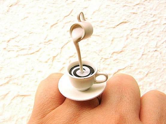
Design details that make a cup memorable
Baristas and stylists lean on a few recurring choices. Cup color frames the drink: white ceramic maximizes crema contrast; dark stoneware makes foam luminous. Saucers and spoons add small metal sparks. Scattered beans, kraft sleeves, and handwritten menus can enrich a scene or clutter it—restraint usually wins. Negative space around the cup often does more work than another garnish.
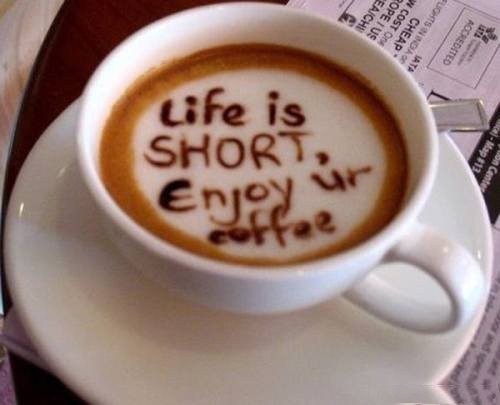
Latte art rewards geometry. A centered heart reads instantly in a thumbnail. An off-center pour can feel more candid, as if you interrupted a working barista mid-shift. Heat shows as steam, which needs backlight or a dark background to register. Without that contrast, a hot drink can look strangely cold on screen.
Sound and smell never appear in still photos, so good coffee images compensate with tactile cues: sugar crystals, linen weave, fingerprint soft focus on a mug lip. The best frames make you remember temperature.
Building your own coffee o’clock
You do not need cafe gear to borrow the mood. Choose a cup you like holding—weight and rim shape matter more than brand. Brew something you will finish, not a prop. Sit near a window if you can; daylight flatters brown tones better than harsh overhead bulbs. Put the phone face down for ten minutes. The “design” of the moment is attention more than plating.
If you do photograph the cup, try one constraint: only natural light, or only a single prop besides the mug. Series work better than one overstyled frame. The images here succeed because they vary scale—some are portraits of foam, others are rooms that happen to contain coffee. Alternate close and wide. Leave one frame slightly imperfect so the set feels lived in.
At home, coffee o’clock can be a boundary ritual: the drink marks the start of deep work, or the end of the workday. In offices, it can be the only unstructured conversation left. In cafes, it can be solitude in public—headphones optional. None of those uses require a perfect pour. They require a clear intention about what the pause is for.
Caffeine, culture, and an honest pause
Coffee culture spans street carts, third-wave bars, office urns, and home moka pots. What they share is a negotiated break. In some cities that break is standing at a counter; in others it is an hour with a newspaper. Neither is more authentic. The drink adapts to the clock you give it. Travel only widens the vocabulary: Italian bars, Scandinavian light roast cafes, Japanese kissaten calm, diner bottomless cups—all different tempos wearing the same bean.
There is no need to romanticize dependence. If coffee jitters your nerves or steals sleep, the most stylish cup is the one you skip—or switch to decaf or tea without apology. “Coffee o’clock” can mean a favorite mug and a clear ten minutes even when the liquid changes. The photographs here celebrate coffee’s look and social warmth; they are not a prescription to drink more.
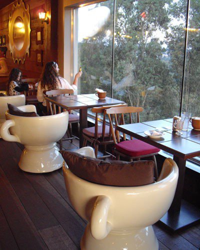
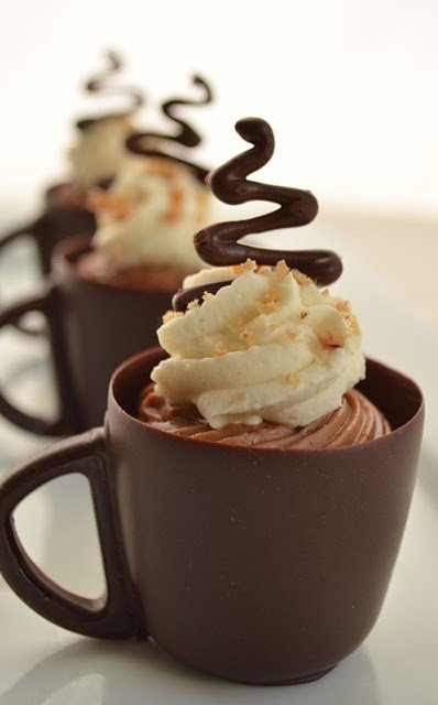
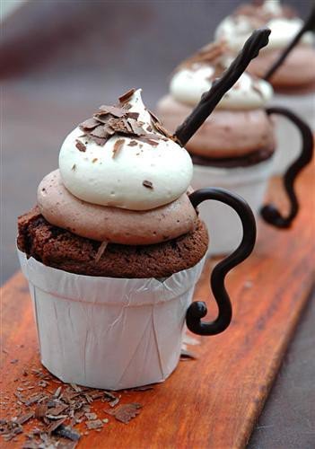
Scroll back to whichever frame made you thirsty—or simply made you want to sit down. Was it the foam pattern, the light on the table, or the suggestion of time slowed by a few degrees? That preference is your coffee o’clock design brief. Brew accordingly, or just look a little longer before the cup cools.

Comments
Continue reading

Funny Animal Signs That Warn People (While Animals Ignore Them)
From a seagull on a no-birds disc to classic zoo and park ironies—why animal warning signs get funny, and what the rules are still for.

How to Find Local Amenities on Vacation: Mechanics, Haircuts & More
Locate trustworthy local services and everyday spots while traveling or settling in—using publications, reviews, map apps, neighbor tips, and low-pressure exploration.

Kristen Stewart for V Magazine, Spring Preview 2013
V81’s Wild at Heart cover story—Kristen Stewart shot by Inez & Vinoodh, styled by Joe McKenna, in pale minimal spring glamour.