
Fabulous T-Shirt Designs by Glenn Jones (Glennz) — First Gallery
Auckland illustrator Glenn Jones—Glennz—built a Threadless-to-tees career on sharp visual punchlines; a first gallery of his graphic shirt designs.
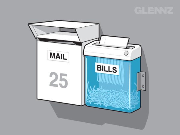
Glenn Jones is an Auckland, New Zealand graphic designer and illustrator; Glennz is the name most tee collectors know him by. The contraction is literal—Glenn from NZ—and it became a signature on shirt graphics built for a single glance: bold silhouettes, pop-culture twists, and visual punchlines that still work when the fabric wrinkles. This page is a first gallery of that work—an introduction to the voice and craft—while other collections continue with more designs from the same catalog.
What follows is not a store pitch and not a scavenger hunt for checkout links. It is a look at how an illustrator trained in packaging and identity learned to make jokes that survive print, distance, and cotton. Meet the designer, watch how the humor is built, then scroll the shirts as evidence. Later galleries can dive into motifs; this one establishes who Glenn Jones is and why Glennz tees became a shared language for a certain kind of geek-culture wit.
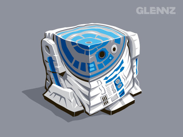
Auckland roots and the Threadless years
Jones spent years in professional graphic design before T-shirts became the public face of his practice. Day work meant corporate identity, packaging, and illustration for clients who needed clarity and brand control. Nights and weekends meant concepts that could live on a chest—tighter constraints, freer jokes. In the mid-2000s he submitted designs to Threadless, the Chicago community platform where users voted graphics into production. By the middle of that decade he ranked among the site’s highest-selling designers. Spare-room ideas suddenly had a global audience.
That momentum became Glennz Tees. Jones focused on the art while production partners handled manufacturing and fulfillment, a split that let an Auckland illustrator serve largely international customers without pretending to run a factory from a villa spare room. Sales eventually ran into the hundreds of thousands of shirts. The through-line stayed consistent: readable forms, witty concepts, and a sense that the wearer is in on the joke rather than wearing a billboard for someone else’s slogan.
Online portfolios of the era helped amplify the work. When a Glennz set caught fire on communities such as Reddit, the drawings did the marketing. Shareability was a side effect of clarity—another reason the work rewards editorial looking rather than hard-sell copy. People forwarded images because the gag landed, not because a caption begged them to buy.
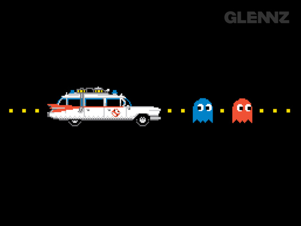
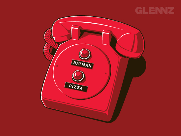
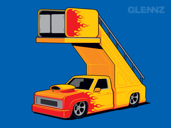
How a Glennz punchline is engineered
Strong tee design is ruthless about hierarchy. Jones’s best pieces usually offer one primary read at conversational distance—a character mash-up, a twist on a familiar icon, a visual pun—then reward a closer look with line detail, expression, or a secondary gag tucked into the margins. Colour counts stay disciplined because printing loves clarity and fabric hates muddy blends. Busy gradients and microscopic type belong on posters, not on moving cotton that will be washed, stretched, and photographed poorly by phone cameras.
Humor lives in the concept more than in caption spam. When text appears, it tends to support the picture rather than replace it. Sci-fi, games, music, and geek-culture references show up often, but the drawings stay friendly rather than mean-spirited. That tone helped the shirts travel across forums and feeds. People passed them along because the idea was sharp enough to explain itself.
Try a simple test as you browse this first gallery. Name each design in six words or fewer. If you can, the graphic is doing its job. If you need a paragraph, either the joke is overcrowded or you have found a denser mash-up that wants a second look. Either outcome teaches you something about how illustration behaves at torso scale—the same skill Threadless voters practiced when they elevated Jones’s early hits.
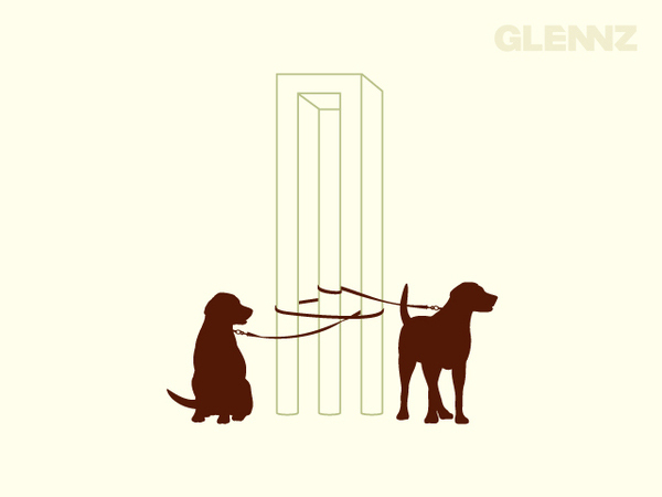
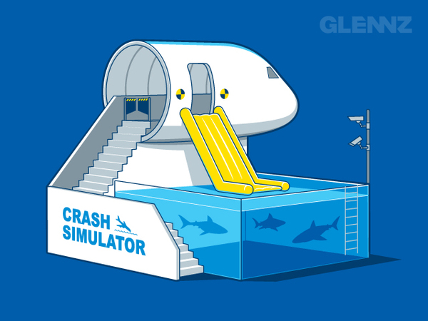
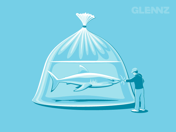
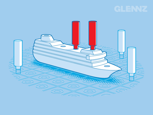
Craft under print and fabric constraints
Shirt graphics are constrained design problems. The printable area is limited; fabric stretches and folds; ink sits differently than screen pixels. Jones’s background in packaging and identity shows in locked compositions and intentional negative space. Characters are posed for the torso, not for a poster that will be cropped later. Outlines hold at distance. Faces read across a room. Those are not accidental virtues—they are professional habits applied to a casual object.
Look for recurring habits across this set: bold silhouettes, economical colour, and concepts that could be pitched in one sentence at a design review. Those habits are why the designs still feel current when fashion cuts change. A good gag does not depend on a seasonal neckline. Vector control and witty thinking age better than trend textures that date within a year.
Compare a sparse one-hit joke with a denser scene when both appear in the gallery. Notice how Jones still protects a single entry point for the eye. Density without hierarchy becomes noise; hierarchy with density becomes a comic panel you can wear. That distinction is useful for anyone designing for print, merch, or social thumbnails where attention is scarce.
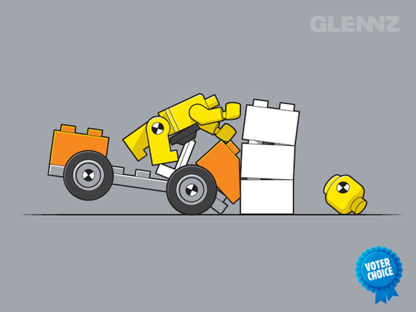
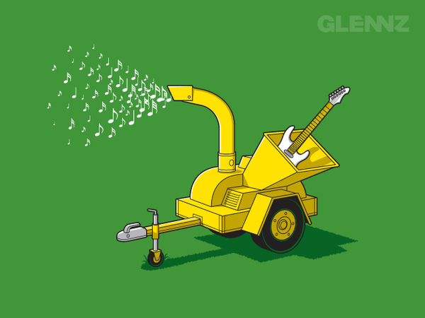
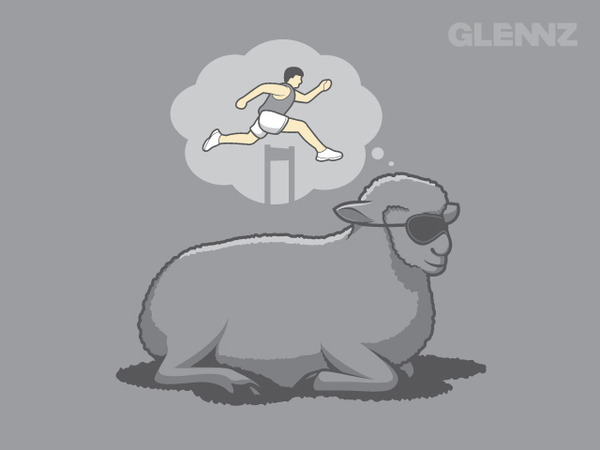
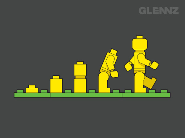
Why this first gallery stays introductory
Jones’s later creative life also includes Glenn Jones Art—New Zealand–flavored prints and gifts developed with his wife Julia—and children’s book work such as The Rhyming Pirate. Those chapters sit beside Glennz Tees rather than replacing them. They matter as biography, and they show an illustrator expanding beyond American pop-culture mash-ups into local nostalgia and storytelling. For this URL, though, the subject remains the shirts: freelance energy, Auckland base, and a catalog built for people who like cotton with a punchline.
Because more Glennz galleries exist elsewhere, this installment stays introductory on purpose. It establishes the name (Glenn Jones / Glennz), the Threadless-to-brand path, and the craft habits to watch—so later sets can explore individual motifs, denser runs of designs, or different eras of the catalog without repeating the origin story every time. Think of this page as the handshake before the longer conversation. The voice here is biographic and instructional; later pages can be more purely curatorial.
As you move through the images, ignore checkout language and study only drawing decisions: where the silhouette breaks, how many colours carry the gag, whether the joke is cultural reference or pure visual invention. That habit turns a scroll into a short masterclass in wearable illustration. It also prepares you to recognize Jones’s hand when more Glennz work appears in adjacent galleries.
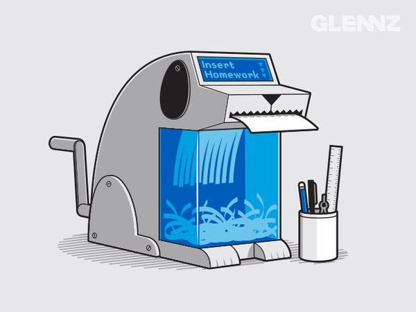
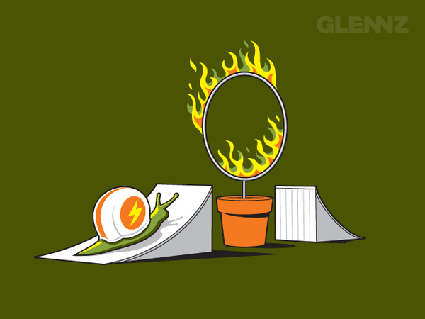
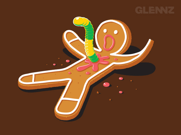
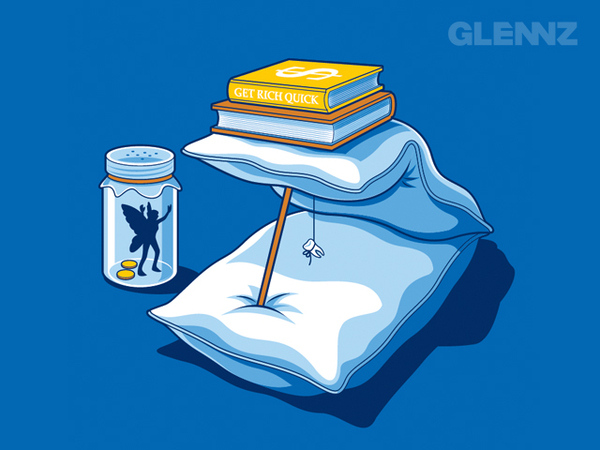
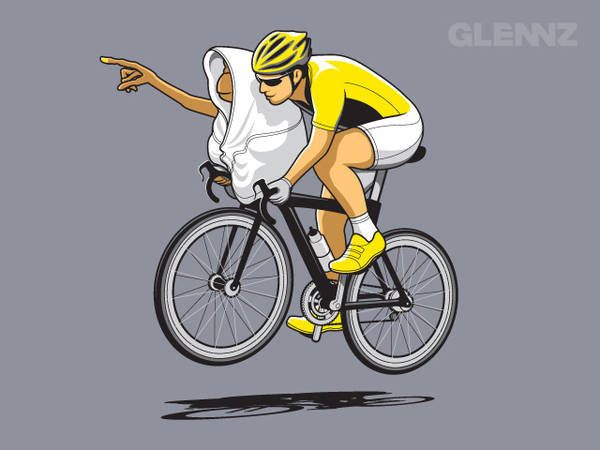
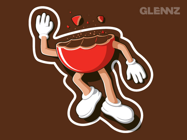
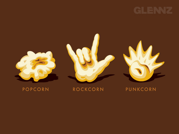
- Learn the name pair: Glenn Jones, working as Glennz
- Watch for one primary gag at distance, detail up close
- Count colours and notice negative space around the print
- Ask whether the joke is reference, mash-up, or pure invention
- Treat this set as the introduction before deeper Glennz galleries
Leave with one favorite from this first set. Cover the merch impulse for a moment and ask only what made the gag land—silhouette, reference, or pure invention. That answer is Glenn Jones’s craft in miniature, and a clean place to stop before more Glennz shirts pick up the thread elsewhere.

Comments
Continue reading
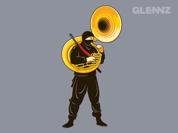
Glenn Jones Glennz Tees, Part 3: Character Contradiction and Loud Archetypes
How Glenn Jones builds Glennz character shirts—ninjas with sousaphones and other role-breaking jokes that work without a caption.

Glenn Jones Glennz Tees, Part 2: Everyday Objects as Wearable Punchlines
A craft look at Glenn Jones’s object-first Glennz shirts—caution signs, still-life humor, and why mundane props travel farther than catchphrases.
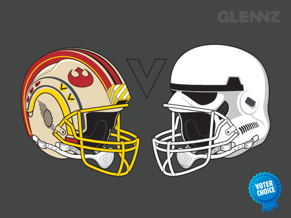
Glenn Jones Glennz Tees, Part 4: Pop Mashups, Versus Graphics, and Gallery Collisions
A catalog pass through Glenn Jones’s mashup Glennz shirts—Star Wars football helmets, rocket popsicles, arcade loops, and how rivalry prints work on cotton.