
Glenn Jones Glennz Tees, Part 2: Everyday Objects as Wearable Punchlines
A craft look at Glenn Jones’s object-first Glennz shirts—caution signs, still-life humor, and why mundane props travel farther than catchphrases.
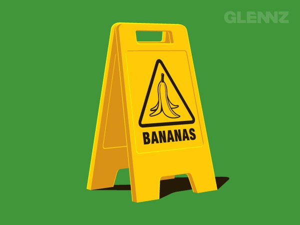
Glenn Jones — better known on tees as Glennz — built a reputation in Auckland for illustrations that feel like one-panel jokes you can wear. This second look at his t-shirt work stays with a quieter corner of that humor: the everyday object made strange. No franchise logos, no costume characters. Just a familiar thing from a shop aisle or a wet-floor corner, redrawn until it becomes a punchline.
The design above is a clean example of that approach. A yellow A-frame caution stand sits on a flat green field. Where you expect “Wet Floor,” you get a banana-peel pictogram and the blunt word BANANAS. The gag is almost too simple to explain — which is exactly why it works on fabric. You read it in under a second, then smile because the slapstick object has been promoted to official hazard status.
Still-life humor for a chest print
Glenn Jones’s object-first shirts behave like still-life paintings with a comic deadline. The subject is centered, lit with soft vector shading, and isolated against a solid color so the silhouette stays readable at street distance. That discipline matters more than people admit. A t-shirt is not a poster on a wall; it moves, folds, and competes with jackets, backpacks, and busy backgrounds. Designs that clutter the frame die on cotton. Designs that treat one object as a stage prop survive.
The caution-stand piece follows a reliable recipe:
- Borrow a real-world template — safety signage, packaging, tools, food packaging labels.
- Keep the materials honest — plastic yellow, black type, hard shadow on the floor.
- Swap only the meaning — one word or one icon flips the entire reading.
- Refuse extra decoration — no floating sparkles, no speech bubbles, no fake “vintage texture” noise.
That restraint is part of Glennz’s signature. Even when the joke is silly, the drawing is tidy. Highlights sit where light would sit. Edges stay crisp. The brand mark “GLENNZ” appears as a quiet watermark rather than a billboard. You are meant to notice the idea first, the author second.
Why mundane objects travel farther than catchphrases
Around the late 2000s and early 2010s, online tee culture rewarded punchy concepts that could win votes on community platforms and then sell through independent stores. Catchphrase shirts burned out quickly. Object humor aged better because it did not depend on a week’s meme cycle. A banana peel is older than social media. A wet-floor cone is older than most of the audience. Combining them feels timeless in a cartoon way.
Glenn Jones understood that apparel humor works best when it is culturally portable. You do not need to know New Zealand street slang to get the bananas gag. You only need to recognize two things: the caution stand and the slippery-fruit cliché. The design speaks international slapstick with local craftsmanship.
Object gags also photograph well. Solid backgrounds, hard silhouettes, and saturated color blocks look sharp in product shots and on blogs that featured Glennz Tees as gallery fodder. That is not an accident of marketing; it is a consequence of composition. The same clarity that helps a shirt across a café also helps a JPEG across a feed.
Reading the joke without hearing a caption
Good tee illustration has to survive silence. There is no caption under your chest in the real world. If someone asks, “What does your shirt mean?” the answer should be short enough to say while waiting for coffee. With the bananas stand, the exchange is almost automatic: “It’s a caution sign… for bananas.” The listener finishes the joke for you. That shared completion is the social life of the garment.
Glenn Jones’s object designs often invite that kind of co-authorship. He sets the props; the viewer supplies the cartoon physics. You imagine someone slipping. You imagine a janitor who has given up. You imagine a grocery aisle after a fruit disaster. The shirt does not need to draw the fall. The caution stand implies it.
Craft notes for designers who want the same clarity
If you study this slice of Glennz’s work for craft rather than nostalgia, a few practical habits stand out.
Commit to one focal mass. The caution stand fills the vertical middle of the frame. Negative space around it is generous. On a shirt, that negative space becomes fabric, which softens the graphic without drowning it.
Use industrial color pairs. Yellow-and-black safety language is already loaded with meaning. Pairing it with an unexpected green field separates the graphic from real store interiors while keeping the warning palette intact.
Letter like a sign maker, not a poster artist. The word BANANAS is heavy, centered, and unapologetic. Fancy typography would ruin the impersonation of official equipment.
Shade just enough to sell volume. Soft gradients on the plastic panels and a grounded shadow keep the object from looking like a flat sticker. Too much rendering would make it look like a product photo; too little would make it look like clip art.
These choices explain why Glenn Jones’s freelance illustration background shows through even on joke tees. Packaging and identity work teach you to respect templates. Tee comedy teaches you when to break them. The sweet spot is a faithful template with one broken rule.
Where this part sits in the Glennz gallery
Glenn Jones’s wider catalog includes ninjas, space mashups, food rockets, and arcade ironies. Those designs chase character and franchise energy. This part deliberately stays with the quieter lane: objects that belong in ordinary life until the drawing refuses to leave them ordinary. It is useful to separate those lanes when you look at a long portfolio. Otherwise every Glennz shirt starts to blur into “clever vector stuff,” and you miss how different the jokes are built.
Object humor is also the lane closest to commercial design training. A caution stand is already a designed artifact. Remaking it is a conversation with public signage, not only with internet jokes. That conversation gives the shirt a slightly different dignity: it looks like a thing that could exist in a shop for five minutes before someone notices the bananas.
A quick way to look at object tees
Next time you scroll a Glennz-style design, try this short checklist instead of asking whether you “like” it immediately:
- Can you name the original object in one breath?
- Is there only one meaningful swap — word, icon, or context?
- Would the silhouette still read if the colors went grayscale?
- Does the joke need a paragraph, or does it land in a glance?
If the bananas caution stand passes those tests for you, you already understand the craft angle of this installment. The fabulous part is not that the idea is complicated. It is that Glenn Jones made complication unnecessary — and still left enough drawing skill on the page that the joke feels designed, not dashed off.

Comments
Continue reading
Fabulous T-Shirt Designs by Glenn Jones (Glennz) — First Gallery
Auckland illustrator Glenn Jones—Glennz—built a Threadless-to-tees career on sharp visual punchlines; a first gallery of his graphic shirt designs.
Glenn Jones Glennz Tees, Part 3: Character Contradiction and Loud Archetypes
How Glenn Jones builds Glennz character shirts—ninjas with sousaphones and other role-breaking jokes that work without a caption.
Glenn Jones Glennz Tees, Part 4: Pop Mashups, Versus Graphics, and Gallery Collisions
A catalog pass through Glenn Jones’s mashup Glennz shirts—Star Wars football helmets, rocket popsicles, arcade loops, and how rivalry prints work on cotton.