
Decorate Your Walls with Paintings That Fit the Room
Match scale and mood to living rooms, dining rooms, and kitchens, with works by Hospodarsky, LeMay, Pan, Evans, Moore, Puczel, Leguizamo, and others.
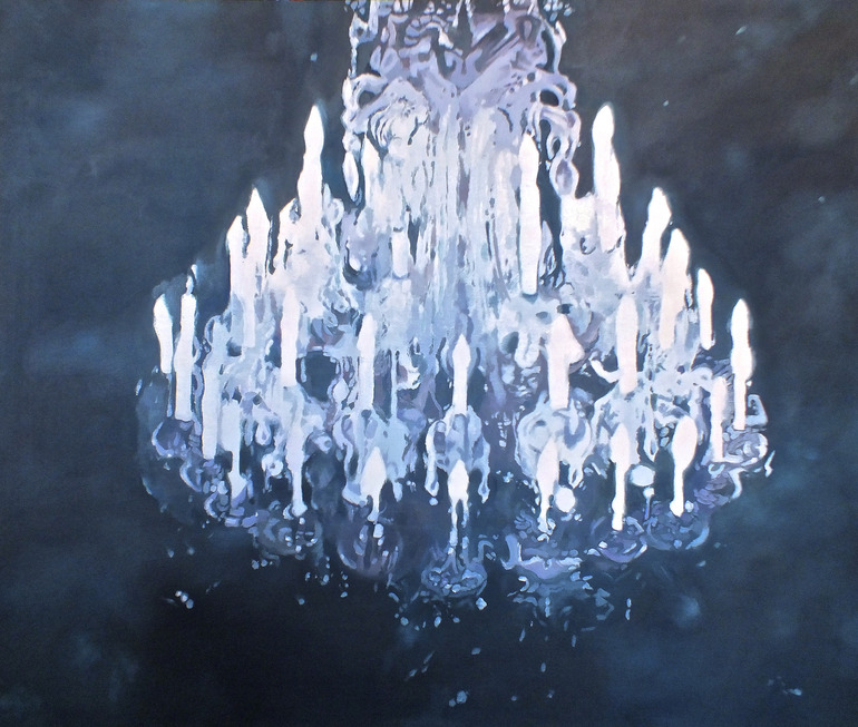
Furniture can make a room usable. Paintings make a room feel chosen. A sofa tells guests where to sit; a canvas tells them what kind of attention you pay to color, mood, and silence. That personal layer matters in living rooms, dining rooms, kitchens, and even bathrooms, where a single strong image can pull a utilitarian space out of looking temporary. The easiest way to add that layer is still a painting—or a painting-like photographic work—hung where light and sightlines already want something to land.
Choosing art is less about chasing a trend and more about matching the job of the room. Welcome spaces ask for energy or warmth. Dining rooms often carry bolder color already, so the art should either join that intensity or cool it with intention. Kitchens tolerate still lifes, landscapes, and graphic color fields that can handle glances between tasks. The works below, drawn from artists working in oil, photography-based composition, and expressive figuration, show how different moods can suit different walls without requiring a museum budget speech—only a clear sense of what the room needs to feel like.
Match the painting to the room’s role
In a living room, people arrive slightly formal and then relax. Art that rewards a longer look—layered figurative scenes, atmospheric landscapes, or compositions with a quiet narrative—gives conversation a place to drift. Dining rooms under chandeliers and strong overhead light can take richer palettes and larger scales; a timid print on a bold wall often looks apologetic. Kitchens and baths need practical framing and glass that tolerate humidity and cooking residue; subject matter can still be ambitious, but the object should survive steam.
Scale is the mistake most people make first. A small painting centered on a vast wall floats. A huge canvas above a delicate console overwhelms. As a rough guide, art above a sofa often looks settled when it spans roughly two-thirds of the furniture width, either as one piece or a tight group. Hang so the visual center sits near average eye level, then adjust for ceiling height and whether people will view the work mainly while seated.
Marek Hospodarsky works in oil on canvas at medium to large scale. His interest runs toward the human figure and its uneasy ties to forces that feel larger than daily life, alongside the strange weight of ordinary relationships. That mix of banality and latent tension suits rooms where guests linger—living rooms and studies—more than hurried corridors.
Credit: Marek Hospodarsky
Color, contrast, and photographic construction
When a room is mostly neutrals, a painting with a dominant hue can act as the missing accent without buying new pillows. When a room is already loud, look for works that organize chaos—strong composition, clear value contrast, or a limited palette—so the wall does not add another argument. Autumn landscapes and mountain scenes bring depth to kitchens and dining nooks that already lean warm; reds and greens can echo produce, pottery, and wood tones without needing a literal still life of fruit.
Ysabel LeMay builds images detail by detail in a painter-like process she describes as photo-fusion: many photographs adjusted for light and visual properties, then assembled into one large composition. The result can read as hyperreal and dreamlike at once. Pieces like these reward walls with enough distance to step back—over a console opposite an entry, or at the end of a hallway vista.

Credit: Ysabel LeMay
Yangyang Pan focuses on contrasts inside nature: beauty beside cruelty, hostility beside hospitality. That dual temperature works well in rooms that already hold mixed materials—stone and linen, dark wood and pale walls—because the painting can speak the same language of tension without copying the furniture.
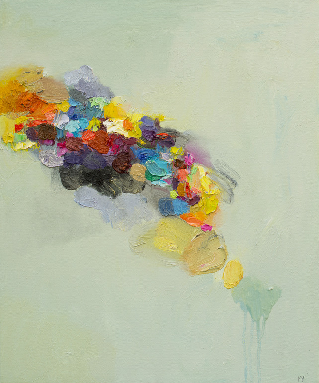
Credit: Yangyang Pan
Atmosphere, memory, and quiet narrative
Some walls need calm more than drama. A Canadian lake scene with a red canoe and cooling evening light—work in the spirit of Charlotte Evans’s quiet outdoor moments—can settle a bedroom or a reading corner. Cool water tones lower the visual temperature of a warm lamp-heavy room; a single bright canoe tip can still give the eye a place to land.

Credit: Charlotte Evans
Claire Moore’s work leans into how the past remains present—nostalgia on one end, argumentative reuse of history on the other. Memorial and memory-driven images suit dining rooms and hallways where family stories already hang in the air. They also ask for honest framing: simple wood or a quiet float frame usually serves better than ornate gold that competes with the subject.
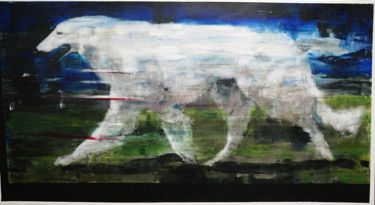
Credit: Claire Moore
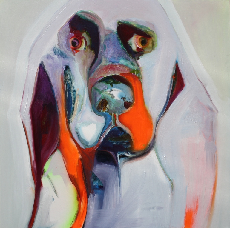
Credit: Patricia Derks
Figures, illusion, and emotional brushwork
Figurative paintings change a room’s social temperature. Jarek Puczel’s interest in life as a kind of movie or game of illusion—realities overlapping on a playground of tension—gives living rooms a conversational spark. Couples in a shared space, half-narrative and half-stage set, remind viewers that domestic life is already a performance. Hang such work where people sit long enough to notice the uncanny details.
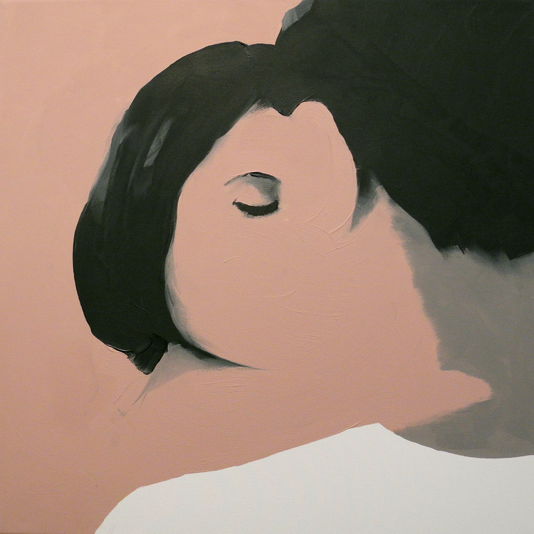
Credit: Jarek Puczel
Jesús Leguizamo often erases or blurs the face, the feature we use to define a person, and rebuilds presence through expressive brushwork. The paintings explore fragility as something paint can show rather than merely describe. They belong on walls that can handle a little unease—studies, creative studios, or living rooms that already prefer character over bland cheer.
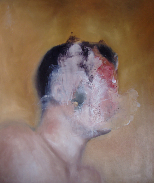
Credit: Jesús Leguizamo

Credit: Thomas Saliot
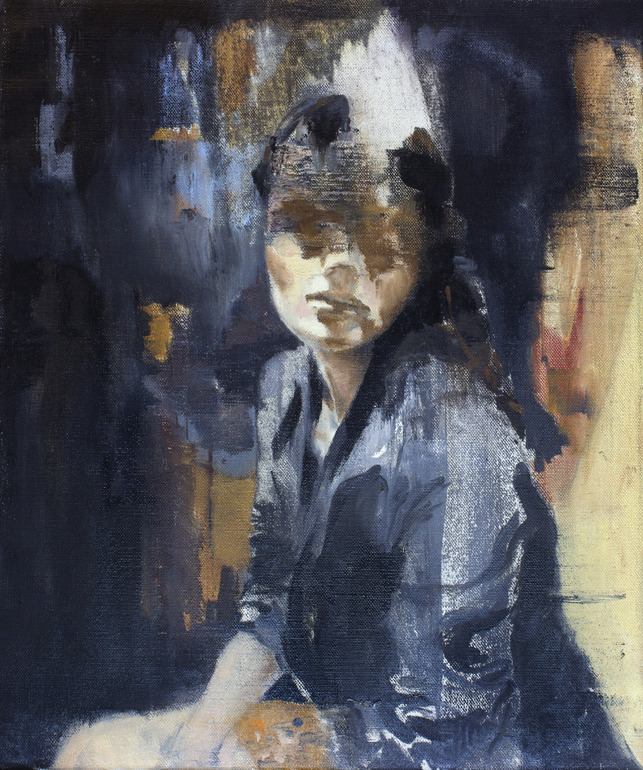
Credit: Julien Spianti
Practical hanging notes
- Use proper wall anchors or find studs; canvases are heavier than posters.
- Keep direct sun off delicate pigments when you can, or use UV-filter glazing.
- Align frames with nearby architecture—door tops, shelf lines—so the wall feels planned.
- Leave breathing room between art and ceiling crowns or crown moldings.
- In kitchens and baths, prefer sealed frames and avoid untreated paper works.
Original art for sale—whether found through galleries, artist studios, or online marketplaces—earns its keep when it survives the second week on the wall: still interesting after the novelty fades, still right when the seasonal pillows change. Start with one wall and one honest preference—color, figure, landscape, or abstraction—and let the next piece answer the first instead of shopping as if every room needed a matching set.

Comments
Continue reading

Photo-Realistic Muscle Car Paintings by Cheryl Kelley
Cheryl Kelley’s glossy oil paintings of classic muscle cars—photo-based realism, chrome reflections, and a feminine take on automotive glamour, with gallery images.

Ray Massey’s Hand Paintings: Trompe-l’oeil Athletes, Castles, and Everyday Objects
Ray Massey’s painted-hand photographs turn fingers into footballers, sprinters, castles, pencil cups, and bananas—studio trompe-l’oeil with lasting wit.

Evgeny Lushpin’s Evening Journey: Twilight Cities, Canals, and Cable Cars
A gallery walk through Evgeny Lushpin’s twilight paintings—from St. Petersburg roofs and European canals to Montmartre rain and the San Francisco Evening Journey canvas.