
Bohemian Rhapsody, Part 2: How to Layer the Look Without a Theme Park
A curatorial companion to Part 1—pavilion logic, colour spines, texture, light, and a stop-test for building bohemian rooms you can actually live in.
Part 2 picks up the same Bohemian dialect—Indian pattern, tribal geometry, Romany colour, hippie layering—but shifts the question from “what does this world look like?” to “how do you build it without turning a room into a theme park?” Where Part 1 lingered on atmosphere and objects of desire, this companion piece is more curatorial: materials, light, seating, and the discipline of stopping before the last cushion.
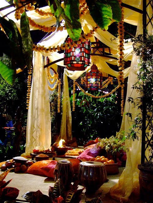
The surviving image in this set is a night pavilion that does the homework for you. Sheer cream fabric drapes a metal gazebo. Moroccan-style lanterns throw stained-glass colour. Marigold garlands hang heavy. Floor cushions in magenta and burnt orange sit with tablas, citrus bowls, and a small flame. It is outdoor bohemian staging at full volume: festive, layered, and unapologetically ornamental. The challenge for everyday interiors is translating that density into a home that still functions on Tuesday morning.
Think of the pavilion as a maximum setting on a dial. Most living rooms need to sit somewhere between “quiet linen corner” and “festival night.” The skill is choosing which pavilion jobs to keep—soft canopy, coloured light, low seating, a single celebratory gesture—and which to leave for parties. Bohemian style is not a license to buy everything at once; it is a method for layering until hospitality appears.
Layer like a host, not like a display window
Bohemian rooms fail most often when every layer arrives at once. A better method is sequential: floor, seating, light, then small ritual objects. Start with a rug or mat that can take colour—kilim geometry, faded floral, or a plain natural weave that will not fight the cushions. Add low seating or a daybed that invites sitting on the floor without apology. Only then hang fabric or lanterns. If you reverse the order and begin with hanging décor, the room often feels theatrical before it feels comfortable.
The pavilion scene works because the layers have jobs. Fabric softens the metal frame. Lanterns provide the only real light. Garlands mark celebration. Cushions and instruments say people are expected to stay. Copy the jobs, not the exact props. In an apartment, a linen canopy over a reading corner can do the fabric’s work. One coloured glass lamp can stand in for a cluster of festival lanterns. A single bowl of fruit on a tray can replace a full offering spread and still keep the gesture of welcome.
Texture is the glue. Bohemian style is tactile: silk against wool, wood against brass, leaf against glass. If everything is the same sheen—all glossy, all matte, all synthetic—the mix looks flat even when the colours are loud. Mix one rough surface for every two soft ones. Let metal show age. Let wood show grain. Let textiles wrinkle a little. Perfect flatness is the enemy of this look. So is the opposite error: a room so cluttered with “found” objects that no surface remains for a cup of tea. Hosting requires empty space as much as ornament.
Furniture height matters more than people admit. Floor cushions and low tables change how conversation happens; they also change how a room photographs. If your household includes elders, guests with mobility limits, or simply a preference for ordinary chairs, keep at least one conventional seat inside the bohemian zone. Style that excludes bodies is costume design, not interior design.
Colour rules that keep mysticism from becoming mud
Bohemian palettes love clash, but clash still needs a spine. Choose one dominant family—warm earth (rust, marigold, clay) or cool jewel (teal, indigo, violet)—and let the opposite family appear as accents. The pavilion leans warm: yellow flowers, orange cushions, flame light, with lantern glass supplying the cool sparks. Indoors, that might mean ochre walls or a terracotta rug with indigo pillows, or a teal sofa with saffron throws. Without a dominant family, every hue competes and the room feels busy rather than rich.
Pattern density needs the same restraint. Two busy patterns can converse if a third surface is quiet. Three busy patterns on overlapping planes usually argue. Place the loudest pattern on the largest soft surface (rug or sofa), the second on cushions or a throw, and keep walls or curtains calmer unless you are deliberately building a maximalist cocoon. Bohemian does not require every wall to shout; it requires that pattern feel intentional when it appears.
Metallic accents help. Aged brass, copper, and dark iron catch lantern light and keep colourful textiles from floating. Gold leaf and high-chrome finishes can tip the room toward boutique hotel. Prefer metal that looks handled. The style’s “mystical” side—candles, incense, mirrored embroidery, small icons—should occupy less visual space than the textiles. Mysticism as seasoning works; mysticism as the main course often reads as costume.
Night lighting is where many attempts collapse. Overhead LEDs flatten colour and erase the pavilion’s romance. Use at least one warm pooled light: a shaded lamp, a lantern, a cluster of candles you will actually supervise. Coloured glass is useful because it paints the walls without requiring painted walls. If you rent, that is half the strategy: change light and textiles first, architecture later or never.
Fashion cues that echo the room
Bohemian lifestyle galleries of this era rarely separate dress from décor. The same logic that layers a pavilion layers a body: soft structure, visible pattern, mixed metal and bead jewellery, natural fibres that move. A kimono wrap over plain trousers, a wide hat against bright sun, stacked bangles that click when you gesture—these are portable versions of cushion piles and hanging ornaments. The goal is ease that still looks considered, not a festival outfit worn to the grocery store as performance.
When editing a wardrobe toward this mood, keep one quiet base (linen, denim, soft black) and rotate patterned outer layers. That mirrors the interior advice: quiet planes supporting louder ones. Footwear should be able to walk; jewellery should survive actual days. If a look only works for photographs, it is styling, not style. Bohemian fashion at its best suggests a life with time outdoors, music nearby, and rooms that forgive a little disorder.
Scent and sound finish the translation from image to life. The pavilion implies drums, conversation, and warm air. At home that might mean a playlist you actually like, an open window, or cooking that fills the room before guests arrive. Do not confuse props with atmosphere. A tabla on the floor is beautiful; a kitchen that smells like dinner is more hospitable.
Practical checklist before you stop
Use this as a short stop-test rather than a shopping list:
- One hero textile or painted object that carries colour for the whole room
- One soft seating zone low enough to feel informal
- One warm light source that is not a flat ceiling wash
- Two or three textures that contrast (wood, metal, weave, plant)
- At least one quiet surface so the eye can rest
- Nothing you cannot clean, sit on, or honestly live with weekly
If an extra lantern, cushion, or hanging ornament fails that last test, leave it out. The pavilion in the photograph is a celebration space; a home only needs a fraction of that intensity to speak the same language. Build toward hospitality and handmade colour, then stop while the room can still breathe.

Comments
Continue reading
Bohemian Rhapsody, Part 1: Caravans, Colour, and Collected Atmosphere
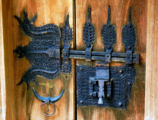
Indian, tribal, Romany, and hippie cues in one mood—painted wagons, ornate iron, layered fashion, and interiors that feel gathered rather than staged.
Kitchen Design Ideas: Layout, Storage, Light, and Finishes That Work
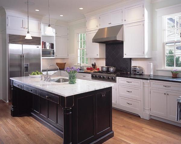
Practical kitchen design ideas—work zones, cabinetry, lighting, and durable finishes—so inspiration translates into rooms that cook and gather well.
18 Kitchen Design Ideas: Gloss Cabinets, Smart Layouts, and Practical Finishes
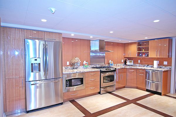
Eighteen kitchen design directions—from high-gloss wood-look cabinetry and stainless suites to islands, pantries, lighting, and backsplash strategies—anchored by the surviving gallery photo.