
What If Pokémon Were Created by Tim Burton?
A speculative look at Tim Burton–styled Pokémon—and Vaughn Pinpin’s hat boy Burton × PKMN fan art that made the mash-up feel real.
Imagine opening a Pokédex and finding not candy-bright creatures but lanky silhouettes, hollow eyes, and striped shadows that look borrowed from a stop-motion attic. That is the fantasy behind a simple “what if”: what if Pokémon had been dreamed up by Tim Burton instead of Game Freak’s sunlit bestiary?
The question is half joke and half design brief. Burton’s visual language—elongated limbs, gothic whimsy, black-and-white drama, sympathetic monsters—collides with a franchise built on friendship, type charts, and pocket-sized optimism. Fan illustrators have chased that collision for years, and one of the clearest early answers came from Vaughn Pinpin, the artist known online as hat boy, whose Burton × PKMN sketches turned the original 151 Kanto Pokémon into haunting, monochrome redesigns.
Why the mash-up feels inevitable
Pokémon and Burton already share more DNA than casual fans admit. Both traffic in creatures that are cute until you look twice. Both love odd proportions: oversized heads, spindly legs, expressive mouths. Both treat the “monster” as a companion rather than a pure villain. Burton’s Edward Scissorhands, Beetlejuice, and Jack Skellington are misfits with soft centers; Pikachu, Gengar, and Cubone are mascots with melancholy baked into their lore.
Where the brands diverge is temperature. Official Pokémon art often reads as warm, rounded, and toy-ready. Burton’s drawings and films prefer high contrast, scratchy linework, and a carnival that never quite finishes setting up. Put those temperatures in the same room and you get fan art that feels like a child’s sticker album left overnight in a haunted house—still playful, but colder around the edges.
Hat boy’s Burton × PKMN project
Around 2012, Pinpin began posting Tim Burton–inspired Pokémon redesigns as a side project: no grand manifesto, just two favorite things sharing a sketchbook. Photoshop, patience, and a plan to work through Kanto from Bulbasaur to Mew. The series circulated because it did more than slap black stripes on yellow fur. It asked what each creature would look like if melancholy and silhouette mattered as much as color and cuteness.
First-generation starters were early showpieces. Grass, fire, and water mascots that usually scream “beginner-friendly” suddenly looked like they had wandered out of a storybook with cracked spines. Evolution lines became studies in how Burton-esque exaggeration can keep a silhouette readable while changing the emotional weather around it. A redesign succeeds when you still recognize the Pokémon’s identity—ears, flame, shell, leaf—yet feel the mood shift from playground to twilight parade.
That recognition-plus-unease is the project’s real craft. Monochrome forces attention onto shape, posture, and negative space. Without the safety net of franchise colors, the artist has to make Charmander read as Charmander through attitude and contour alone. That constraint is why the series rewards lingering: the jokes land, then the melancholy sticks.
What a Burton Poké-world might feel like
Stretch the thought experiment past individual drawings and the whole franchise tilt changes. Gyms might look like crooked carnival tents. Professors could be eccentric inventors in striped suits. Rivalry would still exist, but with more theatrical loneliness—trainers collecting companions because the world feels oversized and the night lasts too long.
Type chart battles would not vanish; spectacle would simply dress differently. Electric attacks as jagged lightning scribbles. Ghost types as genuine gothic leads rather than spooky punchlines. Psychic Pokémon as pale dreamers with eyes too large for their faces. Even “cute” species would carry a slight wrongness—the kind of charm Burton finds in misfit toys and lonely inventors.
None of this is official canon, and it does not need to be. Speculative redesign culture thrives because it is temporary permission: you can love a property enough to break its house style on purpose. Fan art becomes a conversation between brand memory and personal taste. Viewers do not need every Pokédex entry rewritten; they need one strong visual argument that the mash-up could have been true in another timeline.
Fan-art culture and the joy of “wrong” aesthetics
Internet culture has always loved crossover hypotheses—what if Studio Ghibli drew Star Wars, what if Moebius designed Nintendo hardware, what if Burton drew Marvel heroes. Pokémon is an especially generous host for those games because its creature roster is huge, iconic, and flexible. Each redesign is a one-panel essay about style transfer: how much of the original must survive for the joke (and the beauty) to work?
Successful Burton-style Pokémon art usually keeps three anchors:
- Readable silhouette. If the outline fails, the crossover fails.
- Emotional tone. Sympathy for the strange matters more than pure scare.
- Motifs with restraint. Stripes, hollow eyes, and spindly limbs work best as seasoning, not wallpaper.
Fail those tests and you get generic “dark Pokémon.” Pass them and you get something closer to Pinpin’s appeal: creatures that feel personally reinterpreted rather than algorithmically edgified.
There is also a community etiquette layer. Good speculative features credit the artist, treat the work as illustration rather than official merchandise, and leave room for disagreement. Some fans want their starters forever bright. Others discover that a gloomier take makes a favorite character feel newly intimate. Both reactions belong to the same hobby of caring too much about fictional animals—and that is a compliment.
How to look at these redesigns
If you stumble on a Burton-inspired Pokédex page, try reading it the way you would a costume sketch for an alternate film. Ask what changed: posture, eyes, texture, humor. Ask what stayed: type identity, evolutionary logic, the sense that this thing wants a trainer anyway. The best pieces do not erase Pokémon’s friendliness; they relocate it into a colder climate and watch it survive.
Compare a few species side by side when you can. Starters show how beginner icons bend. Ghost and Dark types often feel almost too natural in Burton’s vocabulary. Legendaries become gothic centerpieces—still rare, still awe-inducing, but lit like stained glass in a storm. Ordinary route fodder can be the surprise stars: a Rattata or Oddish in spindly ink can reveal how much personality was already waiting under the official palette.
The lasting charm of the hypothetical
The phrase “what if Pokémon were created by Tim Burton” works because it is both searchable curiosity and creative prompt. It invites illustrators to practice style empathy and invites audiences to rehearse alternate childhoods. You do not need a studio greenlight for that. You need a sketch, a franchise you love, and a willingness to let cuteness wear black eyeliner for an afternoon.
Pinpin’s series remains a useful landmark because it treated the prompt as sustained craft rather than a single viral gag—Kanto as a long drawing assignment, posted piece by piece. Whether or not every redesign is to your taste, the project maps a clear answer to the headline: yes, the mash-up can look coherent, melancholy, and weirdly tender. In another timeline, maybe Professor Oak wears a striped suit, and your first partner Pokémon stares back with enormous, soft, slightly haunted eyes—still ready to battle, still ready to be your friend.
If you draw, try one species yourself. Pick a favorite, drain the color, stretch the limbs a little, and see whether the creature still waves hello. That small experiment is the whole genre in miniature: Pokémon remembering how to be strange, and Burton’s visual grammar finding another set of misfits to love.

Comments
Continue reading
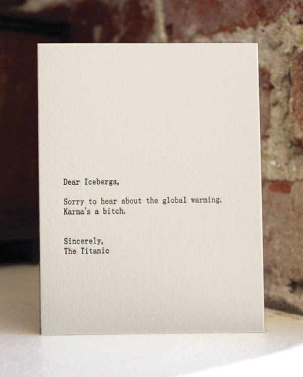
Dear Blank, Please Blank: Letterpress Humour in Three Lines
Jared Wunsch and Hans Johnson’s Dear Blank, Please Blank turned anonymous gripes into a tight letter template—then Sapling Press made the best lines into letterpress cards.

Funny Animal Signs That Warn People (While Animals Ignore Them)
From a seagull on a no-birds disc to classic zoo and park ironies—why animal warning signs get funny, and what the rules are still for.

How to Find Local Amenities on Vacation: Mechanics, Haircuts & More
Locate trustworthy local services and everyday spots while traveling or settling in—using publications, reviews, map apps, neighbor tips, and low-pressure exploration.