
Dear Blank, Please Blank: Letterpress Humour in Three Lines
Jared Wunsch and Hans Johnson’s Dear Blank, Please Blank turned anonymous gripes into a tight letter template—then Sapling Press made the best lines into letterpress cards.
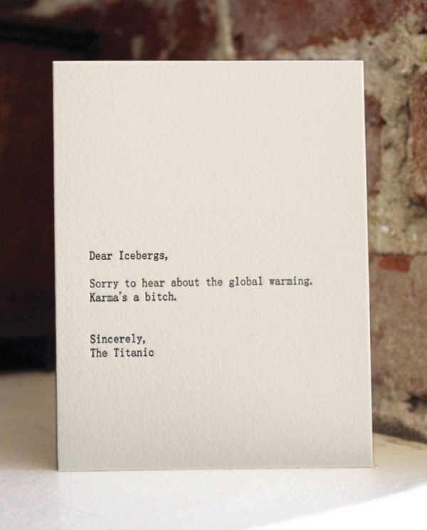
Some complaints are too petty for a diary and too sharp for a polite conversation. The project known as Dear Blank, Please Blank turned that awkward middle ground into a form: three short lines, a blank for the recipient, a blank for the request, and a blank for the signature. The humor lands because the grammar of a letter still sounds polite while the content refuses to behave.
Jared Wunsch and Hans Johnson launched the idea as a simple website where people could submit anonymous notes in that template and vote on favorites. The premise grew from ordinary friction—a bad experience that needed somewhere to go—rather than from a branding exercise. Readers filled the blanks with bosses, relatives, strangers on transit, household appliances, and abstract nouns. The best entries felt like overheard muttering cleaned up just enough to print.
What made the project stick was not only the jokes. The site asked for brevity. A long rant loses energy; a three-line letter forces a punchline. “Dear blank, please blank, sincerely blank” is a constraint the way a sonnet is a constraint: once you accept the frame, invention has somewhere to push. Submissions ranged from gentle exasperation to rude bluntness, and voting sorted the clever from the merely angry. That public sorting mattered. Without it, the feed would have drowned in private scores settled badly; with it, the strongest rhythms rose to the top.
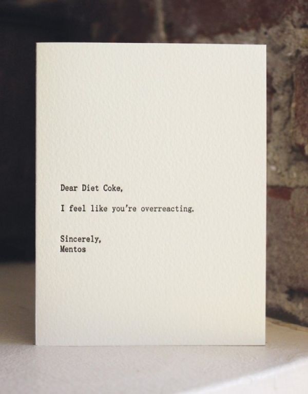
From anonymous posts to letterpress objects
Online humor often evaporates after a scroll. Dear Blank, Please Blank took a different route by partnering with Sapling Press to turn popular submissions into letterpress cards. The physical prints matter to how the jokes read. Clean type on white stock, generous margins, and the slight bite of letterpress ink make sarcasm look like stationery from a careful shop. That contrast—formal production, informal grievance—is the whole gag.
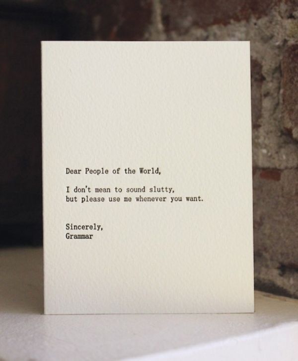
Letterpress also slows the joke down. On a screen, you skim; on a card, you hold something that might be mailed or propped on a shelf. The recipient of a printed Dear Blank card is not always the person named in the salutation. Friends gift these pieces as shared recognition: yes, that meeting; yes, that relative; yes, that recurring household annoyance. The blank is filled once on the press, then reinterpreted every time someone new sees it. A desk display of several cards becomes a tiny exhibition of contemporary manners under pressure.
Why the formula works
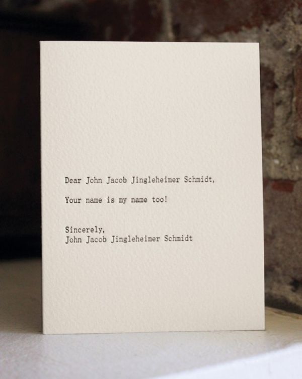
Polite letters train us to open with respect and close with goodwill. Filling those slots with unreasonable demands exposes how often real life ignores manners while still expecting them. Addressing an object—“Dear Alarm Clock”—or a role—“Dear Neighbor Who Parks Across Two Spaces”—turns a private irritation into a public type. Readers recognize the category even when the exact wording is new.
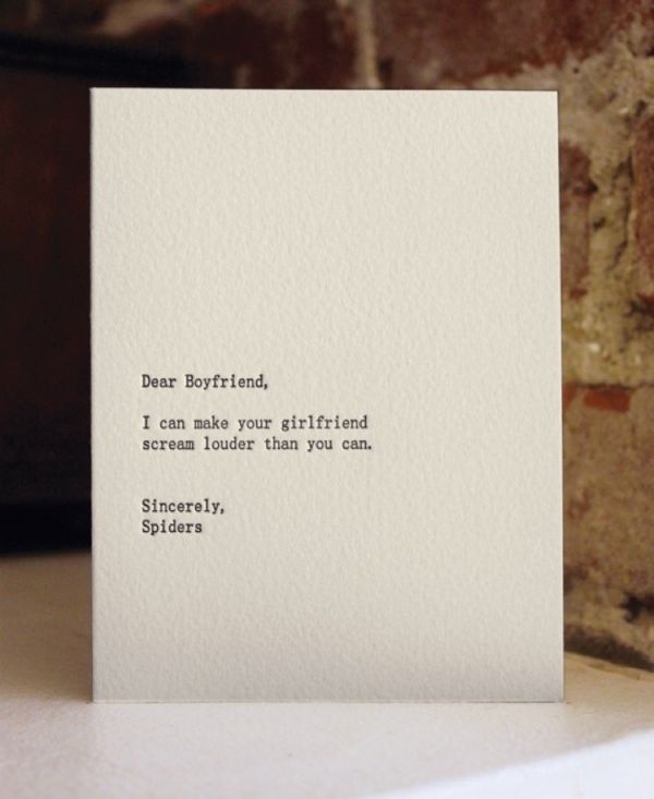
The signature line does as much work as the request. Signing as “Someone Who Has Had Enough,” “Your Future Self,” or a deadpan job title completes the theatrical cast. Comedy thrives on mismatched roles: a humble closing under a savage ask, or a sweet salutation before an impossible demand. The cards in this gallery show that balance again and again—short enough to read in a glance, sharp enough to remember. When the closing voice contradicts the opening courtesy, the joke clicks without needing a fourth line of explanation.
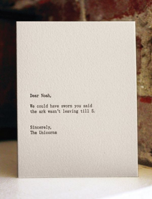
Typography as the straight man
Without careful typesetting, the same lines could look like a meme dump. Centered or calmly aligned text, restrained fonts, and empty space around the copy let the words behave like invitations or thank-you notes. Sapling Press’s letterpress treatment gave the project a visual identity that blogs and social shares could recognize instantly: white field, black ink, three beats of text, no illustration needed.
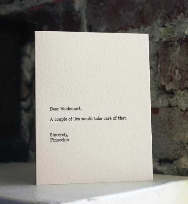
That design choice also explains why the project traveled well through design blogs and general interest sites in the early 2010s. Design audiences noticed the craft; everyone else noticed the jokes. Coverage from outlets that spotlighted visual culture helped the cards circulate beyond the original submission crowd, while the website remained the place where new blanks kept arriving. Hans Johnson’s own notes on the project emphasize how far a tightly built site can travel when the concept is easy to imitate and hard to improve.
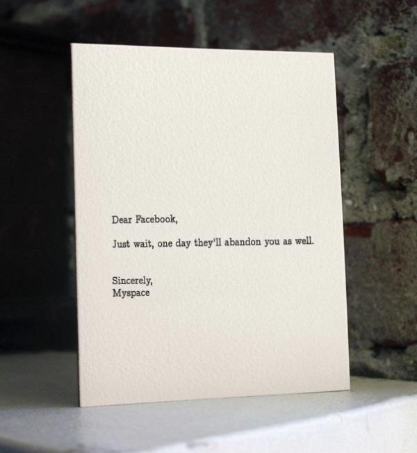
Reasonable requests, unreasonable world
The line that often travels with these cards—“reasonable requests to an unreasonable world”—captures the tone better than calling the project pure mean-spiritedness. Many entries ask for small courtesies: quieter phones, clearer instructions, fewer excuses. The comedy is that those asks feel radical only because everyday life keeps ignoring them. Other entries go further into absurdity, which keeps the series from becoming a complaint board.
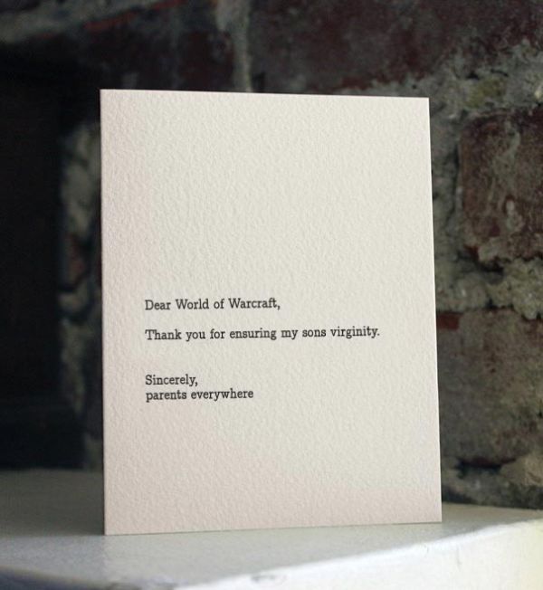
Anonymous submission mattered for that mix. People write differently when their name is not attached. Some posts are kinder for it; some are harsher. Voting acted as a soft editor, elevating lines with rhythm and surprise over pure venting. When the strongest lines became prints, the anonymous crowd-sourced voice met a carefully finished object—an unusual handshake between internet culture and traditional print. That handshake still reads clearly in the gallery: the jokes feel spoken, the objects feel made.
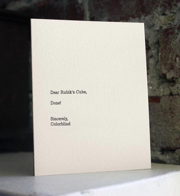
How to look at the gallery
Read each card as a tiny play. Who is being addressed? What is being asked? Who claims to be speaking? Notice which jokes depend on a specific cultural reference and which ones still feel current because the social friction has not changed. Parking, waiting rooms, group messages, and family gatherings age more slowly than last year’s celebrity news. The durable cards are usually the ones that name a role rather than a fleeting headline.
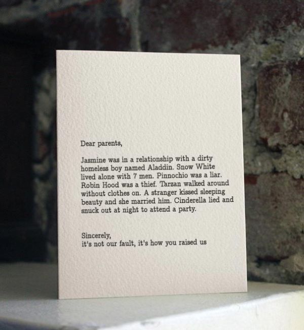
Also notice what is missing: no decorative borders fighting the text, no clip-art illustrations explaining the punchline. The restraint trusts the reader. That trust is part of why letterpress suited the project. Impression and paper quality signal seriousness; the copy undercuts it. Graphic designers studying contrast between tone and presentation can learn as much from these cards as comedy writers can. Students of editorial design can treat the series as a case study in saying more with less ornament.
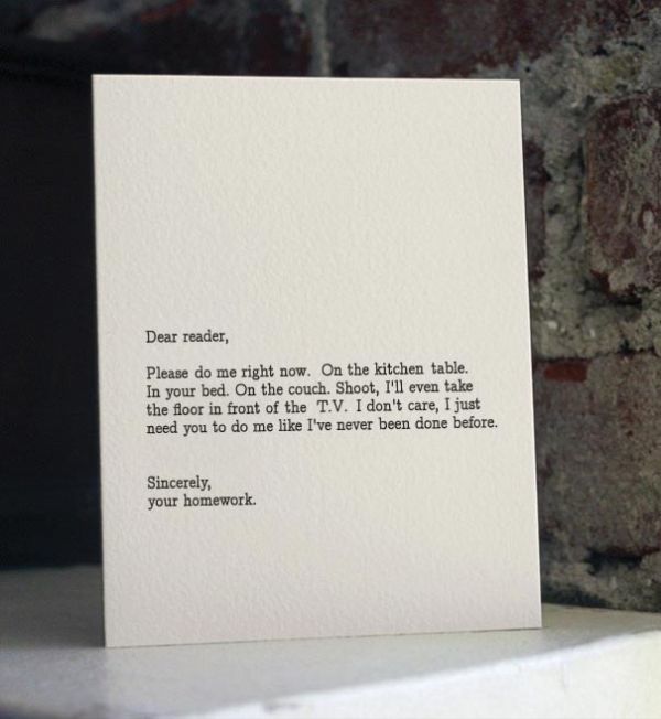
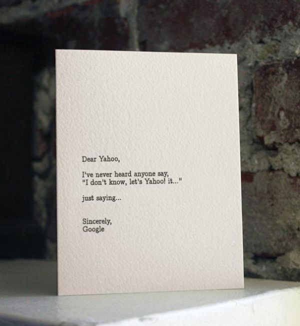
If you collect stationery or teach typography, these prints are useful examples of voice living inside a rigid template. If you simply need a laugh that still looks like something you could leave on a desk, they do that job without requiring a setup paragraph. Try writing one blank letter of your own before you scroll away—three lines, nothing more—and you will feel how the form does half the comic work. The blanks stay the point: name the problem, ask for the fix, sign with whoever is left standing after the day has done its worst.

Comments
Continue reading

Funny Animal Signs That Warn People (While Animals Ignore Them)
From a seagull on a no-birds disc to classic zoo and park ironies—why animal warning signs get funny, and what the rules are still for.

How to Find Local Amenities on Vacation: Mechanics, Haircuts & More
Locate trustworthy local services and everyday spots while traveling or settling in—using publications, reviews, map apps, neighbor tips, and low-pressure exploration.

Kristen Stewart for V Magazine, Spring Preview 2013
V81’s Wild at Heart cover story—Kristen Stewart shot by Inez & Vinoodh, styled by Joe McKenna, in pale minimal spring glamour.