
Uma Thurman in the Campari Calendar 2014
Uma Thurman and photographer Koto Bolofo for Campari’s 2014 Worldwide Celebrations calendar—a limited fashion campaign built around festivals and glamorous staging.
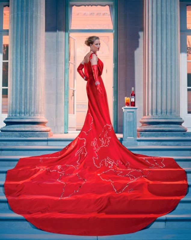
In late 2013, Campari unveiled its official 2014 calendar—the fifteenth edition of a project the brand had turned into a seasonal fashion event. The face of that year was Uma Thurman. The photographer was Koto Bolofo. The theme, Worldwide Celebrations, sent the calendar’s images on a stylized tour of festivals and rituals, filtered through Campari’s signature mix of glamour, color, and Italian aperitivo myth.
What remains interesting now is not launch-week buzz but the collaboration itself: a film actress with a sharp fashion silhouette, a photographer known for lively portrait energy, and a brand calendar that behaved more like a limited art object than a giveaway poster.
A calendar that worked like a campaign
By 2014, the Campari Calendar already carried a reputation. Previous editions had featured major screen names and high-production fashion imagery. Copies were produced in a tightly limited run—famously 9,999—and distributed to friends of the brand rather than sold as ordinary retail merchandise. That scarcity helped the project feel closer to a collectible portfolio than a drinks promo.
The 2014 edition leaned into travel and festivity. Instead of a single studio mood repeated twelve times, Worldwide Celebrations framed each month around a different cultural gathering. Press materials pointed to occasions spanning continents—among them China’s Spring Festival, Japan’s Hanami cherry-blossom season, Midsummer tied to England’s solstice lore, and Brazil’s enormous Réveillon New Year. The point was not documentary ethnography. It was fashion storytelling: celebration as costume, gesture, and atmosphere.
Creative direction for the theme came through BCube Milan, with Andrea Marzagalli and Bruno Vohwinkel working alongside Bolofo. The calendar’s job was clear—carry Campari’s red, pleasure-forward identity into a global party without losing polish.
Uma Thurman as the year’s leading figure
Thurman brought an established screen and style presence to the role. By the early 2010s she was already inseparable from a certain cool, statuesque fashion image—precise posture, an ability to look simultaneously approachable and untouchable. Campari cast her as a guide through the year’s celebrations: not a background model, but the recurring protagonist who changes register as the months change.
In interviews around the launch, Thurman spoke about the calendar as a piece of artwork meant to convey pleasure and discovery. That framing matters. The project asks to be read as staged fantasy—an actress inhabiting festival moods—rather than as a claim to represent every culture from the inside. Viewed that way, the calendar sits in a long tradition of fashion editorials that borrow the visual language of travel and ritual while remaining openly theatrical.
Wardrobe across the months drew on high fashion, including custom pieces; contemporary coverage noted looks such as a Maiyet dress in the unveiling imagery, paired with statement jewelry. Red—Campari’s chromatic trademark—appears often, as expected, with shifts into other tones when a month’s story calls for contrast. The clothes do narrative work: they signal occasion before any caption does.
Koto Bolofo’s camera
Bolofo was a fitting partner for a “worldwide” brief. Born in South Africa, raised in the United Kingdom, and based in France, he already lived a transnational biography that mirrored the calendar’s theme. His fashion and portrait work—seen in major magazines and luxury campaigns—tends toward vivid presence rather than cold minimalism.
In the Campari pictures, that translates to images that feel inhabited. Thurman is not pasted onto generic luxury sets; she occupies gestures and costumes that suggest movement, gathering, and performance. Even when a frame is elegant and still, it implies a larger party just outside the crop.
Bolofo described the Campari Calendar tradition as being about pleasure, intrigue, and charisma. Those three words are a useful key for looking. Pleasure in color and fabric; intrigue in the monthly concept changes; charisma in Thurman’s ability to hold a frame without overacting for the camera.
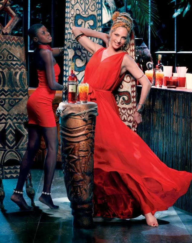
How to look at the 2014 images
Because only some frames circulate widely online, it helps to browse what you can find—including the images on this page—with a consistent eye:
- Find the festival cue. Color, prop, or costume detail that hints at a celebration without becoming a costume-shop parody.
- Track the Campari red. Where does the brand’s signature hue enter—dress, accent, drink, backdrop?
- Watch Thurman’s register. Playful, ceremonial, introspective? The calendar’s range depends on her shifts.
- Read the production design. These are built worlds. Enjoy them as sets, not as travel documentaries.
- Notice fashion construction. Silhouette and textile are doing as much storytelling as any thematic prop.
That approach keeps the viewing generous. The calendar is a luxury fiction about festivity, anchored by a recognizable star and a strong photographic hand.
Place in Campari’s calendar lineage
Thurman joined a roster of previous calendar leads that had included other major actresses across the 2000s and early 2010s. Each edition refreshed the formula: new face, new photographer, new thematic wrapper. The 2014 “celebrations” concept was especially on-brand for a spirit associated with social drinking and ritualized aperitivo hours—moments when ordinary evenings become slightly ceremonial.
For brand historians and fashion-campaign watchers, the calendar also shows how spirits marketing borrowed the tools of couture advertising: limited distribution, photographer authorship, and celebrity casting that could live on magazine sites as culture coverage, not only as ads.
An era snapshot, not a timeless decree
It is worth remembering the date stamp. These images belong to 2013–2014 fashion and celebrity culture—the styling, the retouching norms, the way global themes were packaged for a European luxury brand. Looking back, some choices feel of their moment. That does not erase the craft. It situates it.
Respectful viewing means enjoying Thurman’s performance in the clothes and concepts without reducing the project to age commentary or gossip. She was cast as a glamorous lead for a reason: screen presence that still photographs with authority, and a fashion intelligence that can carry twelve variations of “celebration” without collapsing into sameness.
What lingers
Open the images again and ignore the product brief for a moment. What remains is a collaboration document: Uma Thurman, Koto Bolofo, and Campari’s calendar machine agreeing that festivity can be styled as high fashion. Whether you care about the drink or only about the pictures, the 2014 edition holds up as a polished time capsule of early-2010s celebrity campaign glamour—red-lit, travel-flavored, and built for the turn of a page each month.

Comments
Continue reading

Funny Animal Signs That Warn People (While Animals Ignore Them)
From a seagull on a no-birds disc to classic zoo and park ironies—why animal warning signs get funny, and what the rules are still for.

How to Find Local Amenities on Vacation: Mechanics, Haircuts & More
Locate trustworthy local services and everyday spots while traveling or settling in—using publications, reviews, map apps, neighbor tips, and low-pressure exploration.

Kristen Stewart for V Magazine, Spring Preview 2013
V81’s Wild at Heart cover story—Kristen Stewart shot by Inez & Vinoodh, styled by Joe McKenna, in pale minimal spring glamour.