
Eyal Rosenthal’s Ultra Minimal Superheroes
How Eyal Rosenthal reduces iconic heroes and villains to color blocks and geometry—an early-2010s minimalist series that still reads as a visual riddle.
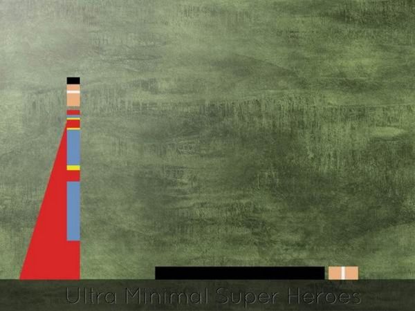
Some superhero art tries to outdo comics with more lines, more muscles, more exploding skyline. Eyal Rosenthal’s Ultra Minimal Superheroes goes the opposite direction. Faces disappear. Capes become slabs of color. Identity survives as geometry: a few rectangles, a familiar palette, and enough negative space that your brain finishes the costume.
The series circulated widely on design and illustration blogs in the early 2010s as a clean proof of how little you need to summon a character people already know. Rosenthal, an illustrator and designer associated with Beer Sheva, Israel, treats pop icons the way a strong logo treats a brand—strip to signal, keep recognition, drop everything else.
What the series is
Ultra Minimal Superheroes is not a story cycle with issue numbers, crossovers, or origin retcons. It is a visual game with shared rules. Each piece reduces a hero or villain to essential color blocks and proportions. You are meant to identify the figure in a glance, then enjoy how much information was deleted to get there.
That deletion is the craft. Classic costumes are already graphic systems: primary colors, emblems, high contrast, readable silhouettes at toy scale. Rosenthal pushes those systems toward pure abstraction until the work sits between poster and pictogram. Comic literacy becomes the decoder ring. If you know Batman’s dark mass against the Joker’s acid clash, or Spider-Man’s red-and-blue rhythm, the strips unlock immediately.
The series also refuses the usual fan-art flex. There is no hyper-rendered armor, no cinematic lens flare, no city vanishing under a punch. The drama is cognitive: can myth survive a severe diet of detail? In most frames, yes—and that “yes” is oddly satisfying.
Minimalism with a punchline
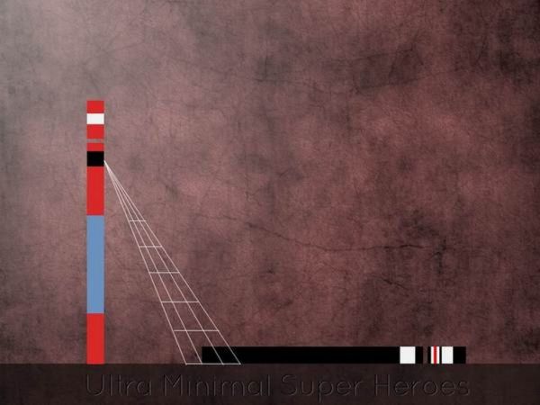
Rosenthal’s broader design voice often pairs restraint with a pinch of humor. You can feel that here. The pictures are sophisticated in their emptiness, but they are not stern gallery exercises. They play like visual riddles: How few shapes still say Superman? How little cape is still a cape?
Humor arrives through confidence. Large fields of color act like silence in a joke’s timing. When a thin stripe, emblem fragment, or sudden vertical band appears, it lands harder because nothing else competes. The compositions do not apologize for blankness; they weaponize it.
That is also why the work travels well on screens. Thumbnails remain readable. Shares do not require a caption to start the conversation—people name the character in comments as if finishing a quiz. Participation becomes part of the piece.
How to read one of the images
Whether you are looking at the frames on this page or others from the same project, a short method keeps the pleasure intact:
- Ignore narrative first. Do not hunt for a fight scene. Hunt for costume code.
- Name the palette. Which figure owns those colors in pop-culture memory?
- Check proportion. Tall verticals, mask-like bands, and emblem zones often replace anatomy.
- Notice what is missing. No musculature, no skyline, no sound effects—absence is intentional.
- Decide the mood. Is the reduction reverent, sly, affectionate, or all three?
The best pieces make you feel slightly proud for “getting it.” That pride is designed. Recognition becomes a collaboration between illustrator and audience memory.
Superheroes as graphic systems
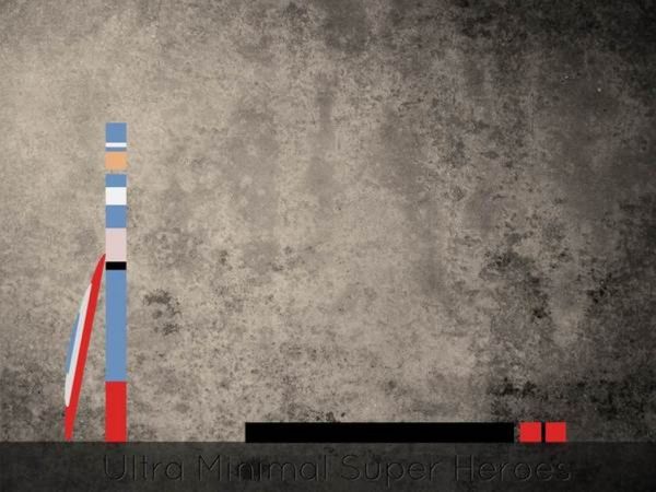
Comics, animation, film, and merchandising already turned these characters into trademarks. Logos on chests, movie-poster color scripts, and action-figure packaging trained audiences to accept simplification. Rosenthal’s series sits in that lineage while pushing further toward fine-art poster calm.
Compare the approach with louder fan illustration: dynamic foreshortening, sweat highlights, debris in the air. Those works celebrate spectacle. Ultra Minimal Superheroes celebrates signal. It asks whether the myth still holds when spectacle is removed. Usually it does, which says as much about audience memory as about the illustrator’s hand.
Villains matter in this game. Antagonists often have even sharper graphic identities—clown chaos reduced to color clash, cosmic tyrants reduced to dominant hues, armored rivals reduced to hard rectangles. Pairing hero and villain as adjacent color statements can feel like a silent confrontation without a single drawn punch. The page becomes a palette duel.
Because the figures are not tied to one actor’s face or one reboot’s armor redesign, the images age differently from tie-in art. Geometry does not need recasting. A rectangle in the right colors still says what it said in 2012.
Place in early-2010s design culture
Around the time this series spread online, flat design, Swiss-influenced poster experiments, and “how minimal can a movie poster get?” challenges were everywhere. Design blogs loved projects that took familiar IP and applied severe reduction. Rosenthal’s superheroes fit that appetite precisely: known characters, unfamiliar restraint, easy to publish, hard to scroll past without naming.
Importantly, the work does not depend on knowing every corporate continuity shake-up. It depends on costume archetypes that predate any single film. Cape, emblem, mask band, signature contrast—these are durable signs. That durability is why the series still reads cleanly years later, even for viewers who first meet it outside the original blog wave.
For working designers, the project is also a teaching object. It demonstrates hierarchy (what remains versus what goes), palette discipline, and the power of cultural shorthand. For casual viewers, it is simply satisfying—like recognizing a song from three notes.

Related instincts in Rosenthal’s practice
Rosenthal’s portfolio interests have also included other pop-culture reductions. Later projects—such as Star Wars–inspired lighting concepts presented with a quiet, almost domestic seriousness—show a recurring habit: take a loud franchise, find a calmer graphic or object form, keep just enough essence for recognition, and let humor live in the gap between source and translation.
Seen beside those efforts, Ultra Minimal Superheroes is an early, clear statement of the same instinct in two dimensions. The through-line is not nostalgia alone. It is translation. Can a myth survive a change of medium and a ruthless edit? When the answer is yes, the character can feel stronger, not smaller—because what remains is what audiences had already memorized.
Why the empty space works
Empty space in these images is not unfinished work. It is the stage. Without busy backgrounds, color relationships sharpen. Without facial acting, costume language has to carry personality. Without action lines, stillness becomes a kind of power pose.
That stillness also changes how you emotionally receive “heroism.” Instead of adrenaline, you get clarity. The figures become flags or seals—public signs rather than private people. In a culture flooded with maximal comic spectacle, that clarity can feel oddly restful.
Try a two-step viewing on the images above. First, refuse to name anyone; look only at balance, edge, and color temperature. Then let the names return. Abstract first, icon second. That sequence is where the series earns its keep—and where Rosenthal’s ultra-minimal bet still pays off.

Comments
Continue reading

Still-Life Photography by Margareth Perfoncio
São Paulo photographer Margareth Perfoncio’s still lifes of food and flowers—Old Master light, dark wood, and tables that feel inevitable.

Meaningful Love Quotes for Inspiration (and Ink)
Meaningful love quotes that still feel true — short lines for tattoos, gifts, and everyday reminders, with placement and wording tips.
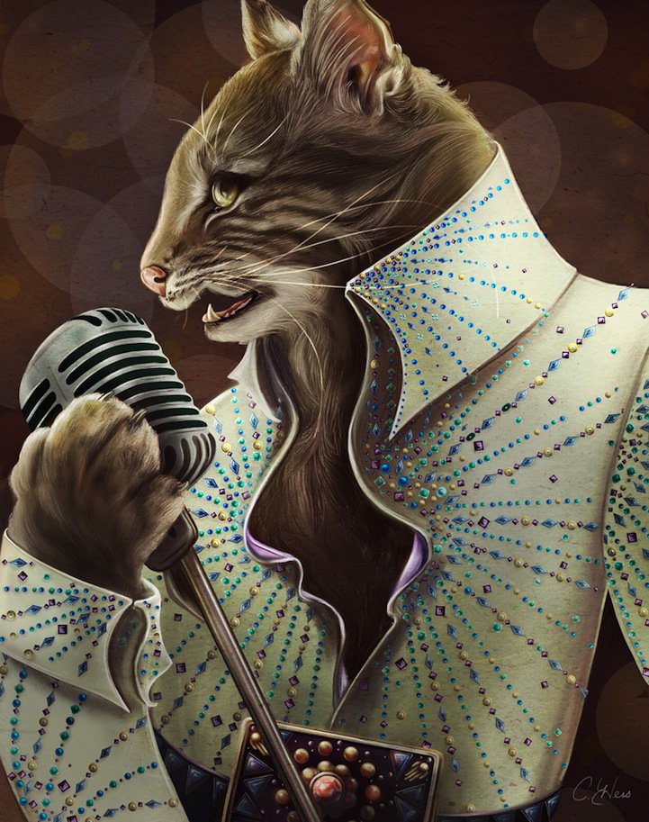
Christina Hess’s Animals From History: Costumed Pets as Playful Portraits
Illustrator Christina Hess reimagines historical icons as ornate animal portraits—Elvis Petme and friends—mixing puns, costume detail, and soft history lessons.