
Gingham for Fall ’13: Why the Picnic Check Went Seasonal
How gingham moved from summer shorthand into Fall 2013 wardrobes—scale, color, silhouettes, and ways to wear the check without looking costumed.
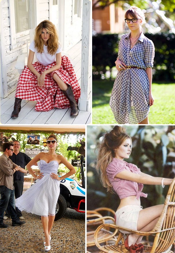
Gingham is easy to underestimate. Call it a picnic cloth and half the room nods; put it on a runway and the same people suddenly call it “graphic.” That double life is exactly why the check kept showing up for Fall 2013 — not as a novelty print, but as a quiet constant that designers could scale, recolor, and set against heavier winter fabrics without apology.
The pattern itself is simple: even checks formed by dyed yarns crossing in the weave, usually in two colors, often with white as the lighter partner. Unlike a printed plaid slapped onto finished cloth, true gingham is structural. That gives it a crisp edge and a slight optical vibration when the squares are small. Fashion keeps returning to it because the grid reads cleanly from across a room and still looks intentional up close — a rare combination for something so familiar.
Why Fall 2013 made room for a “summer” check
By mid-2013, fashion had spent several seasons cycling through florals, animal prints, and soft pastels. Gingham offered a different kind of relief: order without severity. Where black-and-white stripes can feel nautical or optical, gingham feels domestic and slightly mischievous — a school-uniform memory wearing adult proportions.
Fall collections that year treated the check less like beachwear and more like architecture. You saw it in wool blends, brushed cottons, and shirtings thick enough for September mornings. The move was not to invent gingham; it was to relocate it. Picnic associations stayed in the background while the silhouette did the serious work: longer hemlines, sharper shoulders, layered skirts, and tailored trousers that made the grid look deliberate rather than cute.
Street style amplified the shift. A gingham shirt under a camel coat, a checked skirt with opaque tights and ankle boots, a micro-check blazer over black everything — these combinations proved the print could survive after Labor Day without looking like a calendar error. Editors talked about “preppy” and “retro,” but the wearable lesson was simpler: give the check winter weight and winter partners.
Color helped the season move. Classic red-and-white and navy-and-white never left, but Fall 2013 also pushed charcoal, forest, burgundy, mustard, and black-on-cream. Once the light square stops being pure white, the check sheds some of its picnic nostalgia and starts reading as graphic outerwear fabric.
Where the pattern actually worked
The smartest gingham pieces that season were not costumes. They were wardrobe tools with one loud idea — the check — and everything else kept quiet.
- Shirts and shirt-dresses. A crisp gingham button-down under a solid coat remains the easiest entry point. Shirt-dresses in mid-scale checks lengthened the line and avoided the baby-doll trap of tiny schoolgirl prints.
- Skirts and trousers. A pencil or A-line skirt in gingham behaved like a solid from a distance and revealed the pattern only as you moved. Wide trousers in larger checks looked almost like architectural tiles.
- Outer layers. Blazers, cropped jackets, and light coats in muted checks made the print feel seasonal. Paired with black tights and boots, they stopped reading as spring leftovers.
- Accessories. Sunglasses frames, loafers, ballet flats, scarves, and small bags used the check as punctuation. One accessory was usually enough; two could tip into theme-party territory.
Scale mattered more than brand labels. Micro-checks photograph as texture and behave almost like a heathered solid — useful if you want pattern without announcing it. Mid-scale checks are the classic “gingham” people recognize at a glance. Oversized, windowpane-adjacent versions edged toward menswear and needed simpler partners: a cream sweater, a black boot, little else competing for attention.
How to wear it without looking costumed
Gingham fails when every other piece also wants attention. It succeeds when the check is the sentence and the rest of the outfit is punctuation.
Neutral partners work hardest: camel, navy, charcoal, cream, black, and deep brown. Denim can work if the wash is clean and the silhouette is sharp; soft, destroyed jeans tend to fight the grid. Footwear should ground the look — loafers, ankle boots, or a low heel — rather than compete with another loud pattern.
Mixing patterns is possible but not mandatory. A tiny stripe or a solid textured knit can sit beside mid-scale gingham if their colors share a family. Avoid stacking another large check or a busy floral next to it unless you are deliberately chasing contrast and know how to edit jewelry, bags, and shoes down to almost nothing.
Proportion is the other quiet skill. If the check is on a voluminous skirt, keep the top close to the body. If the shirt is boxy, narrow the leg. Fall 2013’s better looks treated gingham like a tailored material, not a novelty apron. Belts helped: a thin leather belt over a shirt-dress could turn a sweet print into a vertical, grown-up line.
Color stories that outlast one season
Black-and-white gingham remains the most flexible because it behaves like a graphic neutral. Red-and-white is cheerier and more literal; it needs mature cuts to avoid costume energy. Navy-and-white bridges both moods and pairs easily with leather and wool.
Darker seasonal pairings — black-and-rust, navy-and-mustard, forest-and-cream — are what made the Fall 2013 story interesting. Those combinations let the check live under coats, beside suede boots, and inside offices without looking like a picnic escaped onto the subway.
If you buy only one piece, choose the color you already wear most. A gingham shirt in your everyday palette gets more use than a “special” check you only love in photos. Try it first with clothes you already own: the coat you wear every October, the black trousers that always work, the boots that already know your commute.
Construction, care, and keeping the grid honest
Because the pattern is woven, quality shows in how evenly the checks align at seams and plackets. Look at collar points, pocket edges, and hems: matched checks signal better construction. Thin, shiny fabrics can make gingham look cheap even when the print is charming; matte cottons, cotton-silk blends, and wool mixes tend to age more gracefully.
Wash dark checks separately at first. Some dyes migrate. Hang or lay flat when possible so the grid does not twist. Iron while slightly damp if you want that sharp, intentional finish the pattern deserves. Store shirts on hangers with enough space that the checks do not crease into permanent diagonals.
Gingham’s reputation for timelessness is earned only when the cut is honest. Trends amplify it; good proportion keeps it. Fall 2013 simply reminded everyone that a check does not need sunshine to make sense — it needs a silhouette strong enough to carry the grid through colder months, and the discipline to let one patterned piece lead.

Comments
Continue reading
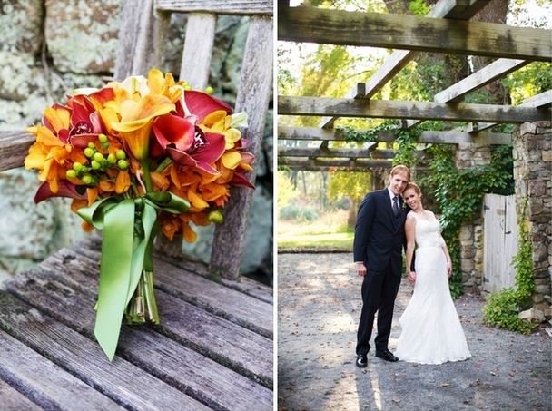
Warm and Earthy Fall Wedding Bouquets
Rust, burgundy, amaranthus, and garden texture — how to build seasonal bridal bouquets that feel like autumn, not forced pastels.
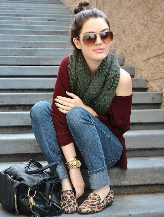
Fall '13 Street Style: Neon to Neutrals and Extreme Layering
How late-2013 sidewalk fashion demoted fluoro to accents, promoted coats and texture, and made transitional layering the real trend.

Funny Animal Signs That Warn People (While Animals Ignore Them)
From a seagull on a no-birds disc to classic zoo and park ironies—why animal warning signs get funny, and what the rules are still for.