
Anka Zhuravleva’s Surreal Color Tales
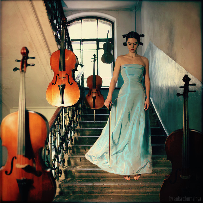
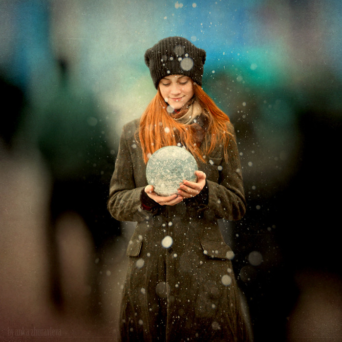
Portugal-based Russian photographer Anka Zhuravleva stages painterly surreal scenes—Color Tales where complementary hues carry the story as much as costume or prop.
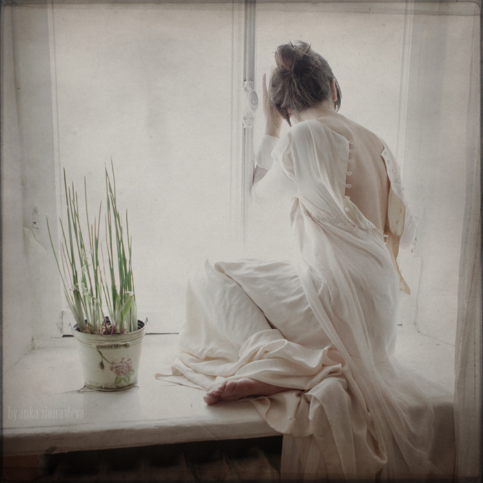
Anka Zhuravleva’s photographs arrive like short fairy tales told in pigment first and camera second. A Russian photographer based in Portugal by the mid-2010s, she brings a painter’s instinct for complementary color into staged, surreal scenes that feel hand-tinted even when they are born digital. The pictures collected here are less “effects portfolios” than chromatic stories: each frame chooses a temperature of feeling and then builds a small world sturdy enough to hold it.
Painter, then photographer
Before photography became her primary language, Zhuravleva worked with painting and design; architectural study sharpened her eye for space, light, and the details that make a constructed scene feel inhabited. In 2006 she noticed how often photographs fed her inspiration and crossed into making them herself. By the time she and her husband settled in Porto in 2013, she already had years of magazine, cover, and exhibition work behind her—and a growing series of personal surreal projects that treated color as narrative engine.
That biography explains why her images rarely feel like random fantasy stickers. Composition behaves like a canvas: foreground anchors, color masses balance, and atmosphere is mixed the way a painter mixes a glaze. Even when the content is whimsical—floating motifs, theatrical wardrobe, dream logic—the craft stays classical. You sense someone who learned harmony before learning filters. The surreal is allowed to be beautiful without apology, which is rarer than it sounds in contemporary photography culture that often equates seriousness with grey. Beauty here is not decoration layered on top of concept; it is how the concept becomes legible in a single glance.
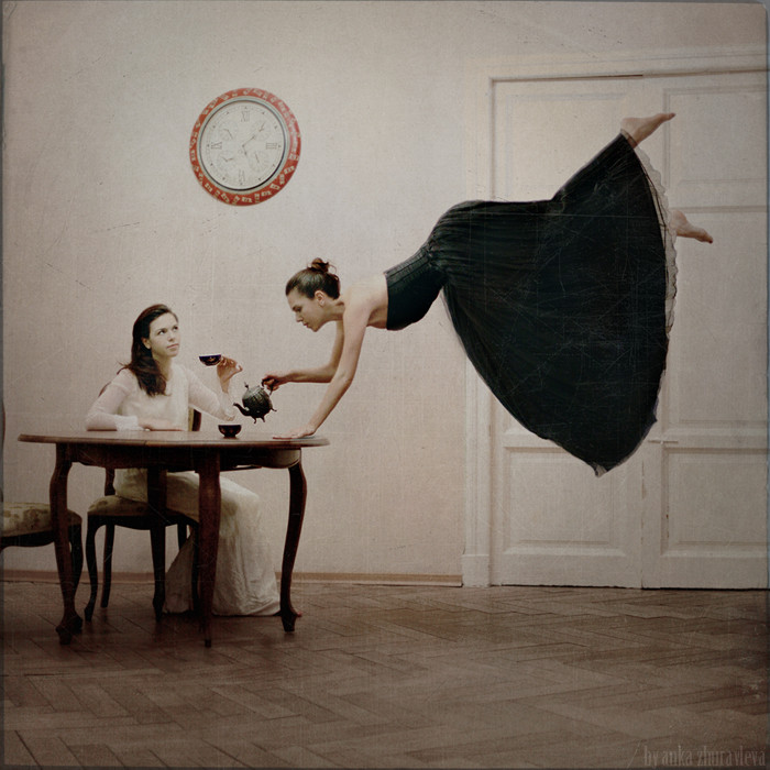
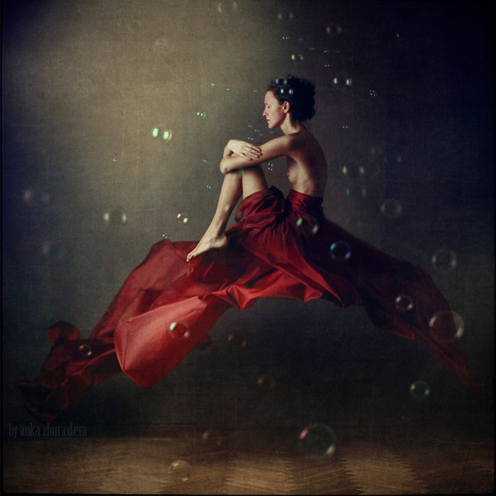
Color Tales and complementary nerve
Among her personal projects, the Color Tales work is the clearest statement of method: series organized around reds, blues, pinks, yellow-and-blue pairings, and other keyed palettes. In an interview she connected those favorites directly to painting, noting how often she pairs yellow with purple, purple with green, orange with blue—combinations chosen because they “greatly affect the viewer emotionally.” The surreal tale, in other words, is not only what happens in the scene. It is what the palette does to your nervous system before the plot arrives.
Complementary pairs vibrate. Yellow against purple can feel festive or feverish depending on saturation. Orange against blue can read as dusk theater or comic-book clarity. Green answering purple can feel botanical and uncanny at once. Zhuravleva uses that vibration as storytelling shorthand. Where some surreal photographers lean on desaturated melancholy, she often trusts lush color to carry wonder, mischief, and longing at once. The emotional readability is why these images travel well across language barriers: chroma speaks first, costume second, caption never required. A viewer who never reads a statement can still feel the temperature change from one frame to the next.
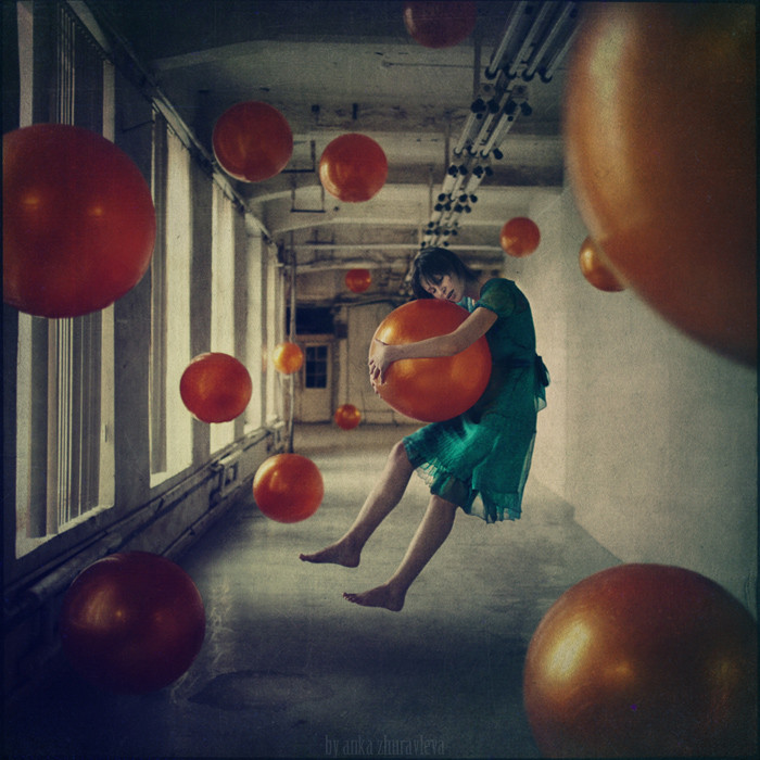
Surreal tales without heavy captions
Call them fairy tales if you like, but they are not children’s illustrations with morals taped on. A Zhuravleva scene typically offers a character, a charged environment, and one impossible or theatrical condition—enough story to dream with, not enough to close interpretation. Props and wardrobe behave like stagecraft. Faces can be tender, masked, or mid-transformation. The “tale” is the feeling that something meaningful just happened off-screen and the photograph caught the afterglow.
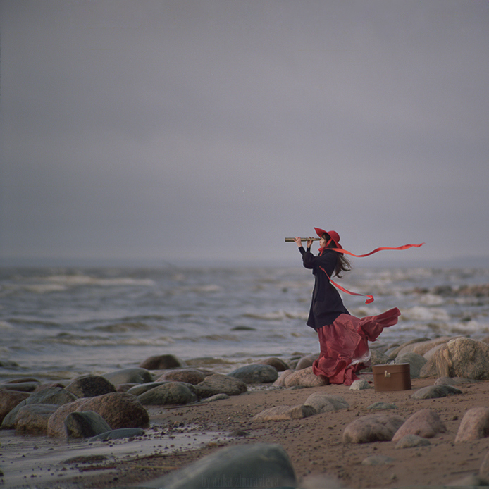
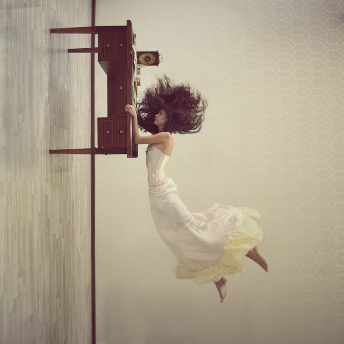
That restraint is painterly too. Classical narrative painting often freezes a decisive instant and trusts the viewer to supply before-and-after. Zhuravleva’s surreal photography inherits that trust. You are not graded on decoding. You are invited to inhabit. The more time you give a single color chord—say a red-dominated frame versus a cool blue one—the more the emotional difference becomes obvious without a wall text. Red can heat a story into urgency; blue can cool it into distance; the same pose can mean different things under different keys. That is why organizing work by color is more than a portfolio trick. It is a way of proving that hue can direct drama as firmly as gesture.
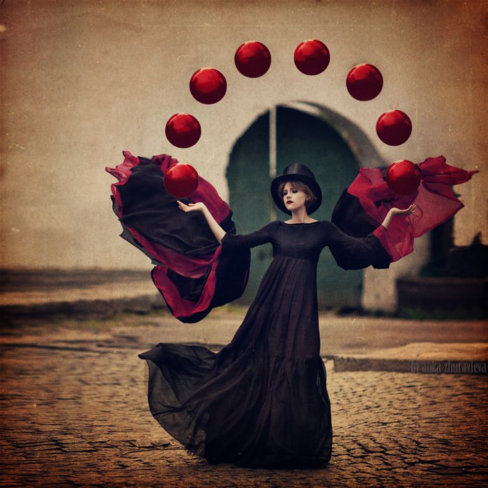
Portugal light, portable myth
Living and working from Porto placed her in a coastal European light quite different from many Eastern European grey-winter stereotypes of “serious” art photography. Soft Atlantic atmospheres, warm interiors, and a life built around both digital and analogue practice feed the work’s cinematic ease. Yet the myths she stages are portable. They do not require you to recognize Portuguese streets. They require you to recognize longing, play, solitude, and the pleasure of a world arranged more beautifully than Monday usually allows.
Her broader catalog—fine-art surreal sets, portraits, monochrome tales, editorial fashion—shows range, but the surreal color work remains the signature for many viewers. It is where the painter’s training announces itself most clearly. Fashion and portrait skills still matter: fabric must fall, skin must breathe, a gaze must land. Without those fundamentals, surrealism collapses into collage noise. With them, impossibility looks temporarily believable. Believability is the hinge. If the person feels real, the dream can lean on them without falling over. That human credibility is what separates a tale from a novelty image.
Walking the gallery as a color score
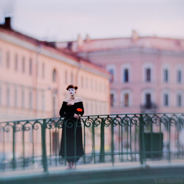
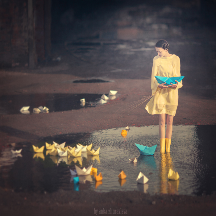
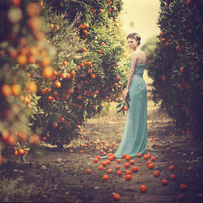
Try reading this page as a score rather than a feed. Assign each image a dominant note—red heat, blue calm, green fable, gold afternoon—and notice when a complementary counter-note answers it. Watch how skin tones are protected or stylized inside those keys. Ask whether the surreal event feels comic, solemn, erotic, or tender, and whether the palette predicted that answer before the subject’s action did. If two neighboring pictures share a pose language but differ in key, treat the pair as a miniature experiment: same actor, different emotional climate.
Also notice craft continuity across the set: controlled lighting, deliberate wardrobe, edges that feel painted even when photographic. That continuity is why the series coheres as “tales” instead of a random moodboard. A tale collection needs a storyteller’s voice. Zhuravleva’s voice is chromatic confidence paired with theatrical softness. Softness here is not weakness; it is permission for beauty to remain part of the uncanny rather than its opposite. In her best frames, the strange and the lovely do not cancel each other. They cooperate.
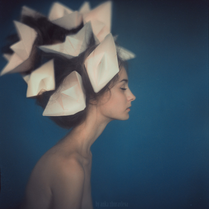
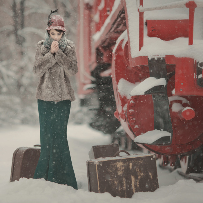
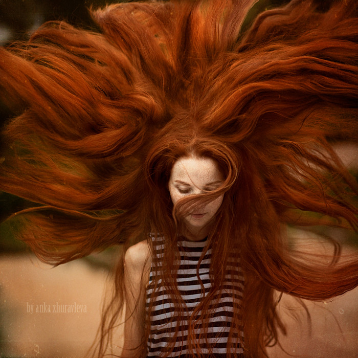
Return to one yellow-and-purple pairing in the set—or the nearest cousin you can find—and sit with it longer than the scroll encourages. Let the complements argue. Let the figure settle into the argument. Anka Zhuravleva’s surreal tales do their most persuasive work right there: not in explaining magic, but in proving that a painter’s favorite chords can still cast spells when the brush has become a shutter.

Comments
Continue reading
Surreal Photography by Nikita Sergyshkin
Belarusian photographer Nikita Sergyshkin stages dream-logic portraits—fashion-adjacent light, controlled estrangement, and surreal mood without collage monsters.
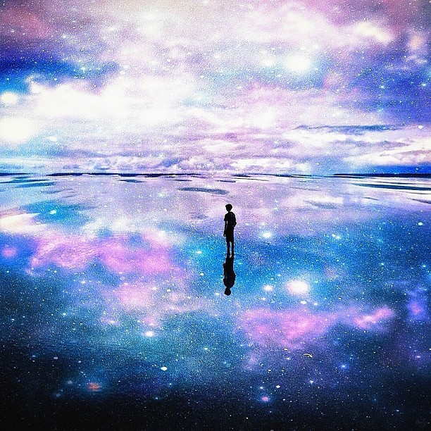
Surreal Worlds by Nois7: Robert Jahns’s Dream Composites
Hamburg artist Robert Jahns—known as Nois7—builds travel photographs into seamless surreal scenes. A look at the mood, craft, and Instagram-era gallery that made his work famous.
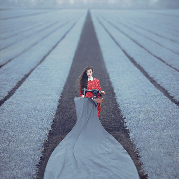
Oleg Oprisco’s Surreal Film Photography on Kiev 6C and Kiev 88 Cameras
Kyiv photographer Oleg Oprisco builds dreamlike conceptual scenes on older Kiev medium-format film cameras—soft color, quiet staging, and surreal mood without the rush of digital spray-and-pray.