
Bold Contrasts in Street Style: Neon, Clash, and Calm Zones
A practical guide to color, value, and texture contrast—neon against black, lace against spikes, and how to keep summer-loud looks composed.
Bold contrast in street style is not the same as wearing every loud color you own at once. It is a deliberate collision: neon against black, soft lace against metal spikes, a geometric print under a solid fuchsia knit, a tan sandal interrupted by a neon platform. Summer 2013 made that collision feel almost mandatory. After seasons of fluorescent accessories and color-block bags, photographers on fashion-week sidewalks were hunting for outfits that argued with themselves—and still looked composed from across the street.
This gallery is a field notebook for that argument. The pieces here do not whisper. They use saturation, pattern clash, and hard-versus-soft texture as tools. If you are building a wardrobe that can hold neon without dissolving into costume, the useful question is not “How bright can I go?” It is “What is the quiet half of the outfit doing while the loud half speaks?”
Contrast also has a social job. On a crowded sidewalk, faint outfits disappear. High contrast is how street style photography finds its subjects: a lime strap cutting a black bag, a pink manicure flashing beside cobalt stones, a neon heel under an otherwise classical sandal. Visibility is not vanity in this context; it is how the look enters the visual record.
What contrast actually means on a sidewalk
Three kinds of contrast show up again and again in strong street photographs. Color contrast pairs hues that sit far apart on the wheel—pink against lime, cobalt against black-and-white print. Value contrast pairs light against dark so the silhouette stays readable from a distance. Texture contrast pairs slick silk with studded gold, lace with spikes, knit with enamel. The best looks usually stack at least two of those three. A neon shirt over black pants is a start; add a leopard belt and a lime-and-black bag, and the frame suddenly has depth.
Contrast also needs a governor. All neon, all pattern, all metal at once tends to flatten into noise. Street style from this period often keeps one zone calm—black trousers, a white lace top, bare skin—so the eye has somewhere to rest before the next jolt. Think of the quiet zone as negative space in a graphic poster. Without it, the loud zones cancel each other.
Scale matters too. A tiny neon earring will not balance a full geometric skirt. A full neon suit rarely needs a second fluorescent handbag. Match the size of the clash to the size of the calm area, or the photograph will feel either timid or overloaded.
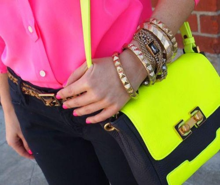
A neon pink button-down against black bottoms is a classic value-and-hue collision. The leopard belt introduces pattern without competing for the same neon bandwidth. The crossbody bag splits the difference: lime flap and strap over a black leather body, gold hardware catching daylight. Matching the manicure to the shirt is a small detail that reads as intention rather than accident. This is contrast as system, not spill.
Gold bracelets stacked on the wrist add a third material voice. Metal reflects light differently from neon fabric; it keeps the look from reading as only “bright cloth.” Pyramid studs and chunky links were everywhere in this era because they photographed as punctuation.
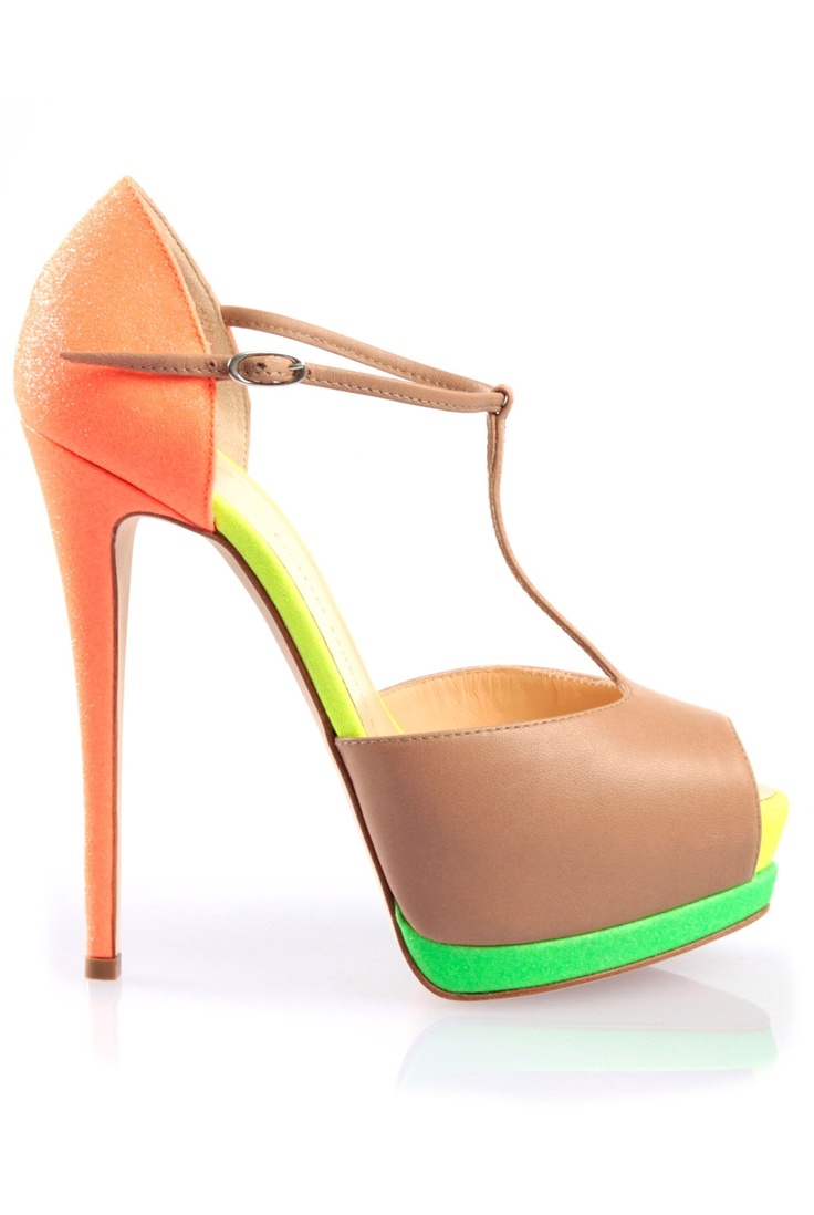
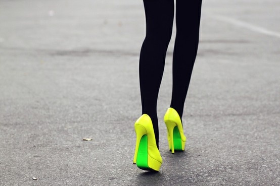
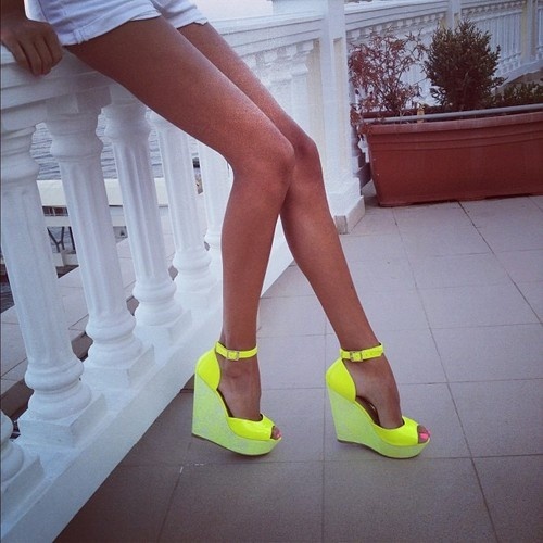
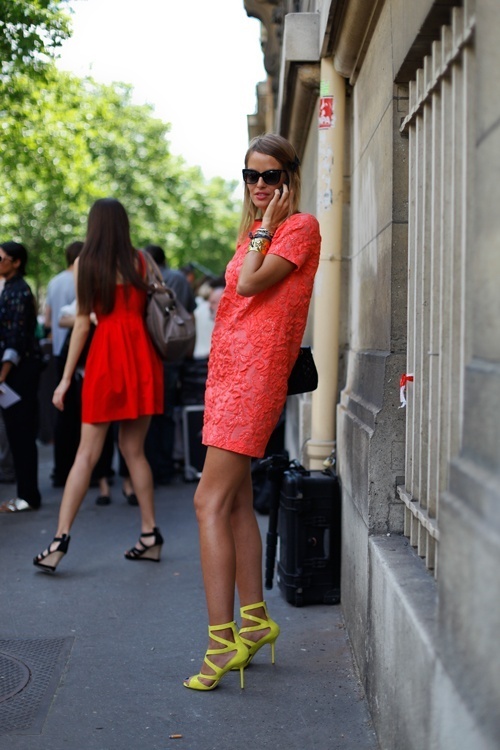
Footwear can carry an entire contrast thesis. A tan leather T-strap sandal stays almost classical until the heel turns tangerine and the platform stacks neon green and yellow. The insole flashes lime through the peep toe. Neutral upper, fluorescent architecture underneath—useful when the rest of the outfit is simple and you want the collision concentrated at ground level.
Shoes are also a low-commitment contrast laboratory. You can test neon underfoot before you commit to a neon coat. If the clash feels right with jeans and a white shirt, you have learned something about your tolerance without rebuilding the whole wardrobe.

Accessories as the loudest half
When clothing stays relatively simple, jewelry and bags do the contrast work. That was a practical street-style strategy in the early 2010s: one knit, one print bottom, then a bracelet stack that could stop traffic. Accessories move between outfits; a cobalt cabochon bracelet can finish five different bases. Investing contrast energy in portable objects is how people kept up with neon seasons without buying a new fluorescent wardrobe every month.
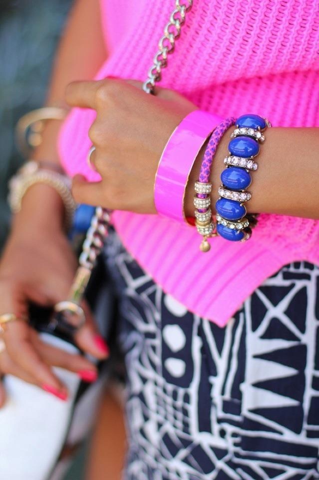
Here the pink open-stitch knit matches a glossy pink enamel bangle, while cobalt blue cabochons ringed in crystal sit beside a thin purple cord bracelet. Underneath, a black-and-white geometric skirt refuses to compete in hue; it competes in graphic energy instead. Pink-plus-cobalt against monochrome pattern is a textbook three-way contrast: two saturated colors and one high-contrast print sharing the same frame.
The white bag with black trim and a chunky silver chain in the same look adds yet another value break. Bags in this period often behaved like moving billboards—color-block panels, oversized hardware, straps designed to be seen diagonally across the body.
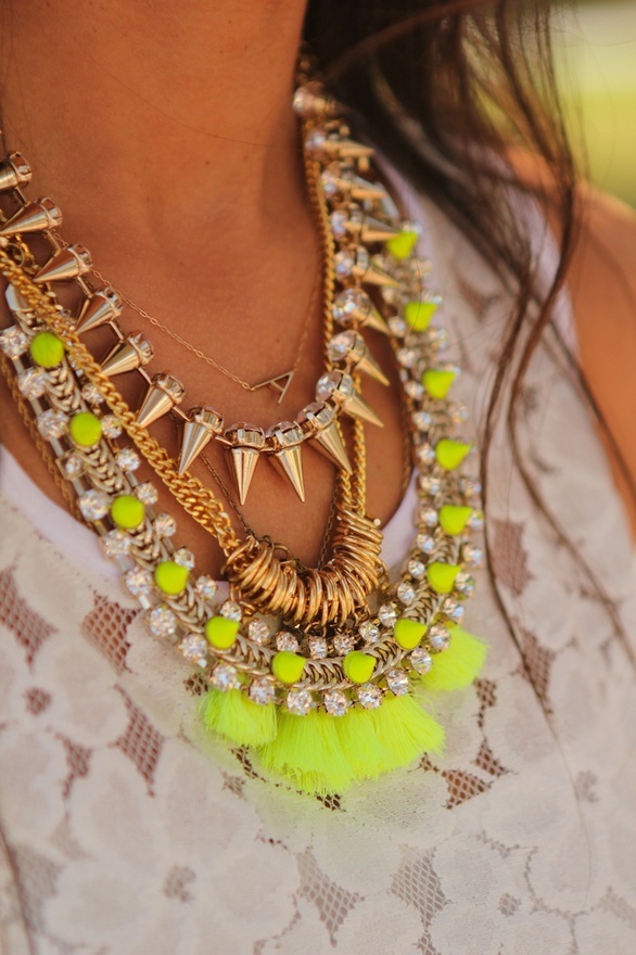
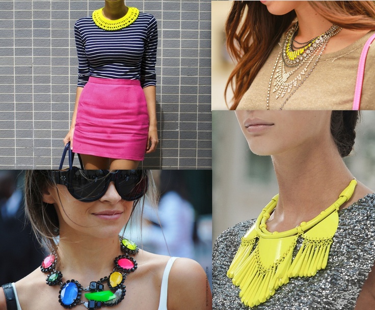
Soft lace under hard metal is texture contrast at full volume. A white floral lace top becomes the calm field for a necklace stack: a tiny initial, gold spikes with crystals, a curb chain, a cluster of rings, then an outer layer of neon yellow spikes and chartreuse tassels. Romantic fabric, aggressive hardware, fluorescent finish. The look works because the base garment stays pale and quiet; the jewelry is allowed to be the argument.
Layering necklaces is its own craft. Start closest to the skin with something small, then build length and aggression outward. If every layer shouts at the same volume, the stack becomes a blur. The neon tassels work here because they arrive last, after gold and crystal have already set a metallic baseline.
Building a contrast outfit without looking costumed
A workable sequence for everyday wear goes like this. First, pick the loudest object you actually want to wear—a neon shirt, a color-block bag, a spike necklace, a fluorescent shoe. Second, choose a base that is either dark, pale, or neutrally patterned so the loud object has a surface to hit. Third, add one secondary contrast at a smaller scale: a leopard belt, a cobalt bracelet, a second neon that appears only in hardware or soles. Fourth, stop. The common failure mode is adding a fifth neon zone because the first four felt exciting in the mirror. Photographs punish that excess; sidewalks do too.
Print mixing follows similar rules. Pair a busy geometric or animal print with solids, or keep prints in different scales so they do not cancel each other. A leopard belt on a solid neon shirt works; leopard pants under a neon tribal print top usually does not, unless one piece is dramatically quieter in value. Animal print behaves like a neutral only when the rest of the outfit agrees to treat it that way.
Lighting changes the stakes. Direct sun makes neon almost radioactive; overcast light softens it. If a look feels costume-bright indoors under warm bulbs, test it near a window or outside before deciding it is too much. Street style is an outdoor medium. Judge contrast where it will actually be seen.
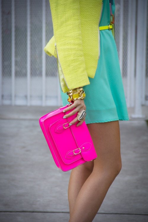
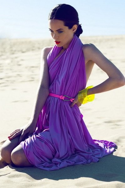
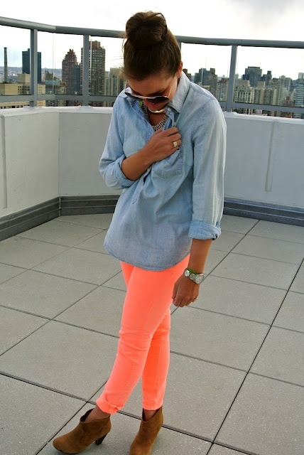
Gold hardware appears constantly in this era’s contrast looks—studded bangles, chunky bag clasps, spiked pendants—because metal reflects light differently from neon fabric. It is a third material voice. Use it as punctuation, not as a full suit of armor, unless armor is the point of the day.
Finally, remember that bold contrast is a temporary temperature, not a personality sentence. You can wear the lime bag on Tuesday and a tonal beige look on Wednesday. The skill is knowing how to turn the collision on and off, not living permanently at maximum saturation.
A short contrast checklist
- One loud hero piece (color, print, or texture).
- One calm base zone for the eye to land.
- One smaller secondary clash (belt, jewelry, sole, bag panel).
- Matched finishes where they help—nails to shirt, enamel to knit—so the look feels edited.
- Permission to leave the house before adding “just one more” neon.
Browse the frames above for the version of clash that matches your nerve. Some days that is a lime bag strap. Some days it is a neon heel under an otherwise quiet sandal. Contrast only has to be bold enough to be visible from the other side of the street.

Comments
Continue reading

Street Style Summer: Heat, Ease, and City Polish
Warm-weather street dressing that survives pavement and humidity—breathable fabrics, removable layers, honest shoes, and edited summer silhouettes.
Trendy Summer Hats for Women: Brims, Crochet, and Warm-Weather Finish
From wide-brim straw and boaters to crochet and city fedoras—how to choose and wear summer hats that shade, photograph well, and actually get used.
Street Style Stripes: Rhythm, Scale, and Colour Partners
How to wear stripes as personal style tools—scale, direction, mixing patterns, and colour partners that keep graphic looks intentional.