
Street Style Stripes: Rhythm, Scale, and Colour Partners
How to wear stripes as personal style tools—scale, direction, mixing patterns, and colour partners that keep graphic looks intentional.
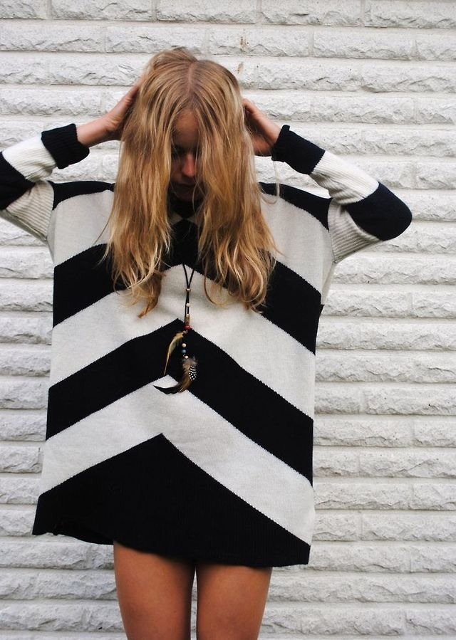
Stripes are the street’s most democratic graphic. They do not require a logo, a seasonal colour forecast, or a designer silhouette to announce themselves. A stripe is a decision about rhythm: how the eye travels across a body, how wide the beat is, whether the outfit feels nautical, optical, schoolboy, or quietly architectural. The original note on this page was simple—combine stripes with various colours and make the look yours. That advice still holds because stripes are less a trend than a tool.
What changes across decades is scale, contrast, and the company stripes keep. Skinny monochrome lines read modernist. Broad colour blocks read sporty or resort. Broken or uneven stripes feel handmade. Mixed directions—horizontal torso, vertical trousers—can lengthen, widen, or destabilize a silhouette on purpose. Street style is where those experiments get stress-tested against real walking, wind, and bad lighting.
Start with the job of the stripe
Before you buy another Breton or pinstripe blazer, decide what the stripe should do. Some people want elongation. Vertical lines and longer unbroken columns help. Some want presence. Horizontal bands and high contrast add volume and graphic punch. Some want camouflage for the midsection; mid-contrast, closer-spaced stripes in softer fabrics often behave better than bold railroad bands. Stripes are not magic—they are optics—but optics are useful when you choose them consciously.
Also decide mood. Classic navy-and-white says coastal ease even inland. Black-and-white says graphic modernism. Red-and-white can tip festive or athletic depending on cut. Multicolour candy stripes can look joyful or juvenile; the cut and the rest of the outfit decide which. If your wardrobe is mostly neutrals, one striped piece can become the personality engine for a week of outfits. If your wardrobe is already loud, a quieter stripe in grey-on-grey or tone-on-tone can add texture without adding noise.
Scale, spacing, and the body in motion
Stripe scale should match both your frame and your context. Micro-stripes from a distance can read as solid colour, which is useful for offices that dislike pattern but allow “almost solids.” Medium stripes are the everyday sweet spot—readable in photos, not overwhelming in person. Jumbo stripes are statement pieces; they need clean companions and confident posture because every step animates the graphic.
Spacing matters as much as width. Tight repeats create vibration, especially in high contrast; some people love that Op Art energy, others get visually tired. Wider spacing feels calmer and more resort. Uneven artisan stripes feel human and slightly off-grid, which can soften an otherwise severe outfit. When you try something on, walk. Stripes that look perfect standing still can create odd moiré effects when you move, especially in thin knits under fluorescent light.
Mixing stripes without looking accidental
Mixing stripes is allowed—and often better than matching a set. The usual rules are practical rather than sacred. Vary the scale: pair a fine stripe with a broad one so they do not fight at the same frequency. Or vary the direction: horizontal top, vertical bottom, with a solid belt or break at the waist. Or vary the contrast: one high-contrast stripe piece, one low-contrast stripe piece, so the eye has a place to rest.
What tends to fail is two high-contrast stripes at similar scale in clashing colour stories—navy-white next to red-black, both medium width—with no solid zone between them. The outfit then looks like two different uniforms collided. Insert a solid jacket, bag, or shoe family to create a buffer. Denim is an excellent buffer because it is visually textured without being striped.
Colour partners that earn their place
Stripes love company, but not every colour is a good date. Against black-and-white stripes, almost any accent can work: red lip, cobalt bag, camel coat. Against navy-and-white, warm metals and terracotta accents feel rich; neon accents can work if you want sport-luxe rather than yacht-club. Against multicolour stripes, pull one colour out of the stripe and echo it once—shoes, nails, or a knit—so the look feels edited instead of rainbow-random.
Pastels beside bold stripes can soften a hard graphic. Earth tones can make stripes feel autumn-ready even when the pattern itself is summer-coded. Metallics are riskier; silver hardware on black-white stripes looks sharp, while too much shine can tip costume. If you are unsure, keep metals small and let the stripe remain the loudest geometry.
Silhouette first, pattern second
A weak cut in a strong stripe still looks weak. Stripes exaggerate construction: a droopy shoulder becomes a sloping diagram; a bad waist placement becomes a broken rhythm. Choose shapes that already suit you in solids, then add stripe. Tailored jackets, clean trousers, neat knits, and simple dresses generally carry pattern better than shapeless jerseys—unless the shapelessness is intentional volume with good fabric.
Layering changes stripe behavior. A striped tee under a solid blazer becomes a controlled flash. A striped coat over solids becomes the entire architecture. A striped scarf can be the only pattern you need on a grey day. In transitional weather, stripes are excellent “one interesting thing” dressing: everything else stays calm, the pattern does the talking, and you still look composed on a commute.
Men’s, women’s, and the shared grammar
Stripe grammar is largely shared across wardrobes. Breton tops, pinstripe suiting, rugby shirts, awning-stripe shirts, and track stripes all migrate between gendered departments every few seasons. What differs is proportion and styling habits. A rugby stripe can look collegiate with chinos or tough with black denim. A pinstripe can look boardroom with a tie or subversive with sneakers and no jacket. Street style thrives on those transfers.
If you are building a small stripe capsule, three pieces cover most needs: one black-white or navy-white knit for casual days, one finer stripe shirt or blouse for polished days, and one bold stripe statement—coat, trousers, or dress—for days when you want the outfit to arrive before you do. Rotate them with the solids you already trust.
Care, longevity, and not looking dated
Stripes show wear in specific ways. High-contrast blacks can fade into blue-grey and make the rhythm muddy. Stretch knits can warp so lines curve around the torso like a topographic map—charming only if intentional. Hang striped knits carefully; fold if they grow. Wash inside out. Avoid over-drying, which can shrink one fibre more than another and skew alignment.
Styling keeps stripes current more than the stripe itself does. Update the companions: modern sneakers instead of dated boat shoes, a sharp blazer instead of a tired cardigan, cleaner denim, better outerwear. The pattern can stay classic while the silhouette moves. That is why stripes rarely truly die; they wait for a new shoe and a new jacket to look inevitable again.
Making the combination personal
Personal style with stripes is less about owning the “right” Breton and more about repeating a logic that feels like you. Maybe you always break stripes with leather. Maybe you only wear horizontal lines above the waist. Maybe your signature is black-white stripes with one hot accent colour that changes by season. Consistency of logic reads as style; random stripe accumulation reads as laundry.
Use this gallery idea as a prompt rather than a catalogue—especially since only a fragment of the original photo set remains. Ask what rhythm you want tomorrow morning. Choose scale and contrast for that job. Add one colour partner with intention. Keep the rest quiet enough that the stripe can speak. When the lines match your pace, you stop wearing a pattern and start wearing a point of view.

Comments
Continue reading
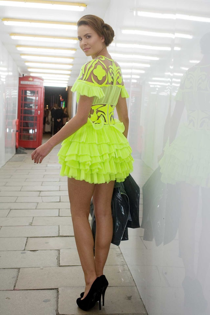
Street Style Neon Colours #2: Night Heat Voltage
A second neon chapter for warm evenings and artificial light—signal colour in crowds, shine after dark, and heat-ready saturation instead of spring thaw accents.
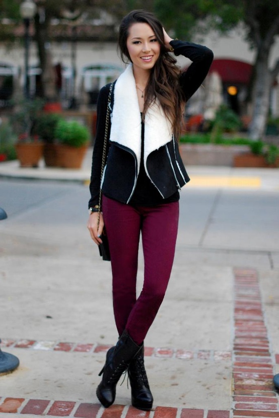
Global Street Style #3: Color, Warm Climates, and Hero Accessories
LA, Mediterranean, and Rio-spirited street looks where bags, shoes, sunglasses, and jewelry lead the silhouette instead of heavy coats.
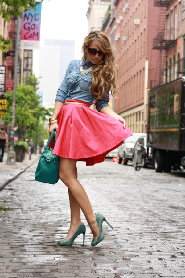
Global Street Style #2: Layering in Tokyo, Seoul, and London
Creative-district street fashion through denser stacks—texture contrast, length mismatch, and cold-weather layering moves that still walk.