
Simpsonized Game of Thrones Characters by ADN
ADN’s Game of Thrones simpsonizations use crowns, cloaks, and heraldic hair—fantasy pageantry translated into Simpsons faces, distinct from his Breaking Bad set.
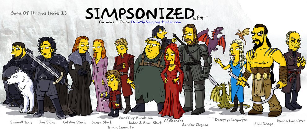
Illustrator and art director Adrien Noterdaem—better known online as ADN—has a specialty that sounds like a dare: take faces the culture already knows and rebuild them inside the proportions of The Simpsons. Crowns shrink into yellow silhouettes. Direwolves and dynasties become hair shapes and cloak colors. His Game of Thrones project does not ask whether Jon Snow would survive Springfield. It asks whether you can still name a character when the likeness has been traded for overbite and primary color.
Shared originally through his Draw The Simpsons work and circulated among fans who wanted one more way to live in Westeros between seasons, the series treats HBO’s costume department as a second script. Armor edges, fur collars, braided hair, and heraldic reds do the casting. Once those signals land, the Simpsons face can finish the joke.
Fantasy pageantry as recognition technology
Game of Thrones is unusually kind to this kind of parody because its visual language is already emblematic. Viewers learned to read houses the way comics readers read costumes. A blond braid and a controlled expression can mean Cersei before a single line of dialogue. Dark curls and a northern coat can mean Jon. ADN’s simpsonizations lean into that emblem system. They are less about morphing actor skulls and more about preserving the icon that made the character scroll-stopping in the first place.
That is different work from photoreal caricature. Caricature hunts for the actor. Simpsonization hunts for the role as a graphic object. In Westeros, the role often arrives wearing metal, fur, leather, and hair architecture that would look exaggerated even without a parody filter. ADN simply completes a journey the costume design already started.
How this set differs from ADN’s Breaking Bad cast
ADN later turned the same method on Breaking Bad, and the contrast is useful. Albuquerque’s icons are hats, lab suits, and suburban menace—props from a world that looks almost like ours. Westeros hands the illustrator dragons’ adjacent wardrobe: crowns, hand-of-the-king pins, wildling furs, kingsguard white. One project translates prestige realism; this one translates epic costume theater.
Because of that, the comedy lands on a different beat. With Breaking Bad, part of the laugh is seeing ordinary American crime clothes on yellow cartoon bodies. With Game of Thrones, the laugh is seeing medieval-fantasy grandeur survive a sitcom face system without losing status. A porkpie hat and a spiked crown are both silhouettes, but they drag different genres behind them. Keeping those genre temperatures distinct is how ADN avoids making every show look like the same yellow mashup.
Tone matters too. Thrones swings between ice, intrigue, and sudden violence; the parody has to stay affectionate enough that beloved characters do not flatten into mean jokes, especially when the source material already courts extremity. The best frames in this vein feel like affectionate casting announcements from an alternate animated network, not like mockery of the actors’ features.
What “simpsonized” actually constrains
Working in a Simpsons-adjacent face language means accepting a short list of tools: large eyes, overbites, simple noses, bold outlines, flat color. Personality then migrates into eyebrows, mouth set, hair mass, and costume blocks. That constraint is why the method scales across franchises. It also explains failures of weaker imitators—when every character receives the same grin, the set collapses into one repeated sticker.
ADN’s stronger pieces keep emotional weather. A stern northern stare still reads as stern after yellowing. A politic smile still reads as politic. The conversion is a translation, not a reset to default Springfield cheer. That translation skill is the real craft on display, more than the novelty of “Character X as a Simpson.”
Hair and headgear deserve special attention in a Thrones set. Westerosi identity is often worn above the shoulders: Cersei’s controlled gold, Daenerys’s evolving pale braids, Tyrion’s distinctive proportions reinterpreted carefully inside cartoon rules, Ned’s solemn northern framing. Get the head wrong and no amount of cloak rendering will save the casting.
Looking at the gallery that remains
The image preserved with this post is a reminder of how the series circulated: as shareable character sheets and group moments meant to be recognized instantly in a feed. Even a single frame teaches the method—scan for house colors and signature wardrobe, then enjoy how little facial realism is required once those cues are locked.
If you remember the wider set from when it first spread, you probably remember the double take more than any one line quality. That double take is the aesthetic goal. First you think, “I know that person.” Then you think, “No, I know that role, rebuilt.” Fan art that produces that sequence respects both the source show and the parody system.
Credit and where to follow the hand
Adrien Noterdaem’s ADN work has lived publicly on DeviantArt and related shares for years, including Flickr sets tied to these experiments. Credit matters because simpsonization formats get scraped, reposted, and stripped of names until they look authorless. They are not authorless. A specific illustrator chose which Thrones signals to keep and which facial details to sacrifice.
Enjoying the pieces responsibly means treating them as fan illustration with a byline, not as interchangeable meme ore. If the yellow Kingsroad calls you back to the books or the show, let it. Parody is one of the ways franchises stay mentally alive between official seasons and long after finales.
Why the crossover still charms
Part of the charm is tonal whiplash done gently. The Simpsons promises domestic comedy; Game of Thrones promises dynastic dread. Putting them in the same facial font creates a safe temporary universe where dread wears comedy’s mask. You get to love the characters again without rewatching the hardest episodes. That emotional utility is easy to underestimate when talking about “just fan art.”
There is also a design lesson for anyone who draws for the internet. Identity cues beat likeness hunts when the viewing time is two seconds. ADN’s Thrones cast is a syllabus in cue selection: pick the three things a character cannot lose, discard the rest, and rebuild inside a known system. Crowns, cloaks, and hair become the syllables of a visual sentence.
Compared with photo-manipulation trends of the same era, drawn simpsonizations age more cleanly. They are not tied to a filter app’s lifespan. They are tied to two durable graphic languages—Groening’s face system and Westeros’s costume mythology—meeting on paper. As long as both languages remain culturally fluent, the hybrid stays legible.
So look again at the yellow court. Iron and parody share a face for a moment, and the shared face is enough. ADN did not need to resolve the Song of Ice and Fire. He only needed to prove that even in Springfield proportions, you can still tell who holds the knife, who holds the North, and who is already plotting three moves ahead.

Comments
Continue reading

Funny Animal Signs That Warn People (While Animals Ignore Them)
From a seagull on a no-birds disc to classic zoo and park ironies—why animal warning signs get funny, and what the rules are still for.

How to Find Local Amenities on Vacation: Mechanics, Haircuts & More
Locate trustworthy local services and everyday spots while traveling or settling in—using publications, reviews, map apps, neighbor tips, and low-pressure exploration.

Kristen Stewart for V Magazine, Spring Preview 2013
V81’s Wild at Heart cover story—Kristen Stewart shot by Inez & Vinoodh, styled by Joe McKenna, in pale minimal spring glamour.