
Social Network: Beomseok Yang’s Seoul Phone-Overlay Short
A three-minute Korean motion-design short turns Facebook-style holograms on Seoul streets into a clean thesis: connection collapses the second the phone drops.
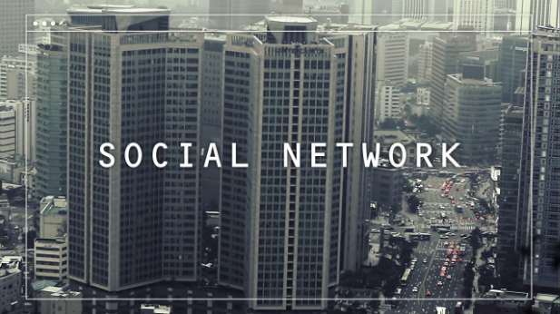
A young man walks through Seoul and the city answers him. Faces bloom into floating profile cards. Status updates hang in the air like neon weather. Strangers become readable the moment his phone unlocks them. Then the phone slips—and the overlays vanish. The street does not change. Only the social operating system does. That pivot is the whole argument of Social Network, the roughly three-minute 2013 short by Korean motion designer Beomseok Yang: connection feels frictionless until the device fails, and then you notice how little of the warmth was actually in the room.
Not the Fincher movie—a phone-era essay in motion
Yang’s film shares a title with David Fincher’s feature about Facebook’s founding, but the projects are unrelated. This Social Network is a motion-design short with live-action footing: Seoul streets, a smartphone, and digital holograms that visualize what social apps claim to do—introduce, annotate, and rank the people around you. Contemporary write-ups placed it beside other early-2010s phone satires such as I Forgot My Phone and “social media generation” shorts: pieces that treated the always-online habit as a public health mood rather than a private quirk.
Runtime listings usually clock it near three minutes. That brevity matters. The film does not need a subplot about a breakup or a workplace meltdown. It needs one sensory contrast: mediated social life versus unmediated street life. In a festival or Vimeo Staff Pick context (the short received Staff Pick attention after release), that economy is a feature. Viewers finish the piece before their attention wanders, and the afterimage is the point.
What the holograms are doing
The visual trick is simple to describe and hard to forget. Social interaction is externalized as augmented reality: Facebook-flavored cards, streams of data, and floating interface chrome that flood public space. The protagonist looks happy inside that system. He can “meet” people without the awkwardness of unknown faces. The city becomes a searchable directory.
Yang’s craft background shows. The overlays do not feel like a late After Effects sticker pack; they feel like the environment’s second skin. Motion design here is not decoration on top of drama—it is the drama. When the phone is present, the world is noisy with soft information. When the phone is gone, the same sidewalk looks quieter, lonelier, and somehow more honest. That quiet is the short’s real punchline. It does not scold you for liking apps. It shows how quickly presence collapses when the interface disappears.
Some coverage described the piece as flirting with augmented-reality futurism and stop-motion energy. Whether every technique label fits perfectly is less important than the hybrid feel: live streets plus graphic intervention. That hybrid is why the film still reads in an era of actual AR filters and always-on notifications. The prediction was not literal holograms on every corner. The prediction was that social metadata would feel inseparable from walking down a block.
Seoul as character, not postcard
Setting the short in Seoul is not tourism. Dense urban sidewalks, quick passerby encounters, and a culture of heavy smartphone use give the satire concrete geography. The young man does not need exposition about “the digital age.” The city supplies density: enough strangers that a social overlay can feel like magic rather than loneliness with extra steps.
Yang was working as a motion designer when the short circulated; later career notes place him in broadcast and studio art-direction roles in South Korea. The film’s student-and-designer DNA matters for viewers who care about indie craft: this is not a studio PSA with a branded moral. It is a designer thinking in shots about a problem designers helped build—interfaces that make people legible, then make them unreachable without the glass rectangle.
Music and pacing as soft persuasion
Reports around the release credited the soundtrack to “Common Ground” by Funkastic James in a Glen Check remix. The music’s job is not to lecture. It keeps the walk buoyant while the overlays bloom, then leaves room for the drop when the phone hits reality. In a dialogue-light short, score and sound design do the emotional captioning. The happiness of the connected state has to feel real; otherwise the crash looks fake. Yang sells the high first. That is why the comedown works.
Pacing follows the same logic. Early beats are playful—recognition, novelty, floating friendliness. The accident is short. The aftermath is not a speech. You get enough emptiness to understand the thesis, then the piece ends before it becomes a TED Talk with nicer fonts.
Why the short still lands
Phone-addiction shorts from 2013 can age into museum pieces: people staring at black rectangles instead of each other, filmed as if that were shocking. Yang’s version ages better because the satire is spatial. The problem is not “phones bad.” The problem is a city redesigned as a feed. When your social world lives in overlays, dropping the device is not just inconvenience—it is sudden anonymity. You are surrounded by people again, and none of them come with captions.
That idea maps cleanly onto later habits: walking with AirPods and maps, scanning QR menus, checking whether a café is “worth it” before looking up. The platforms changed names. The hologram metaphor remains useful. If your sense of who is near you depends on a glowing rectangle, then the rectangle is not a tool. It is a prosthetic social sense.
How to watch it usefully
Watch once for the gag of floating profiles. Watch again for how little dialogue the film needs. Notice when the overlays feel helpful versus when they feel like a crowd you cannot leave. Ask a blunt question after: in your own day, which interactions only happen because an app invents them, and which ones survive a dead battery?
If you are a filmmaker or motion designer, treat the short as a case study in thesis economy:
- Pick one visual system that equals the theme (here: holograms = mediated social life).
- Stage a single failure that removes the system.
- Let the environment, not a character monologue, deliver the moral.
- Keep runtime short enough that the metaphor cannot dilute.
Yang’s Social Network is not an anti-tech sermon. It is a three-minute reminder that “connected” and “present” are different verbs—and that the difference becomes visible the second the screen goes dark.

Comments
Continue reading

Funny Animal Signs That Warn People (While Animals Ignore Them)
From a seagull on a no-birds disc to classic zoo and park ironies—why animal warning signs get funny, and what the rules are still for.

How to Find Local Amenities on Vacation: Mechanics, Haircuts & More
Locate trustworthy local services and everyday spots while traveling or settling in—using publications, reviews, map apps, neighbor tips, and low-pressure exploration.

Kristen Stewart for V Magazine, Spring Preview 2013
V81’s Wild at Heart cover story—Kristen Stewart shot by Inez & Vinoodh, styled by Joe McKenna, in pale minimal spring glamour.