
Passionate About Purple: Ideas for Violet Lovers
A purple-lover’s gallery and guide—lavender to plum—covering mood, nature cues, fashion and home pairings, and how to build a palette that stays intentional.
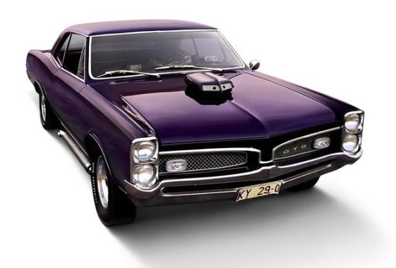
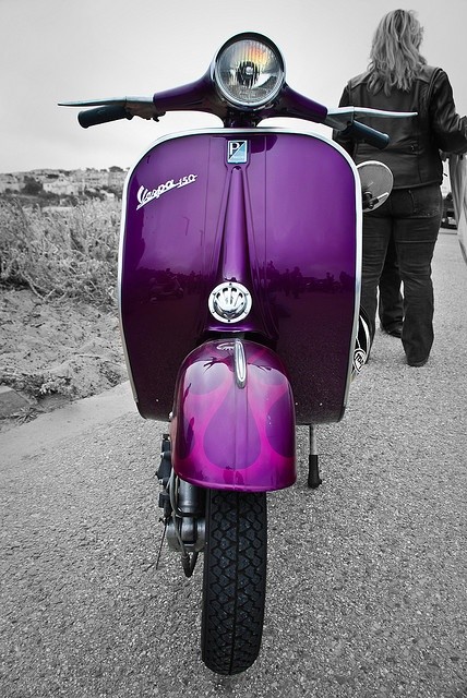
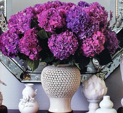
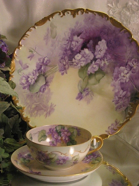
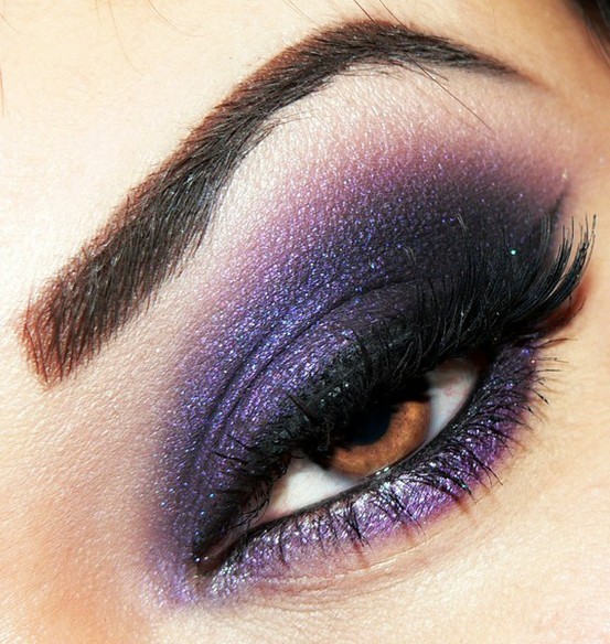
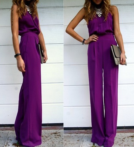
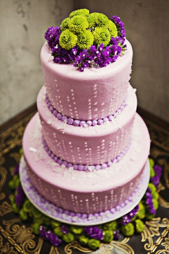
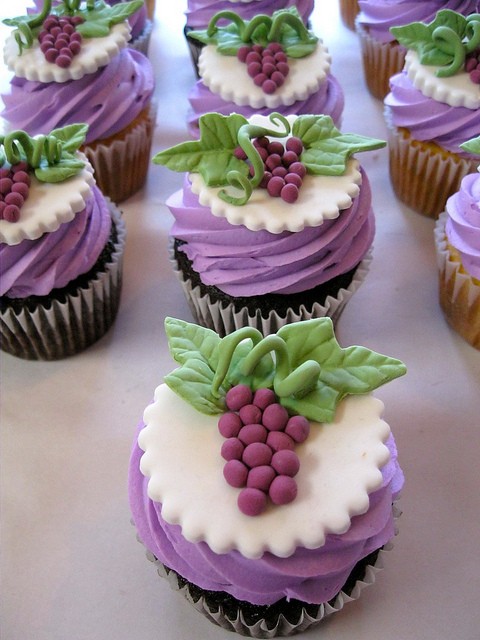
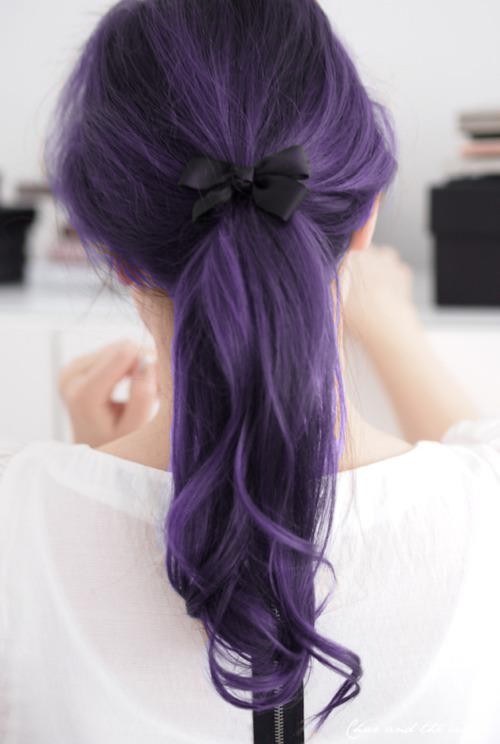
Gorgeous ideas for purple lovers start with a simple truth: violet is rarely neutral. It can read royal or playful, lavender-soft or ink-deep, vintage or electric. The gallery below gathers purple as mood more than as a single paint chip—flowers, fashion, interiors, and graphic moments that treat the color as the main character rather than a timid accent. Enjoy the range; purple rewards people who commit.
Why purple feels personal
In design psychology shorthand, purple sits between warm red energy and cool blue calm. That middle seat is why the same hue can signal luxury in a velvet chair and whimsy in a balloon bouquet. Historically it carried rarity—expensive dyes, ceremonial cloth, liturgical vestments—so modern use still borrows a little of that “special occasion” charge even when the pigment is cheap. Lavender and lilac soften the charge into romance and spring. Eggplant and plum push it toward drama and evening. Magenta-leaning purples flirt with pop. Knowing which branch you mean saves rooms and wardrobes from muddy accidents.
Light changes everything. North light can cool a lilac wall toward gray; warm bulbs can turn the same wall candy. Matte surfaces swallow purple; silk, gloss paint, and glass throw it back at you. That is why purple galleries often mix textures: a matte flower petal beside shiny packaging, a knit scarf beside lacquered nails. The color stays constant; the finish decides whether it whispers or shouts. Photographers editing purple scenes learn this fast: boost saturation too far and lilac becomes cartoon; crush shadows too hard and plum becomes bruise. The sweet spot is usually a clear undertone plus honest texture.
Culture layers meaning on top of physics. Purple can suggest creativity in a studio brand, spirituality in a quiet bedroom, or nightlife in a neon sign. None of those meanings is mandatory. What matters for living with the color is choosing one emotional lane for a space or outfit and letting supporting colors obey that lane. A nursery lilac and a club violet are both “purple,” but they ask for different whites, woods, and metals.
Nature’s purple curriculum
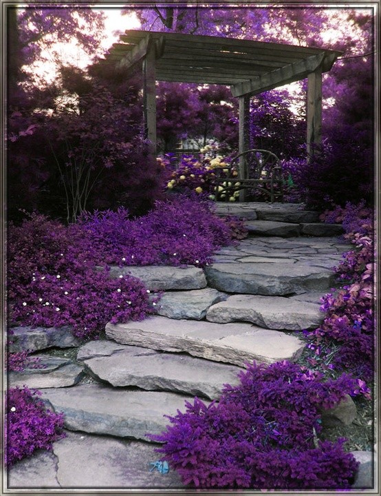
Flowers teach safer combinations than mood boards sometimes do. Lavender fields pair violet spikes with dusty green and warm soil—proof that purple loves neighbors that are slightly grayed rather than neon. Iris and hydrangea show how blue can lean into purple without fighting. Plums and grapes demonstrate edible purple: deep, glossy, and flattered by cream and wood. Even urban weeds offer lessons; a patch of wild violets against concrete proves that small doses of saturated purple can punch above their size.
Photographers chasing purple in nature often underexpose slightly to keep petals from blowing into pink mush, then warm the shadows so the scene does not feel cold. Interior stylists borrow the same idea: if a purple sofa looks bruise-like, the fix may be lighting temperature, not a new sofa. Pair it with brass, honey oak, or ivory linen and the bruise becomes jewel. Pair it with cool gray and chrome and it becomes nightclub—fine if you want that, confusing if you wanted calm.
Seasonality helps too. Spring lilac wants air and pale greens. Autumn plum wants amber leaves and wool. Winter purple can go jewel-toned beside candlelight or stay chalky and quiet beside snow. When a purple object looks “wrong” in your house, ask which season it belongs to before you reject the hue entirely. Sometimes the object only needs a different companion textile or a warmer lamp bulb.
Wearing and living with violet
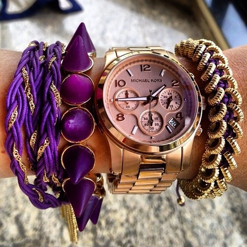
In fashion, purple works as either a statement block or a jewelry-like accent. A plum coat over neutrals is easier for daily life than a head-to-toe magenta look, but both can succeed if proportions are intentional. Patterns that mix purple with mustard, olive, or soft pink often feel more contemporary than purple with pure black alone, which can tip gothic unless fabrics are luxurious enough to justify the drama. Accessories—scarves, nails, sunglasses arms—let cautious lovers test saturation before committing to a full garment.
Skin undertones are less of a prison than internet quizzes claim, but contrast matters. Deep plum near deep hair can look seamless; pale lilac near fair skin can disappear unless fabric texture or jewelry creates an edge. If a purple shirt washes you out, try shifting temperature (more blue or more red in the purple) before abandoning the family entirely. Makeup follows similar logic: a cool berry lip beside a warm orchid dress can fight; matching the undertone usually looks more deliberate.
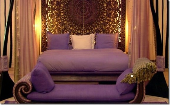
At home, start with objects that can leave: throws, candles, art prints, a painted side table. If you love the experiment after a month of real evenings and morning light, graduate to larger surfaces. Full purple rooms need breathing room—white trim, pale ceilings, or a second wall in a quiet cream. Kitchens and bathrooms can take purple in tile or cabinetry if the undertone matches the metal finishes; cool purple with brushed nickel, warm purple with brass or copper, is a rule of thumb more than a law. Children’s rooms often do well with lilac as a wall and brighter purple only in toys and art, so the color can grow with the child instead of locking the space into a theme park.
Building a purple palette that holds
Useful partners for purple include:
- Soft greens — sage, olive, eucalyptus; botanical and calming.
- Warm neutrals — cream, sand, camel; they keep violet from feeling sterile.
- Gold and brass — classic jewelry pairing; lifts plum toward luxury.
- Blush and dusty rose — romantic without competing for the same “cool” lane.
- Charcoal instead of pure black — deep contrast with less harshness.
- Clear glass and mirrors — bounce light so saturated purple does not deaden a corner.
- Mustard and soft ochre — energetic contrast that still feels designed rather than random.
Avoid dumping five different purples into one small room unless they share an undertone. A blue-violet next to a red-violet can look like a mistake even when each chip is lovely alone. Test samples on more than one wall and at night. If you are styling a table or a photo set, limit yourself to one hero purple and one supporting tint; let everything else support those two. When in doubt, photograph your corner in phone daylight and evening modes—screens reveal clashes your eyes forgive in person for about ten minutes.
Graphic designers working with purple brand systems often pick a primary violet, a lighter tint for backgrounds, and a near-black purple for text instead of pure black. That keeps the family coherent across web, print, and packaging. Home stylists can steal the same trick: one hero, one airy tint, one deep anchor.
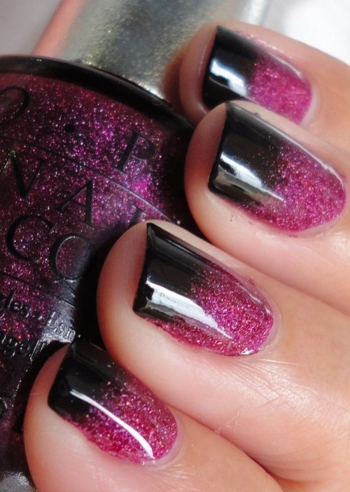
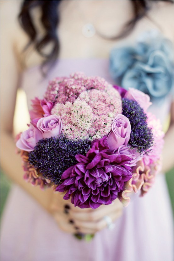
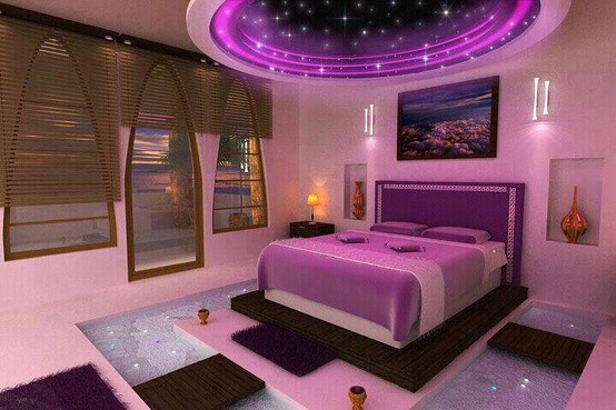
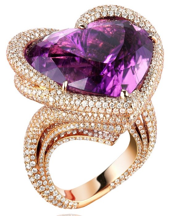
Flip back through the images and pick a single temperature you love—lilac morning, orchid midtone, or plum night—then steal only the companions that appear beside it. Passion for purple is easiest to live with when it is specific. A house that loves every violet at once can feel restless; a house that loves one violet deeply usually looks intentional, even when the rest of the palette stays quiet. If you leave with one swatch name and one metal finish in mind, the gallery has done more than decorate a scroll—it has given you a decision.

Comments
Continue reading

Funny Animal Signs That Warn People (While Animals Ignore Them)
From a seagull on a no-birds disc to classic zoo and park ironies—why animal warning signs get funny, and what the rules are still for.

How to Find Local Amenities on Vacation: Mechanics, Haircuts & More
Locate trustworthy local services and everyday spots while traveling or settling in—using publications, reviews, map apps, neighbor tips, and low-pressure exploration.

Kristen Stewart for V Magazine, Spring Preview 2013
V81’s Wild at Heart cover story—Kristen Stewart shot by Inez & Vinoodh, styled by Joe McKenna, in pale minimal spring glamour.