
The Uncomfortable: Katerina Kamprani’s Mind-Bending Everyday Objects
Athens architect Katerina Kamprani redesigns brooms, pots, chairs, and door hardware so they stay recognizable while sabotaging the one motion you expect.
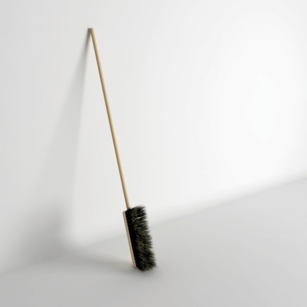
Athens-based architect Katerina Kamprani builds everyday tools that look almost right and feel completely wrong. Her ongoing series The Uncomfortable redesigns familiar objects—brooms, pots, chairs, door hardware—so they stay recognizable while sabotaging the one motion you expect to make. The broom still has a handle and bristles; the handle simply attaches to the narrow side of the head, so sweeping becomes a sideways argument with physics. The joke is visual first, then physical: you can name the object instantly, and only then notice why it would never help you clean a floor.
Kamprani trained across architecture and industrial design and has spoken about restless career daydreams—film direction, animation, product design—while practicing as an architect. That restless eye shows in the work. Instead of inventing alien gadgets, she edits the grammar of things you already trust. Her stated aim is to keep the semiotics of the original item intact: a coffee pot must still read as a coffee pot, a chair as a chair. The redesign is a small act of vandalism against usefulness, not a costume change. In an internet decade crowded with “weird product” listicles, that restraint is why her images linger. They do not shout novelty; they whisper that the ordinary object was always a carefully negotiated set of grips, balances, and pour lines.
Deliberately inconvenient, still almost usable
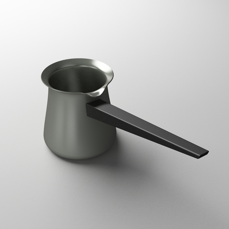
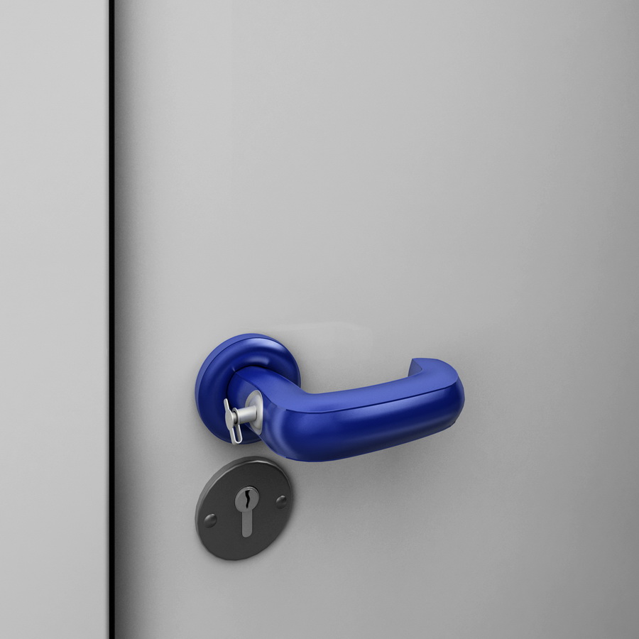
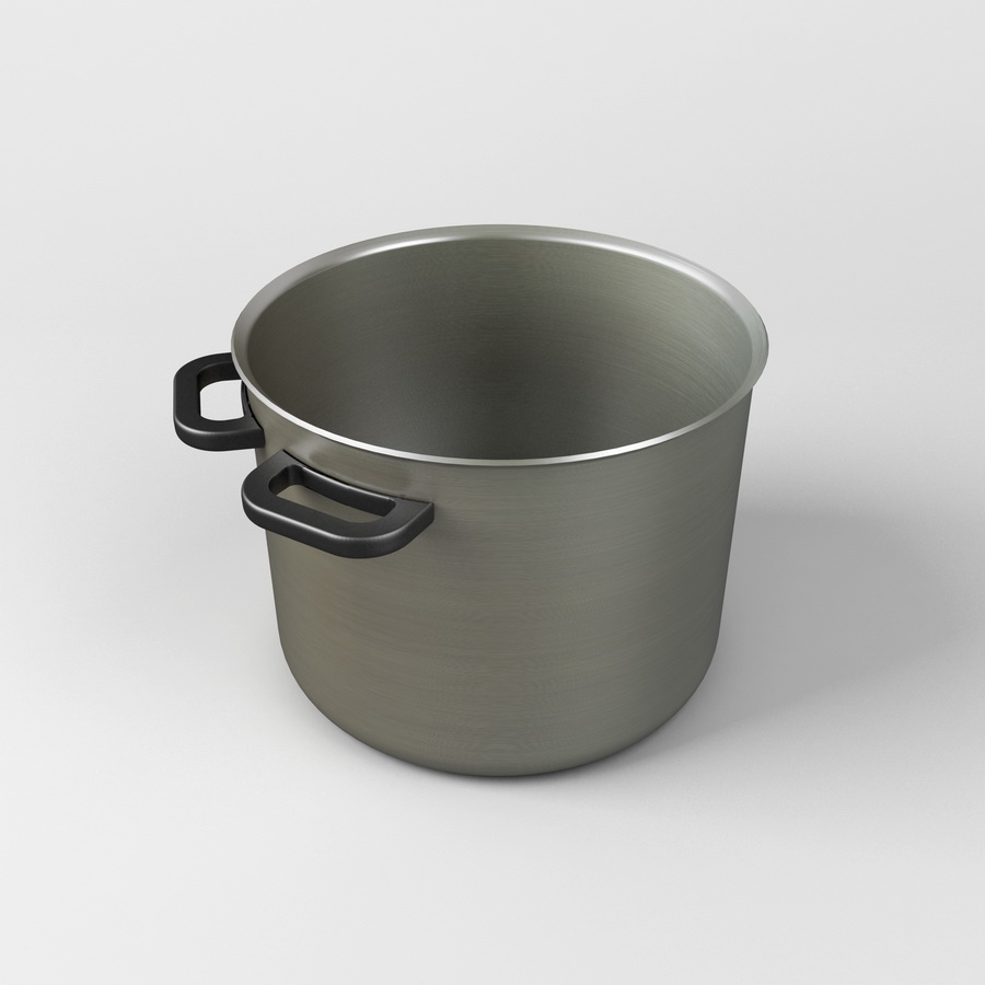
The series began around 2011 as a private design game and later became a public collection of 3D visualizations and occasional prototypes. Kamprani has described the early method as methodical sabotage: study how a person grips, lifts, pours, or sits; then break only one step of that interaction. A cezve-style pot keeps its spout, but the long handle sits directly under the pour line, so hot liquid would travel straight toward the hand. A blue door handle still invites a downward pull, yet a tiny key-like pin juts from its neck above a conventional keyhole—redundant hardware that makes opening the door feel like a riddle.
That “uncomfortable but usable” rule matters. Completely useless objects tip into cartoon props. Kamprani’s better pieces stay close enough to function that your body rehearses the motion before your mind vetoes it. You feel the pour, the sweep, the sit—then the design refuses. Humor arrives as delayed recognition, the same beat that makes optical illusions funny: first belief, then correction. If a piece drifts too far into surreal impossibility, it loses that delayed beat and becomes mere fantasy furniture. The sweet spot is the near-miss.
She has also noted that later ideas grew more symbolic—objects that barely pretend to work at all—yet the early discipline of single-point sabotage remains the clearest way to read most of the gallery. When you can point to exactly one broken relationship (handle to head, handle to spout, legs to floor), you are inside her original game.
What the gallery keeps showing
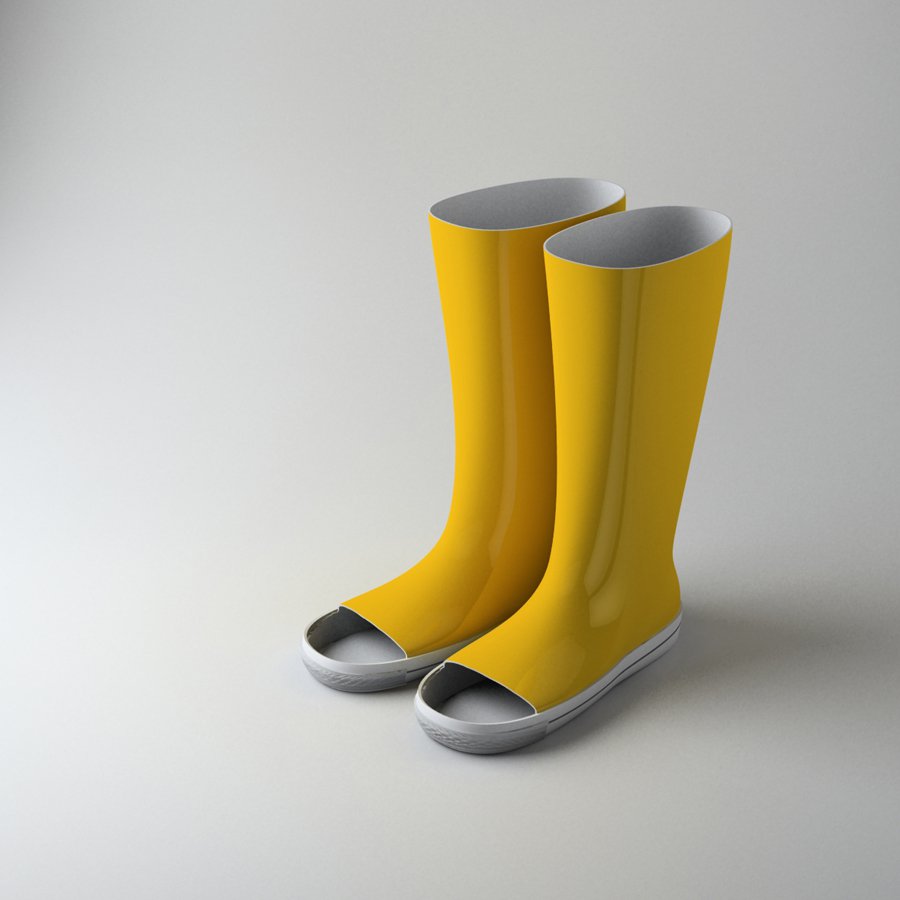
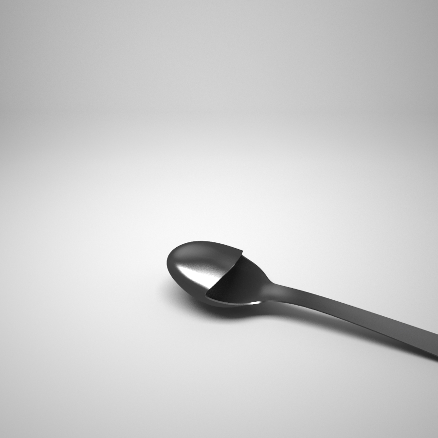
Across the renders collected here, certain sabotage patterns repeat:
- Misplaced handles. The grip survives; its relationship to the working end does not. Side-mounted broom heads and spout-side pot handles are classic examples.
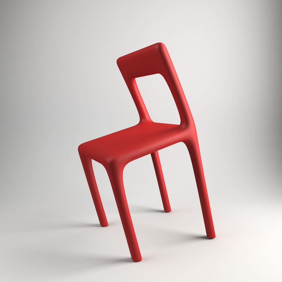
- Stability games. A saturated red chair leans on its rear legs as if mid-tip, turning a sitting tool into a balance performance.
- Hardware contradictions. Locks, pins, and openings appear where muscle memory does not expect them, forcing a second look at “simple” door furniture.
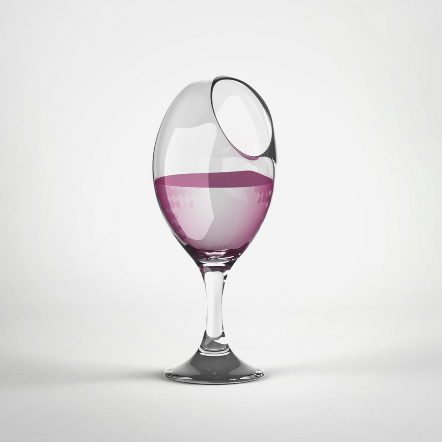
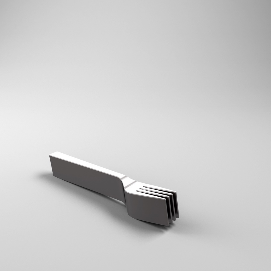
- Material honesty. Wood, matte plastics, and quiet metals are rendered with product-photography clarity. The objects look shoppable until you try to imagine using them.
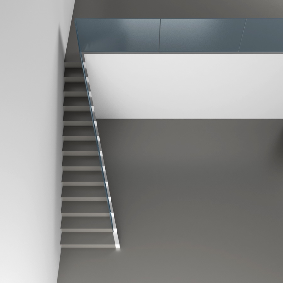
- Neutral stages. Soft shadows on grey floors and white walls borrow catalog language so the sabotage reads as intentional industrial design.
That last point is strategic. Soft studio light, neutral floors, and catalog-clean backgrounds borrow the language of ecommerce and industrial design portfolios. The Uncomfortable infiltrates that language and flips the sales pitch: instead of promising ease, each image advertises friction. Because the renders look so professional, the sabotage reads as intentional design rather than doodle humor. A sketchbook gag becomes a fake product launch, and the fake product launch becomes critique.
Design critique disguised as a prank
Good product design usually hides itself. You open a door, pour coffee, or sweep a hallway without narrating the interaction. Kamprani makes the hidden choreography visible by breaking it. After a few minutes with the series, ordinary objects start to look engineered: every curve is a decision about grip, balance, heat, and safety. The project is funny, but it is also a crash course in affordances—the cues that tell a body what an object wants.
She has acknowledged kinship with earlier mischief designers and surreal object-makers, yet The Uncomfortable keeps a distinct tone: not pure Surrealist dream logic, not pure anti-consumer rant. It is closer to a studio exercise that escaped into the internet. Many pieces exist first as visualizations; some later become physical prototypes. That digital-first path fits the mid-2010s moment when concept renders traveled as quickly as photographs, and a clean white-background image could circulate as if it were a real catalog product. Viewers argued in comments about whether the objects were “real.” That confusion was unpaid marketing for the concept.
There is also a gentle ethics in the humor. The objects annoy without cruelty toward a specific user type. They do not mock poverty or disability; they mock the smug perfection of frictionless consumer goods. You laugh at the broom, then notice how many “clever” real products fail for quieter reasons—bad hinge placement, slippery grips, lids that fight you. Kamprani’s extremes make ordinary failures easier to spot. In that sense the series is strangely generous: it trains attention rather than selling a lifestyle.
Architecture training may also explain the calm staging. Each object occupies space like a model on a plinth. Proportions feel measured. Even when a chair tips, the composition stays orderly. Chaos is reserved for the user’s imagined experience, not for the image’s graphic design.
How to look at these images
Treat each render like a short puzzle. Ask three questions in order:
- What ordinary object is this pretending to be?
- Which single interaction has been sabotaged—grip, pour, sit, open, balance?
- Would your body still try the old motion before your brain stops it?
That third question is where the series earns its keep. If you answer yes, the redesign still carries the original object’s semiotics. If you answer no, the piece has drifted into pure fantasy and lost the uncomfortable middle zone Kamprani prefers. You can also add a fourth question for designers: what real-world product fails in a quieter version of the same way? Suddenly a viral render becomes a critique of lids, handles, and seating you already own.
Designers and students can steal the method without stealing the jokes. Pick a kitchen tool, list the steps of use, and change only one step on paper. Keep materials and silhouette familiar. Photograph or render it like a serious product. The discipline of changing one variable—rather than inventing a chaotic mess—teaches more about interaction design than another afternoon of “creative” shapes with no use case. Try it with a mug, a light switch, or a pair of scissors. If classmates laugh and then frown, you hit the Uncomfortable register.
For casual viewers, the gallery is simply a tour of near-misses: a broom that refuses to sweep, a pot that threatens the pourer’s hand, a chair that performs a tip instead of offering rest, a door handle that overexplains security. Katerina Kamprani’s The Uncomfortable keeps proving that the most memorable redesigns are not always the most helpful ones—they are the ones that make usefulness suddenly visible by taking it away. After you leave the page, notice the next object you touch without thinking. That automatic ease is exactly what her renders interrupt.

Comments
Continue reading

Still-Life Photography by Margareth Perfoncio
São Paulo photographer Margareth Perfoncio’s still lifes of food and flowers—Old Master light, dark wood, and tables that feel inevitable.

Meaningful Love Quotes for Inspiration (and Ink)
Meaningful love quotes that still feel true — short lines for tattoos, gifts, and everyday reminders, with placement and wording tips.

Christina Hess’s Animals From History: Costumed Pets as Playful Portraits
Illustrator Christina Hess reimagines historical icons as ornate animal portraits—Elvis Petme and friends—mixing puns, costume detail, and soft history lessons.