
Magnificent Stained-Glass Windows: Color Built Into Daylight
A contemplative gallery of stained-glass windows—craft, sacred and civic storytelling, and how pot-metal color turns architecture into living light.
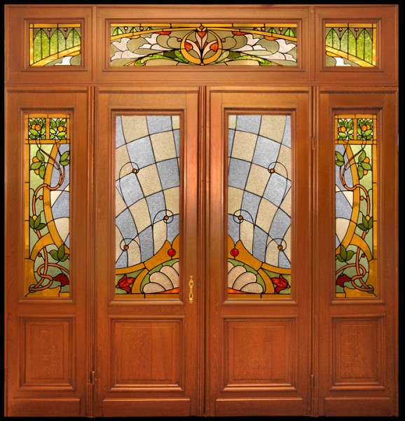
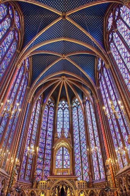
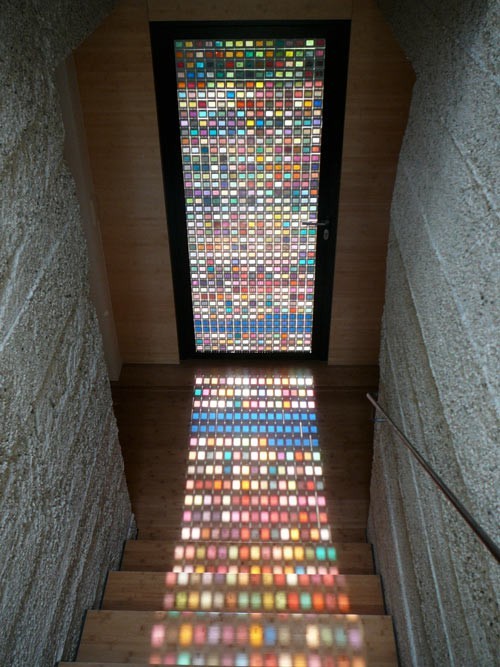
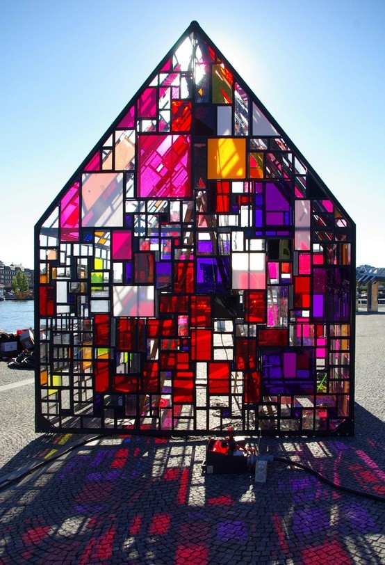
Stained glass is architecture you can see through. Color is not painted onto the room; it is mixed into the daylight itself. When sun hits a leaded window, the floor becomes a temporary painting, dust motes turn into glitter, and stone or plaster walls borrow hues they will lose again by dusk. This gallery gathers magnificent stained-glass windows—sacred and secular—that prove how lead, glass, and light still outperform most interior trends.
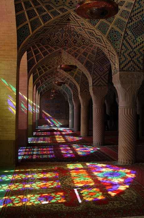
Unlike a photograph of a mural, these images change with weather. A cloudy noon softens the palette into watercolor. A hard afternoon beam throws sharp jewel fragments across pews, stairs, or gallery floors. Looking at still photographs, remember you are seeing one weather report out of thousands the window will live through.
That dependence on the sky is why stained glass resists being reduced to décor. A printed film on clear glass can imitate color; it cannot imitate the thickness, the bubbles, the slight waves of handmade sheets, or the way pot-metal blue deepens as clouds pass. The windows collected here earn the word magnificent by behaving like instruments, not stickers.
How colored light is built
Traditional stained glass is not a single sheet tinted in a factory wash. Artisans cut pieces of pot-metal glass—color melted into the material—then join them with lead cames soldered at the joints. Details such as faces, drapery folds, and inscriptions are often painted in vitreous enamels and fired so the linework becomes permanent. Silver stain can turn white glass gold from the back. The craft is equal parts chemistry, drawing, and structural puzzle.
Lead lines are not merely outlines. They are the skeleton that holds wind load and weight while also composing the image. A strong window reads clearly from the nave floor even when individual brushstrokes disappear. That is why distant photographs still work: silhouette and color blocks carry the story before fine painting does.
Support bars, putty, and protective glazing are the unglamorous partners. Without them, a tall window would sag or shatter. Conservators speak of breathing rooms and reversible repairs; photographers simply notice when a panel sits true in its stone. Integrity of craft shows even in a web gallery if you look for even leading, coherent paint, and colors that feel thick rather than sprayed.
Sacred storytelling and civic pride
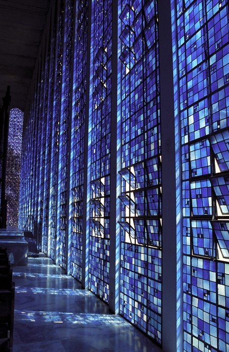
Churches and cathedrals made stained glass a public teacher for centuries: saints, scripture scenes, local guilds, and donors rendered in light for congregations that might not read manuscripts. The medium rewarded clarity—large gestures, recognizable attributes, saturated robes against cooler grounds. Modern eyes may come for beauty alone, yet the windows still carry narrative sequence if you read them bay by bay.
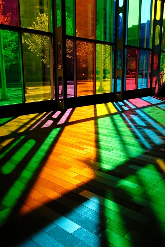
Secular buildings borrowed the glamour. Libraries, university halls, city chambers, and grand houses used armorial glass, allegorical figures, and floral ornament to claim dignity. In those rooms the window is less sermon than signature: a way for an institution to say it takes permanence seriously. Either context shares the same physical poetry—glass that refuses to be only transparent.
Memorial windows add another layer: names, dates, and quiet symbols of vocation or loss. They ask viewers to pause longer than a pretty pattern demands. Even without reading the dedication, you can often sense the commemorative gravity in restrained palettes and centered emblems.
Color, contrast, and the eye’s path
Deep blues and reds dominate many historic palettes because those pot-metal colors were prized and stable. Greens, ambers, and flashed whites fill supporting roles. Designers balance dense color with clear or lightly tinted glass so the window does not become a dark wall. From inside on a bright day, that balance keeps interiors luminous rather than cave-like.
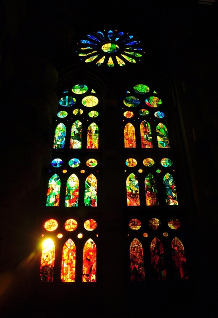
Photographers of stained glass learn humility. Expose for the bright panes and the stone mullions go black; expose for the architecture and the glass blows out. The images here generally honor the glass—color first—which is the right bias for a gallery about windows. When you visit in person, walk until your eyes adjust; the room and the window negotiate brightness differently than a camera meter does.
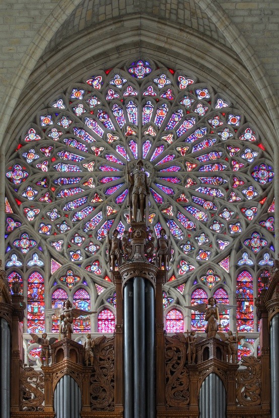
Composition inside the glass guides the eye the way a painting does: verticals lift, roses radiate, borders frame like manuscript margins. Stand far enough that the whole scheme locks together, then step in until a single face or leaf fills your vision. Both distances are correct; stained glass was designed for procession as much as for stillness.
Gothic inheritance, later revivals
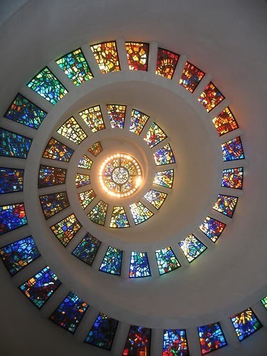
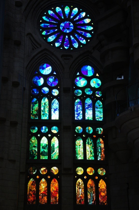
Medieval workshops set the template: narrative medallions, towering lancets, rose windows like frozen fireworks. Nineteenth-century revivals rediscovered the craft with industrial confidence—sometimes more polished, sometimes more sentimental, always eager to fill new churches and civic halls. Twentieth-century modernists stripped figures toward geometry, letting pure color fields do the preaching. The gallery’s variety hints at that long conversation without needing a museum label on every frame.
What unites the periods is respect for daylight as collaborator. Artificial light can show a window at night for tourists, but the authentic medium is the sun’s changing angle. A south-facing scheme behaves differently from a north clerestory. Architects who understand that place the richest glass where the day will animate it longest.
Regional glass cultures differ too: some favor jewel-box density, others airy grisaille with color accents. Traveling between buildings teaches your eye to spot those dialects. Online, the lesson is subtler—compare how much clear glass each window allows, and you begin to sense the workshop’s philosophy of light.
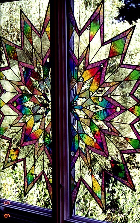
Living with colored light
Stand back first. Read the big shapes: cross, rose, tree of life, coat of arms, abstract lattice. Then step closer for painted faces, quarry patterns, and the slight warp of old glass that makes light swim. Notice repairs—newer pieces that do not quite match—as honest scars rather than failures. Living windows survive storms, wars, and restorations; perfect uniformity can signal a recent copy more than a medieval survivor.
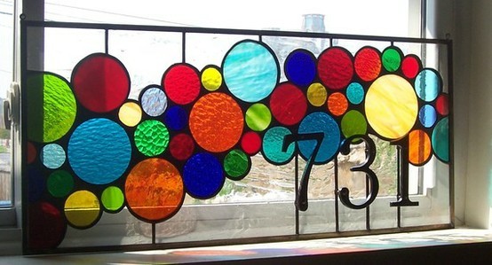
If you design interiors, borrow lessons carefully. A single antique or artisan panel in a stair hall can outshine a wall of generic décor. Protect it from harsh continuous spotlighting that heats the glass, and let daylight remain the primary source. Stained glass wants to be a window, not a backlit poster. Keep nearby surfaces matte enough to catch color pools without competing chrome glare.
For visitors, patience is the ticket. Arrive when the forecast promises broken cloud. Watch one bay for ten minutes. The show is free and never repeats the same way twice.
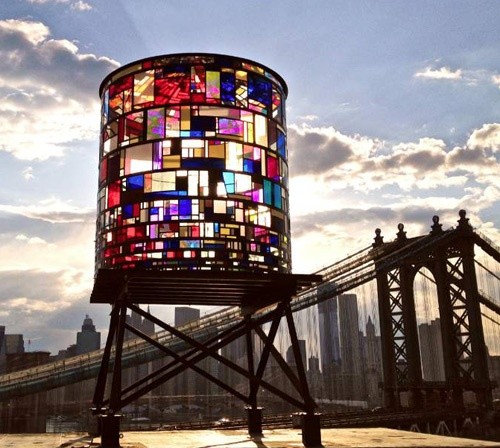
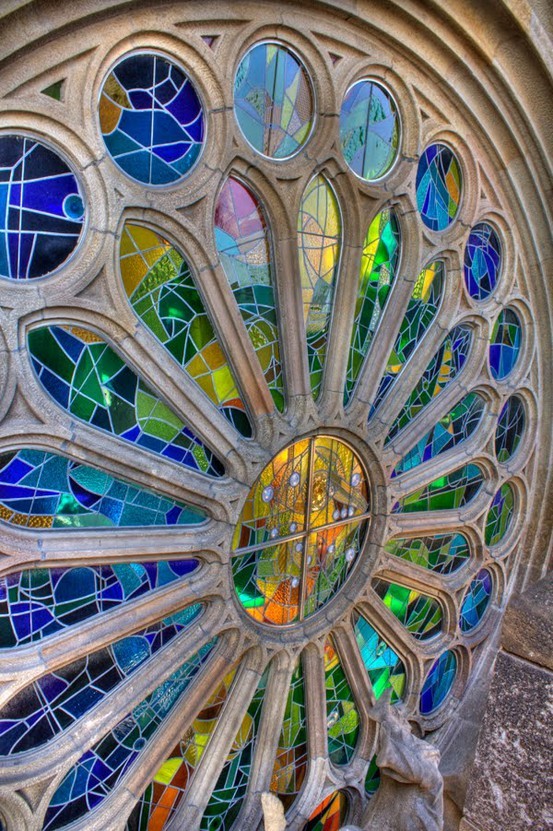
Which pane would you stand under at four in the afternoon, when the color finally climbs the opposite wall? That question is a fair way to leave the set—not with a ranking of masterpieces, but with a private appointment between your eyes and whichever window still holds the light.

Comments
Continue reading
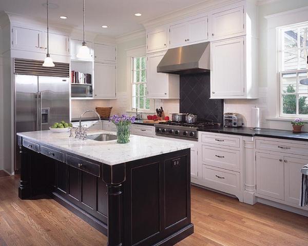
Kitchen Design Ideas: Layout, Storage, Light, and Finishes That Work
Practical kitchen design ideas—work zones, cabinetry, lighting, and durable finishes—so inspiration translates into rooms that cook and gather well.
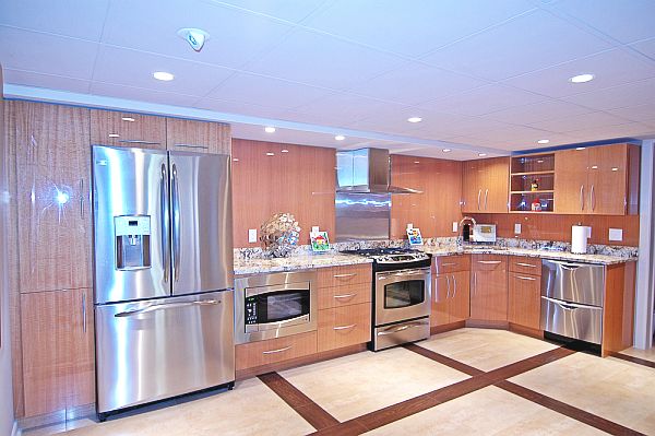
18 Kitchen Design Ideas: Gloss Cabinets, Smart Layouts, and Practical Finishes
Eighteen kitchen design directions—from high-gloss wood-look cabinetry and stainless suites to islands, pantries, lighting, and backsplash strategies—anchored by the surviving gallery photo.

Exclusive Home Theaters: Designing a Private Cinema
Seating geometry, blackout light, quiet acoustics, and screen-wall architecture—how luxury home theaters turn a room into a focused place for film.