
Home Dream Home: Simplicity as Everyday Sophistication
Edited rooms, quiet planes, and scarce accents—how simple interiors stay sophisticated without feeling empty or austere.
“Simplicity is the ultimate form of sophistication.” — Leonardo da Vinci
Simple rooms are not empty rooms. They are edited rooms: fewer competing ideas, clearer sightlines, materials allowed to speak once instead of shouting in chorus. This Home Dream Home chapter looks at interiors that feel airy and intentional—sunlit seating, quiet desks, restrained palettes—where sophistication comes from what you refuse to pile on as much as from what you buy.
If a space photographs as “minimal” but still makes you anxious to set down a glass, it is not simple yet. True simplicity reduces friction: walking is easy, cleaning is obvious, and the eye always knows where to rest.
Simplicity as a method, not a brand of furniture
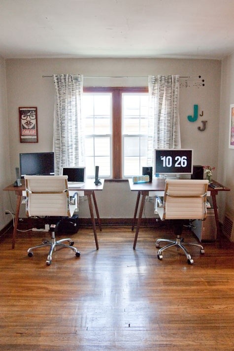
People often treat simplicity as a style label—Scandinavian white boxes, or hard minimalism with one black chair on a concrete floor. A more useful definition is operational. Every object has a job. Large surfaces stay calm. Accent moments are rare enough to matter. A turquoise glass lamp on an otherwise quiet desk is simple. Ten competing accessories on the same desk are complexity wearing pretty clothes.
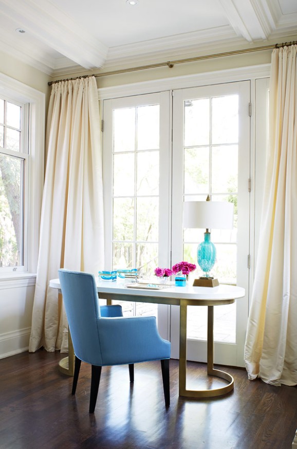
Da Vinci’s line links simplicity to sophistication, not deprivation. The oval white desk with a curved metal base, the single blue chair, cream curtains on French doors, dark wood floors, and one cluster of bright flowers feel refined because proportions are considered and clutter is absent. The flower is allowed precisely because the field around it is clear.
Begin by naming each room’s primary job: sleep, cook, work, gather, bathe. Remove objects that serve a different job. Charging cables in the living room, laundry on the dining chair, and mail on the kitchen island are complexity disguised as everyday life. Give each category a home, then reassess décor. Most rooms need subtraction before they need a new lamp.
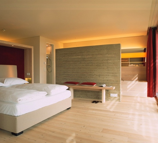
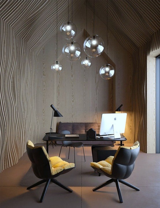
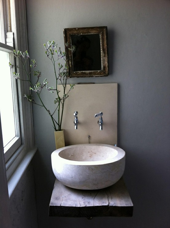
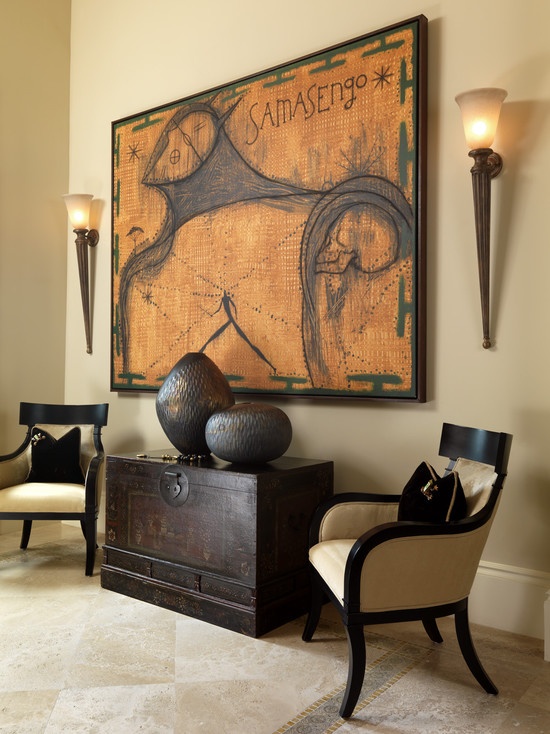
Protect the three big quiet planes
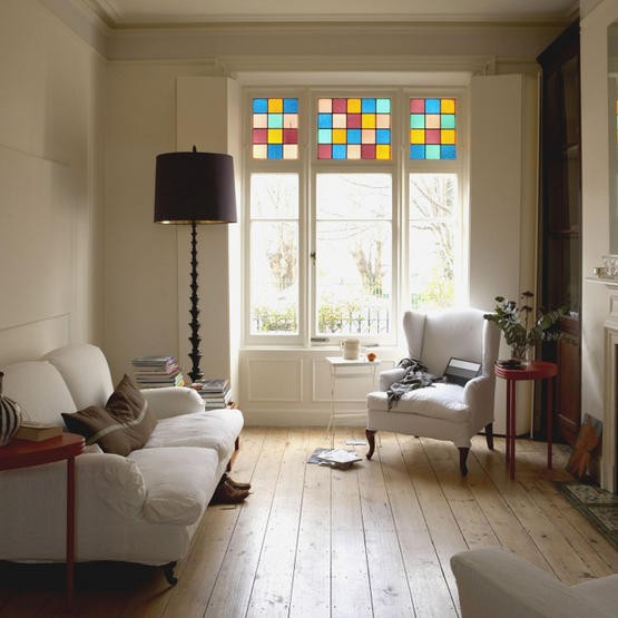
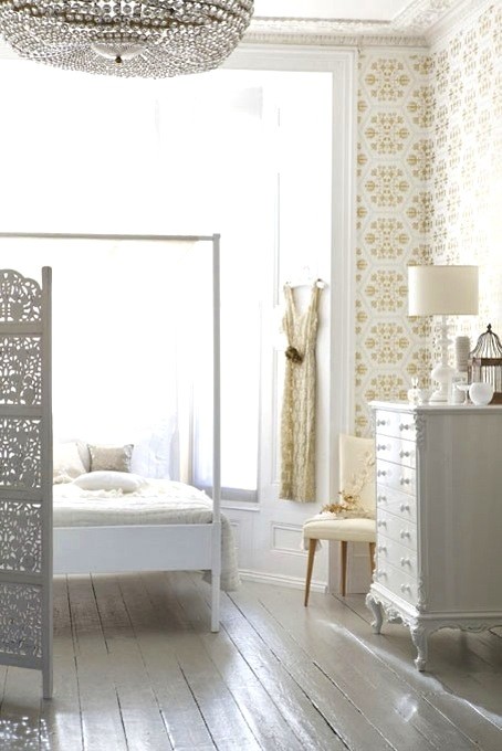
Simple rooms usually protect walls, floors, and windows as continuous planes. Walls stay one calm color instead of becoming a patchwork of leftover accent experiments. Floors are continuous wood or one large rug rather than a scatter of tiny mats that chop the room into leftovers. Windows are allowed to be architecture—mullions, French doors, even a playful band of colored glass—without heavy valances fighting them for attention.
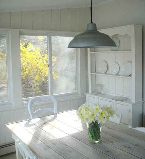
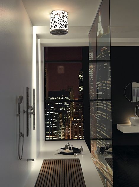
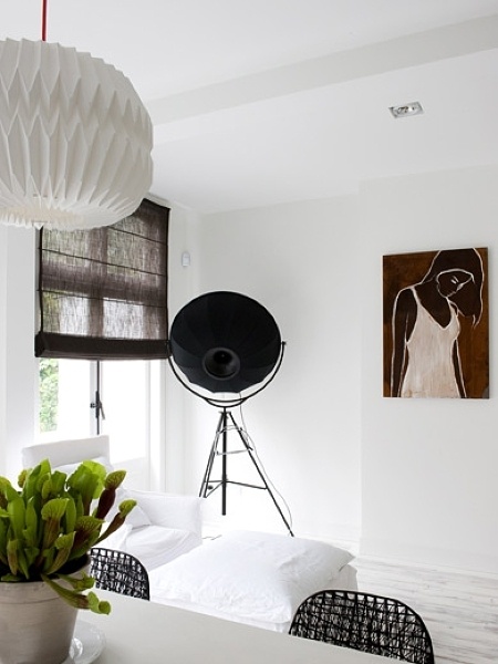
Daylight does half the styling work. Pull furniture slightly off the glass so light can wash the floor. Choose curtain fabric that stacks clear of the panes when open. Use simple ceiling light for cleaning and lamps for living. Avoid installing five fixture styles in one sightline; mixed metals and mixed eras create visual homework.
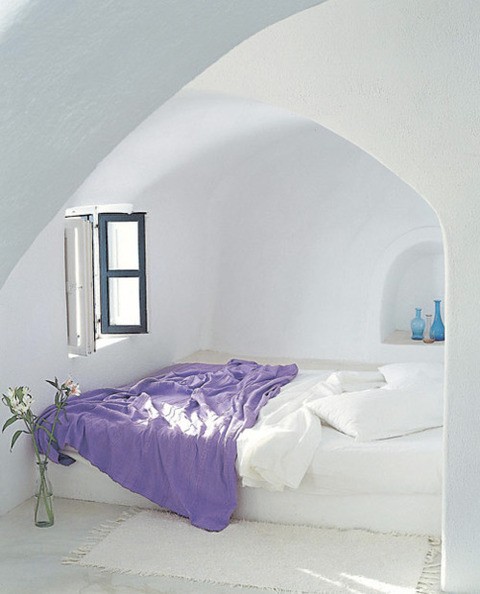
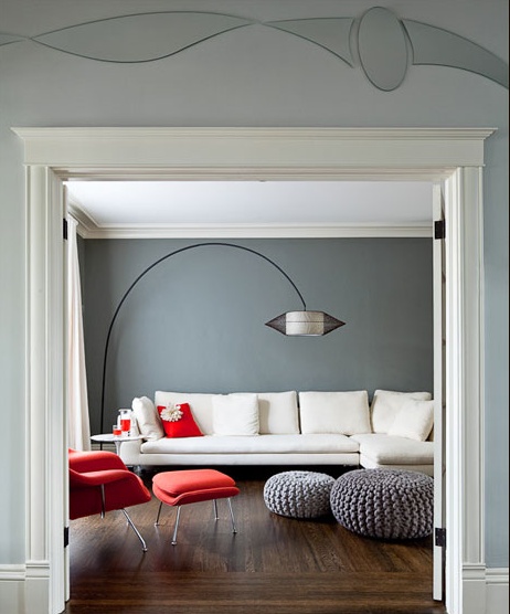
Color restraint does not forbid color. A pair of red side tables, stained-glass squares, or one turquoise lamp can vivify a white room. The rule is dosage. Accents should be countable on one hand. If you cannot list them quickly while standing in the doorway, you have drifted into noise.
Contrast still matters. Dark floors against pale walls, or a saturated chair against a quiet desk, keep simple rooms from looking unfinished. Flat sameness is not the same as calm. Calm has hierarchy.
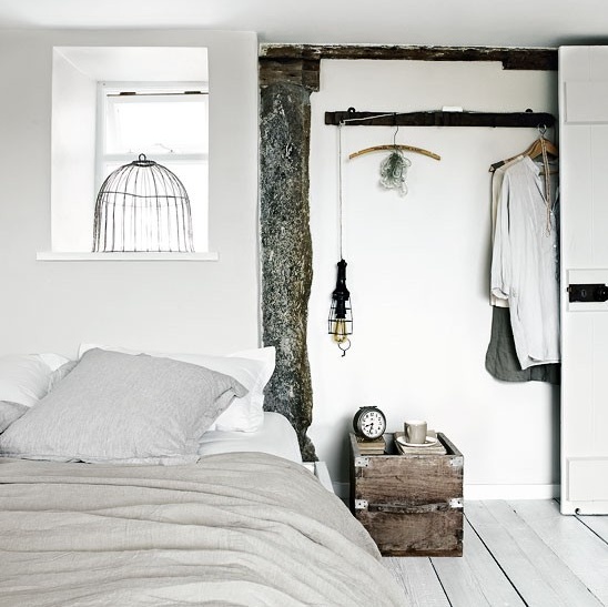
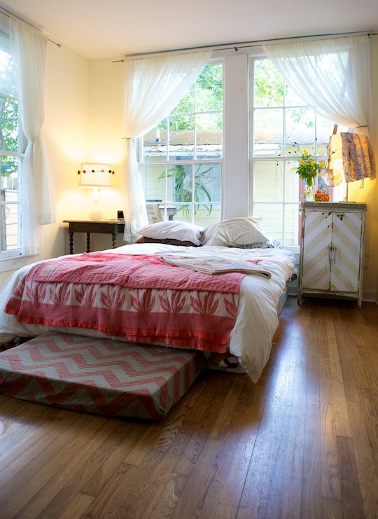
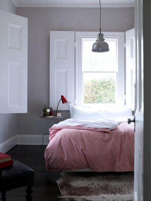
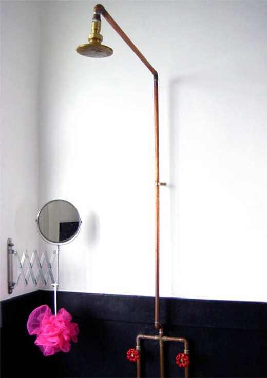
Fewer furniture pieces, clearer silhouettes
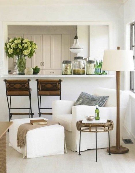
A simple plan prefers one sofa and one chair over a showroom cluster. Negative space between pieces is part of the design; it lets you walk and lets the eye rest. Choose silhouettes with readable outlines—an oval desk, a wingback, a straight-legged bench—so each piece registers from across the room without decorative apology.
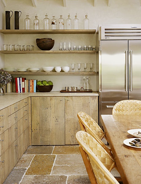
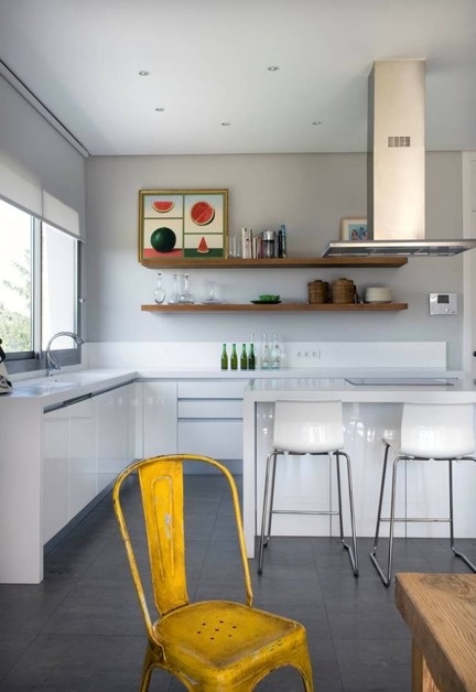
Built-ins can be the strongest simplicity tool when they hide mess: continuous cabinetry, a media wall with closed drawers, shelves that stop before they become clutter magnets. Open shelving only stays simple if you edit it weekly. Closed storage forgives real households and keeps the visible story short.
Scale honesty prevents false minimalism. An oversized sectional in a small room creates complexity because every path becomes an obstacle course. Measure walkways with arms full of groceries. If a piece forces constant micro-negotiations, it is not simple no matter how “clean” the fabric looks in a swatch book.
Multifunction pieces help when they do not look like gadgets. A bench with hidden storage, a desk that truly clears at night, or nesting tables that disappear between uses beat clever furniture that requires a manual.
Surfaces and the one-story rule
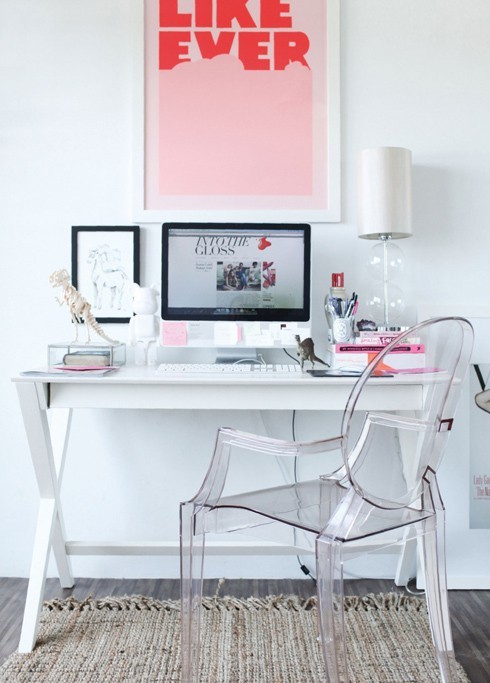
Give each major surface a default story. A desk holds lamp, one vessel, and active work. A coffee table holds a tray and a book. A nightstand holds lamp and book. Temporary piles get a lidded basket or a drawer. The one-story rule—only one decorative narrative per surface—stops the slow creep of souvenirs, candles, and bowls that each seemed harmless alone.
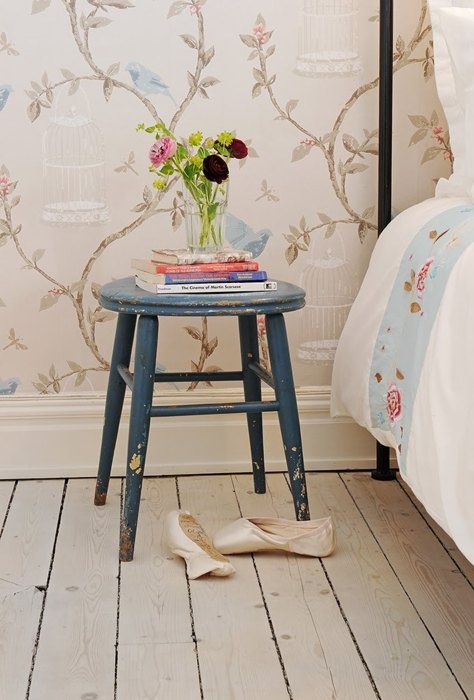
Books on the floor can look casual and still simple if they are a deliberate low stack, not a landslide against the baseboard. Magazines left as permanent props become static. Prefer vertical storage for paper when you can.
Plants earn their footprint only when light supports them. One healthy plant beats three struggling ones that advertise neglect. Artificial stems are acceptable if dusted and well proportioned; sun-bleached plastic breaks calm faster than an empty corner would.
Cables are visual noise. Route them, sleeve them, or hide them behind furniture. A beautiful lamp with a snarl of black cords underneath quietly cancels the sophistication of the shade.
A maintenance habit that keeps the edit honest
Simplicity decays without a ritual. Once a week, walk each main room with a basket and remove anything that does not belong to that room’s job. Wipe one large surface completely empty, then return only the default objects. Take a phone photo from the doorway; the camera reveals clutter the eye has normalized.
Seasonal rotation helps. Store excess pillows and décor so the room can breathe between holidays. Finite storage forces better buying decisions than endless open shelves ever will. When a surface fills, the next step is subtraction, not a bigger tray.
If a room still feels busy after the weekly edit, remove one more large idea—an extra pattern, a second rug, a redundant chair—before you add anything new. In this collection, sophistication is the confidence to stop while the room still has air.

Comments
Continue reading
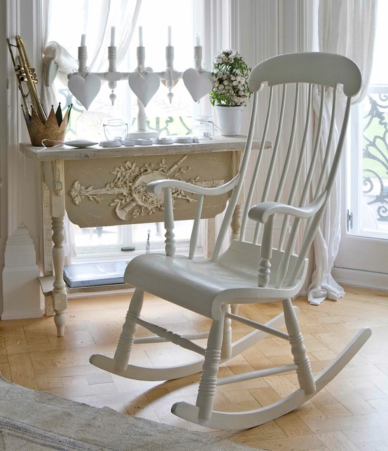
Home Dream Home: Romantic Details for Soft, Vintage Rooms
Ethereal light, French-inspired silhouettes, and weathered whites—how to add romance with sheers, candles, and inherited-feeling pieces.
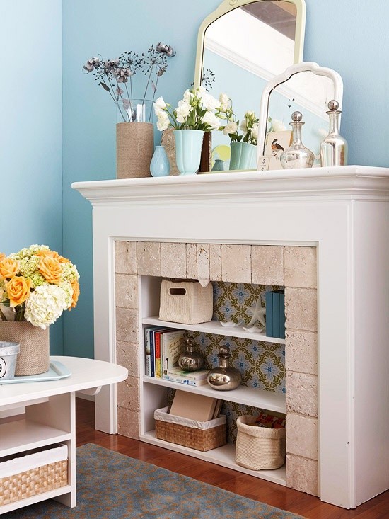
Home Dream Home Part 2: Soft Renovation and Layered Interiors
Inspiration for gentle home updates—fireplace restyles, pastel dining chairs, texture layering, and a weekend plan that turns photos into real moves.
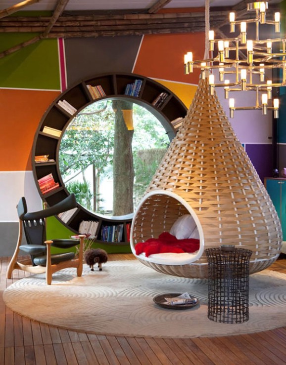
Home Dream Home Part 3: Statement Rooms and Compact Architecture
Dream-home inspiration built around bold structure—hanging lounges, circular windows, tiny-house volumes, and the questions to ask before you chase a hero piece.