
Victoria’s Secret Valentine’s Day Collection, 2013
Red-and-pink Very Sexy edits, limited lace, and the Temptation fragrance launch—a seasonal retail chapter, not the November runway show.
In early February 2013, Victoria’s Secret rolled out a Valentine’s Day assortment built for stores, the catalogue, and the website—reds, pinks, limited-edition lace, and gift-adjacent extras timed to the holiday week. This is seasonal retail fashion, not the November runway extravaganza at the Armory. No circus segments, no broadcast wings: a commercial collection meant to be chosen, wrapped, and worn.
The campaign mood was romantic confidence rather than costume fantasy. Models including Candice Swanepoel and Lily Aldridge appeared in store appearances and lookbook imagery promoting picks from the Very Sexy universe, with additional faces such as Karlie Kloss, Barbara Palvin, and Behati Prinsloo circulating through the season’s photography. The palette stayed close to valentine shorthand—scarlet, blush, soft black accents—while silhouettes emphasized push-up constructions, lace trims, and coordinated separates.
What “Valentine’s collection” meant in 2013
Victoria’s Secret has long used calendar holidays as merchandising chapters. Valentine’s sits between post-holiday clearance and spring floorsets, so the assortment needs a clear emotional hook. In 2013 that hook was temptation-with-a-bow: limited-edition Valentine’s lace on familiar bra architectures, gift sets, and fragrance launches that could sit beside intimates on a counter.
Contemporary brand messaging highlighted the Very Sexy collection—including new lace treatments and Bombshell push-up styles—in saturated reds and pinks. Dream Angels and Body by Victoria pieces also appeared in seasonal lookbooks, giving shoppers a ladder from softer everyday silhouettes to more dramatic holiday buys. The point of the edit was choice within a color story, not a single hero SKU forced on every body and every budget.
Merchandising tables did the rest of the storytelling. Matching sets, gift boxes, and “complete the look” bottoms turned a bra decision into a present. Even small add-ons—robes, slippers, cards—helped a partner who felt lost in the intimates aisle leave with something finished. That is retail choreography as much as design.
Color, fabric, and silhouette
Seasonal lingerie design works through a short list of signals. Red reads celebratory and bold. Pink reads playful or tender depending on saturation. Black lace cools the sweetness so the story does not tip into costume. Satin and smooth microfibers photograph as glossy gift objects; scalloped lace photographs as texture you want to touch through a screen or catalogue page.
Push-up and plunge shapes dominated the conversation because they deliver an immediate “dressed for the evening” change under clothes or in campaign frames. Demi cups and lighter lined styles offered a quieter path for the same color story. Bottoms—cheeky cuts, hiphuggers, classic briefs—were merchandised as mix-and-match partners rather than afterthoughts, because Valentine’s tables sell sets as much as single bras.
From a design-history angle, notice what did not change. Fit architectures customers already trusted stayed in place; novelty lived on the surface—lace exclusives, seasonal dyes, hardware details, packaging. That is how a mass brand creates urgency without inventing an entirely new product category every February.
Fragrance as the parallel launch
Alongside the apparel, Victoria’s Secret introduced limited-edition Very Sexy Temptation—a fruity-floral fragrance story with notes called out in press materials as passion flower, Moroccan jasmine, and blushing orchid—available as perfume, mist, and body lotion. A men’s counterpart, Very Sexy for Him Platinum, extended the gift aisle with a bolder scent profile. Pairing fragrance with lingerie is classic February strategy: two categories, one shopping trip, easier bundle math for shoppers who dislike guessing cup sizes.
Fragrance also gave the campaign a sensory claim beyond color. Lookbooks can show lace; a mist suggests a complete ritual. In 2013 that dual launch helped the Valentine’s story feel bigger than a temporary bra dye lot. Counter displays could stack bottles beside folded sets and call the whole island a gift destination.
How the campaign was framed
Store appearances at flagship locations—such as Herald Square in New York—put Angels in the retail environment itself, collapsing the distance between catalogue fantasy and shopping floor. Behind-the-scenes clips and lookbook galleries (sometimes titled in the vein of “My Tempting Valentine”) extended the same imagery online. The tone stayed glossy and flirtatious, aimed at adult shoppers buying for themselves or for a partner.
Fashion writing can cover that imagery without turning exploitative. Focus on merchandising logic: seasonal colorways, limited lace stories, gift packaging, and how a mass intimates brand turns a calendar date into a two-week sales chapter. Describe construction and palette. Credit the campaign as commercial photography with a job to do. Leave the leer out.
If you are studying the lookbooks now, pay attention to how faces, hands, and fabric fill the frame. Soft focus on lace edges, repeated red-pink blocking, and gift props are the grammar. The collection sold romance as a shoppable system, not as a single viral runway exit.
Runway show vs. Valentine’s floorset
It helps to keep the brand’s November Fashion Show and its February collection in separate mental folders. The Fashion Show is theatrical costume for television—wings, crystals, live pop sets, segment narratives at an armory. The Valentine’s assortment is commercial product: priced, sized, folded on tables, shipped from distribution centers. Shared DNA exists—glamour, Angels as ambassadors, “sexy” as house language—but the jobs differ. One manufactures attention. The other manufactures sell-through before February 14.
Readers hunting Armory lore, Fantasy Bras, and segment names belong on the 2012 runway feature. Readers hunting how a major lingerie label packaged romance for 2013 shoppers belong here: red-and-pink Very Sexy edits, Dream Angels alternatives, fragrance sidekicks, and campaign photography built to make a holiday cart feel intentional.
Reading the collection as design history
Early-2010s Victoria’s Secret Valentine’s campaigns belong to a period when print catalogues, store theater, and early social clips still shared the load. The visual formula—saturated romantic color, push-up emphasis, Angel ambassadors—was already familiar, which is precisely why small twists (a lace exclusive, a named fragrance, a gift wrap story) mattered. Differentiation inside a template is the craft.
From a styling perspective, the wearable lesson is simple. A strong seasonal story usually needs only one loud variable. In 2013 that variable was holiday color and lace, applied to known fits. Shoppers could chase novelty without abandoning the bra shape they already trusted. Designers in any category can steal that trick: change the surface, protect the architecture, and let packaging finish the gift narrative.
Another lesson sits in the ladder of options. By showing Very Sexy drama beside Body by Victoria and Dream Angels softness inside the same holiday color world, the brand reduced the chance a shopper would bounce because “nothing feels like me.” Seasonal merchandising succeeds when it offers multiple temperatures of the same mood.
A short checklist for looking back
- What color carries the holiday?
- Which silhouette is pushed as the hero?
- What non-apparel add-on completes the gift?
- How does the campaign separate this week from ordinary restocks?
For Victoria’s Secret in February 2013, the answers were red-pink romance, Very Sexy and Bombshell push-up energy, Temptation fragrance on the side table, and limited lace as the “only now” reason to buy. Hearts on the marketing, merchandise on the floor—February, done as a timed retail chapter.

Comments
Continue reading
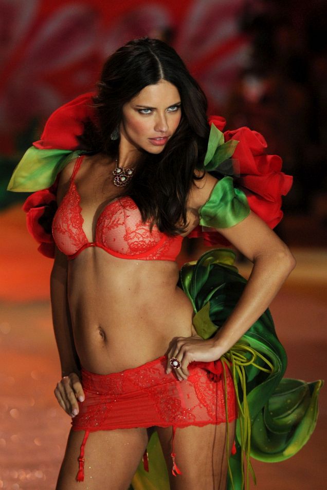
Victoria’s Secret Fashion Show, New York 2012
Six runway segments, live sets by Rihanna, Justin Bieber, and Bruno Mars, and the costume spectacle at the 69th Regiment Armory after Hurricane Sandy.
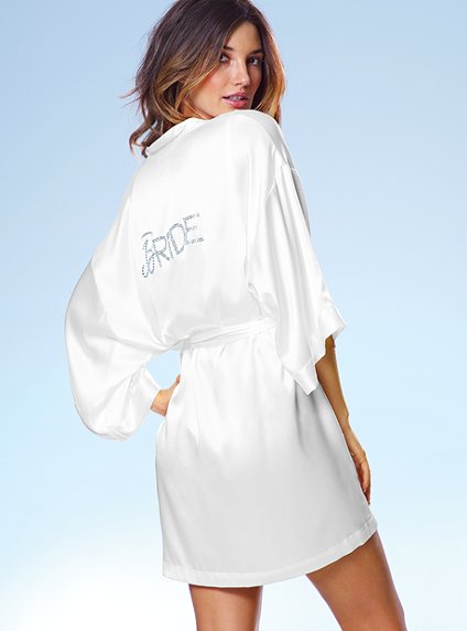
Victoria’s Secret Bridal Lingerie: Lace, Ivory, and Early-2010s Romance
A tasteful look at early-2010s Victoria’s Secret bridal lingerie—lace, soft colour, campaign mood, and how commercial bridal codes shaped intimate fashion.
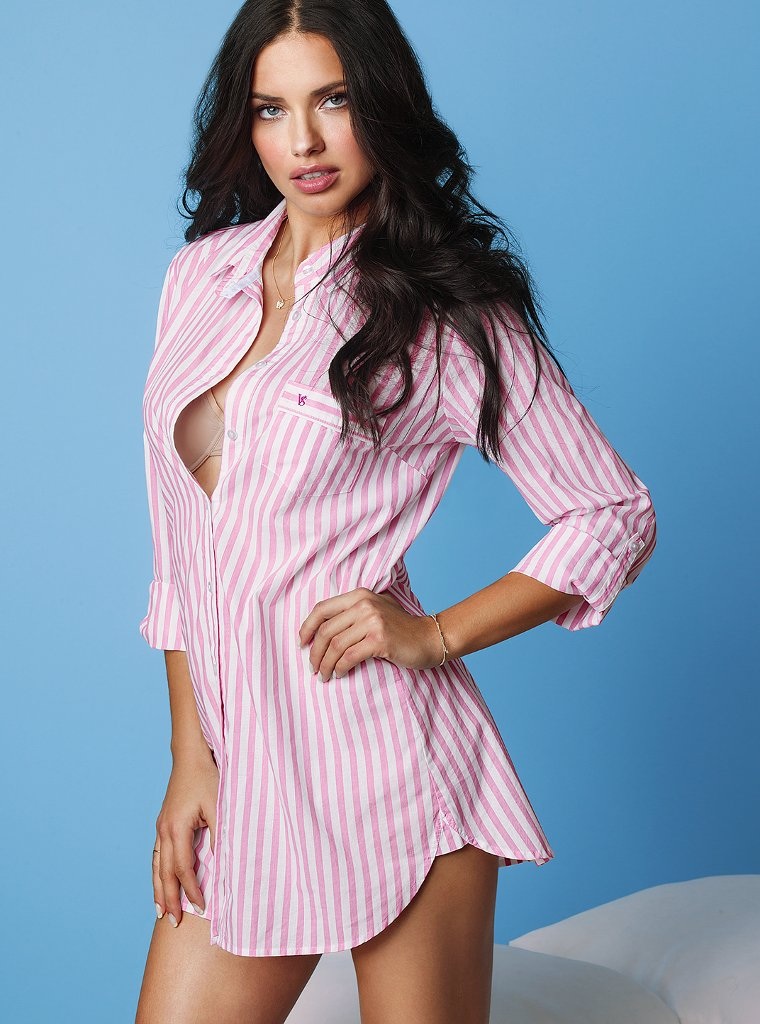
Adriana Lima in Victoria’s Secret’s April 2013 Lookbook
Pink-striped sleep shirt, sky-blue seamless, gold chains—Adriana Lima’s surviving frame from Victoria’s Secret’s April 2013 lookbook.