
Adriana Lima in Victoria’s Secret’s April 2013 Lookbook
Pink-striped sleep shirt, sky-blue seamless, gold chains—Adriana Lima’s surviving frame from Victoria’s Secret’s April 2013 lookbook.
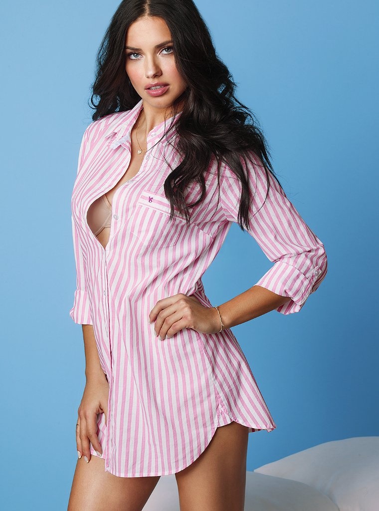
In April 2013, Victoria’s Secret circulated a lookbook starring Adriana Lima—soft studio light, sky-blue seamless, and the kind of striped sleep shirt that sold “weekend at home” as much as it sold lingerie. Lookbooks of that era sat between campaign films and e-commerce grids: styled enough to feel like editorial, product-clear enough to move units. Lima, already one of the brand’s most recognizable Angels, was the casting that needed no caption.
The single frame preserved from that April package is enough to read the mood. Oversized pink-and-white vertical stripes, nude bra underneath, rolled sleeves, small embroidered pink mark on the pocket, gold jewelry catching the key light. Hand on hip, eyes on camera, white bedding edge in the corner. It is commercial fashion doing what it did best in 2013: make sleepwear look like a lifestyle still.
The April lookbook frame
Lima stands mid-thigh up, body angled slightly right, left hand on hip, right arm relaxed. Long dark waves fall over her shoulders. Light blue-green eyes meet the lens with a calm, parted-lip confidence that was already her public signature. A thin gold necklace with a small pendant, a delicate bracelet on the left wrist, and a simple ring on the right hand keep the metal quiet—enough sparkle for a beauty close-up without competing with the shirt’s stripe rhythm.
The shirt is the product hero. Light cotton or poplin, pink and white bars running long, front largely unbuttoned to show a smooth beige bra, sleeves rolled to three-quarter length, curved shirttail hem. On the left breast pocket sits a small pink embroidered logo in the Victoria’s Secret family of marks—readable as brand without turning the photo into a billboard. Behind her, solid sky blue fills the studio; bottom right, a soft white cushioned edge suggests a bed or styled prop, anchoring the sleepwear fiction.
Lighting is bright, even, and forgiving—classic e-comm-meets-editorial hybrid. Shadows stay soft so fabric texture and skin remain clean for print and web crops. That technical neutrality is intentional. Lookbooks from spring 2013 needed files that survived blog scrapes, Tumblr reblogs, and brand site zooms. Adriana Lima’s face did the emotional work; the set did not fight her.
Why Victoria’s Secret cast Lima this way
By April 2013, Adriana Lima had been central to Victoria’s Secret’s public image for years: runway Angel, fragrance face, catalog and digital campaign regular. Fans associated her with Fantasy Bra moments and winged finales, but the brand’s commercial calendar also needed quieter chapters—bras and sleep shirts sold on ordinary Tuesdays, not only during the televised Fashion Show. A lookbook frame in stripes and blue seamless serves that quieter commerce.
Sleepwear and lounge shirting were growth categories in lingerie retail of the early 2010s. The oversized boyfriend-shirt silhouette promised comfort; the pink stripe promised youth and softness associated with the broader VS/PINK visual world even when the garment sat in the main brand lookbook. Unbuttoned fronts were a recurring styling trick: show the bra as a second product without a separate still. One photograph, two SKUs in the viewer’s mind.
Casting Lima rather than a lesser-known fitting model was a trust signal. Shoppers who followed Angels by name treated lookbook drops like celebrity content. Blogs (including galleries like this one) amplified those drops within days of release. The April 2013 date places the image in the post-winter, pre-summer stretch when brands refreshed lounge and travel sleep stories—light fabrics, brighter backdrops, less holiday red.
Reading the styling choices
Vertical pink stripes lengthen the torso and keep the oversized cut from looking shapeless. Rolling the sleeves exposes the wrist jewelry and prevents the shirt from swallowing her hands. The hip plant creates a classic fashion triangle—shoulder, waist cue, standing leg line—even when the garment is intentionally loose. Nude bra under pink stripe is a deliberate color hierarchy: underwear as skin-tone base, outer shirt as the loud graphic.
Jewelry stays gold and fine. Victoria’s Secret lookbooks of the period often mixed delicate chains with lingerie so the customer imagined the product with “real life” accessories rather than only showpiece wings. The sky-blue seamless is cooler than the warm pink shirt, which makes both colors pop—a simple complementary trick used across 2010s catalog photography. White bedding in the corner is barely there, but it completes the sleep narrative: this is not a runway, it is a styled bedroom that happens to have perfect light.
Lima’s expression matters as much as the clothes. She does not smile wide; she holds a neutral, slightly parted look that reads as campaign confidence rather than candid morning. That controlled face is how commercial beauty photography of 2013 kept intimacy without abandoning polish. Compare it mentally to harder editorial black-and-white (such as her Esquire UK work from the same spring season): here color is mandatory because the product is pink stripe and blue set. Different jobs, same model fluency.
Lookbooks in the 2013 media cycle
April 2013 sat in a media environment where Instagram was rising fast but brand lookbooks and blog galleries still moved fashion news. A Victoria’s Secret drop would appear on the official site, then fragment across style blogs, Tumblr, and image hosts. Single-hero posts—one strong frame, short caption—were common because scrapers and curators preferred clean verticals. The sparse original caption on this gallery (“Adriana Lima for Victoria’s Secret’s April 2013 lookbook”) reflects that curation habit: identify casting, brand, and date; let the photograph sell.
For historians of commercial fashion imagery, that sparseness is also a limitation. Full lookbooks contained multiple outfits, crops, and sometimes video. What survives here is a representative still—the sleep-shirt beat—rather than the entire April book. Treating it honestly means expanding context around the one file we have, not inventing a dozen missing outfits. The stripe shirt, blue cyc, and Lima’s stance are the evidence; career and brand calendar supply the frame.
Victoria’s Secret in 2013 was still at peak cultural volume: annual show buzz, Angel mythology, mall retail ubiquity in North America, and global name recognition. Critics already debated the brand’s beauty ideals; consumers still bought the fantasy in cotton and lace. Lookbook images like this one sat in the middle of that tension—selling softness and accessibility while starring a supermodel few customers resembled. The photograph does not resolve that tension; it simply documents how the brand wanted April to look.
Adriana Lima’s commercial grammar
Certain habits recur across Lima’s Victoria’s Secret archive: direct eye contact, controlled mouth, hair given volume, body angled rather than squared flat to camera. This April frame follows the grammar. The slight body turn thins the silhouette under a boxy shirt; the hip hand prevents the oversized garment from reading as tent; the gaze sells confidence more than flirtation. Angels were trained in that vocabulary on runway and in studio alike.
Brazilian modeling success in the 2000s and early 2010s—Lima among the most famous—had already reshaped lingerie advertising’s international face. By 2013 her name alone moved clicks. Pairing that name with an approachable sleep shirt was strategy: aspirational casting, wearable product. The embroidered pocket logo seals ownership without a giant wordmark across the chest. Viewers who followed the brand would clock it instantly; casual scrollers would still see “pretty striped shirt on Adriana Lima.”
Gold jewelry against pink stripe also nods to daytime luxury rather than nighttime glitz. Sleepwear campaigns often walk a line between boudoir and brunch. This image chooses brunch-adjacent: bright blue, rolled sleeves, soft bed edge, no heavy smoke or crystal. That choice fits an April refresh—lighter season, lighter story.
Keeping the picture useful
If you are studying commercial styling, note three reusable moves: (1) let one loud textile carry the frame, (2) use a cool seamless to lift warm product color, and (3) show underlayer deliberately so lingerie remains visible inside loungewear. If you are studying Lima’s pose library, note the hip plant and the unsmiling direct look—tools she used across years of VS work. If you are simply remembering April 2013 fashion media, remember that lookbooks still functioned as shareable celebrity content even when they were, fundamentally, sales tools.
The sky-blue still does not need a harder sell than that. Adriana Lima wears the season’s sleep shirt the way Victoria’s Secret wanted the season remembered: bright, branded, and calm under studio lights. One lookbook frame, kept intact, is enough to reopen that April—and to show how a single product photograph could carry a name as large as hers.

Comments
Continue reading
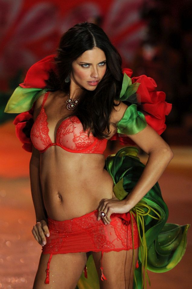
Victoria’s Secret Fashion Show, New York 2012
Six runway segments, live sets by Rihanna, Justin Bieber, and Bruno Mars, and the costume spectacle at the 69th Regiment Armory after Hurricane Sandy.
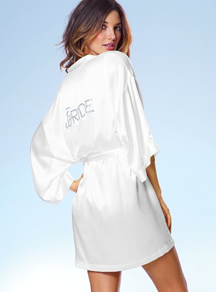
Victoria’s Secret Bridal Lingerie: Lace, Ivory, and Early-2010s Romance
A tasteful look at early-2010s Victoria’s Secret bridal lingerie—lace, soft colour, campaign mood, and how commercial bridal codes shaped intimate fashion.
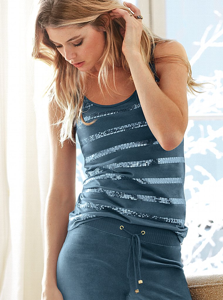
Doutzen Kroes for Victoria’s Secret: The October 2012 Lookbook
A historical look at Doutzen Kroes fronting Victoria’s Secret’s October 2012 fall lingerie lookbook—catalog craft from the Angel-era retail calendar.