
Ombre Home Details: Gradients on Walls, Textiles, and Objects
How to use soft color fades on walls, curtains, furniture, and DIY sets—readable gradients, undertone matching, and small projects before big paint.
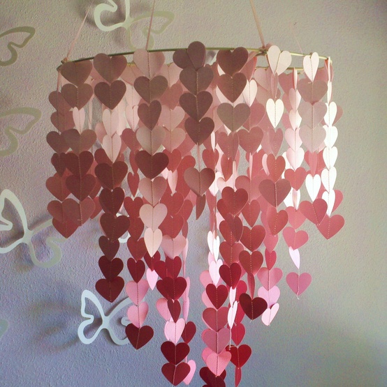
Ombre is color in motion: one hue shifting lighter, darker, or into a neighbor along a wall, curtain, vase set, or piece of furniture. Unlike a hard color block, the fade softens edges and makes transitions feel deliberate. The effect works in quiet pastels and in deeper jewel tones; what matters is a readable gradient, not a muddy blend that looks like a paint mistake.
Homes pick up ombre easily because it scales. You can paint a full wall from floor to ceiling, dip-dye a set of curtains, arrange candles or jars in stepped tones, or upholster a headboard that moves from charcoal to mist. The same idea appears on ceramics, rugs with tonal bands, and stair runners that deepen as they climb. Once you see the gradient logic, you start spotting places to try it.
How a good gradient reads
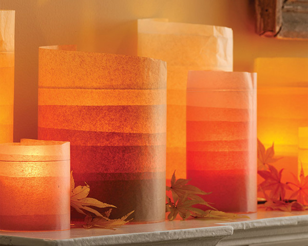
Successful ombre keeps a single color family or a short bridge between two related hues. Soft coral fading to cream, blue sliding into gray, or forest green lifting toward sage all feel coherent. Jumping from neon lime to hot magenta in five inches usually reads as stripe, not ombre. Give the transition enough length: on a wall, that often means the fade spans most of the height; on objects, a row of four or five stepped tones works better than two abrupt jars.
Direction matters. Floor-to-ceiling fades often go darker at the base and lighter toward the ceiling to lift the room, though a reverse gradient can ground a tall space. Curtains typically deepen toward the hem so the weight sits visually at the floor. Horizontal ombre on a long wall can stretch a narrow room if the lightest band sits near a window.
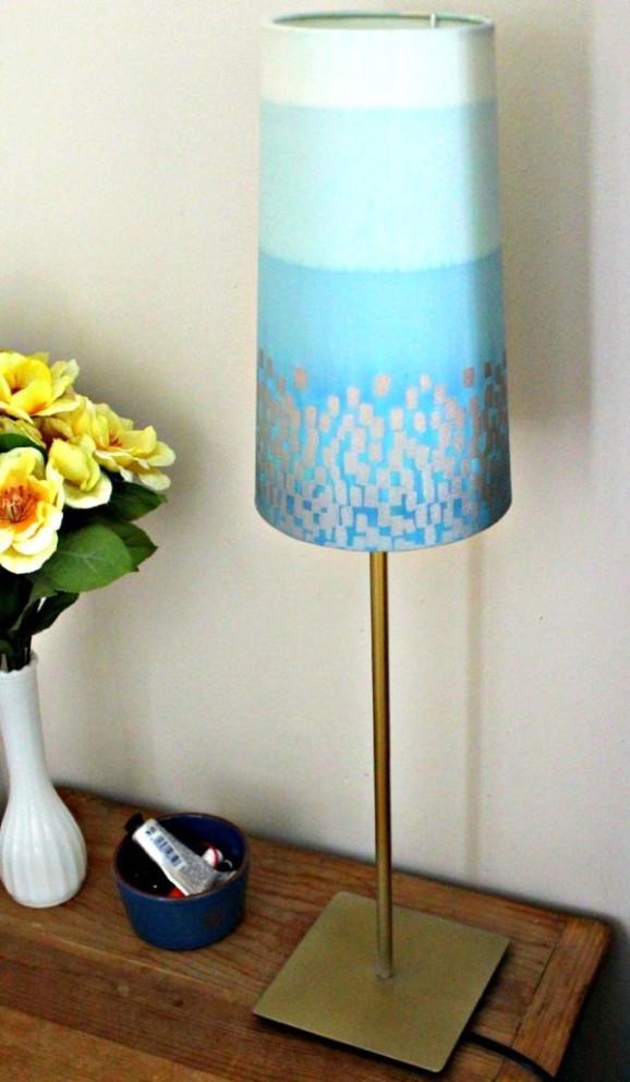
Finish choices change the mood. Matte paint softens transitions; gloss can create hot spots that break the fade. Distressed or rubbed finishes on DIY pieces—painted jars, side tables—add texture so the gradient feels handmade rather than printed. Keep lighting even across the fade; a single spotlight on the darkest band can flatten the effect.
Walls, curtains, and large surfaces
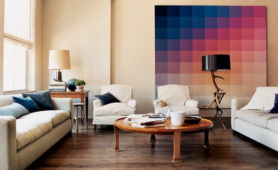
Wall ombre rewards patience. Work in blended bands while the paint stays wet, or use a sponge and glaze to merge edges. Mark light pencil guides, mix more mid-tones than you think you need, and step back often. A sample board the full height of a door is worth the afternoon; phone photos of wet paint can lie about the final dry shift.
If full-wall painting feels intimidating, try a headboard wall behind the bed, the niche inside a bookshelf, or the back of an open closet. Smaller fields forgive uneven blending and still deliver the gradient story. Removable ombre wallpaper exists for renters; check pattern repeat so the fade aligns at seams.
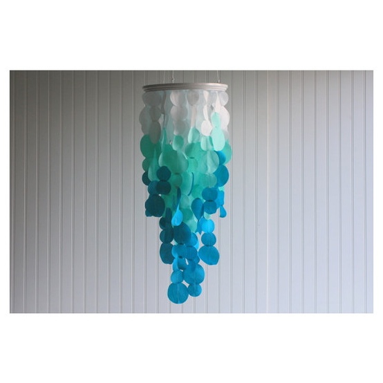
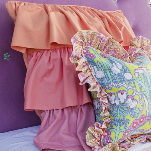
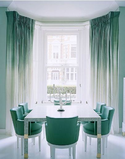
Curtains and sheers are among the easiest textile ombres. Dip-dye cotton or linen, or buy ready-made panels with a tonal wash. Hang them full height so the transition has room. Pair ombre drapery with plain walls; patterned wallpaper plus gradient fabric often cancels both ideas. Roman shades with a soft vertical fade suit kitchens and baths where full drapery is impractical.
Furniture and decorative objects
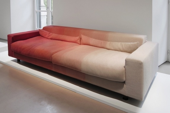
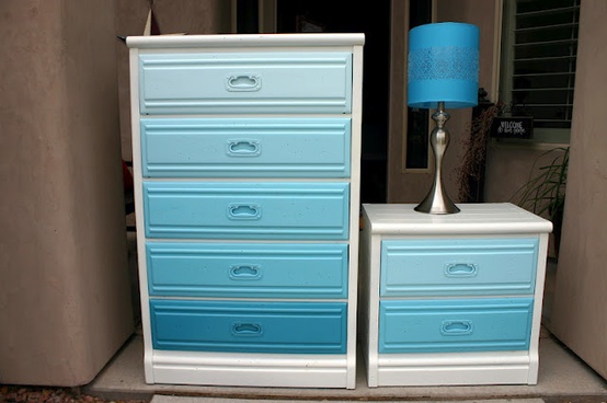
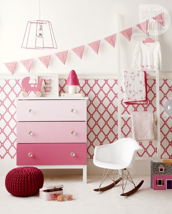
Furniture ombre can be painted—dresser drawers stepping from dark to light—or upholstered with tonal fabrics. Even a simple bench with ombre seat cushions introduces the idea without refinishing a whole piece. Keep hardware quiet; shiny brass every six inches will interrupt the fade more than matte knobs in one finish.
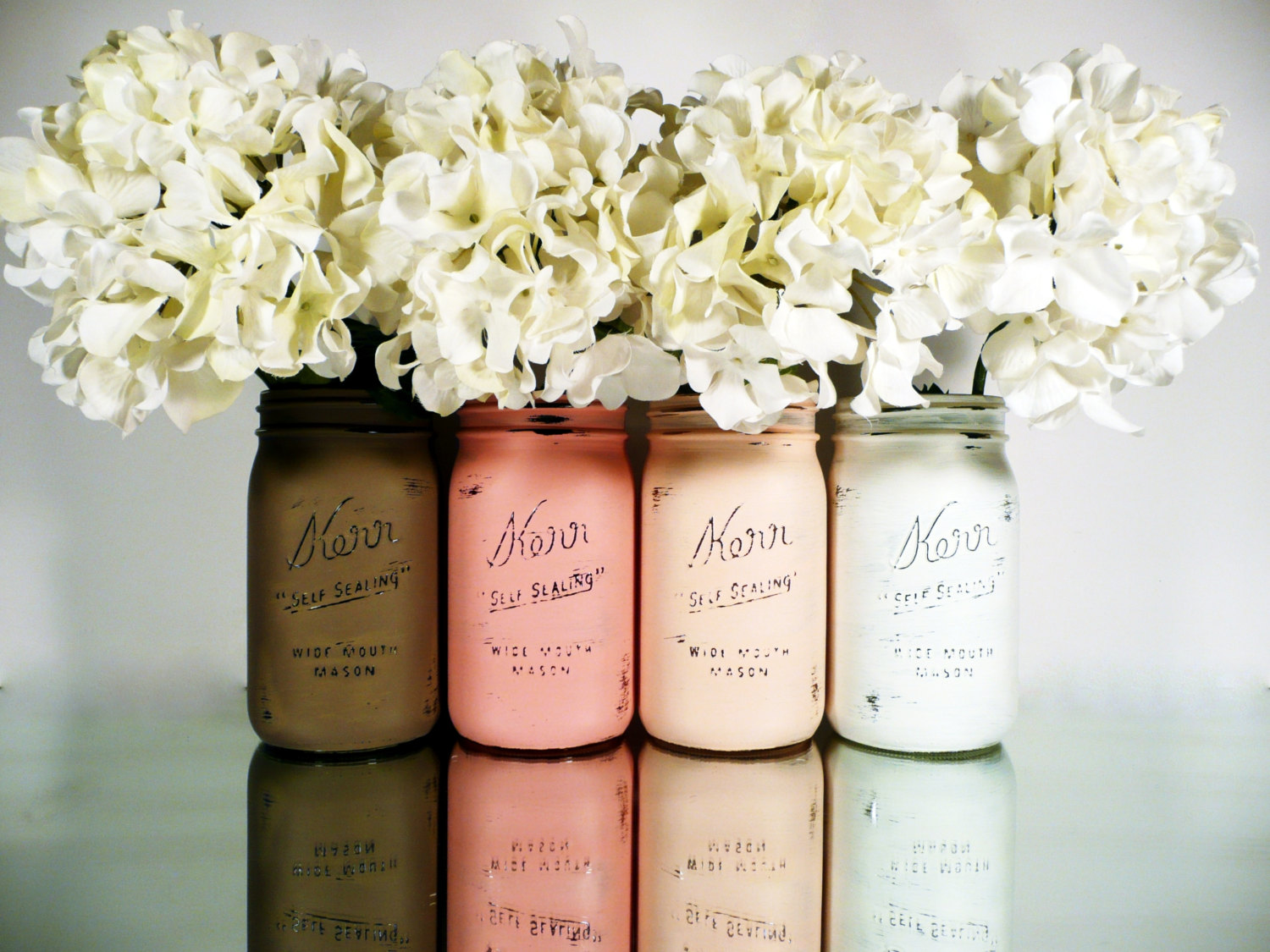
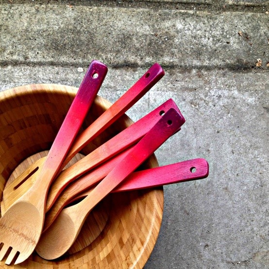
Small objects shine in sets. Mason jars, bottles, or candleholders painted in graduated tones become a mantel or table story when lined up light to dark. Fill them with the same flower or greenery so color, not bouquet variety, carries the eye. Ceramics with glaze that pools darker at the base are ready-made ombre; group three heights in one glaze family.
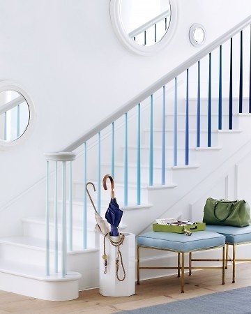
Rugs and runners with banded tonal stripes approximate ombre underfoot. Choose low-contrast bands for bedrooms and stronger steps for entries where you want direction. Avoid competing with a heavily patterned sofa; let either the floor or the seating own the gradient.
Color choices that wear well
Soft neutrals—sand to ivory, gray to white—age gracefully and suit rental constraints. Blush-to-cream and blue-to-fog feel romantic without demanding matching furniture. Deeper ombres (indigo to sky, burgundy to rose) suit dining rooms and dens where you want drama after dark. In small rooms, keep the lightest value near the ceiling or the window wall so the space does not close in.
Match undertones. A green-leaning gray will fight a purple-leaning mauve mid-tone. Buy all paints from one strip when possible, or mix mid-steps yourself from the end colors. For DIY craft paints on jars and trays, test on cardboard; craft acrylics dry darker than they look wet.
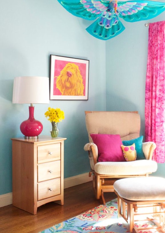
Coordinate with fixed elements. If your sofa is warm beige, cool blue ombre on the opposite wall may feel disconnected unless you bridge with wood tones or mixed metals. Pull one mid-tone from the gradient into a pillow or lamp shade so the fade belongs to the room, not only to one surface.
Try ombre in one afternoon
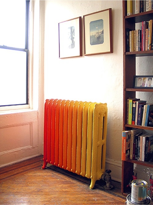
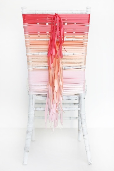
Not every gradient needs a scaffold and a sprayer. Start with a tray of objects: sort candles, books with cloth spines, or painted jars from light to dark on a shelf. Photograph the line; if the jump between two neighbors looks harsh, insert a mid piece or remove an outlier. That same sorting habit trains your eye for larger projects.
For a first paint experiment, choose a thrifted side table or a set of unfinished wood boxes. Sand lightly, prime if needed, and brush bands of color that you blend at the edges while damp. Stop before you overwork—muddy brown is the enemy of ombre. Seal with a clear matte finish so daily use does not burnish one band differently from the next.
Live with the small win for a week. If you still want the fade on a wall or curtain, you will approach the bigger surface with clearer preferences about direction, value range, and how much contrast feels right in your light. Ombre rewards that patience: the best gradients look inevitable, as if the color always knew where it was going.

Comments
Continue reading
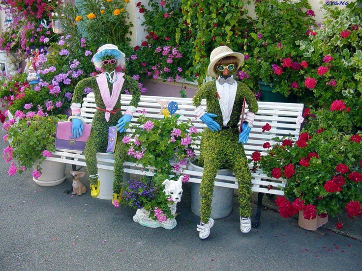
Garden Decoration Beyond Beds: Lace, Mosaiculture, and Upcycled Yard Art
From dressed topiary and floral cyclists to license-plate dragonflies and lace between trees—garden decorations that give a yard a voice.
Kitchen Design Ideas: Layout, Storage, Light, and Finishes That Work
Practical kitchen design ideas—work zones, cabinetry, lighting, and durable finishes—so inspiration translates into rooms that cook and gather well.
25 Cool Room Partition Ideas That Actually Divide Space
From frosted sliders and pallet screens to book towers and branch walls—twenty-five ways to carve rooms without building solid walls.