
Neon Home Colors: Bright Accents on a Quiet Base
How to use high-saturation reds, yellows, and blues at home—white envelopes, color blocking, and editable accents that feel intentional, not frantic.
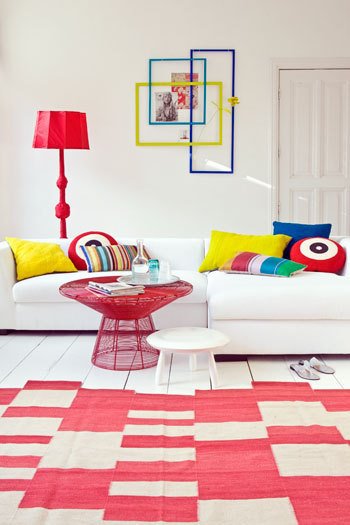
Neon at home is not about painting every wall electric pink. It is about controlled saturation: a few high-chroma objects, textiles, or light accents that read bright against a calm field. The rooms that work keep floors, sofas, and large wall planes quiet, then let red, yellow, cobalt, lime, or hot pink do the talking. That contrast is what makes color feel intentional instead of frantic.
Seasonal refreshes are the natural use case. When you want a room to feel awake after a long stretch of neutrals, neon-adjacent hues deliver energy faster than rearranging furniture. The trick is treating brightness as a layer you can edit—pillows, a lamp, a rug graphic, framed color blocks—rather than a permanent commitment across every surface.
Start with a white or quiet base
High color needs a resting place. White walls, pale wood or painted floors, and a light sofa give saturated accents room to breathe. Without that base, neon competes with itself and the eye never settles. Think of the large surfaces as a gallery wall: they should stay mostly blank so the “art” of color can land cleanly.
If pure white feels cold in your climate or lighting, use warm white, soft gray, or a barely-there cream. The goal is low chroma, not clinical sterility. Avoid pairing neon with busy wallpaper, heavy wood paneling, and patterned upholstery on the main seating all at once. Pick one quiet field and protect it.
Natural light amplifies neon. A red wire table or yellow pillow in a sunlit room will look vivid; the same pieces under dim warm bulbs can skew muddy or orange. Test paint chips and fabric swatches at the time of day you actually use the room. Evening-only spaces may need slightly clearer, cooler brights to keep punch after sunset.
Primary color blocking that still feels grown-up
Red, yellow, and blue remain the most readable neon-adjacent trio for living rooms. Used as blocks—solid pillows, a graphic rug, a single sculptural lamp—they create rhythm without requiring matching sets. Mix shapes: squares of yellow next to a deep blue cushion and a round red accent reads playful; three identical neon pillows in a row can look like a store display.
Limit the number of saturated hues to two or three per view. A cobalt frame, a lemon cushion, and a crimson table can coexist if everything else stays quiet. Add a fourth hot color and the room starts to shout. Black and white graphics—target motifs, stripes, checkerboards—help neon feel designed rather than childish when used sparingly on textiles or rugs.
Furniture can carry color when accessories alone feel timid. A bright pedestal table, a lacquered side chair, or a floor lamp in a single saturated finish becomes a landmark. Prefer one bold piece over five medium ones. Neon works best when the eye can name the hero object in a second.
Where neon belongs—and where it does not
Living rooms and creative studios tolerate brightness well. Dining corners benefit from one vivid move: painted chairs, a bold runner, or colorful glassware that appears only at meals. Entryways can take a neon coat hook, umbrella stand, or artwork if the rest of the hall stays calm. Kid spaces and play lofts are natural homes for saturated color, provided storage stays orderly so the brightness does not amplify clutter.
Bedrooms usually need softer handling. Neon on a reading lamp, a single throw, or art opposite the bed can energize mornings without hijacking sleep. Avoid neon on every wall in a small bedroom; the bounce of color can feel restless at night. Bathrooms handle vivid accents on towels, a stool, or a framed print more gracefully than full neon tile unless you love high drama daily.
Open-plan homes require sightline discipline. If the kitchen sees the living room, keep neon on one side of the conversation. A lime kitchen island facing a primary-color sofa can work when both share a white envelope; two unrelated neon schemes fighting across the same volume rarely do.
Textiles, light, and small objects
Pillows and throws are the lowest-risk neon tools. Buy covers you can swap. Mix solids with one patterned piece that already contains your brights so the set feels related. Rugs with geometric blocks of red and white or graphic stripes anchor color at floor level and protect the scheme from floating mid-air on cushions alone.
Lighting changes how neon reads. A red fabric shade casts warm glow; a clear bulb in a colored fixture keeps the hue truer. Colored LED strips can tip into nightclub territory quickly—use them as under-shelf accents or art washes, not as the only light in a room. Daylight-balanced bulbs help yellows and blues stay distinct instead of blending into generic “bright.”
Wall treatments do not have to mean paint. Interlocking colored frames, floating shelves in mismatched brights, or a trio of painted rectangles behind a sofa create neon presence you can reverse. If you do paint, consider a single accent plane or a color-blocked panel rather than four walls of the same electric hue. Removable wallpaper in bold geometrics is another reversible path.
Balancing play with calm
Neon fails when every surface competes. Leave negative space: bare wall beside a colorful frame cluster, empty floor around a graphic rug, a plain throw on a patterned sofa. Negative space is not unfinished; it is what lets saturation register as a choice.
Materials matter. Matte finishes soften neon; high gloss intensifies it. Wire mesh, powder-coated metal, and lacquer read more “electric” than washed linen in the same pigment. Mixing one glossy hero with matte textiles keeps the room from feeling like a toy box. Natural materials—wood floors, woven stools, stone—ground synthetic brights so the scheme feels residential.
Edit quarterly. Neon collections grow the way souvenirs do. If a new yellow vase arrives, retire a yellow pillow or the room gains weight. Photograph the room on your phone in daylight; if the thumbnail looks busy, remove one saturated item before you buy another.
A practical neon checklist for one room
- Choose a quiet base: walls, large seating, and floor plane stay low-chroma.
- Pick two or three saturated hues maximum for the main view.
- Assign one hero object (lamp, table, or rug) and let accessories support it.
- Test color in real light at the hours you use the room.
- Keep at least one large empty surface so the eye can rest.
- Prefer removable layers—covers, frames, rugs—over permanent neon paint until you live with the intensity.
When the white sofa, the graphic rug, and a handful of primary accents lock into place, the room feels alert without asking you to live inside a nightclub. Bright color earns its keep when it is edited, lit honestly, and given enough quiet space to shine.

Comments
Continue reading
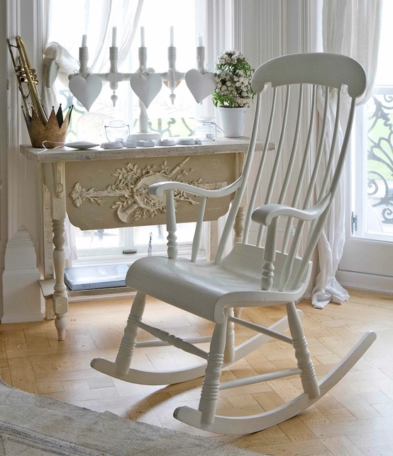
Home Dream Home: Romantic Details for Soft, Vintage Rooms
Ethereal light, French-inspired silhouettes, and weathered whites—how to add romance with sheers, candles, and inherited-feeling pieces.
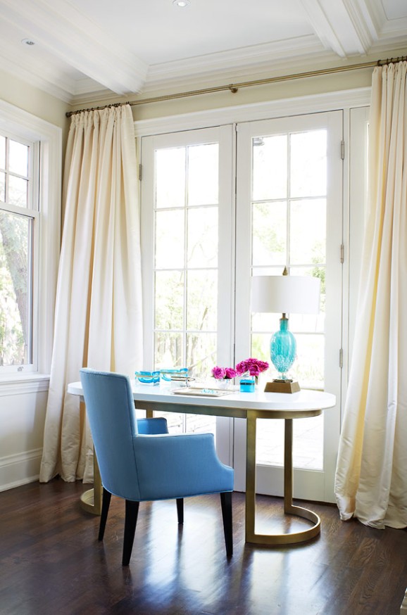
Home Dream Home: Simplicity as Everyday Sophistication
Edited rooms, quiet planes, and scarce accents—how simple interiors stay sophisticated without feeling empty or austere.
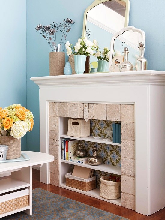
Home Dream Home Part 2: Soft Renovation and Layered Interiors
Inspiration for gentle home updates—fireplace restyles, pastel dining chairs, texture layering, and a weekend plan that turns photos into real moves.