
Richard Wilkinson Illustrations: Editorial Detail and Surreal Humor
A look at Richard Wilkinson’s finely drawn editorial illustrations—urban atmosphere, surreal character humor, and the science-press eye behind the polish.
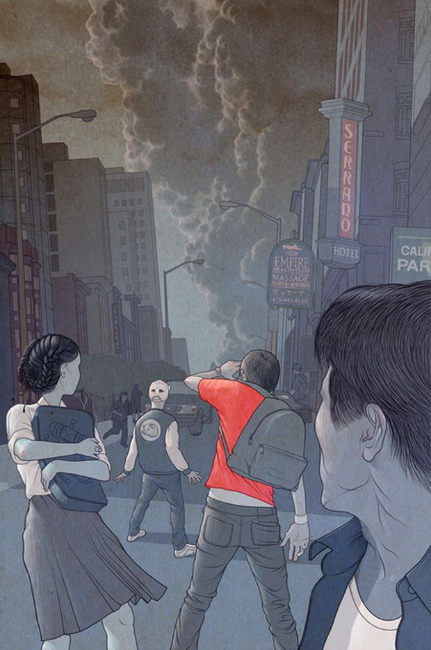
Richard Wilkinson’s illustrations look researched even when they are inventing. Fine line, controlled color, and a taste for the slightly off-kilter turn ordinary subjects—street crowds, suited animals, editorial metaphors—into scenes you read as carefully as captions. The gallery here gathers work that circulated widely in the early 2010s, when design blogs were hungry for illustrators who could deliver polish without flattening personality.
Wilkinson, based in Brighton in the United Kingdom, has long worked for science and culture publishers. Covers and features for titles such as New Scientist and Nature, along with editorial clients in newspapers and books, reward exactly the habits visible in these images: clarity at thumbnail size, denser rewards when you lean in, and a willingness to let oddness sit beside precision. That combination is rarer than pure virtuosity. Many illustrators can render; fewer can make a concept feel collected and slightly strange at the same time.
Atmosphere as narrative
In the San Francisco–coded street scene above, architecture and signage do half the storytelling: hotel neon, massage-club lettering, parking fragments, a pig-masked figure walking away while others stare toward a rising plume. Cool greys and blues hold the frame together; a single red shirt punches the center. The drawing does not explain the emergency. It stages curiosity and unease—the moment before rumor hardens into news.
That editorial instinct matters. Wilkinson’s commercial training shows in how quickly you can parse hierarchy: foreground profile, central gesture, background smoke. Magazines need images that communicate under headline pressure and still survive a second look on a phone screen. These pieces leave enough mystery that you keep scanning edges after the first read—braid detail, backpack strap, the way smoke dirties the sky.
Urban disaster and urban theater have a long history in illustration; Wilkinson’s version feels contemporary because the clothes and signs are specific while the cause stays withheld. Specificity without full explanation is a useful recipe for editorial art that must accompany essays about risk, cities, or collective attention.
Surreal humor with a straight face
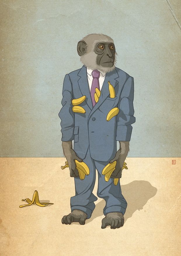
The banana-laden monkey in a wrinkled suit is comedy delivered with portrait seriousness. Anxious eyes, purple tie, pockets stuffed past reason, a peel on the floor—greed and professionalism share one body. A small red seal in the corner nods to print traditions without turning the piece into pastiche.
Wilkinson often treats absurd premises as if they were specimens. The joke lands harder because the rendering refuses to wink too early. You believe the fabric weight and the fur texture first; then the premise catches up. That delay is craft. Slapstick illustration telegraphs the gag in the first outline; this approach earns the laugh by committing to material truth.
Character design here also shows economy. The background is a simple divided field—wall and floor—so the figure carries every narrative burden. Commercial illustrators under deadline learn that empty space is not laziness; it is pressure that pushes attention back onto the subject and keeps the file readable beside a column of text.

Line, color, and the science-press eye
Profiles of Wilkinson frequently return to childhood walks with a father who loved natural history—attention trained on insects, plants, and the pleasure of naming what you see. Even when the subject is urban or satirical rather than entomological, that collector’s eye remains: edges stay informative, surfaces carry information, and the picture feels catalogued rather than vaguely sketched.
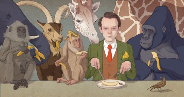
Color is usually purposeful rather than decorative. Muted fields let one accent object carry symbolic weight—a red shirt, a yellow fruit, a warm smear of smoke. Gradients and texture suggest print paper and ink as much as screen glow. For readers who discovered him through blog roundups, that print sensibility was part of the appeal—digital files that still felt like objects you might find in a magazine rack.
Science periodicals especially need metaphors that respect intelligence. A clumsy cartoon can insult a technical audience; a cold diagram can fail to invite non-specialists. Wilkinson’s lane sits between those failures: inviting, slightly uncanny, and precise enough that art directors trust him with difficult briefs.
Characters you can almost hear
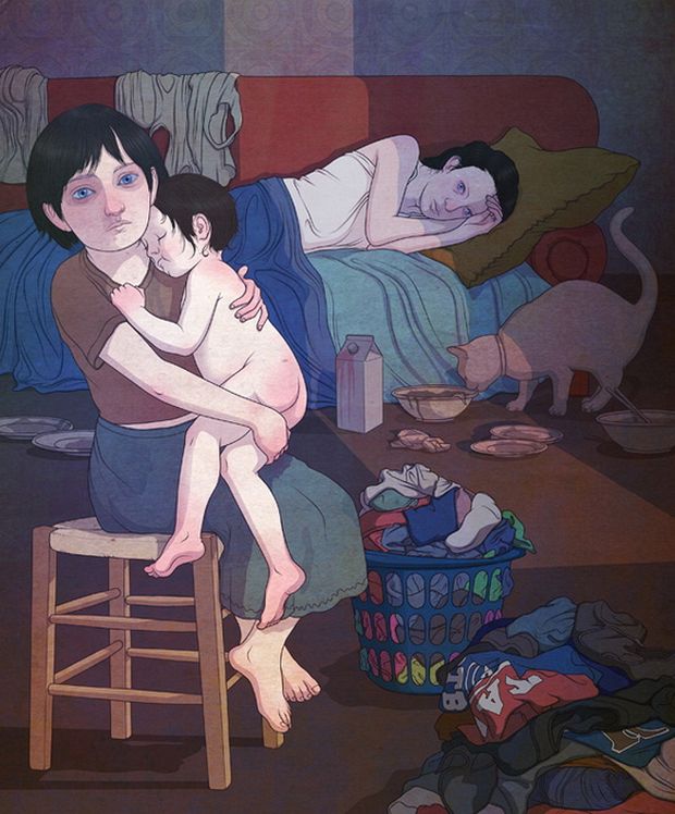
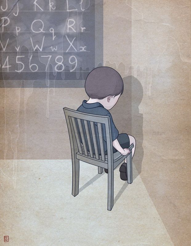
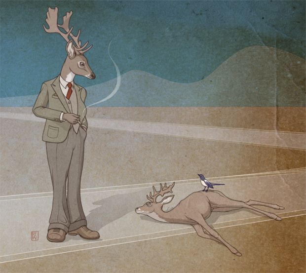
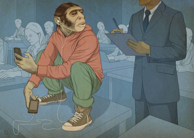
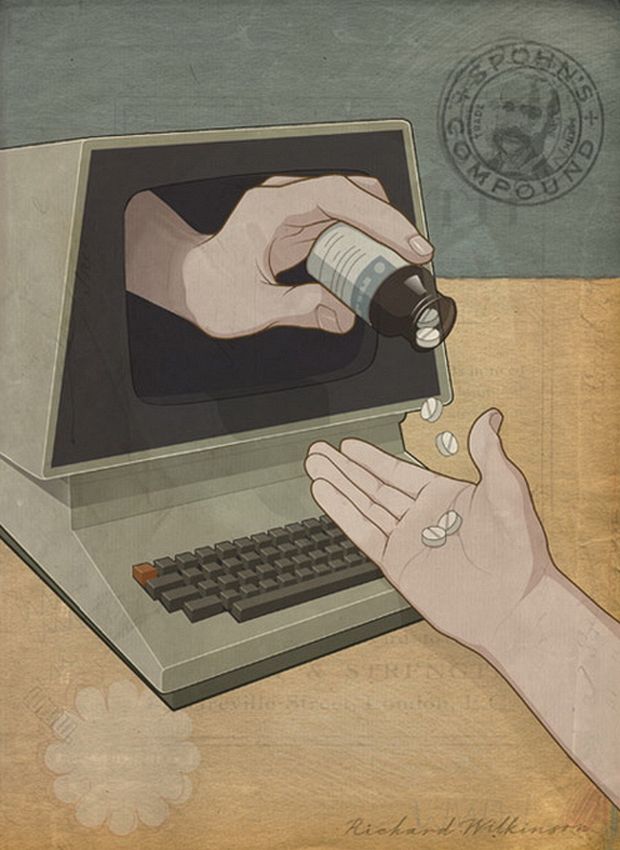
Across the set, faces and posture do heavy lifting. Wilkinson’s figures rarely float as fashion mannequins; they lean, clutch bags, squint, hoard, or turn away. Hands are specific. Clothing wrinkles where bodies move. Even when anatomy tips toward caricature, the psychology stays readable—worry, appetite, distraction, performative calm.
That quality serves editorial metaphor. Science and culture magazines often need an image for an abstract argument—risk, appetite, surveillance, memory, inequality—without a literal diagram of a spreadsheet. A suited animal or a tense street crowd can carry the idea while remaining a pleasure to look at. The best of these frames work as independent pictures and as concept delivery systems.
Look at how often secondary figures complicate the main action. A masked walker, a distant pedestrian, a car idling—these notes keep scenes from becoming single-icon posters. Life, in Wilkinson’s streets and rooms, is plural even when one figure dominates the composition.

How to look at the gallery
Start with silhouette. Can you recognize the main figure or smoke mass from across the room? Then move closer for texture: hatching, fabric fold, signage letterforms, the way a shadow sits on a wall. Ask what the single loudest color is doing—warning, comedy, emotional heat—and whether removing it would collapse the story.
Illustrators can study the economy of backgrounds. Wilkinson often gives just enough architecture or floor plane to locate the figure, then stops. Art directors can study how these pieces would sit beside a column of text: margins of calm, a clear entry point, a secondary detail for readers who linger after the jump.
Students sometimes chase Wilkinson’s finish and miss his staging. Finish without staging is empty gloss. Staging without finish can still teach composition. Ideal study copies both: block the shapes first, then earn the surfaces.


From editorial craft to collecting instincts
Later personal projects would push Wilkinson’s natural-history fascination into elaborate imagined taxonomies—pop-culture icons reinvented as arthropods and catalogued with scientific deadpan. The seed of that impulse is already visible here: classification humor, specimen-like presentation, affection for the strange made orderly. Knowing that later chapter helps explain the temperament; it should not overwrite what this earlier gallery actually shows.
For this collection, the pleasure is more immediate. These are working illustrations with blog-era reach—images strong enough to stop a scroll and smart enough to reward a second look. Open any frame, name the emotion in five seconds, then spend a minute on the edges. That double tempo—fast read, slow craft—is Wilkinson’s lasting signature in this period.
If one picture sticks after you leave the page, ask why. Usually it is not only the joke or the smoke plume. It is the sense that someone drew the world as if every pocket, braid, and neon tube deserved a careful record—and trusted you to notice.

Comments
Continue reading

Still-Life Photography by Margareth Perfoncio
São Paulo photographer Margareth Perfoncio’s still lifes of food and flowers—Old Master light, dark wood, and tables that feel inevitable.

Meaningful Love Quotes for Inspiration (and Ink)
Meaningful love quotes that still feel true — short lines for tattoos, gifts, and everyday reminders, with placement and wording tips.
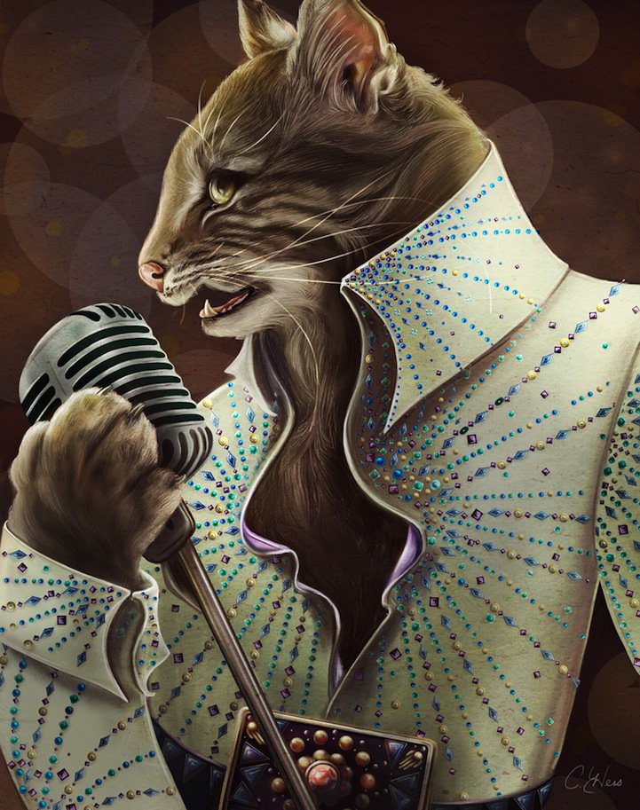
Christina Hess’s Animals From History: Costumed Pets as Playful Portraits
Illustrator Christina Hess reimagines historical icons as ornate animal portraits—Elvis Petme and friends—mixing puns, costume detail, and soft history lessons.