
Hilarious Realistic Paintings by Tos Kostermans
Dutch painter Tos Kostermans blends near-photographic realism with celebrity satire—“imprealism” scenes where glamour looks convincing and behavior looks ridiculous.
Tos Kostermans paints like a realist and jokes like a satirist. His celebrity-and-contemporary-life pictures—often circulated under titles that call them hilarious, bold, or beautiful—look polished enough to pass for high-end illustration, then tip into absurdity once you read the scene. Pretty figures take center stage; men often play supporting roles; success, status, jealousy, and spectacle get treated as party props. The surfaces are lush. The situations are not polite.
Kostermans, born in Haarlem in the Netherlands, trained early and moved from impressionist beginnings toward near-photographic realism while keeping an impressionist touch in color and light. He has described his approach as “imprealism”—a personal blend of realism and impressionism marked by vivid color, strong contrast, and portrait-level detail. That hybrid matters for the humor: the jokes land harder because the world looks convincingly solid.
What “hilarious realistic painting” means here
Caricature exaggerates noses and jaws until recognition becomes the gag. Kostermans usually keeps faces and bodies believable. The comedy sits in narrative: who stands where, who watches whom, what luxury object becomes ridiculous, how fame behaves in an ordinary or glamorous room. Viewers get the double pleasure of craft appreciation and social punchline.
Magic-realism comparisons show up in write-ups for a reason. Everyday logic bends just enough—party energy in the wrong place, celebrity mythology colliding with mundane desire—without collapsing into pure cartoon. The paintings stay in a zone where you could almost believe the event happened, which makes the satire sharper. If the paint looked slapdash, the scenes would read as sketches. Because they look finished, they read as evidence.
Recurring themes in the widely shared “Bold & Beautiful” vein include:
- Celebrity proximity — rock-star myth, groupie culture, red-carpet bodies treated as public furniture.
- Status games — casino light, city speed, dinner-table hierarchy, who gets the best seat in the myth.
- Gendered spectacle — women often drive the composition’s confidence; male figures can look secondary, decorative, or comically diminished.
- Public-private mashups — subway cars, streets, and party spaces that refuse to stay ordinary once fame enters.
- Behavioral observation — not just “look, a famous person,” but “look how people perform around desire and attention.”
Why realism intensifies the joke
Humor in painting has many tools: distortion, caption-like text, collage, crude linework. Realism’s special effect is credibility. When fabric folds, skin tones, reflections, and interior light are handled with care, the brain accepts the room as real. Only then does the odd social arrangement register as wrong—and funny. Kostermans uses that acceptance against the viewer. You admire the rendering; then you notice the power dynamic; then you laugh (or wince).
Color does rhetorical work. High contrast and saturated hues push emotion toward glamour magazines and advertising, the same visual dialects that sell celebrity. By borrowing that language and loading it with satirical situations, the paintings critique the culture that taught us to find those colors desirable. The palette is not neutral decoration; it is part of the argument.
Portrait skill is the other half. Kostermans has long specialized in portraits, traveling for commissions and family likenesses. That discipline shows in faces that feel specific rather than generic. Even when a figure is a type—“the star,” “the admirer,” “the hostess”—the paint suggests a person who could leave the canvas and order a drink. Specificity keeps satire from becoming a poster slogan.
How to look at one of these scenes
A useful pass through a Kostermans humor painting goes in layers:
- Inventory the room. Where are we—subway, dinner, street, stage-adjacent space? Setting sets the social rules being broken.
- Find the hierarchy. Who occupies the brightest light, the largest share of the frame, the most relaxed pose?
- Track the gaze. Eyes tell you who holds power and who is performing for whom.
- Name the props. Instruments, cars, chips, phones, fashion armor—objects often carry the punchline.
- Ask what “success” looks like in the frame. Is it enviable, exhausted, predatory, lonely, or simply loud?
That method works whether or not you can name every celebrity reference. Some paintings lean on recognizable personas; others use archetypes. Either way, the behavioral joke remains available. You do not need a gossip blog to understand a scene about attention, vanity, or misplaced glamour.
Celebrity as material, not only as subject
Painting famous people is a crowded genre. What distinguishes Kostermans’s humorous strand is that celebrity functions as a pressure system. Fame changes how bodies arrange themselves in space. It licenses excess. It turns ordinary transit and dinner into stages. The paintings are less “here is a likeness for fans” and more “here is what the fame economy does to manners.”
Titles that circulate with the work—party scenes, dinners, races through the city, casino nights, rock-adjacent vignettes—read like short story names. They promise a situation, not a neutral portrait sitting. That storytelling impulse aligns with Kostermans’s broader interest in “the hilarity of the world,” a phrase that appears in gallery notes about his life-and-humor paintings. Hilarity here is not slapstick alone; it includes the awkward comedy of status.
Viewers who mainly know him from viral image galleries sometimes miss that his practice also includes landscapes, still lifes, and more straightforward portrait commissions. The hilarious realistic pictures are a mode, not the entire biography. Still, they are the mode that matches this page’s topic: realism pressed into service of a grin and a critique.
Where these images lived online
In the early 2010s, design and inspiration blogs loved dense galleries of “wow” paintings with short intros. Kostermans’s celebrity humor set fit perfectly: high detail for zoomers and zoomers-with-cursors, clear punchlines for skimmers, and enough polish to feel like curated culture rather than meme sludge. Behance and portfolio links often sat nearby for readers who wanted the artist path rather than only the shareable grid.
That distribution shape explains why a page might once have been little more than a credit line and empty space where images lived. The internet treated the paintings as a slideshow first and an essay almost never. A fuller article can reverse that ratio: keep the artist and the intent, explain why the realism matters, and leave room for readers to seek the work itself through the artist’s channels without turning the piece into a shop floor.
Craft notes for painters and viewers
If you paint (or commission) narrative realism with a comic edge, Kostermans’s approach suggests a few durable choices:
- Commit to believable light so the gag feels staged in a real world.
- Let composition encode power; do not rely on a caption to explain who matters.
- Use fashion and interior detail as social text, not only as prettiness.
- Keep faces specific; stereotypes flatten satire into cliché.
- Allow discomfort. The best humorous scenes are not always “nice.”
For viewers, the invitation is similar: slow down past the first recognition hit. Ask what the painting thinks about the glamorous life it depicts. Admiration and critique can share a frame. That tension is the point of hilarious realism done well.
A last look at the bargain
Kostermans offers a bargain common to sharp figurative satire: enjoy the beauty, then notice the bill. The colors seduce; the situation invoices. Celebrity becomes a lighting condition as much as a subject. Ordinary spaces become theaters. Men and women rearrange into comedies of attention. Whether you meet the work as a viral gallery or as a quieter study of “imprealism,” the same skill carries the joke—paint that looks trustworthy enough to tell an untrustworthy story about how people behave when they think someone is watching.

Comments
Continue reading
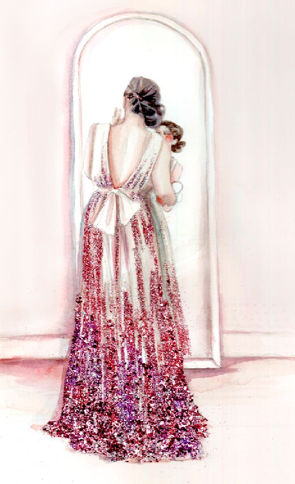
Katie Rodgers’s Glittering Paper Fashion Illustrations
How Katie Rodgers builds Paper Fashion watercolors—pencil, wash, ink, then glitter—into dreamy fashion figures that sparkle on the page.

Stunning Paintings of Movie Scenes
New York illustrator Alixce X. Zhang turns unforgettable film frames into intimate portraits—gallery notes on light, mood, and cinema as paint.

Funny Animal Signs That Warn People (While Animals Ignore Them)
From a seagull on a no-birds disc to classic zoo and park ironies—why animal warning signs get funny, and what the rules are still for.