
Katie Rodgers’s Glittering Paper Fashion Illustrations
How Katie Rodgers builds Paper Fashion watercolors—pencil, wash, ink, then glitter—into dreamy fashion figures that sparkle on the page.
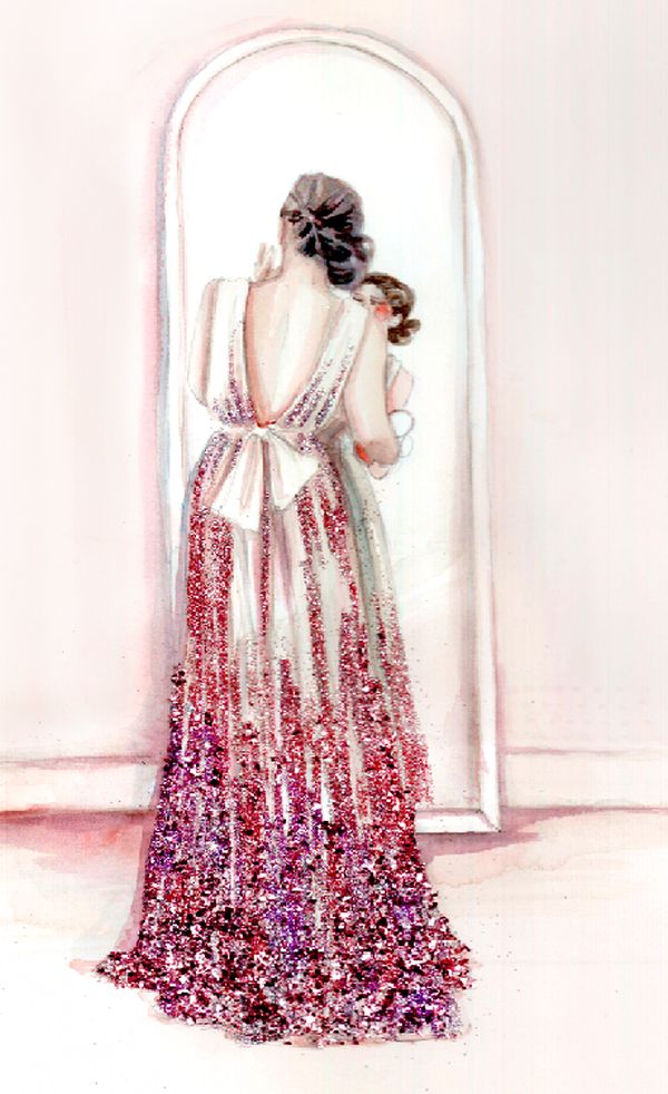
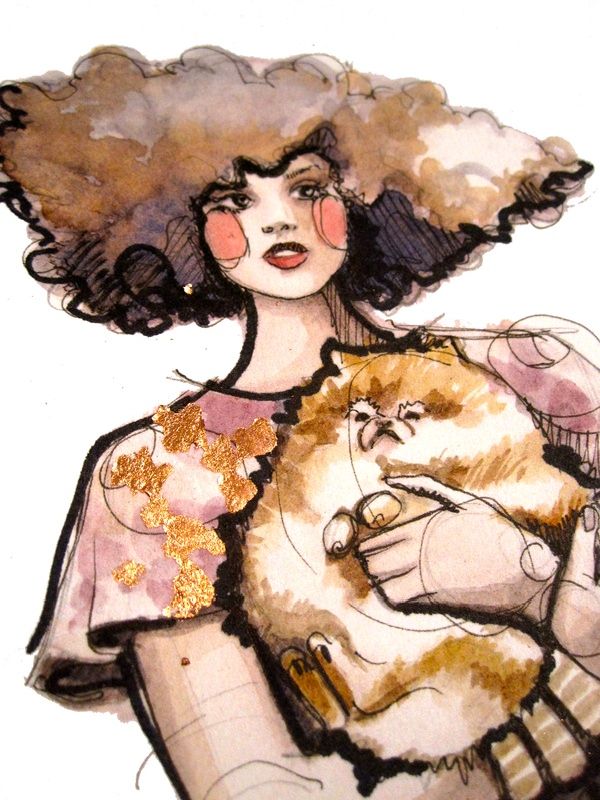
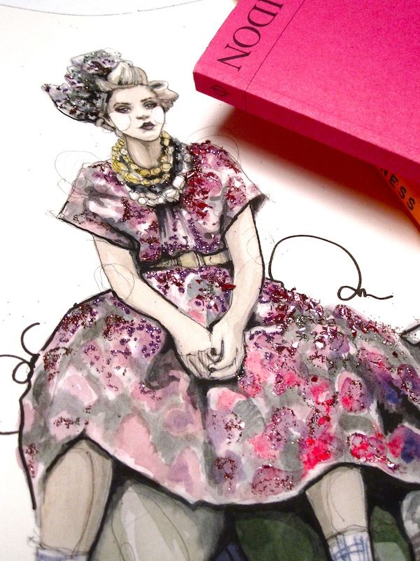
Katie Rodgers paints fashion the way some people remember a party: soft color first, then a glitter finish that catches light after the wash dries. Her watercolors of elongated figures, floating gowns, and dreamy getting-ready scenes feel handmade in a way photography cannot fake. Sequins and sparkle sit on the paper like jewelry, not as a digital filter slapped on at the end.
By the early 2010s, Rodgers had turned a childhood habit into a full studio practice under the name Paper Fashion. She studied industrial design at Carnegie Mellon, worked in apparel at Reebok, and kept illustrating on the side until commissions from brands such as Coach and Kate Spade made illustration the day job. The gallery on this page belongs to that moment—watercolor women, inked outlines, and glittering dresses that look ready for a night that never quite arrives.
Paper Fashion as a handcrafted brand
Paper Fashion began as a blog in 2009: a place to post sketches while Rodgers still held a design desk job. The name fits. Paper is the stage; fashion is the subject; the product is an interpretation rather than a technical flat. Clients later stretched from handbags and beauty campaigns to stationery and editorial work, but the core language stayed consistent—feminine figures, romantic silhouettes, and mixed media that refuse to look flat.
Rodgers has described a process that favors decision over endless drafting. She rummages through shows, editorials, trend reports, and product design until one subject wins, then moves quickly to the table. Pencil lays the pose; watercolor builds atmosphere and cloth; black ink locks edges and gesture. She has said she does not burn hours on preliminary sketches because the thinking lives in the layers themselves. That preference shows in these images: you can almost count the passes of pigment and the final sparkle pass that makes a dress feel lit from within.
Growing up outside Atlanta, she filled sketchbooks with runway scenes and magazine-inspired women. That early habit—escaping into drawn clothes—explains why the finished illustrations still feel like private daydreams rather than cold product renders. Even when a brand commission anchors the subject, the page keeps a diary quality: someone getting ready, someone wishing a dress into existence, someone pausing before the night begins.
Why glitter belongs on watercolor
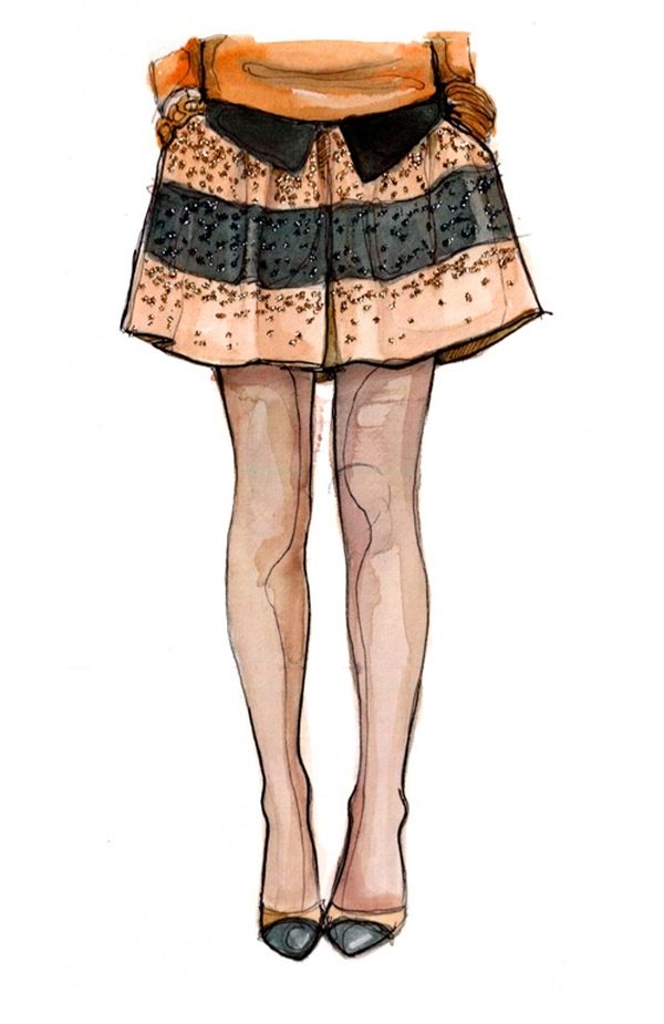
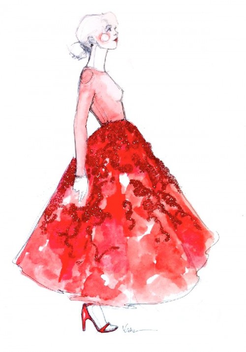
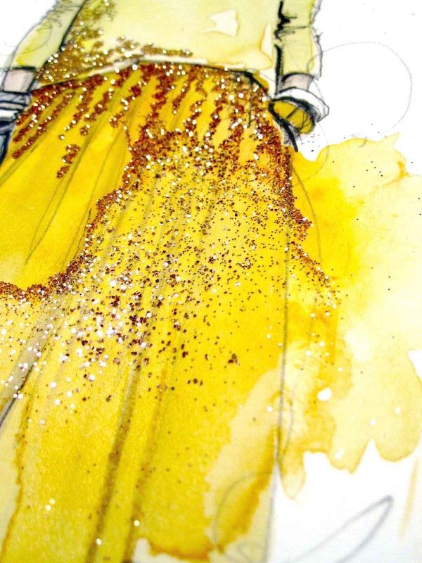
Watercolor alone can look ethereal and slightly unfinished—beautiful, but quiet. Glitter changes the register. A sprinkle on a skirt turns a wash into eveningwear. Chunks along a neckline suggest embroidery or crystal. Sudden sparkle on shoes or jewelry gives the eye a place to land after soft pinks and blues have done their atmospheric work.
The trick is restraint. Too much glitter becomes craft-store noise; too little and the promise of “glittering fashion” never arrives. Rodgers tends to place sparkle where a real garment would catch light: on a bodice panel, along a hem, across a clutch. In one getting-ready scene she has written about wishing the dress existed and noting the glitter she used for the gown—an artist’s aside that reveals how material choices are as intentional as color mixing.
For illustrators copying the look, the lesson is not “add glitter everywhere.” It is: finish watercolor and ink first, then use sparkle as highlight the way a photographer uses catchlights. Protect the quiet passages of skin and background so the dress can shine. If you are working in a small studio apartment, lay a scrap sheet under the paper; glitter migrates, and you will find it in coffee cups for a week.
Reading the figures
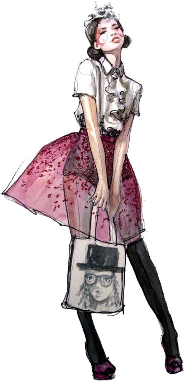
Rodgers’s women are fashion-illustration tall—long legs, small heads, poses that favor gesture over anatomy class correctness. Hair often floats. Arms hold mirrors, glasses, or nothing at all. The mood is preparatory and private: someone about to leave, someone already dreaming of the destination. Clothes dominate the page the way a runway look dominates a photograph, yet the faces stay soft enough that the drawings feel personal rather than catalog-cold.
Look for how negative space works. Large blank or lightly washed areas let a single sparkling dress breathe. When backgrounds thicken, they usually support color stories instead of competing with the garment. That is editorial thinking applied to fine-art materials: the dress is the headline; everything else is supporting type.
Also notice the ink. Contours are decisive but not mechanical. A slight wobble in a hemline or wrist keeps the figure human. In an era when vector fashion flats can be perfect to the pixel, that human wobble is part of the luxury.
Materials and studio habits worth stealing
You do not need Rodgers’s client list to learn from her desk habits. A useful practice kit looks like this:
- Heavy watercolor paper that can take wash, ink, and adhesive glitter without warping into ruin.
- Pencil underdrawing kept light so pigment and sparkle remain the stars.
- Transparent watercolor for skin and atmosphere; denser mixes for cloth where you want opacity.
- Waterproof black ink for final contour after the washes dry.
- Fine glitter or sequin fragments applied selectively with a clear medium, then sealed if the piece will be handled or sold.
Work in daylight or consistent lamp light so glitter does not trick you into over-applying. Photograph pieces at an angle that shows sparkle without blowing out the watercolor. If you sell prints, decide early whether glitter is for originals only—reproduction rarely captures the real shimmer, and buyers should know what they are getting.
Rodgers has also spoken about handcraft in a digital age: the beauty of a line that can include human error. That stance matters for anyone tempted to fake watercolor with a brush preset and then sprinkle a glitter overlay in software. Digital tools can study composition, but the charm of these particular images comes from pigment pooling, ink wobble, and physical sparkle sitting above the paper tooth.
A practical drill: paint three versions of the same dress—one watercolor only, one watercolor plus ink, one with a final glitter pass. Compare which stage feels finished. Many students over-glitter because they skipped earning the dress in pigment first.
Where the work sits in fashion illustration
Fashion illustration once served mainly as a pre-photo stand-in for garments and ads. By the Paper Fashion era, photography owned that job, and illustration shifted toward interpretation, lifestyle fantasy, and brand storytelling. Rodgers’s glittering watercolors fit that shift. They do not replace a lookbook; they sell a mood—romance, preparation, wishful ownership of a dress that may not exist off the page.
That is why the pieces still work as wall art and as campaign texture. They flatter the idea of fashion without demanding you decode a season’s hemlines. A viewer who never opens Vogue can still feel the sparkle. A designer looking for silhouette ideas can still mine the drapery of a painted gown.
Later collaborations across beauty, jewelry, and luxury houses extended the Paper Fashion vocabulary without abandoning the handmade core. For readers of this gallery, the useful takeaway is closer to the desk than the client list: choose a subject, commit to layers, and let glitter finish what watercolor began.
Scan the images once for color stories, once for where sparkle sits, and once for how much empty paper remains. Katie Rodgers’s Paper Fashion illustrations earn their glitter by earning their watercolor first—soft color, decisive ink, then just enough sparkle to make the paper feel dressed for evening.

Comments
Continue reading

Stunning Paintings of Movie Scenes
New York illustrator Alixce X. Zhang turns unforgettable film frames into intimate portraits—gallery notes on light, mood, and cinema as paint.

Funny Animal Signs That Warn People (While Animals Ignore Them)
From a seagull on a no-birds disc to classic zoo and park ironies—why animal warning signs get funny, and what the rules are still for.

How to Find Local Amenities on Vacation: Mechanics, Haircuts & More
Locate trustworthy local services and everyday spots while traveling or settling in—using publications, reviews, map apps, neighbor tips, and low-pressure exploration.