
Tim Gardner’s Watercolors of City Lights, Sea, and Moonlight
Canadian painter Tim Gardner uses exacting watercolor to capture nocturnes—city glow, starry skies, open water, and moonlight—with near-photographic clarity.
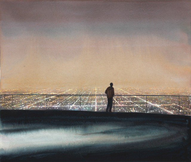
Tim Gardner paints with watercolor as if light itself were the subject and places were only the stage it needs. City glow, star fields, open water, and moonlight return again and again in his work—not as decorative moods pasted onto scenery, but as the reason the picture exists. The Canadian artist, widely shown for small-scale watercolors that can look almost photographic at a glance, uses a medium often associated with softness to chase precision: the exact temperature of a night sky, the way sodium streetlight stains a sidewalk, the cool plane of moonlight on a hillside or a wave.
Browse a selection from his gallery and the first impression is often disbelief that watercolor can hold so much clarity. Edges stay crisp where they must. Gradations stay breathable where night air has to feel deep. Figures, when they appear, occupy contemporary space—recreation, travel, ordinary pauses—yet the surrounding light can tip toward the sublime. Inspired by city lights, starry nights, the sea, and the moon, Gardner depicts beauty without emptying it of modern detail.
Watercolor that behaves like a lucid photograph
Gardner’s reputation rests partly on a paradox. Watercolor is transparent, fast, and unforgiving; photography is associated with instant capture. He often begins from snapshot sources—images taken by himself, friends, or family—then translates them into paint over careful sessions. The finished watercolor can read as hyper-real from a distance and as hand-made up close, where washes, reserves of paper white, and tiny decisions about edge quality become visible.
That method explains why his nocturnes feel inhabited rather than invented. A night photograph already contains the awkward truths of contemporary landscape: power lines, phone glow, uneven commercial lighting, the leftover geometry of parking lots and paths. Gardner does not always scrub those truths away. In urban sky studies especially, lamps and cables can cut across dawn or dusk color with a wry honesty. The romantic sky remains; the modern interruption remains too. Beauty and encroachment share the frame.
Scale matters. Many of the watercolors are intimate. Intimacy forces attention. A small sheet depicting a full moon over water or a city basin of light asks you to lean in. The experience is closer to holding a jewel than to standing before a mural. Within that small field, Gardner can still suggest vastness—because night sky and open sea are scale tricks that work even at postcard size when value relationships are exact.
Nocturnes: moon, indigo, and the language of night
Night is difficult in any medium. Cameras and eyes disagree about color; memory invents blues that sensors may not record. Gardner’s nocturnal watercolors often lean into a painterly night language—indigo and blue structures that keep forms readable while still declaring “this is darkness.” The result can feel more true to remembered night than a literal exposure would. Moonlit mountains, beaches, and figures outdoors become stages for that negotiated color.
Influences from print traditions—commentators have linked some of his night thinking to the way certain Japanese woodblock artists staged day and night versions of a scene with shifted ink sets—help explain the clarity. Night is not merely underexposure. It is a different key, with its own hierarchy of what stays visible. In Gardner’s hands, a motorcycle at a beach after dark, skiers under a moon, or a person photographing Los Angeles lights with a phone becomes a contemporary figure inside an older problem: how to picture human scale against sky.
Sea and moonlight pair naturally. Water reflects and fractures light; moonlight is both weak and authoritative. Gardner’s coastal and open-water images use that physics for emotion. A calm surface can turn the moon into a path. A moving surface can shatter it into glitter. Either way, the viewer’s eye has a bright itinerary through an otherwise cool field. Starry nights extend the same invitation upward—tiny points that force the surrounding wash to stay deep and quiet.
City lights and the modern sublime
City lights are Gardner’s other great lure. Urban glow is warmer, messier, and more social than moonlight. It turns valleys of buildings into constellations and makes ordinary evenings look ceremonial. In watercolor, that glow must be built from transparent layers rather than from opaque highlights alone. Paper white and pale washes become streetlamp halos; darker surrounding washes push the lights forward. Done well, the city feels luminous without dissolving into pure abstraction.
Some of his urban landscapes remove the figure entirely and let skyline and sky carry aspiration—an updated sublime where weather and infrastructure share authorship. Others keep people in the story: friends, family, recreational bodies moving through North American landscapes that Gardner has long studied. Early work often examined youth culture and middle-class rituals with snapshot candor. Later and parallel strands open onto wider terrain and night weather while keeping that observational backbone. The brush remains exacting; the subject remains lived-in.
Why the medium fits the obsession
Oil can match luminosity with body and glaze. Watercolor matches luminosity with air. For night skies, distant haze, and the thinness of moonlight, air is an advantage. Gardner has spoken, in exhibition contexts, about working with risk and immediacy on the paper’s surface—selecting, editing, and accepting the medium’s refusal to fully erase. That risk suits subjects that are themselves fleeting: a particular dusk, a cloud break, a phone screen briefly brighter than the street.
There is also craft humility in watercolor’s reputation. People still underestimate it. Gardner’s flawless-looking night scenes exploit that underestimation. Viewers arrive expecting soft florals and leave confronted with photographic conviction. The bewitchment is partly technical—control of edges and values—and partly thematic. He keeps returning to lights that humans gather around or lights that make humans feel small. City and moon are both gatherings of attention.
A short way to look at the gallery
When you study Tim Gardner’s watercolors, try a quick three-pass look. First pass: name the light source—moon, stars, streetlamps, dusk afterglow, or a mix. Second pass: find the coolest and warmest zones; night pictures often live on that temperature contrast. Third pass: notice what modern detail survives—wires, screens, vehicles, clothing. Those leftovers keep the sublime from floating away into fantasy.
Then ask one painter’s question: where is the paper left lightest, and does that lightness equal the brightest remembered light in the scene? In strong watercolors, the answer is usually yes. Gardner’s city glows and moon paths earn their radiance by how much darkness surrounds them. The beauty of the world, in his practice, is not a slogan. It is a lighting problem solved one transparent layer at a time—sea, street, and night sky included.

Comments
Continue reading
Photo-Realistic Muscle Car Paintings by Cheryl Kelley
Cheryl Kelley’s glossy oil paintings of classic muscle cars—photo-based realism, chrome reflections, and a feminine take on automotive glamour, with gallery images.

Ray Massey’s Hand Paintings: Trompe-l’oeil Athletes, Castles, and Everyday Objects
Ray Massey’s painted-hand photographs turn fingers into footballers, sprinters, castles, pencil cups, and bananas—studio trompe-l’oeil with lasting wit.
Evgeny Lushpin’s Evening Journey: Twilight Cities, Canals, and Cable Cars
A gallery walk through Evgeny Lushpin’s twilight paintings—from St. Petersburg roofs and European canals to Montmartre rain and the San Francisco Evening Journey canvas.