
Celebrity Eyeglasses as Fashion: Frames, Shapes, and Style Cues
A fashion look at how bold eyeglasses work on famous faces—acetate shapes, color, carpet and street styling—without gossip or lifestyle speculation.
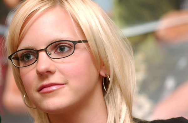
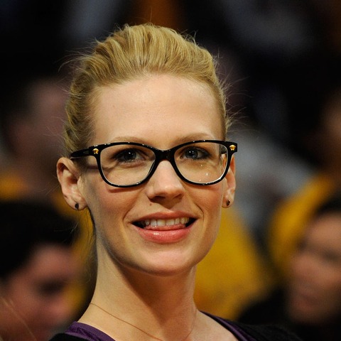
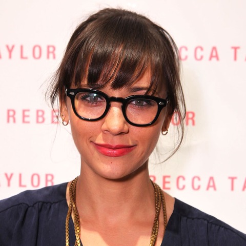
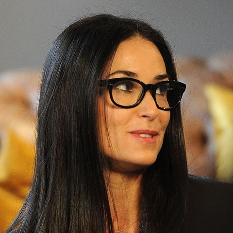
Eyeglasses moved from purely practical prop to fashion signal years ago, and celebrity red carpets, street-style photos, and magazine covers helped lock that shift in place. Thick acetate frames, clear lenses worn as styling, cat-eyes, and round “intellectual” shapes all cycle through editorial spreads the way hemlines do. The images collected here sit in that fashion conversation: glasses as silhouette, color block, and attitude—not as a medical checklist, a net-worth roundup, or a gossip column about private lives.
What changed culturally is simple. Frames stopped apologizing. Designers put eyewear in lookbooks beside bags and shoes. Actors and musicians wore bold pairs on and off set, and photographers framed faces so the glasses read as intentional. “Geeky” became a compliment in styling notes: oversized, nerdy, graphic. Whether the lenses are prescription or not matters less to the photograph than the line they draw across the face. This gallery is a mood board for that idea—how famous faces wear frames as part of a complete look.
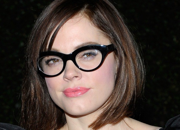
Why frames photograph so well
A strong frame organizes a face the way a hat or a lip color does. Horizontal brows get underlined; round lenses soften a sharp jaw; colored acetate adds a second hue without changing the outfit. On camera, reflections and transparency create depth that bare eyes sometimes lack under flash. Stylists know this: a plain black turtleneck becomes graphic the moment thick black frames appear. A soft dress gains edge from translucent or neon temples. Even a casual baseball cap look hardens into a defined silhouette when dark rims sit below the brim.
Editorial lighting loves acetate because it catches specular highlights on the rims. Metal frames read finer and more jewellike. Mixed materials—metal bridges with plastic rims—show up often in fashion weeks because they photograph as both delicate and bold. None of that requires inventing personal drama. The interesting part is visual grammar: proportion, contrast, and how the glasses sit relative to hair, collar, and jewelry. Flip through publicity stills from the early 2010s and you see the same lesson repeating—eyewear as intentional accessory, not apology.
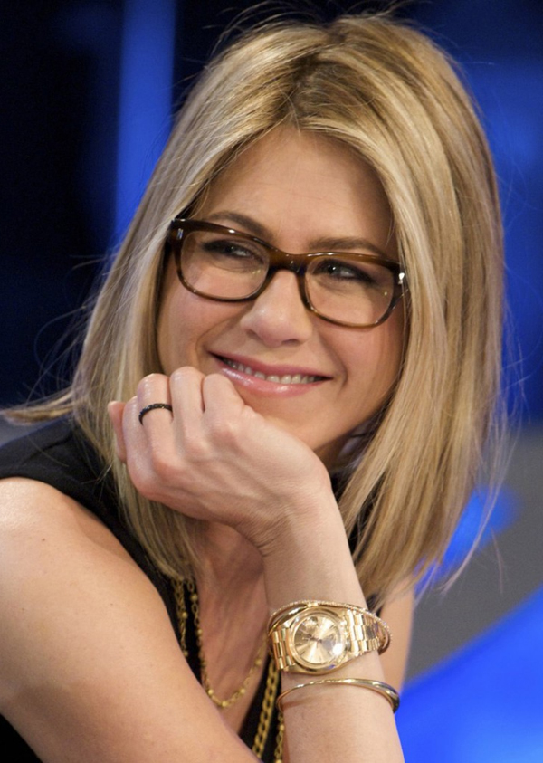
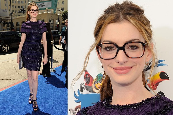
Shapes that keep returning
Round lenses nod to mid-century intellectuals and musicians; they still appear whenever soft seventies references return. Wayfarer-descended trapezoids stay tied to cool casual dressing. Cat-eyes lift the outer corners and suit vintage red-carpet moments. Oversized squares and “librarian” rectangles spike whenever thick rims trend in menswear and womenswear alike. Clear frames had a long run because they outline the face without adding a dark bar in photos—useful for beauty campaigns that still want the eyewear cue without hiding eyeshadow.
Color stories matter as much as geometry. Tortoiseshell remains the perennial neutral that works with camel, black, and denim. Bright primaries turn glasses into the outfit’s focal point. Matte black is the graphic default for monochrome looks. Rose gold and thin wire read quieter and often pair with softer makeup. Celebrity styling teams rotate these options the way they rotate handbags: seasonally, sometimes ironically, always with an eye on the next magazine cover. A single person may own several silhouettes—round for press, square for premiere, metal for daytime—without the wardrobe reading as costume.
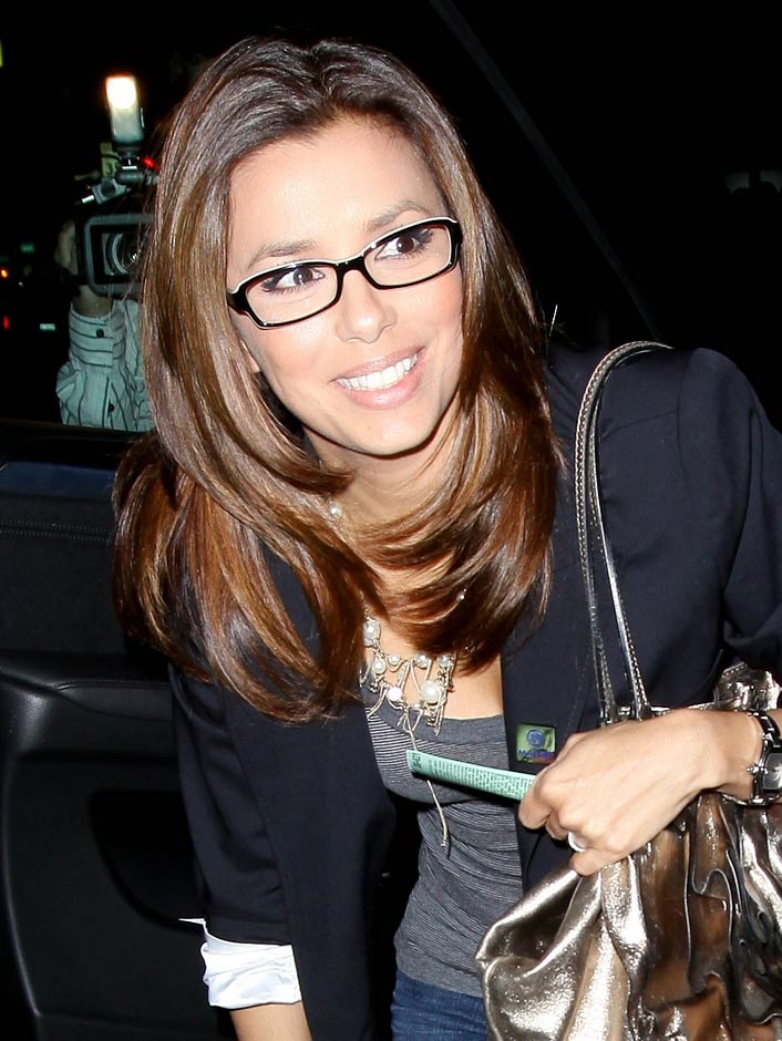
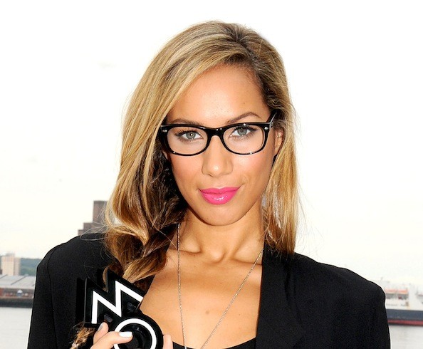
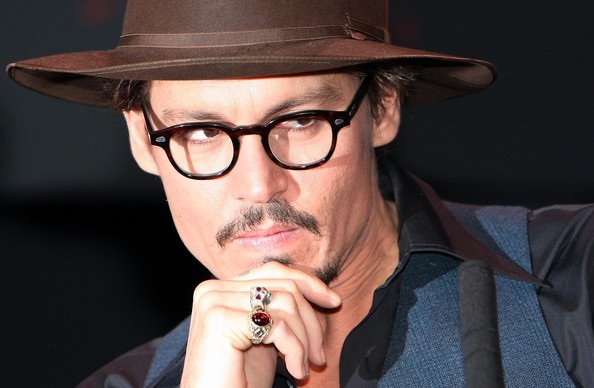
On the carpet, on the street, on set
Red-carpet glasses used to be rare; now they appear when a look needs intelligence, rebellion, or simply a break from smoky-eye sameness. Street-style photographers catch the same people in softer daylight with different pairs—proof that a frame wardrobe can be as varied as a shoe collection. On film and television sets, character-defining glasses become part of costume design: audiences read “bookish,” “tech,” or “arch” from a silhouette alone, often before a line of dialogue lands.
Fashion campaigns blur the line further by casting famous faces in optical and sunglass ads. The celebrity is the hook; the product is the geometry and brand mark at the temple. Readers flipping through a lifestyle gallery like this one were not looking for relationship timelines or salary speculation. They were looking at how frames sit on a face under real publicity lighting—and whether a similar shape might work in ordinary life. That is fashion editorial work in miniature: observe, compare, borrow.
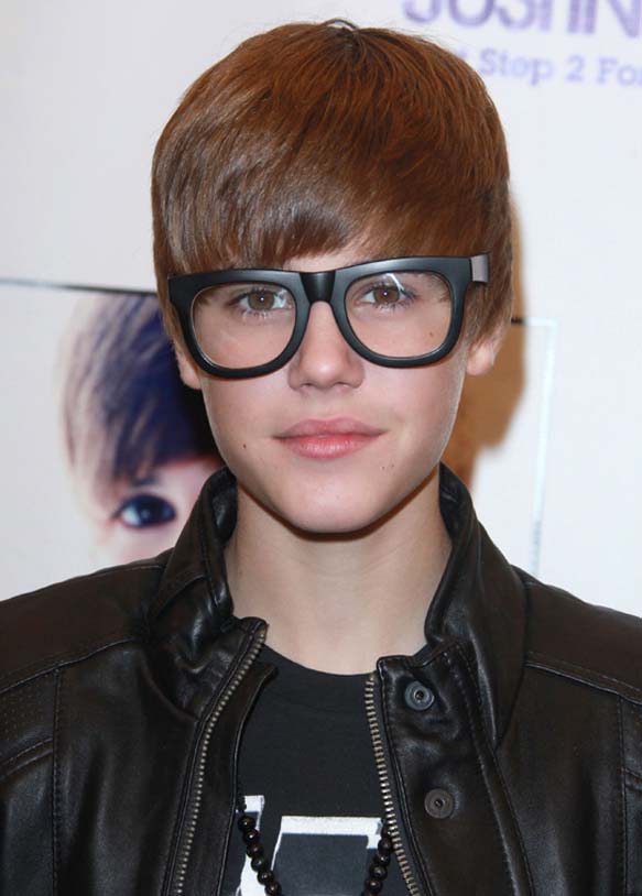
Borrowing the look without the entourage
Match frame scale to your features the way stylists do: smaller faces often drown under huge rims; stronger brows can carry thicker acetate. Try shapes opposite your face geometry if you want contrast—angular frames on a round face, softer rounds on a square jaw—or echo your face shape for harmony. Bridging fit matters more than logos; a frame that slides down the nose ruins the photograph and the day. Pupillary distance and temple length are unglamorous details that decide whether a trend survives past the fitting room.
Lens choice is part of styling too. Clear demo lenses keep the eyes visible for indoor events. Light tints add mood without full sunglass darkness. Anti-reflective coatings reduce camera flash bounce—worth asking about if you are often photographed. Hair tucked behind the ears shows temples and hinges; hair forward softens the look. Makeup can intensify or simplify: a strong lip with quiet frames, or bare lips with graphic rims. If you wear hearing aids or headphones often, test how thick temples feel during a full afternoon, not only for a mirror selfie.

Reading this gallery as a style reference
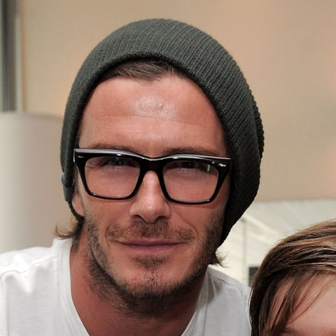
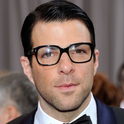
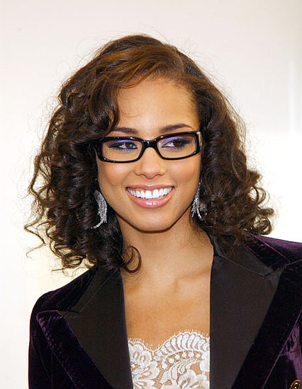
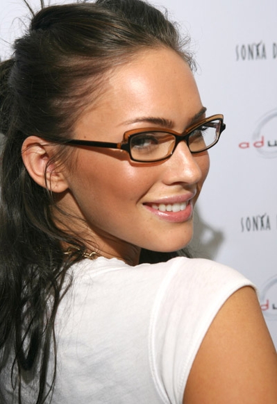
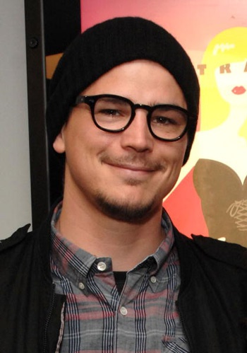
Move through the pictures looking for three things: scale of the rim relative to the brow, color contrast against skin and hair, and whether the outfit steps back to let the glasses lead. Notice how often black or tortoiseshell wins on busy red carpets, and how clear or pale frames appear when the clothes already carry pattern. Spot when round lenses soften a severe suit, or when oversized squares turn a simple tee into a statement. Those are transferable observations, not secrets about anyone’s private schedule.
The early-2010s caption habit of calling these looks “geeky” was really a permission structure—frames allowed to be loud, graphic, and proudly part of the outfit. Trends have rotated since then, but the editorial lesson holds. If one pair in these pictures makes you tilt your head and imagine your own face inside the rims, take that cue to a fitting: same shape family, honest lighting, and a second opinion from someone who sees you every day. Fashion eyewear earns its place when it feels deliberate in the mirror, not when it chases a rumor about who wore what last night.

Comments
Continue reading
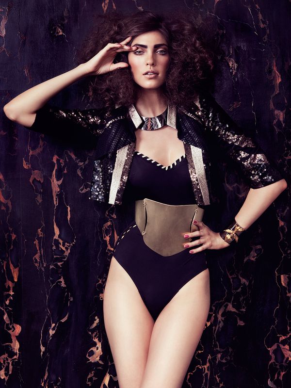
ELLE Bulgaria September 2012: Georgi Andinov’s Editorial
A historical look at ELLE Bulgaria’s September 2012 fashion story—Georgi Andinov’s photographs, the creative team, and how early-2010s magazine polish still reads.
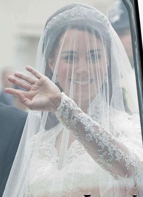
Adorable Kate Middleton Style: The Early Duchess-Era Lookbook
A historical look at the “Kate Middleton effect”—coat dresses, occasion polish, and the early Duchess of Cambridge wardrobe vocabulary—plus a gallery of outfit references.
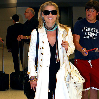
Celebrity Airport Outfits
How transit-day celebrity style became its own fashion beat—layers, sneakers, sunglasses, and the early-2010s uniform between curb and gate.