
Extraordinary Disney Illustrations by Pez: Distroy in Graphite
French artist Pez (Pierre-Yves Riveau) peels Mickey and other icons in his graphite Distroy series—cute silhouettes rendered as decaying, fibrous, sketchbook monuments.
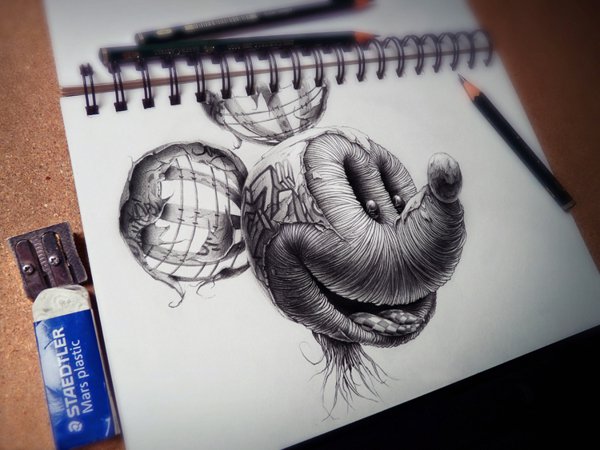
French illustrator and graphic designer Pierre-Yves Riveau—better known as Pez—draws pop icons until their cuteness starts to peel. His graphite series Distroy (the spelling is part of the brand) takes characters we know from animation and games and rebuilds them as decaying, fibrous, half-mechanical heads. Disney figures sit at the center of why the series travels so well online: Mickey and Donald are among the most protected silhouettes in popular culture, which makes their ruin feel sharper than a stranger’s monster.
The work is not a joke sticker slapped on nostalgia. It is slow pencil craft—hatching, depth, and texture dense enough that a sketchbook page can look sculpted. When the series circulated widely around 2013, viewers split between delight and unease. That split is the point. Pez keeps the grin, the ears, the readable cartoon stance, then removes the smooth, colorful safety that usually packages those cues.
What Distroy is doing
Pez has described applying his graphic style to famous cartoons, mixing cartoon drawing with a graffiti sensibility to reach a strange, oneiric image. In practice that means familiar proportions collide with surfaces that look mummified, corded, cracked, or cage-like. Skin is no longer a flat cel color; it is terrain. Ears that should be solid discs become shattered shells. Tongues or oral cavities may pick up checkered patterns that feel borrowed from street graphics or optical toys. Fine root-like lines drip from a chin. A graffiti mark can sit on a temple like a brand burned into the design.
Graphite is essential to the effect. Without Disney’s reds and yellows, the characters lose their merchandising armor. Monochrome equalizes Mickey with Homer, Mario, or Kenny: all become studies in mark-making. The pencil also lets Pez build contradiction—soft cartoon eyes recessed in hard, ridged sockets; a manic smile that remains “on model” while everything around it collapses.
Distroy sits in a longer conversation about what fans and artists do with corporate icons: parody, tribute, critique, horror-comedy. Pez’s version is less punchline than autopsy. The characters are still cute enough to recognize in a second, which makes the decay feel intimate rather than abstract. You are not looking at a generic skull with mouse ears glued on. You are looking at Mickey’s face after something has happened to the surface that was supposed to stay forever new.
Disney under the pencil
Mickey Mouse is the series’ clearest stress test. The circular ears and snout are among the most efficient logos ever drawn; children can reproduce them with three circles. In Pez’s hands those circles survive as references while their interiors fail. Hollow ear structures show bands like ribs or birdcage wires. The snout wraps in concentric ridges. The smile stays wide. Recognition and revulsion arrive together.
Donald Duck offers a different anatomy for the same method. A beak is already a hard form; peeling it into layered plates or fibrous bundles plays with the boundary between bird and mask. Eyes that were designed for slapstick take on a cornered intensity when the surrounding feathers become wreckage. Across both characters, Pez preserves enough “appeal”—the animation term for charming clarity—to keep the drawing from tipping into pure gore. The cuteness is damaged, not deleted.
That balance explains why design sites framed the Disney sheets as extraordinary illustrations rather than as disposable shock content. Technique carries the concept. Zoom in (or lean over the sketchbook page) and the labor is obvious: consistent light logic, controlled gradients, textures that change purpose from zone to zone. Zoom out and the icon snaps back into place. Few illustrators manage both distances at once.
Beyond the mouse ears
Although this page focuses on the Disney charge of the work, Distroy also pulls in other household faces—Simpsons, Mario, South Park’s Kenny among them in early features. The wider cast matters because it proves the method is portable. Pez is not only “doing something to Mickey.” He is testing how much structural damage a beloved silhouette can absorb before it stops being itself. Disney simply raises the stakes: the more sacred the outline, the more charged the peel.
There is also a studio honesty in photographs of the drawings in progress—spiral sketchbook, Staedtler eraser, metal sharpener, pencils on a wooden desk. The tools demystify the horror. This is not digital glitch aesthetic and not a filtered meme. It is paper abrasion and graphite dust. Seeing the page as an object reminds you that Distroy belongs to drawing culture as much as to internet share culture.
How to look without rushing
Viral posts flatten the work into a single reaction: “creepy Mickey.” A slower look pays better.
- Cover the ears with your hand. Does the face still read as Mickey from the snout and smile alone?
- Uncover the ears. Watch how quickly branding returns.
- Trace one texture family—ridges, cracks, checkered plane, hanging filaments—and see where Pez switches techniques.
- Ask what emotion the eyes are selling: mischief, panic, blank performance?
- Imagine the same head in full Disney color. What disappears when saturation returns?
That last question is useful. Color would restore merchandise energy; graphite keeps the autopsy clinical. Pez chooses the harder path for nostalgia.
Craft notes for illustrators
Whether or not you draw fan characters, Distroy offers transferable lessons. Establish the readable cartoon first—proportions, landmarks, expression—before you destroy the surface. Destruction without recognition is just texture. Vary mark length so decay does not become a single stamp repeated everywhere. Leave a few “clean” zones so the eye has somewhere to rest; total corrosion reads as noise. And compose for the page edge: Pez’s heads often feel monumental because they claim the sheet with confidence rather than floating as timid stickers.
For viewers who care about authorship and franchises, remember the obvious tension: these are unofficial interpretations of characters owned by others. Their cultural life depends on fair conversation, exhibition context, and the difference between commentary and counterfeit merchandise. The drawings thrive as art objects precisely because they cannot be mistaken for official cel art.
Why the unease lasts
Cartoon mascots are designed to never age. Pez forces age, injury, and material failure onto faces built for immortality. The result is funny until it is not—or not until it is funny again. That oscillation is healthier than a one-note “dark reboot.” It treats childhood icons as powerful graphic machines and then asks what happens when the machine’s shell cracks.
If one image sticks, let it be the Mickey on the sketchbook page above. Notice the checkered mouth, the broken ear shells, the tools waiting at the margin. Somewhere between the eraser and the grin is Pez’s whole thesis: icons are sturdy enough to survive a hard look—and strange enough, under graphite, to look brand new in their ruin.

Comments
Continue reading
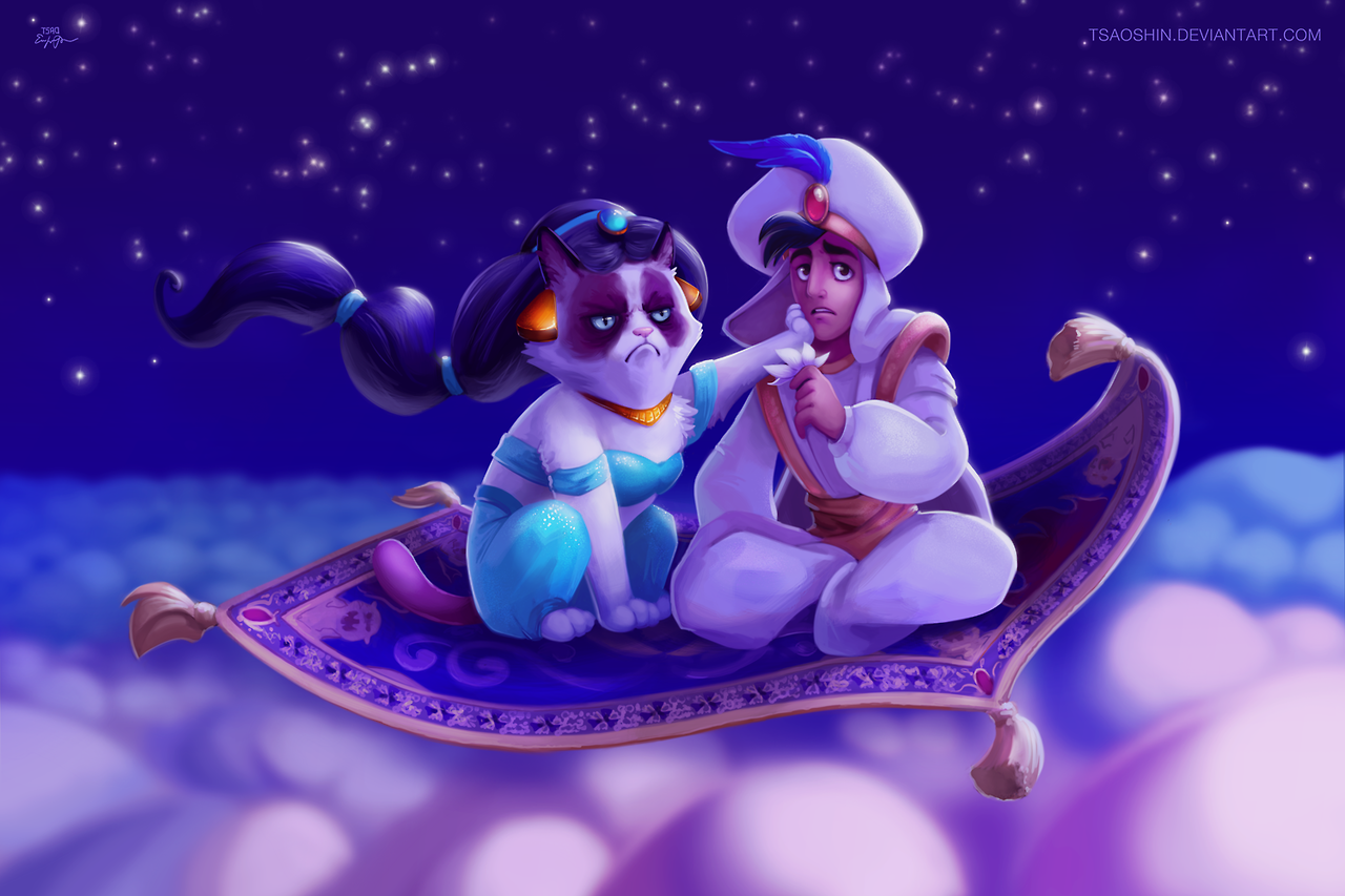
Grumpy Disney by TsaoShin
Digital painter TsaoShin (Eric Proctor) drops Grumpy Cat into classic Disney scenes—beautiful frames built so one scowl can derail the whole fairy tale.
20 Heartwarming Disney Quotes That Still Stick
Twenty heartwarming Disney movie lines—from Rafiki, Dory, Lilo, Olaf, and more—plus why Walt’s four C’s of happiness still echo through them.

Still-Life Photography by Margareth Perfoncio
São Paulo photographer Margareth Perfoncio’s still lifes of food and flowers—Old Master light, dark wood, and tables that feel inevitable.