
Everyday Objects Reimagined in Art by Javier Pérez
Ecuadorian illustrator Javier Pérez (cintascotch) turns grapes, condiments, and desk clutter into witty photo-doodles—minimal lines, maximum double takes.
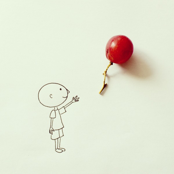
A red grape sits on paper like a balloon that has just slipped free. Below it, a few ink lines describe a smiling figure with an arm still raised—too late, or just in time, depending on how you read the moment. That simple collision of a real object and a minimal doodle is the signature move of Javier Pérez, the Ecuadorian illustrator and stop-motion animator better known online as cintascotch.
Based in Guayaquil, Pérez builds images that ask almost nothing of the viewer’s patience and almost everything of their willingness to play. A ketchup packet becomes a pouch of blood. Nails stand in for quills. Coins, paper clips, scissors, balloons, and fruit stop being inventory from a junk drawer and start behaving like props in a one-panel joke. The drawings stay sparse on purpose: black line, blank field, object doing the heavy lifting of color and texture.
Who is behind cintascotch
Javier Pérez Estrella studied graphic design and audiovisual production at ESPOL in Guayaquil. He has described a childhood full of homemade comics, magazines, toys, and improvised “TV” productions—then a long creative pause after his father’s death, when family responsibilities crowded out play. When he returned to making images in earnest, the project that carried his name farthest was a series often called Instagram Experiments: frequent posts in which a photographed object and a quick illustration complete each other.
That series traveled well beyond Ecuador in the early 2010s, landing on design blogs and social feeds that prized wit over polish. Outlets that specialize in creative culture highlighted grapes-as-balloons, hardware-as-creature parts, and other small inventions that rewarded a second glance. Pérez has continued to work as an illustrator and animator, as Creative Director connected with the digital agency Cafeína, and on commissions for brands and publications. The doodles remain the public handshake—the work people recognize even if they never learn the client roster behind commercial reels and magazine covers.
He has cited influences that make sense once you stare at a grape-balloon long enough: the clear storytelling of illustrator Marta Altés, and the surrealist habit of letting ordinary things behave wrongly, in the spirit of artists such as Salvador Dalí and René Magritte. The goal, in his own framing, is to keep a childlike intensity pointed at adult surroundings—to notice what busy eyes skip. Minimalism, for him, is not austerity for its own sake; it is a push against visual noise, a way to reunite viewers with the habit of looking twice.
How the everyday-object doodles work
Most pieces follow a reliable recipe. Pérez places a physical object on a clean surface or photographs it so that empty space remains for ink. Then he draws the missing context: a body, a landscape, a punchline. The object is never merely decorated; it is reassigned. A grape is not “a grape with a drawing nearby”—it is the balloon. A mini condiment packet is not a snack; it is a medical prop. The humor lands because the substitution is both absurd and instantly legible.
Compositionally, the square format that suited early Instagram also suits the jokes. Centered or gently off-center objects cast real shadows; flat linework sits beside them without competing for texture. Negative space is an active ingredient. If the background were busy patterned paper, the brain would waste time sorting decoration from punchline. On near-blank stock, the eye goes straight to the partnership between thing and mark.
Technically, the public series often combines photography and digital drawing. Pérez has noted working with a camera and Photoshop for still illustrations, and with tools such as Dragonframe and After Effects when the same playful logic moves into stop-motion. Motion work extends the gag across frames—an object that “breathes,” rolls, or transforms—but the stills remain the easiest entry point: high contrast, almost no background noise, readable in a feed the way a good caption is—fast, then sticky.
Restraint is part of the craft. Overdraw the scene and the object becomes a prop in a busy illustration. Underdraw it and the joke fails. The sweet spot is a few decisive contours and an expression—usually a smile, a stretch, a tiny gesture of surprise—that tells you how to feel about the object’s new job. Hands matter disproportionately: an open palm under a floating grape sells the balloon idea harder than any caption could.
Why the jokes stay gentle
There is a strain of object art that leans dark or grotesque. Pérez’s experiments usually stay light. Even when a ketchup packet becomes a unit of blood, the tone stays cartoonish rather than clinical. The work invites recognition—“I have that in my fridge”—and then rewards it with a second meaning. That double take is the entertainment. You are not asked to decode a manifesto; you are asked to admit that a grape can be a balloon if the string is only a stem.
That gentleness helps explain the series’ shareability. Parents show the posts to children. Designers save them as reminders that concept can outrun rendering time. Teachers use them as prompts: take three objects from your desk and invent new identities before lunch. The barrier to trying the game yourself is low; the barrier to doing it as cleanly as Pérez does is higher than it looks. Clean lighting, consistent line weight, and the courage to stop early are skills disguised as simplicity.
There is also an ethical quietness to the approach. The objects are seldom precious. They are the kind of things that survive in pockets and kitchen drawers. By elevating them without expensive materials, the series democratizes surrealism. You do not need a studio full of props—you need attention and a pen.
Looking without scrolling past
Spend a minute with the grape piece above and the method clarifies. The paper is almost empty. The figure is a handful of lines. The grape carries volume, highlight, and shadow that no amount of hatching would improve. Photography supplies what drawing would labor to fake; drawing supplies narrative photography alone would not invent. Collaboration between media, not rivalry, is the point.
Other experiments in the same family swap in different household inventory—hardware, stationery, snacks—but the contract with the viewer stays constant. Trust the object. Trust the blank space. Trust that one clear idea beats five decorative flourishes. When Pérez posts under cintascotch, he is less announcing a finished masterpiece than keeping a practice alive: create often, stay curious about the ordinary, and let humor do the explaining.
If you leave with a habit rather than a favorite image, try this tomorrow morning. Set one small thing from the kitchen on a blank page and ask what else it could be. A spoon becomes a lake. A tea bag becomes a sleeping bag. A bottle cap becomes a porthole. A grape becomes a balloon again, because some jokes deserve a remake. Pérez’s gift is not that he owns the idea of playful seeing—it is that he keeps proving how little material you need to make that seeing contagious, one object and a few honest lines at a time.

Comments
Continue reading
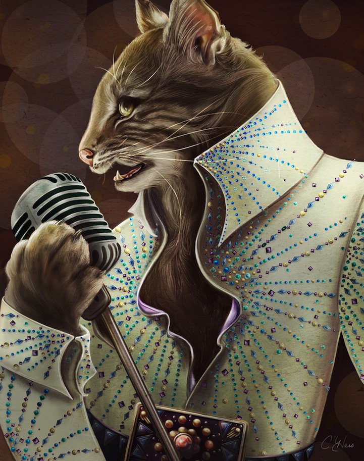
Christina Hess’s Animals From History: Costumed Pets as Playful Portraits
Illustrator Christina Hess reimagines historical icons as ornate animal portraits—Elvis Petme and friends—mixing puns, costume detail, and soft history lessons.
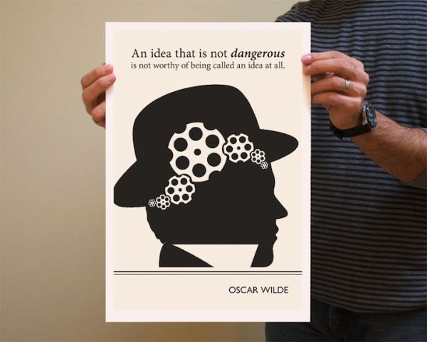
Evan Robertson’s Illustrations from Underlined Book Quotes
Through Obvious State, designer Evan Robertson turns underlined literary lines into black-and-white posters where text and drawing think together.
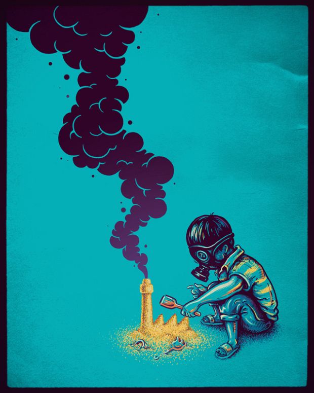
Enkel Dika’s Surreal Illustrations: Wit, Space, and Sharp Concepts
A look at Macedonian illustrator Enkel Dika’s graphic surrealism—gas-mask play, lunar chores, and pop-culture collisions built for a one-second read and a longer second look.