
Enkel Dika’s Surreal Illustrations: Wit, Space, and Sharp Concepts
A look at Macedonian illustrator Enkel Dika’s graphic surrealism—gas-mask play, lunar chores, and pop-culture collisions built for a one-second read and a longer second look.
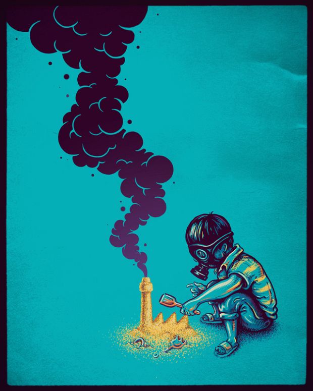
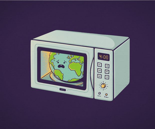
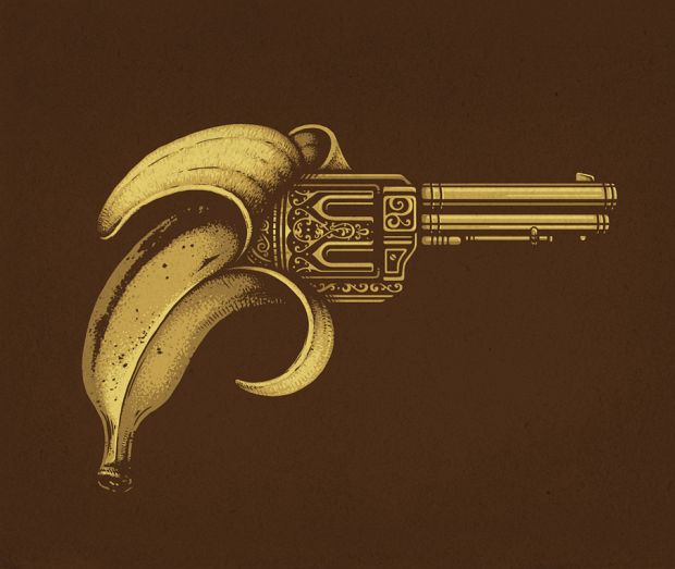
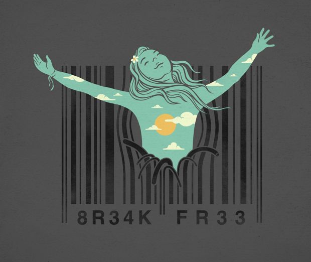
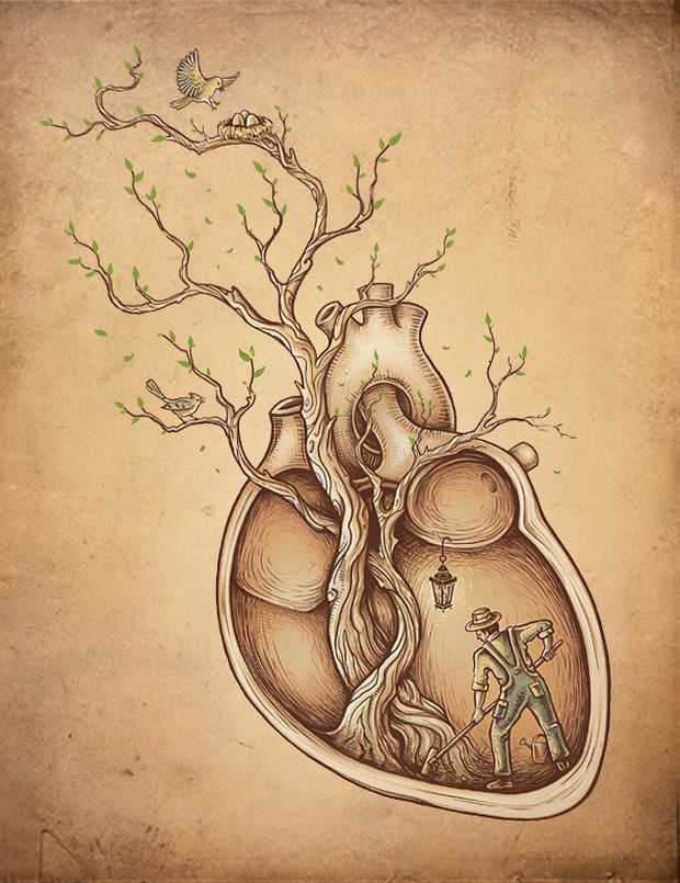
Enkel Dika’s illustrations work like visual punch lines that refuse to dissolve into pure jokes. A child builds a factory in the sand while wearing a gas mask. An astronaut mows a flat lunar “lawn.” Familiar objects and pop-culture silhouettes slide into surreal frames until the ordinary looks newly strange. Around 2012, when these pieces circulated widely online—including through the artist’s Flickr stream—the Macedonian illustrator (from Struga) had already found a clear lane: bold graphic color, clean contours, and concepts that can be read in a second and then re-read for minutes.
That mix of wit and quiet unease is why the work still rewards a slow gallery scroll. The pictures below are not a complete catalogue; they are a cross-section of Dika’s recurring habits—limited palettes, poster-like backgrounds, and juxtapositions that turn childhood, space, and consumer culture into pointed little stages.
Concept first, decoration second
Many illustrators lead with atmosphere or virtuoso rendering. Dika more often leads with a premise you can say in one sentence. The sand-factory image is a clean example: play and pollution occupy the same gesture. The shovel is toy-scale; the smokestack is not. Turquoise ground, gold sand, and heavy purple smoke keep the page poster-simple so the idea never gets buried under texture for texture’s sake.
That same economy shows up across the set. Backgrounds tend to behave like stage flats—flat teal, deep navy, warm paper tones—while subjects carry the narrative load. You notice silhouette and emblem before you notice brushwork. The result sits near pop-surrealism and editorial illustration at once: printable, shareable, and still oddly personal.
Space as a stage for chores and myths
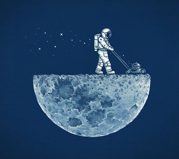
Astronauts recur in Dika’s orbit for good reason. A spacesuit is already a costume of seriousness; put a lawnmower in those gloved hands and the suit becomes comedy without losing loneliness. The half-moon with a perfectly flat top reads like a joke about how humans remake every landscape into something usable—even when the landscape is a cratered rock in a star field. Fine hatching on the lunar underside keeps the fantasy grounded in craft.
Elsewhere, space themes braid with cultural icons and abstract symbols rather than hard science fiction. The point is rarely “what year is this mission.” It is “what happens when we transplant earthly habits into an impossible setting.” Domestic labor, childhood games, and brand-adjacent silhouettes become tools for thinking about ambition, pollution, and longing.
Two stories in one frame
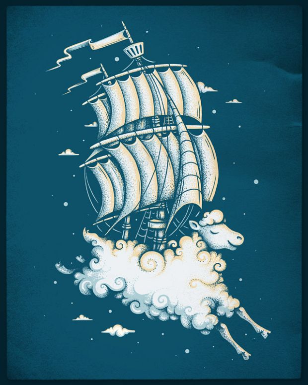
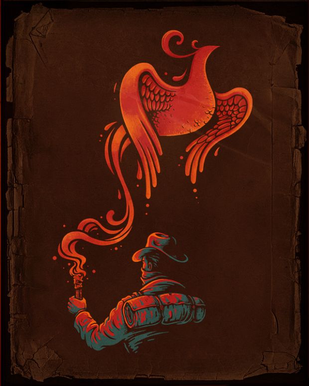
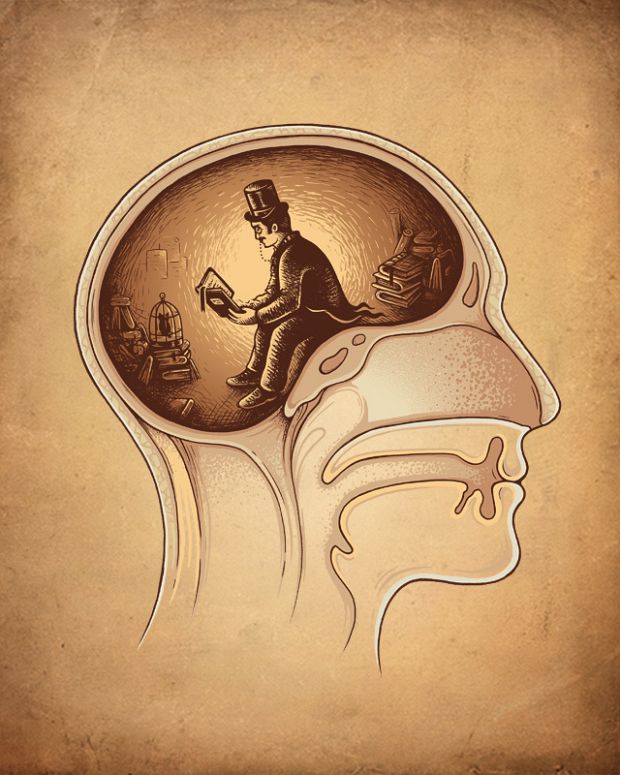
Commentators covering Dika’s early-2010s work often noted his habit of folding two narratives into a single composition. A figure may belong to one story while the object they hold belongs to another; the tension between them is the picture. That structure helps explain why the images feel like magazine covers for essays that were never written. You supply the second half of the argument while looking.
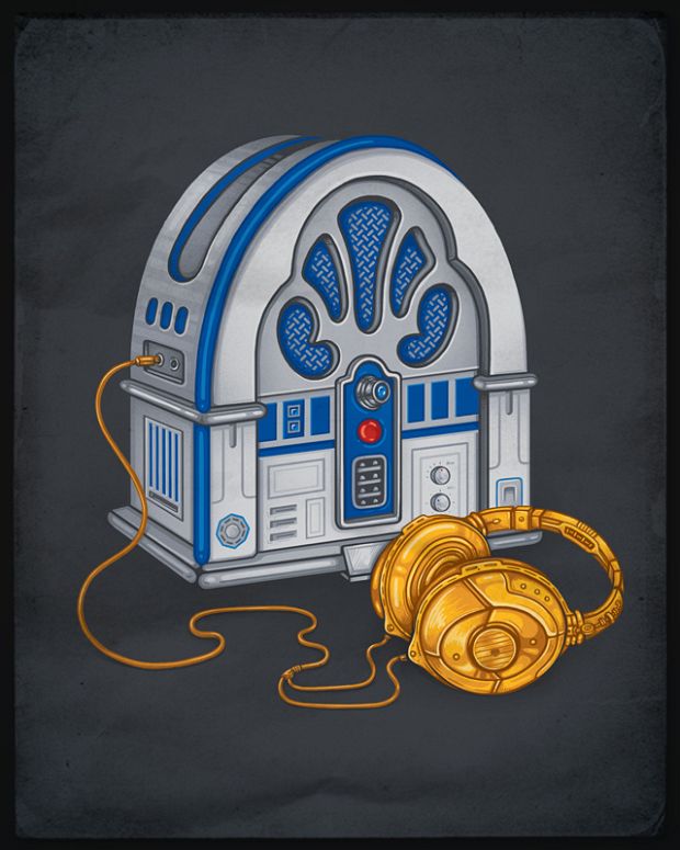
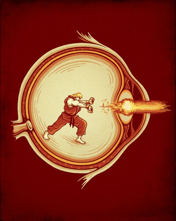
Pop-culture and geek references appear not as pure fan service but as shared vocabulary. When a familiar silhouette enters a strange setting, recognition becomes the first step of the joke—and of the critique. Threadless and other design communities circulating tee-shirt-ready concepts in that era were a natural home for this kind of clarity: strong read at thumbnail size, richer after a closer look.
Color as argument
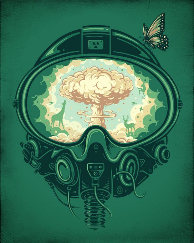
Dika’s palettes are rarely muddy. High-key sand against teal, white suit against navy, or a single accent cutting through near-monochrome fields—these choices act like rhetorical underlining. Limited color also makes the darker pieces feel designed rather than gloomy for mood alone. Smoke can be almost cartoon-bulbous and still land as warning because the surrounding hues stay disciplined.
Look for how often a single saturated note carries emotional weight: a red shovel handle, a warm highlight, a slash of contrast on otherwise cool paper. That restraint is part of why the illustrations photograph and resize well. They are built for screens and prints without needing a paragraph of explanation printed beside them—though they reward one.
Childhood without nostalgia filters
When children appear in these pictures, they are rarely soft-focus cherubs. Masks, tools, and oversized responsibilities turn play into allegory. The sand-factory child is not “cute environmental art” in the greeting-card sense; the protective gear makes the game feel like rehearsal for a damaged world. That edge separates Dika from purely whimsical illustrators who use kids as shorthand for innocence.
Adult viewers tend to project policy debates onto such images—climate, industry, consumerism—but the drawings stay specific. A plastic shovel. A handmade mound. A plume that looks almost friendly until you notice what it is. Specificity keeps the work from floating away into slogan territory.
Craft under the concept
Because the ideas are so loud, it is easy to underrate the draftsmanship. Contours stay confident. Folds in a spacesuit, crater texture, and the weight of a figure’s squat are handled with enough modeling to feel solid without tipping into hyperrealism. Stipple and hatch appear where they earn their keep—on rock, fabric, and smoke edges—rather than as a default skin for every surface.
That balance matters for illustrators studying the set. Concept without craft becomes a caption with a sketch; craft without concept becomes a pretty void. Dika’s early gallery pieces show a workable middle path for anyone building a portfolio meant to travel online: invent a sharp premise, design it for immediate reading, then finish the surfaces just enough to invite a second look.
Where the work sat historically
This collection belongs to a moment when Flickr, design blogs, and tee-shirt communities still functioned as primary discovery engines for freelance illustrators outside major agency circuits. A strong series could travel from a personal photostream into roundups within days. Dika’s mix of surreal humor and poster clarity was well suited to that ecosystem: images that survive compression, invite comments, and still feel authored rather than stock.
Later print and merchandise channels would continue to suit the same strengths—bold icons, readable metaphors, colors that hold on paper. The historical context for this page, though, is that early-2010s circulation: a freelance voice from Struga finding an international audience through shareable conceptual pictures rather than through gallery pedigree alone.
How to look at the gallery
Try reading each image twice. First pass: name the collision—childhood versus industry, space versus housework, icon versus abstraction. Second pass: notice what Dika refused to add. Missing backgrounds, spare props, and flat color fields are not emptiness; they are editing. If you are an illustrator, steal the editing habits before you steal the motifs. If you are a viewer, let the silence around the figures do some of the storytelling.
A useful exercise is to cover the “clever” object with your hand—the mower, the mask, the factory chimney—and ask what remains. Often a lonely figure in a strong silhouette is still there. The concept amplifies an already solid figure drawing; it does not replace one.
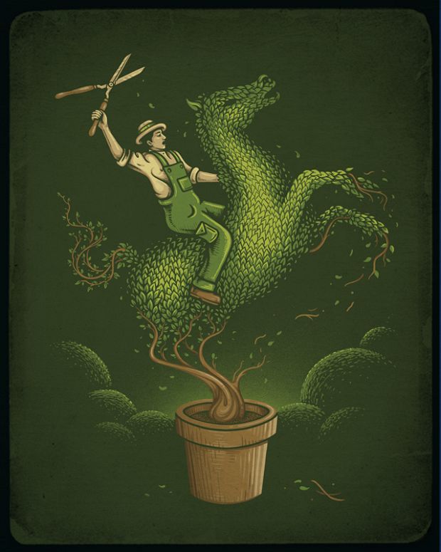
Keep that habit as you finish the set: find the human scale inside the surreal gag. When the joke and the loneliness arrive together, you are looking at Enkel Dika at full strength.

Comments
Continue reading
Christina Hess’s Animals From History: Costumed Pets as Playful Portraits
Illustrator Christina Hess reimagines historical icons as ornate animal portraits—Elvis Petme and friends—mixing puns, costume detail, and soft history lessons.
Everyday Objects Reimagined in Art by Javier Pérez
Ecuadorian illustrator Javier Pérez (cintascotch) turns grapes, condiments, and desk clutter into witty photo-doodles—minimal lines, maximum double takes.
Evan Robertson’s Illustrations from Underlined Book Quotes
Through Obvious State, designer Evan Robertson turns underlined literary lines into black-and-white posters where text and drawing think together.