
Evan Robertson’s Illustrations from Underlined Book Quotes
Through Obvious State, designer Evan Robertson turns underlined literary lines into black-and-white posters where text and drawing think together.
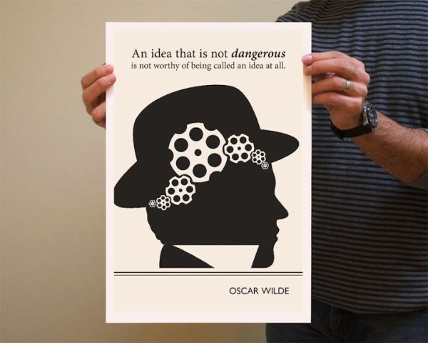
Some sentences refuse to stay on the page. You underline them, dog-ear the corner, or highlight a strip of light on a screen, and the line keeps working after you close the book. New York graphic designer Evan Robertson built a body of black-and-white illustrations out of exactly that habit: literary quotes treated not as décor slogans, but as springs for images that think alongside the words.
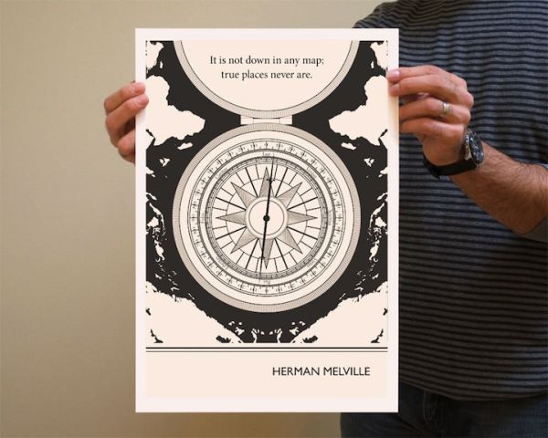
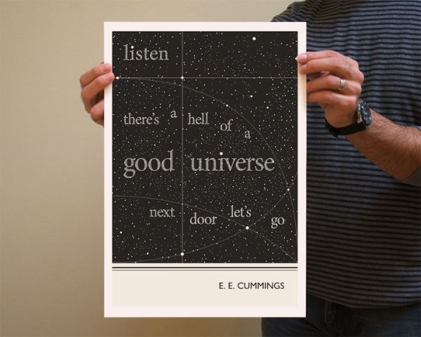
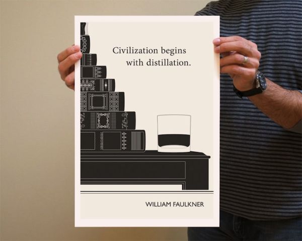
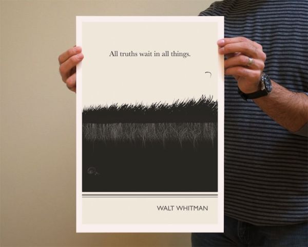
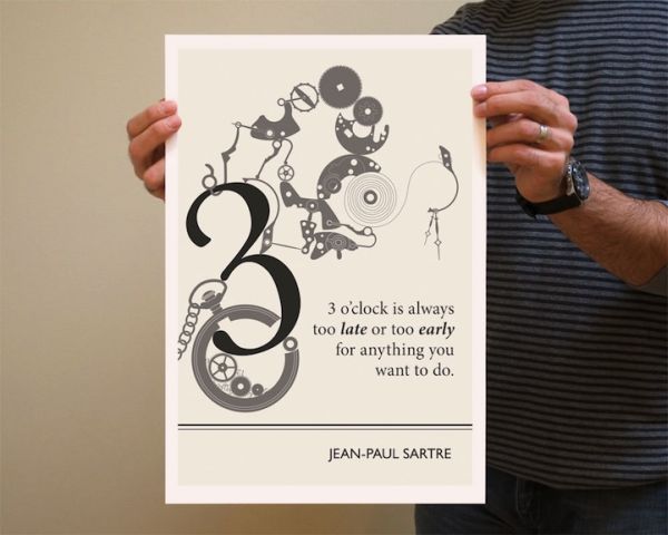
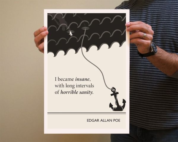
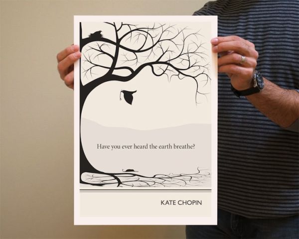
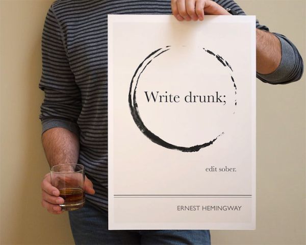
The series—widely shared in the early 2010s and sold through Obvious State, the studio he founded with Nichole Robertson—turns “underlined” fragments into posters where type and drawing share one field. Faulkner, Wilde, Whitman, Vonnegut, Hemingway, Nabokov, Salinger, Chopin, Bowles, and others appear not as solemn marble busts but as partners in a visual argument. You read; you look; the two acts refuse to separate. Bookworms recognize favorite voices. Everyone else still gets a sharp graphic poem.
Underlining as the original hyperlink
Robertson has described paperback underlining as interactive media before apps claimed the word. A marked sentence is a private hyperlink: it leaves the plot for a moment and opens a window onto your own associations. That metaphor explains the posters better than “quote art” ever could. He is not illustrating a chapter summary or casting the author as a brand mascot. He is chasing the spark that made a line underline-worthy in the first place—the moment reading becomes thinking.
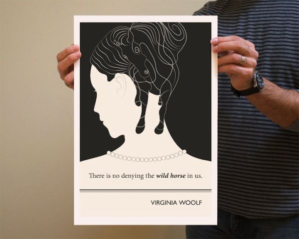
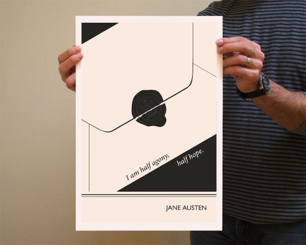
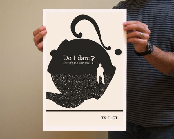
In interviews he talked about finding “little jewels of sentences,” then letting those snippets become springboards. The drawings incorporate and interact with the text so the result engages mind and eye together. When the system works, you cannot crop the words out without breaking the picture, and you cannot read the words as a neutral caption floating in a margin. Image and quote braid until neither half feels pasted on.
That standard is stricter than merch culture usually allows. Plenty of products plaster famous lines over unrelated stock illustrations: a mountain under a courage slogan, a typewriter under any writer’s name. Robertson’s better pieces invent a visual logic that answers the sentence—sometimes literally, often sideways, occasionally with a wink that matches the author’s own tone. The wit is structural, not only decorative.
Why black and white fits literature
Restricting the palette does rhetorical work. Black ink on light ground echoes the book page and the printshop poster at once. It also forces invention: without color spectacle, composition, silhouette, texture, and negative space must carry emotion. The monochrome look makes the series feel like a set—cohesive enough to collect as a wall conversation, varied enough that each quote still gets a distinct visual thesis.
Designers studying the work should notice lettering as drawing. Words are not always typeset in a polite footer; they participate in the illustration’s weight and rhythm. A phrase may curve, stack, interrupt a figure, or lock into a shape that is also an object. That integration is the craft lesson. Separating “nice font” from “nice drawing” would miss how Robertson builds meaning. The quote is not a label for the picture. The quote is load-bearing architecture.
Restraint also ages well. Trends in poster color and stock photography churn quickly. A strong black-and-white idea still reads as intentional a decade later, which is part of why these images kept circulating after the first blog-wave attention faded.
Authors as material, not as brands
Part of the series’ charm is quote selection. Robertson has said he avoided only the most over-exposed lines when he could, preferring sentences he had underlined himself or stumbled on and loved. Visually minded reading was the test: a quotation earned a poster when it moved the hand as well as the head. If a line was famous but inert on the drawing board, it waited.
That approach keeps the gallery from feeling like a tote-bag starter pack of the same five aphorisms. Across coverage of the work you may meet Whitman on truths waiting in things, Capote needling writing-versus-typing, Nabokov on curiosity as insubordination, Salinger on poets and weather, Chopin asking if you have heard the earth breathe, Vonnegut wincing at being human, Bowles counting how many full moons you will really watch. Even Molly Bloom’s cascading yes from Joyce’s Ulysses has appeared in this literary-poster culture—proof that the project can handle exuberance and long breath as well as epigram.
Readers who know the books bring extra layers; readers who do not can still enjoy the posters as self-contained graphic poems. Either path is valid. The work does not punish the under-read; it rewards the attentive. In a feed culture that often uses authors as lifestyle accessories, that patience feels almost radical.
How to look at one poster
Try a short ritual with any image in the set:
- Read the quote once without hunting for the drawing’s “answer.”
- Cover the words with your hand (or mind) and describe the image alone—shapes, tension, humor.
- Uncover the words and name the hinge—the place where text and picture lock.
- Ask whether the illustration agrees with, argues with, or expands the line.
- Notice what is left un-drawn; restraint is often the wit.
- Decide whether you would still hang it if you forgot the author’s fame.
That method turns browsing into criticism without draining the pleasure. It also explains why these posters survive beyond a single viral pass: they have a re-readable structure, like a short poem with a visual stanza. Skimming collects likes; slow looking collects meaning.
From underlined line to studio practice
What began as a focused poster run grew into a broader Obvious State practice—prints, journals, cards, and related objects for people who want literature in the room, not only on the nightstand. The through-line remains graphic clarity and a belief that a sentence can be a public image without becoming empty branding. Robertson’s other projects (including music artwork and collaborative visual books with Nichole Robertson) sit in the same neighborhood: design that trusts viewers to think.
For illustrators, the transferable lesson is process order. Start from language that already has voltage. Build a visual system that needs those words. Edit until neither half feels optional. Test the piece by removing the author’s name—does the image-text hinge still hold? For teachers and book clubs, the posters can be prompts: guess the tone before revealing the source; compare two illustrated readings of related themes; ask students to underline one line and sketch a response without aiming for polish.
For ordinary readers, the invitation is gentler. Keep underlining. Your marks are not damage; they are a map of attention. Robertson simply made some of those maps visible, ink-dark and sharp enough to hang. If a particular poster sends you back to the novel or essay it came from, the experiment has succeeded twice—once as design, once as reading. That double success is rarer than another pretty quote on a wall, and it is why illustrations from underlined book quotes still earn a slow second scroll through the gallery.

Comments
Continue reading
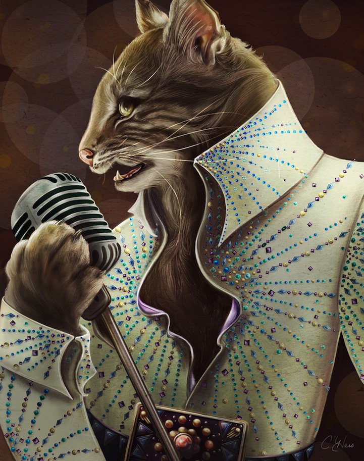
Christina Hess’s Animals From History: Costumed Pets as Playful Portraits
Illustrator Christina Hess reimagines historical icons as ornate animal portraits—Elvis Petme and friends—mixing puns, costume detail, and soft history lessons.
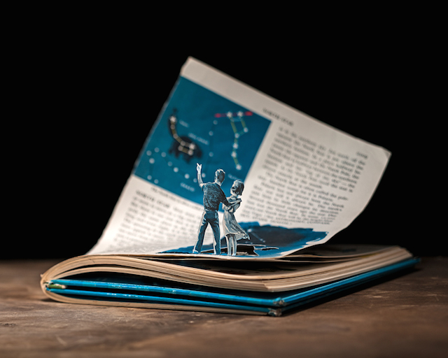
Thomas Allen’s Book-Cut Illustrations
Michigan illustrator Thomas Allen cuts pulp paperback figures into 3D tableaux, photographs them in shallow focus, and gathers the practice in his Aperture book Uncovered.
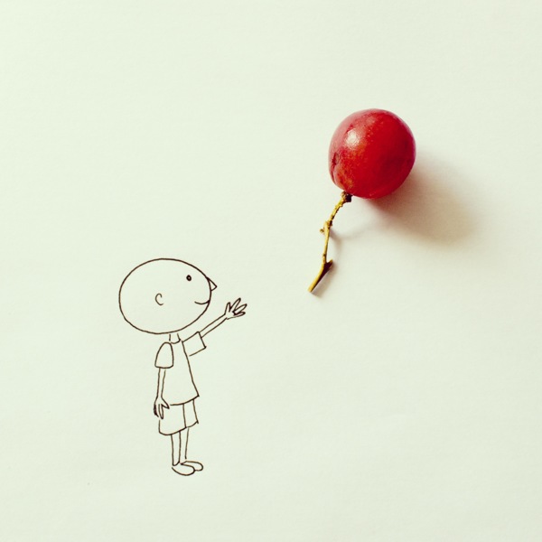
Everyday Objects Reimagined in Art by Javier Pérez
Ecuadorian illustrator Javier Pérez (cintascotch) turns grapes, condiments, and desk clutter into witty photo-doodles—minimal lines, maximum double takes.