
Cool Illustrations by Nabhan Abdullatif: Visual Puns in Vector Form
Omani illustrator Nabhan Abdullatif turns idioms, gadgets, and pop icons into minimalist conceptual cartoons—tea cups, office chairs, Mario cans, and more.
Nabhan Abdullatif draws the way a good comedian tells a one-liner: set the scene, leave out every extra word, and let the punchline land in a single glance. An Omani graphic artist and illustrator, he works mainly in conceptual illustration and vector art—clean shapes, flat color, thin stick limbs, and faces made from almost nothing. In the early 2010s he shared much of that portfolio on DeviantArt while working in media and advertising; later audiences found him through Instagram and design blogs that circulated his visual puns. The drawings still read instantly because the jokes are built from language you already know.
What follows is a walk through a set of those pieces: tea cups and autumn trees, game characters and office chairs, diamonds under pressure and umbrellas that hesitate. Together they show how Abdullatif turns everyday objects into small stage plays.
Language first, drawing second
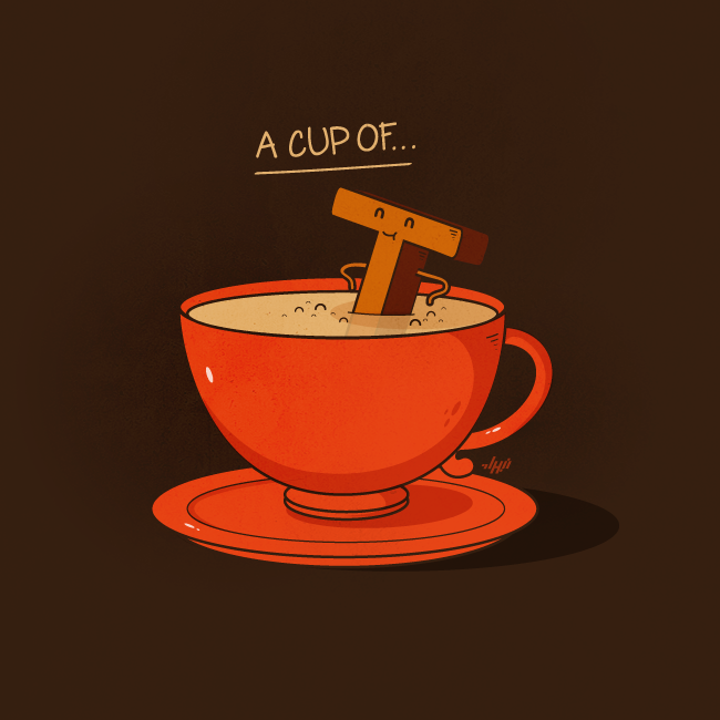
Start with a cup. “A cup of…” hangs above a bright red teacup; inside the milky tea, a smiling letter T soaks like a bather. The gag is almost too neat. English already hid the punchline in the phrase “a cup of tea.” Abdullatif only has to stage the letter as a character—closed eyes, tiny arms on the stem of the T—and the idiom becomes a scene.
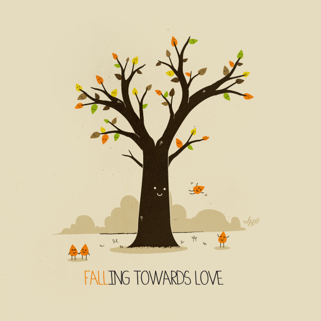
Romance gets the same treatment in “Falling Towards Love.” A tree with a tiny face sheds smiling leaves; two leaves hold hands on the ground while another floats down. The word “FALL” is painted in leaf orange so the season and the feeling share one stroke. Nothing is overdrawn. Hills are soft mounds; grass is a few ticks of ink. The warmth comes from restraint.
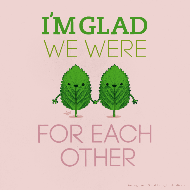
Mint leaves holding hands under “I’m glad we were… for each other” push the method further. “Mint for each other” is a groaner on paper and a sweet image on screen. Serrated edges and pale pink negative space do the botanical work; the faces do the emotional work. Abdullatif trusts you to hear the missing syllable.
Pop culture as shared vocabulary
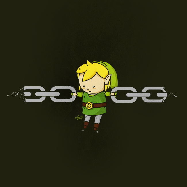
When he borrows from games and comics, he still keeps the line count low. Link from The Legend of Zelda becomes a literal link in a metal chain—green tunic, yellow hair, rosy cheeks—hanging between two oval rings against a near-black field. The name does the joke; the illustration only has to make the physics adorable.
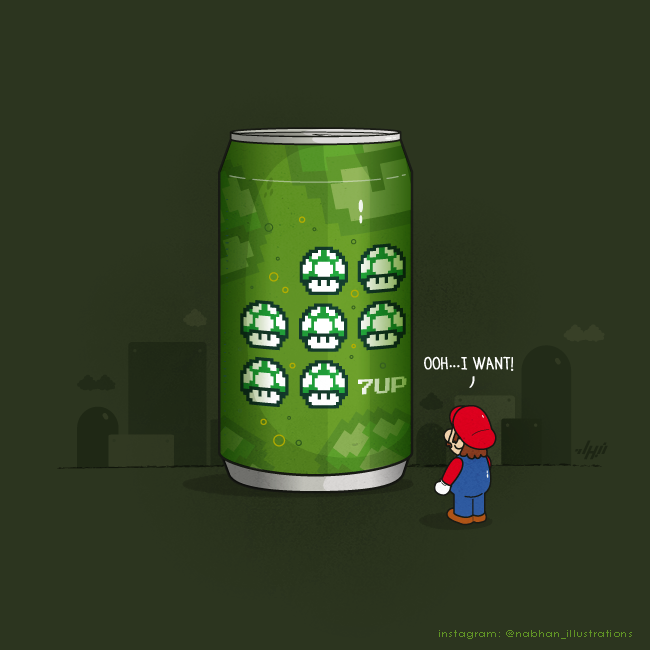
A giant green soda can labeled “7UP” with seven pixel 1-up mushrooms is the same idea aimed at Mario fans. A tiny Mario looks up and says he wants it. Pixel mushrooms sit on a smooth vector can; hills and clouds sketch a game world without rebuilding it. The mash-up works because both brands already live in the viewer’s head.
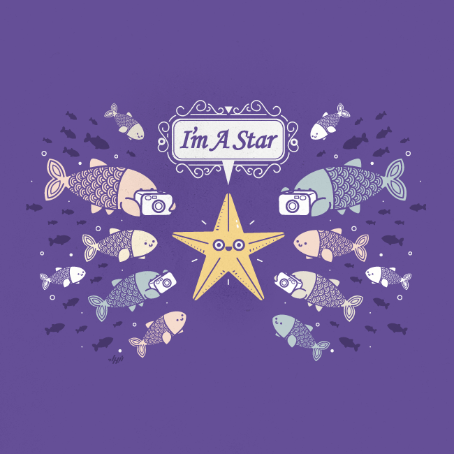
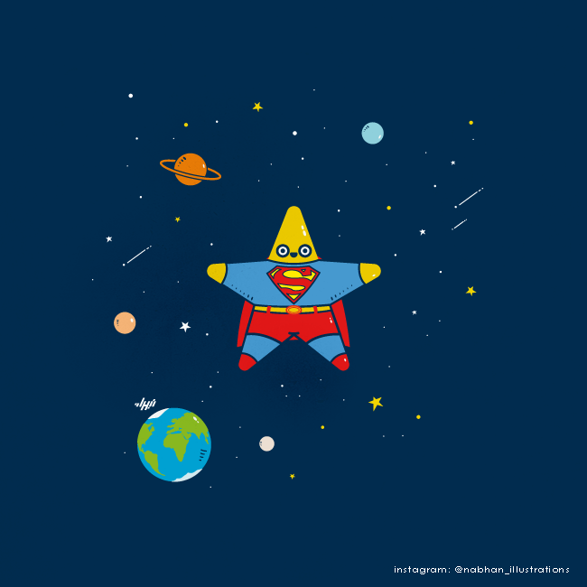
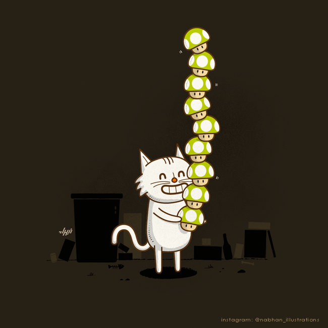
Elsewhere a yellow starfish poses for pastel fish with cameras—“I’m a star”—and a Superman-costumed star floats past Saturn and Earth. Celebrity and heroics collapse into geometry. A white cat balancing a tower of green 1-up mushrooms in an alley feels like a cousin to those pieces: pop icons treated as props in a quiet cartoon, not as merch posters.
Objects with opinions
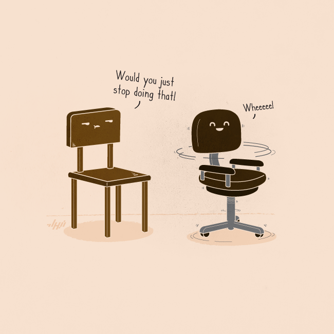
Abdullatif’s best panels give furniture and tools the emotional range of sitcom characters. A wooden chair snaps “Would you just stop doing that!” while a spinning office chair replies “Wheeeee!” Motion lines do half the comedy; the faces do the rest. Anyone who has shared a workspace recognizes the roles.
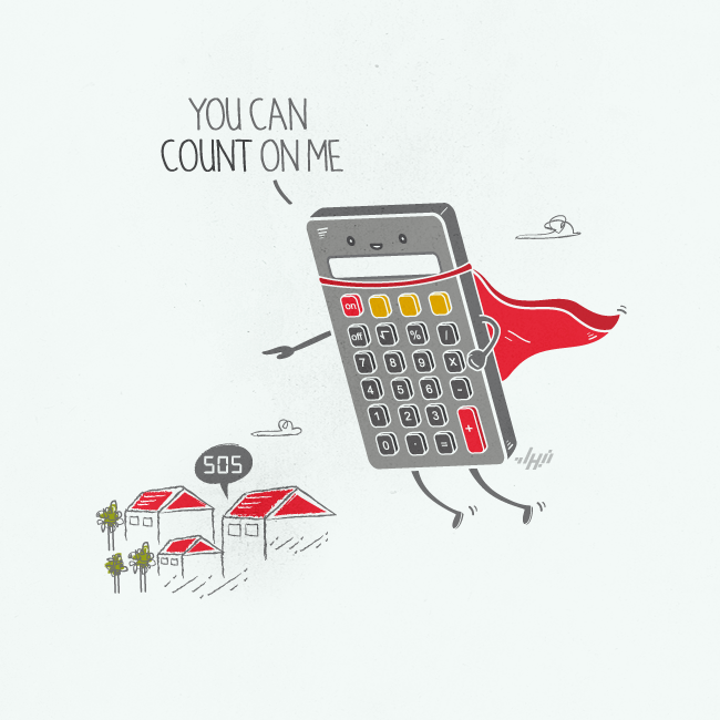
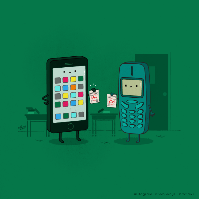
A calculator in a red cape flies over tiny houses shouting “You can count on me,” while a speech bubble from the ground reads “505”—calculator digits that look like SOS. Dependability becomes a costume change. A smartphone with an A+ gloats beside a sad feature phone holding a C−; “smart” stops being marketing language and becomes a report card.
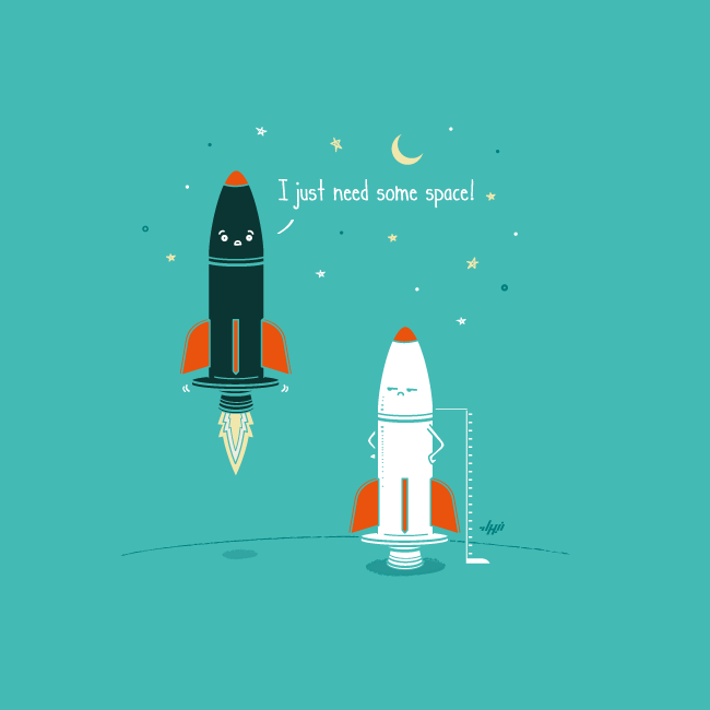
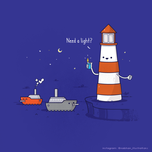
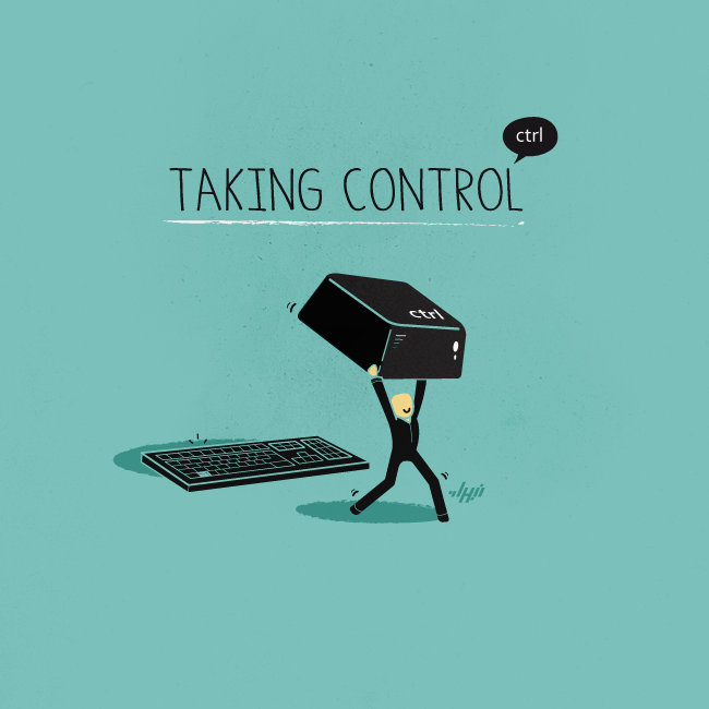
Rockets argue about personal space—one blasting off with “I just need some space!”—while a lighthouse offers ships a cigarette lighter: “Need a light?” A figure in a suit carries an oversized Ctrl key away from a keyboard under the title “Taking Control.” In each case the object’s job and the idiom’s second meaning collide, and Abdullatif draws only what the collision needs.
Food, candy, and kitchen bands
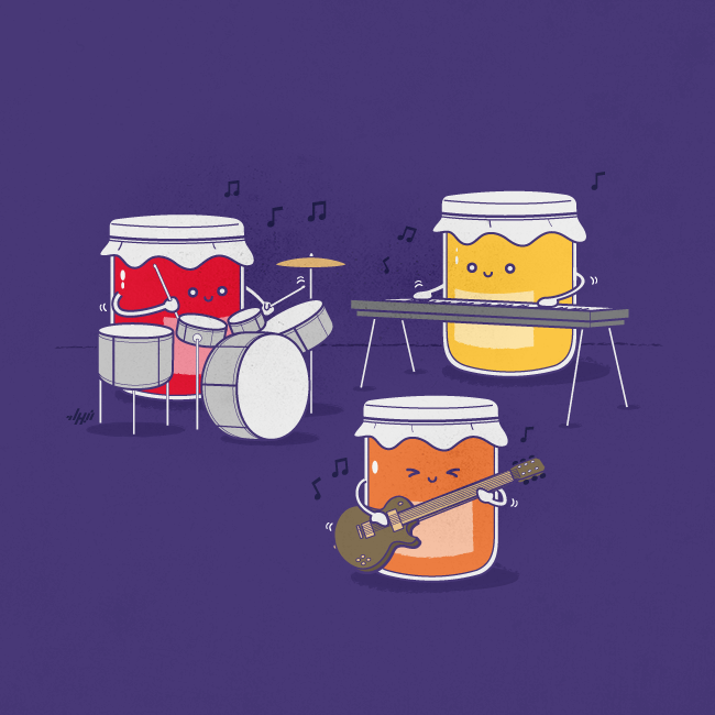
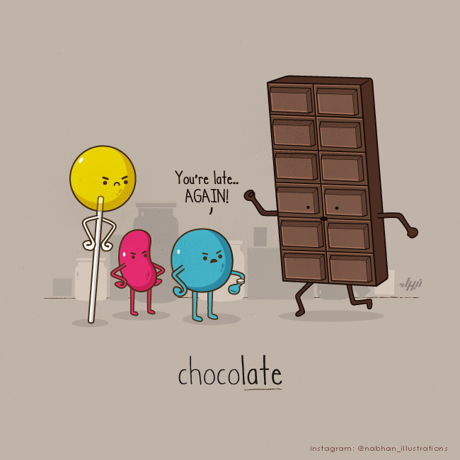
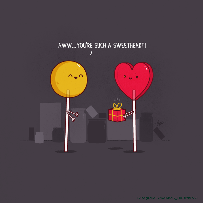
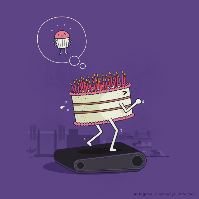
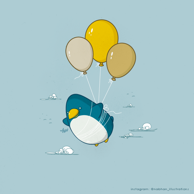
Kitchen vocabulary is fertile ground. Three jam jars form a band—drums, guitar, keys—on a purple stage: a jam session you can see. A chocolate bar sprints toward impatient candies while the word “chocolate” underlines “late.” A yellow lollipop calls a heart-shaped one a sweetheart. A birthday cake sweats on a treadmill, dreaming of becoming a lean cupcake. Even a penguin lifted by balloons belongs in this playful set—less a spoken pun than a flightless bird granted flight by party supplies.
Sharper edges and quieter gags
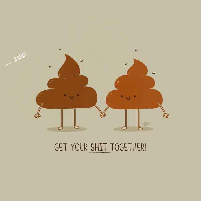
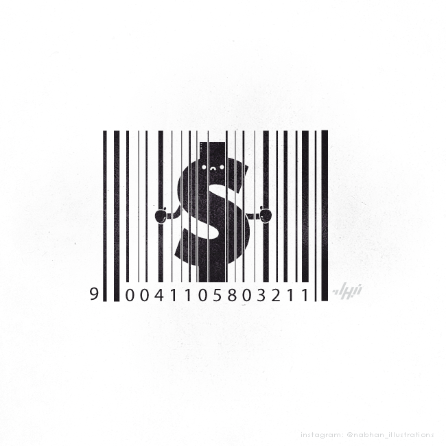
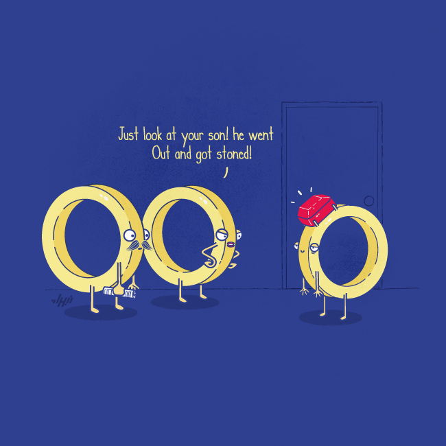
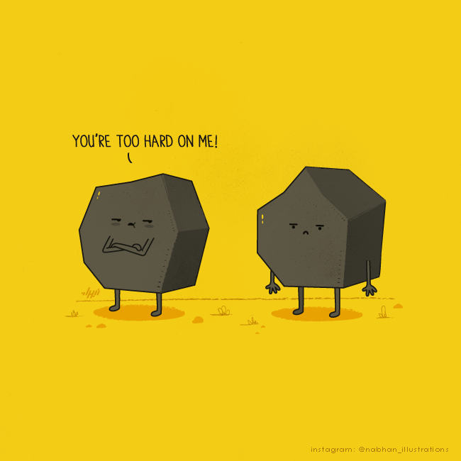
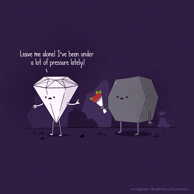
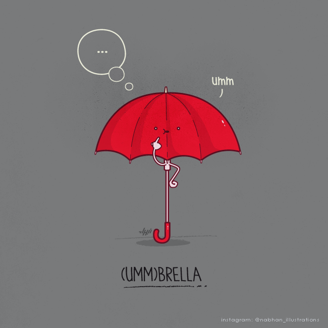
Not every panel is pure sweetness. Two swirly characters hold hands under “Get your shit together!”—crude, yes, but drawn with the same gentle faces as the mint leaves. A dollar sign grips barcode lines like prison bars: commerce as a cell. Rings argue about a son who “got stoned” (read: received a gem). Rocks complain “You’re too hard on me!” A diamond tells coal to leave it alone—“I’ve been under a lot of pressure lately!” An umbrella pauses with “umm…” above “(UMM)BRELLA.” The range matters. Abdullatif can be cute, slightly rude, or lightly critical without changing his toolkit.
Why the style travels
Abdullatif’s craft habits explain the shareability. Solid color fields replace busy environments. Faces are two dots and a curve, so emotion reads at thumbnail size. Captions are short and often underline the double meaning. Stick arms and soft shadows keep objects on a stage instead of floating in void. The work is digital and vector-clean, yet it feels handmade because the ideas are human-scale: deadlines, romance, sibling annoyance, fitness guilt, office boredom.
For illustrators, the lesson is not “draw more jokes.” It is: pick phrases that already contain pictures, then remove everything that does not serve the second meaning. For everyone else, the gallery is simply fun to look at slowly. Which object on your desk already has a face waiting—and which idiom would it complain about first?

Comments
Continue reading

Still-Life Photography by Margareth Perfoncio
São Paulo photographer Margareth Perfoncio’s still lifes of food and flowers—Old Master light, dark wood, and tables that feel inevitable.

Meaningful Love Quotes for Inspiration (and Ink)
Meaningful love quotes that still feel true — short lines for tattoos, gifts, and everyday reminders, with placement and wording tips.
Christina Hess’s Animals From History: Costumed Pets as Playful Portraits
Illustrator Christina Hess reimagines historical icons as ornate animal portraits—Elvis Petme and friends—mixing puns, costume detail, and soft history lessons.