
Andrew Zonzini’s Comic-Strip Photographs (@perrycolante)
Italian illustrator Andrew Zonzini stages colorful paper graphics on real walls, then photographs them so still images read like comic strips—without post-shoot digital collage.
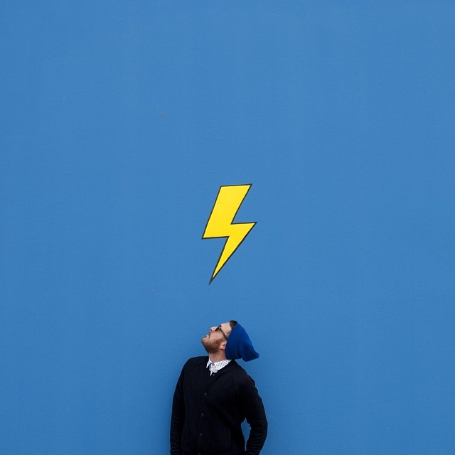
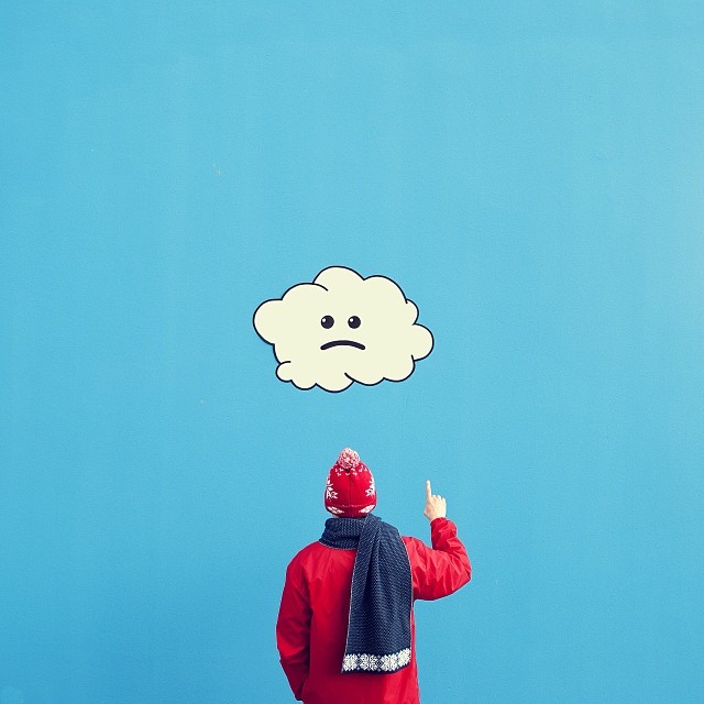
Andrew Zonzini—better known on Instagram as @perrycolante—is an Italian illustrator and graphic designer who builds photographs that behave like comic strips. Flat color fields, bold graphic shapes, and human figures share the same frame until the picture stops looking like a snapshot and starts reading like a panel. The trick is that the “digital” look is mostly physical.
In the early 2010s, when Instagram still felt like a place for experiments rather than brand calendars, Zonzini’s feed stood out for exactly that confusion. Viewers assumed the illustrations were layered in software after the shoot. He has said the opposite: he wants the photograph to seem like a graphic composition, because that means the staged scene already did the work of a comic strip.
Comic logic inside a still photograph
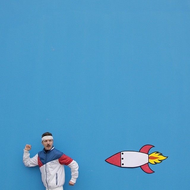
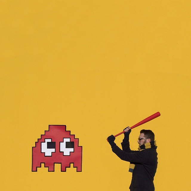
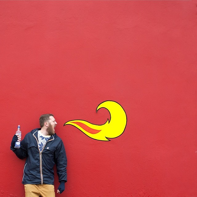
A comic strip simplifies. It reduces a moment to shape, color, gesture, and a punch of contrast. Zonzini’s images borrow that economy. Backgrounds are often continuous painted or papered walls. Props are oversized icons—speech bubbles, arrows, flat characters, geometric blocks—rather than naturalistic clutter. People inside the frame act as both models and typography: a pose becomes a caption, a glance becomes a punchline.
Color does heavy lifting. Saturated reds, yellows, blues, and greens sit next to each other with little atmospheric blending. That clarity is why so many frames get mistaken for pure illustration. Soft gradients and lifestyle haze would break the comic contract. Hard edges keep the eye reading the picture as design first and documentary second.
Simplicity is not emptiness. The compositions are usually sparse on purpose: one interaction, one graphic idea, one joke or tension. That restraint is closer to a single-panel gag or a clean album cover than to a busy collage. When the image works, you can summarize it in a sentence. When it fails, it would look like stickers on a person—and Zonzini’s best frames avoid that deadness by aligning body, prop, and wall into one rhythm.
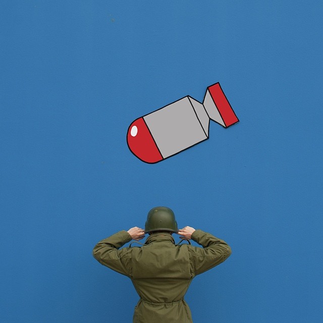
Scale games sharpen the humor. A paper shape larger than a head, or a tiny graphic interrupting a full-body pose, creates the same surprise a comic panel gets from bold lettering. The camera freezes that imbalance so the joke does not need a caption thread underneath.
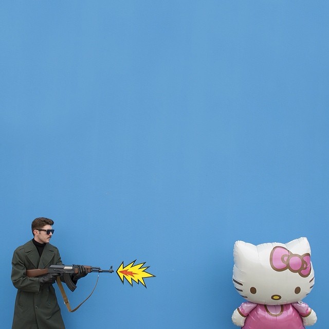
Built on the wall, not in the laptop
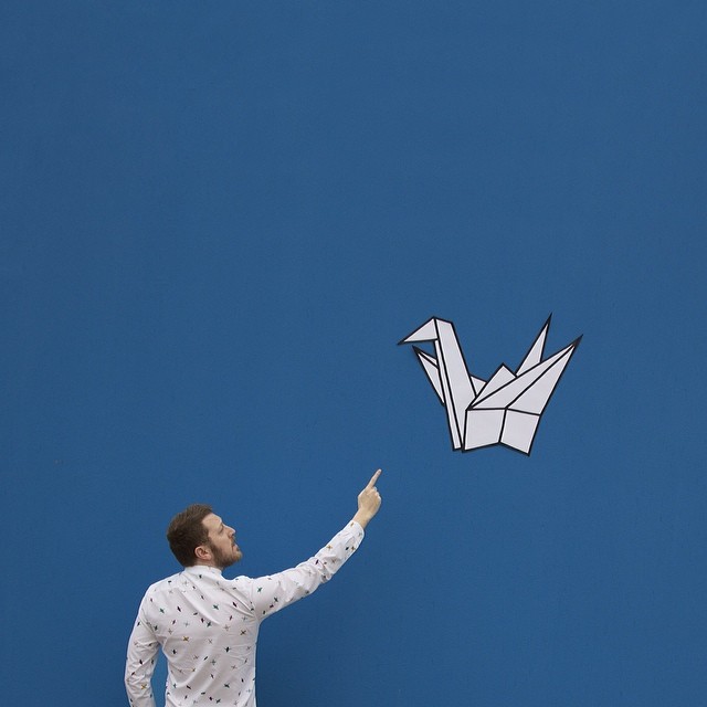
Zonzini’s process has been described in interviews with a useful concreteness: handmade paper cutouts and graphic elements are attached to a wall—often with double-sided tape—then photographed with friends, family, or himself as the human element. After the shoot, the stickers come home. Some end up decorating a garage wall, a leftover set from pictures that already traveled the world as JPEGs.
That workflow matters critically. It means scale, shadow, and alignment have to be solved in real space. A speech bubble that looks perfect in Photoshop can sit wrong when a shoulder moves three centimeters. Tape, paper weight, and camera distance become design tools. The “digital” cleanliness people admire is partly the discipline of not fixing everything later.
He is a designer who draws, not only a photographer who filters. The graphic pieces are his illustrations temporarily installed as set design. The camera records a collaboration between drawing and body. In an era when phone apps made surreal composites easy, choosing the harder physical route gave the work a slight uncanny friction: light wraps around paper edges; tape occasionally betrays itself; the joke still lands.
Practical constraints also shape the style. A wall is a finite stage. Lighting is whatever the room and time of day allow. Models cannot levitate unless a prop invents the fiction. Those limits push invention toward graphic clarity instead of endless digital revision. The finished square on Instagram looks effortless; the afternoon behind it is closer to building a tiny set for a one-frame play.
From symmetrical landscapes to graphic statements
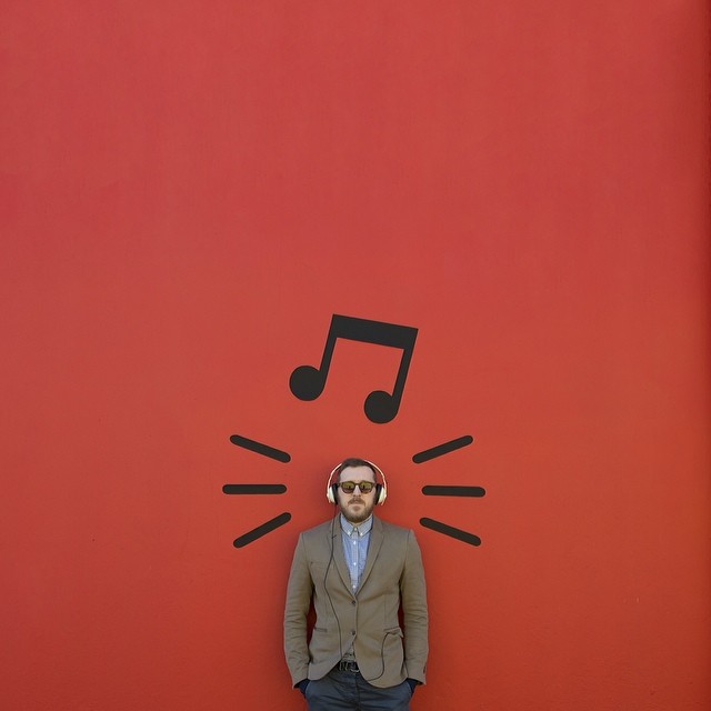
Accounts that followed Zonzini over time noted an evolution. Earlier posts leaned toward crisp, sometimes HDR-flavored views of buildings and symmetrical landscapes. The later signature—bold props, saturated walls, staged people—did not erase that eye for order. It redirected it. Symmetry and clean framing remain, but the subject became invented rather than found.
Living and working between Italy and San Marino contexts, he published work that design blogs and Instagram roundups repeatedly singled out around 2013–2015. The appeal was not celebrity access. It was a recognizable personal system: anyone scrolling could spot a perrycolante frame without reading the username. In a feed full of sunsets and brunch, a flat yellow wall with a paper monster and a deadpan human face was a different tempo.
Some images push beyond cute into satire. Minimal setups can still carry a jab—about connection, vanity, boredom, or the way people perform for cameras. The philosophical tone other writers noticed comes from that gap: bright colors, simple shapes, and a slight unease about what the people in the frame are doing with the icons around them. You do not need a caption when the prop already argues.
Friends and relatives as recurring cast members keep the work intimate. These are not fashion-agency tableaux. Familiar faces in unfamiliar graphic weather make the surrealism friendlier and stranger at once. The feed feels handmade because the social circle in it is real.
Why the work still teaches designers
For illustrators, the lesson is spatial. Drawings do not have to live only on screens or posters; they can occupy a room long enough to be photographed as truth. For photographers, the lesson is art direction: a strong graphic idea upstream beats heavy retouching downstream. For anyone making square images for social media, the lesson is compression. One conflict, one palette, one readable silhouette will outlast a busy scene that tries to say everything.
There is also a craft lesson about trust. Viewers love being fooled when the fooling is generous—when the maker invites a double take instead of hiding a cheap composite. Zonzini’s images reward the second look: the shadow under a paper edge, the slight curl of a cutout, the fact that a “vector” character shares real light with a living shoulder. That honesty inside the illusion is why the series holds up after the first viral share.
Zonzini has said that if his work inspires anything, he hopes it transmits the desire to invent a personal creative style. That is a modest claim and a hard one. Copying his tape-and-wall method without his sense of color and timing produces props. Copying his saturation without his editing eye produces noise. The durable part of the project is the decision to make photographs that think like comics while remaining, stubbornly, photographs.
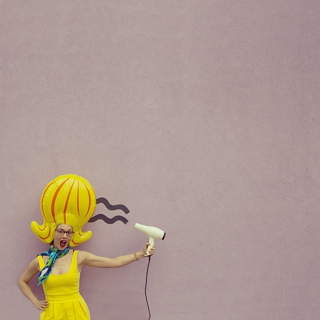
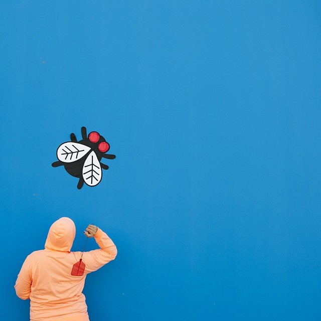
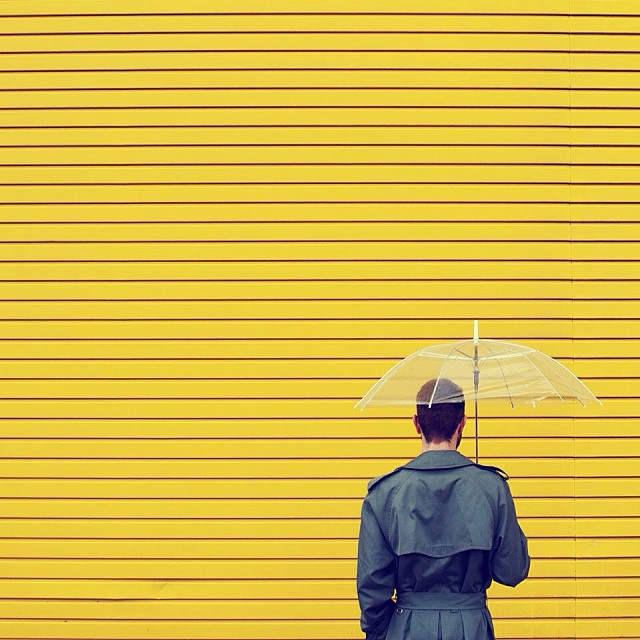
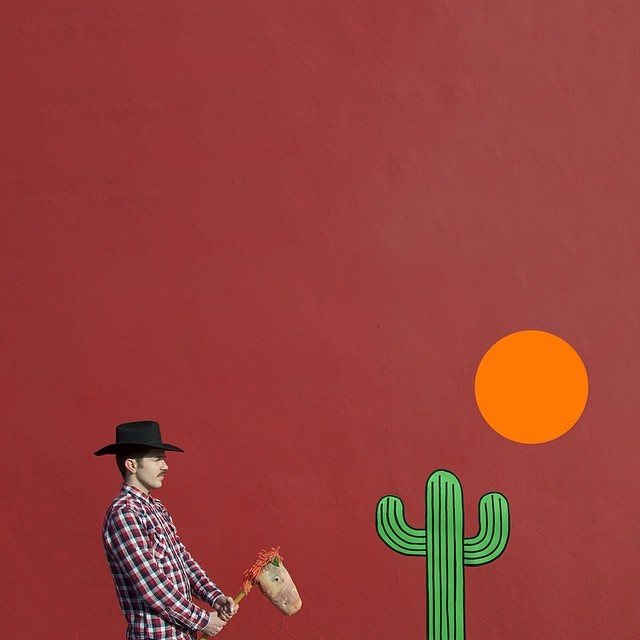
Look at the frames in sequence and you start to see the rules he keeps returning to: flat color, human scale against paper scale, and a final image that could pass as a digital layout until you notice the small physical tells. That hesitation—Is this drawn or shot?—is not a bug in the work. It is the punchline he builds toward every time.

Comments
Continue reading
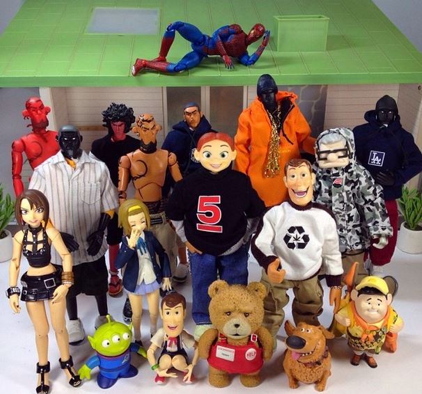
Extremely Funny Toy Stories by Johandi Yahya
Johandi Yahya’s short Instagram toy films—Toy Story figures, Spider-Man, turtles, and more—use tabletop staging and sharp timing to turn a shelf into comedy.
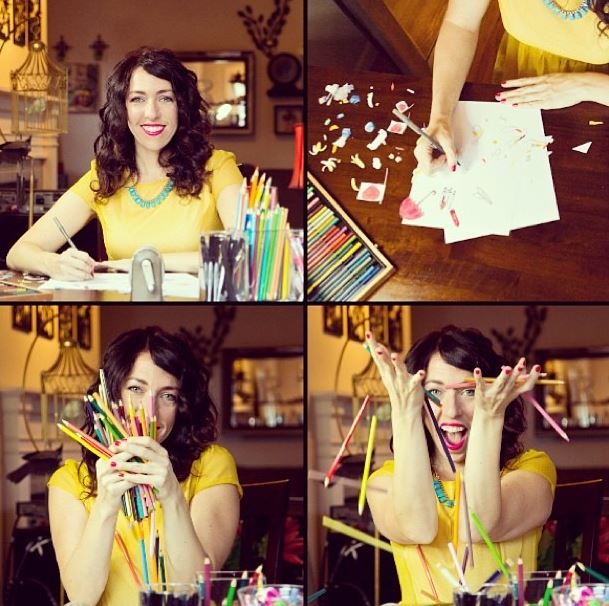
Rachel Ryle’s Stop-Motion Art on Instagram
Illustrator Rachel Ryle turned colored pencils and paper into 15-second Instagram stop-motion—handmade loops, desk craft, and a career launched in 2013’s video era.

Still-Life Photography by Margareth Perfoncio
São Paulo photographer Margareth Perfoncio’s still lifes of food and flowers—Old Master light, dark wood, and tables that feel inevitable.