
Funny Illustrations by Phil Jones: Objects with Punchlines
Minneapolis illustrator Phil Jones gives everyday objects dry, punny voices—coolers, fruit, planets, and cacti—in spare single-panel cartoons.
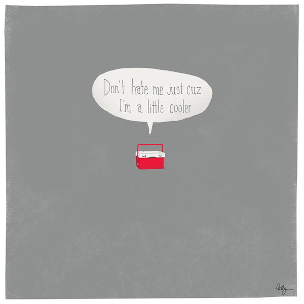
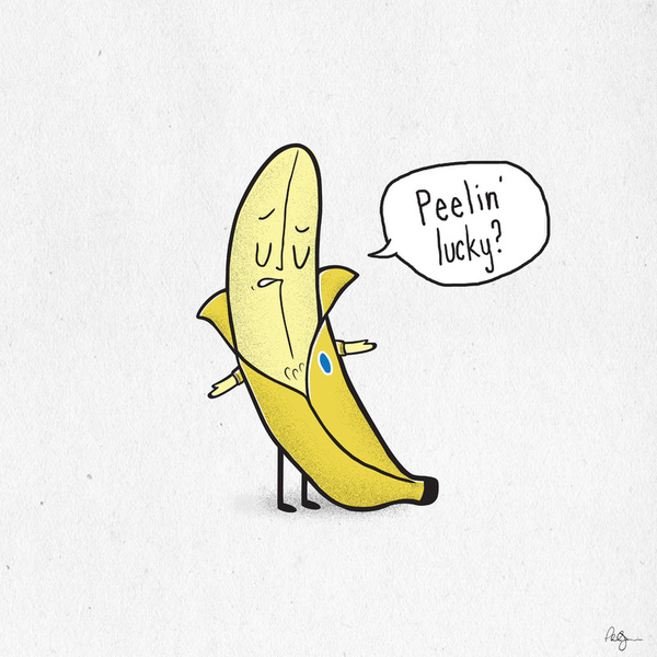
Minneapolis designer and illustrator Phil Jones has a habit of giving ordinary objects a voice—and then letting them say something slightly rude, slightly sweet, or perfectly timed. A cooler chest boasts that you should not hate it for being a little cooler. A hot dog flashes its bun. A banana peels open like a trench coat and asks if you are peelin’ lucky. The setups are simple; the punch lines land because the drawings stay spare enough for the joke to breathe.
Jones’s professional life has long lived in brand and experiential work—agency art direction, campaigns, immersive storytelling for clients that demand polish. The single-panel pieces that circulate online feel like a private sketchbook made public. He has shared “rejected” New Yorker–style cartoons as a running practice: tight concepts, flat color, handwritten speech bubbles, and a signature tucked in the corner. The humor sits next to the playful object-world of illustrators such as David Olenick, Marc Johns, and Alex Solis, yet Jones’s tone is drier. He trusts the pun. He does not decorate past the gag.
That mix—commercial craft plus personal silliness—is why the panels travel well. They read as logos that decided to tell a joke. They also reward people who care about illustration as a daily practice, not only as gallery work.
Objects with opinions
The cooler punchline is a master class in one-beat comedy. The prop is recognizable at a glance. The face is two curved lines. The bubble does the rest. That economy shows up across the gallery: saturated or grainy backgrounds, centered subjects, and captions that sound like something muttered at a party rather than written for a billboard.
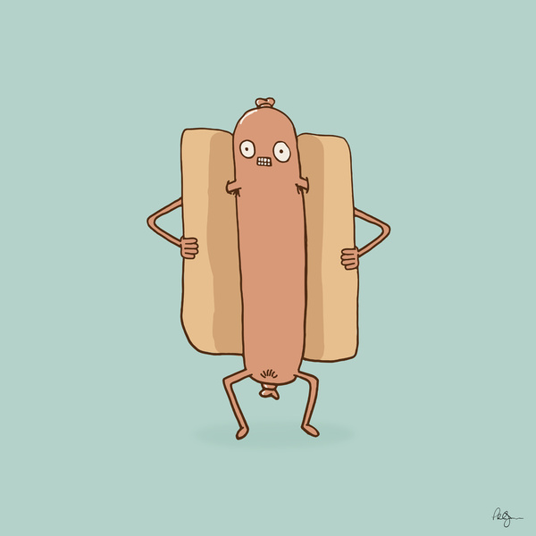
The hot dog in the bun-as-coat pose is pure visual slapstick. Stick limbs, clenched teeth, flat teal field—no scenery required. Food becomes character without needing a kitchen story. The banana that follows the same “flasher” logic goes further into pop-culture paraphrase, pairing the reveal with a Dirty Harry echo. You do not need the reference to smile; if you catch it, the smile lasts longer. Both pieces prove Jones can repeat a premise without making the second drawing feel like leftover inventory.
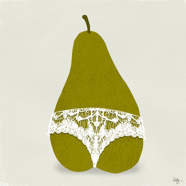
Some pieces skip dialogue entirely. A pear in lace lingerie is almost silent comedy: the shape of the fruit does the casting, the garment does the punchline, and the grainy background keeps the image from feeling like a product shot. It is the kind of drawing that works on a gallery wall and on a phone feed for the same reason—there is nowhere for the eye to hide from the joke. Silence is harder than caption comedy; Jones makes it look easy.
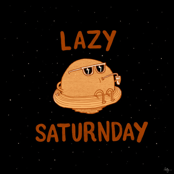
“Lazy Saturnday” turns a planet into a lounge character: rings as pool float, sunglasses with lightning bolts, a drink with a straw, starfield behind. The pun is printed large enough to read as title and caption at once. Jones often borrows that poster energy—word and image locked in one square—so the piece can travel as a shareable unit without a paragraph of explanation. Leisure absurdity is a Jones specialty: the cosmos taking a day off.
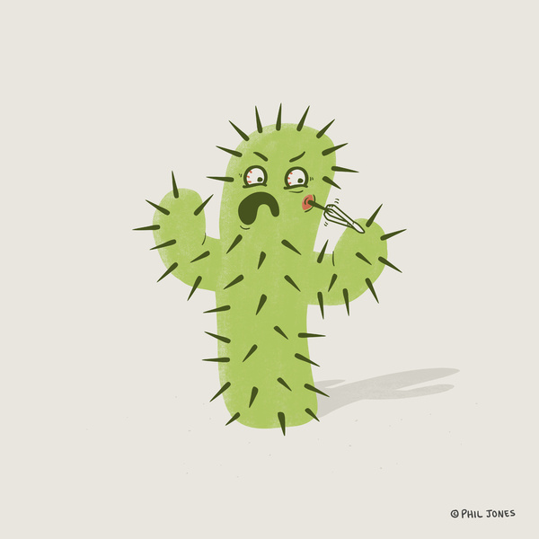
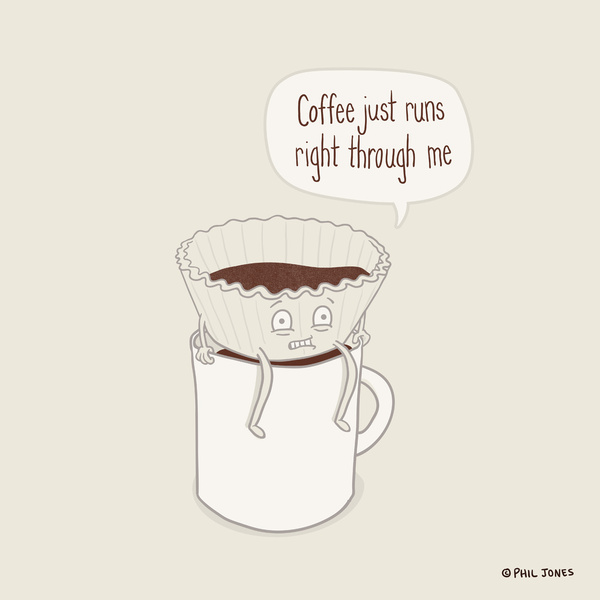
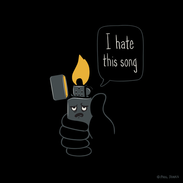
The cactus with tweezers is empathy comedy. A plant defined by spines is stuck doing the one grooming task that makes spines worse. Bloodshot eyes sell the pain; the red patch around the needle sells the specificity. It is the same animism that lets a lighter hate a song or a cupcake liner complain that coffee runs right through it: the object’s job in the real world becomes its personality problem on the page. Viewers laugh because they recognize the human version of the same bad idea.
Why the jokes stick
Look at the craft under the silliness. Outlines stay confident. Color fields are limited. Faces, when they appear, use a handful of marks. That restraint is advertising training turned inside out: Jones knows how to make a brand mark read at a glance, then applies the same clarity to a banana’s chest hair or a cooler’s smug lids. The drawings do not compete with the caption; they set the stage and get out of the way. Designers notice the negative space. Everyone else notices that the joke arrived on time.
Pop culture leaks in without becoming costume design. Sunglasses, movie paraphrases, lingerie as prop, planetary leisurewear—references are seasoning, not the meal. You can enjoy the cactus without knowing a single brand Jones has art-directed. You can still appreciate that the same brain that builds immersive brand worlds also notices how a pear looks in lace. That dual vision—boardroom polish and sketchbook mischief—is rare.
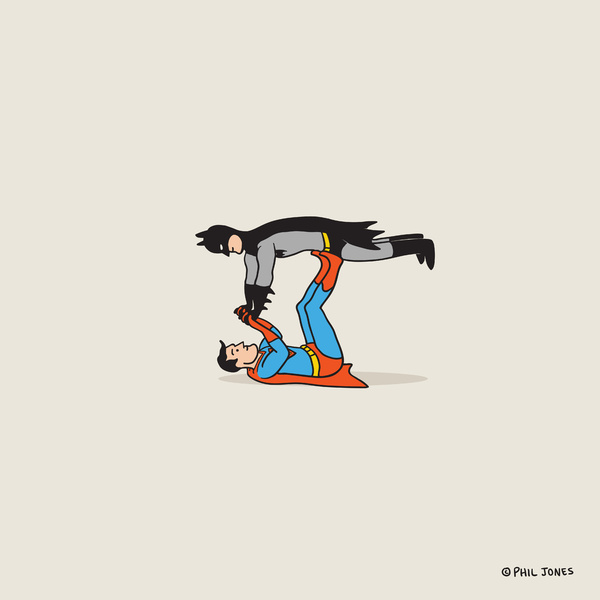
There is also a Midwestern deadpan in the delivery. The panels rarely shout. Even the wildest premise—planet as beach bum, fruit as exhibitionist—is drawn with the calm of a logo sheet. That contrast is the laugh. Loud jokes drawn quietly feel smarter than they need to. It is the opposite of trying-too-hard internet humor; the restraint is the flex.
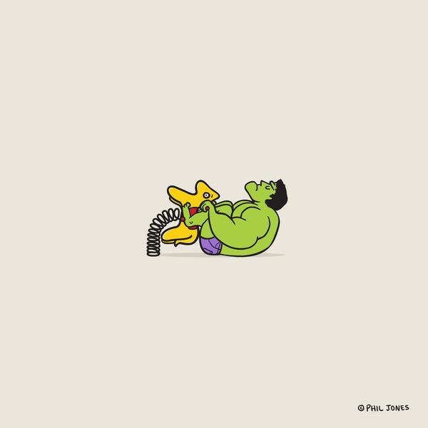
Scroll culture rewards exactly this format: one idea, one image, one beat. Jones’s panels were built for that before every feed demanded it. They also reward a second look—the texture on a background, the way a signature sits, the tiny label on a banana peel that makes the personification feel weirdly documentary. First laugh for the caption; second smile for the craft.
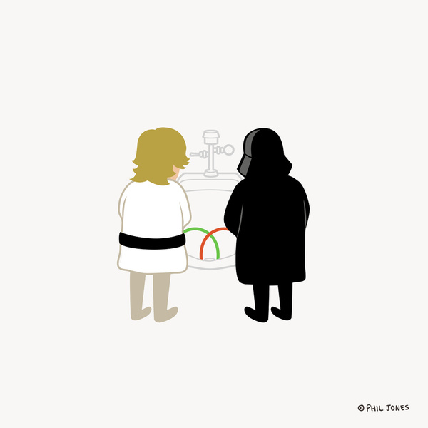
Seen as a set, the illustrations map a consistent world. Food and household objects are people. Planets are people. Plants are people with hygiene routines. Speech bubbles borrow human slang. Nothing needs a plot beyond the moment of recognition—“oh, of course the cooler would say that.” Consistency across gags is what turns a viral one-off into a recognizable body of work.
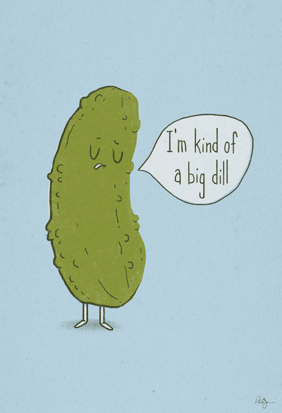
If you collect funny illustration the way some people collect vinyl, Jones belongs on the shelf beside the other object-comedians of the 2010s internet: clean vectors, soft surrealism, captions that behave like friends. His portfolio site and the work that filtered into design blogs treat the cartoons as both personal practice and public calling card. Awards and agency credits explain the polish; the jokes explain why people keep saving the images. Press mentions over the years—from design and culture sites that love a sharp single panel—helped the work find audiences who never open an agency reel.
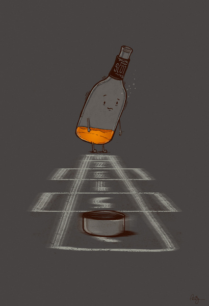
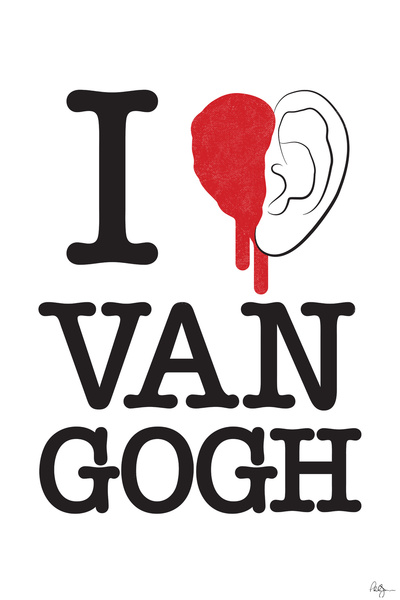
What to watch for when you go through the panels: how often Jones chooses the smallest possible face; how often the background is a flat field instead of a room; how often the caption could be spoken aloud without sounding written. Those choices are the house style. Once you see them, you start spotting the same discipline in his quieter pieces—the ones that do not rely on a famous movie line or a planetary pun.
Pick a favorite the way you pick a joke you would retell: the cooler for wordplay, the cactus for pathos, Saturnday for pure leisure absurdity, the pear for silent mischief. Then look at the next panel. Jones’s gift is making you believe a lighter, a cupcake wrapper, or a planet has something to say—and that you already know the punchline before the bubble finishes.

Comments
Continue reading

Still-Life Photography by Margareth Perfoncio
São Paulo photographer Margareth Perfoncio’s still lifes of food and flowers—Old Master light, dark wood, and tables that feel inevitable.

Meaningful Love Quotes for Inspiration (and Ink)
Meaningful love quotes that still feel true — short lines for tattoos, gifts, and everyday reminders, with placement and wording tips.
Christina Hess’s Animals From History: Costumed Pets as Playful Portraits
Illustrator Christina Hess reimagines historical icons as ornate animal portraits—Elvis Petme and friends—mixing puns, costume detail, and soft history lessons.