
Black and White Beauty Portraits, Part 3: Mood, Shadow, and Editorial Distance
A smaller monochrome beauty set focused on atmosphere—shadow language, hair as graphic design, crop orientation, and which frames still hold when you squint.
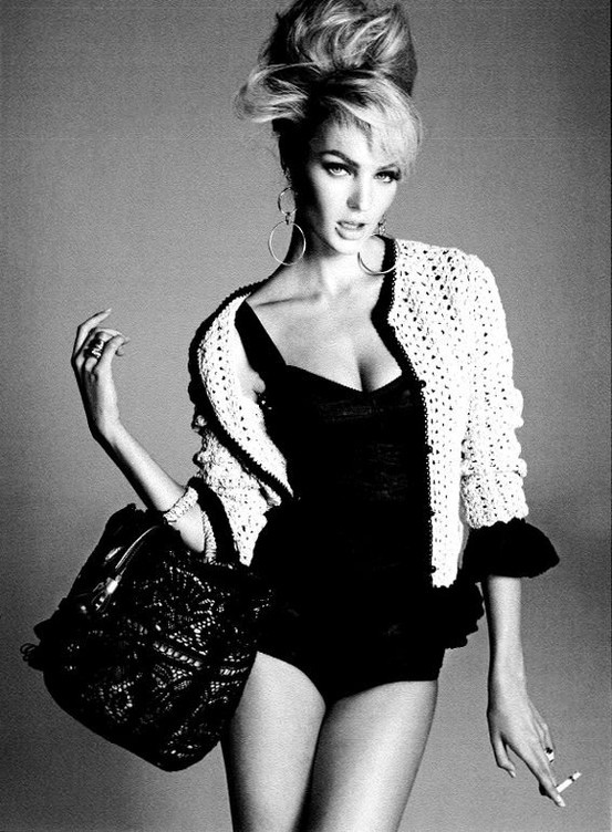
By a third chapter of black-and-white beauty portraits, grayscale itself is no longer news. Mood is. Some images lean toward quiet studio stillness; others feel closer to fashion editorial—stronger shadow, more deliberate hair architecture, a sense that the subject is performing a character as much as presenting a face. This smaller gallery rewards slower looking: fewer frames, more time with each tonal decision.
Read these photographs as atmosphere first. Ask what kind of room the light implies, how close you feel allowed to stand, and whether the portrait wants admiration, intimacy, or a little distance. Beauty in monochrome can be tender or severe. The difference is rarely the model alone. It is contrast, crop, hair edge, and the emotional temperature of the gaze working together.
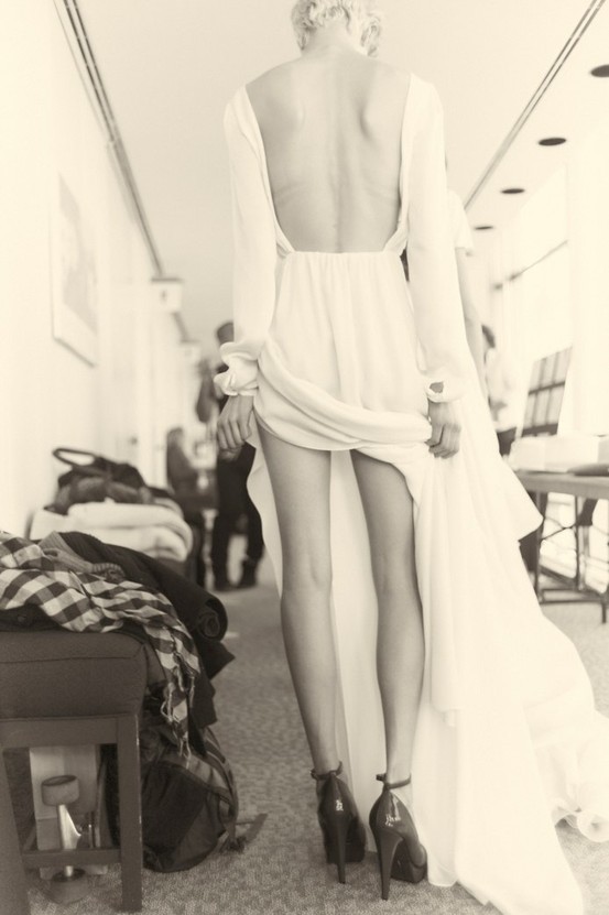
Shadow as a mood instrument
Deep shadow under the cheekbone can suggest sculpture and strength. Shadow that swallows the far side of the face can suggest mystery—or simply underexposure. The line between those outcomes is thin. In successful frames, the shadowed side still holds a whisper of contour: an ear edge, a jaw hint, hair separating from background. Pure black voids work only when the composition is bold enough to treat absence as a shape the eye can hold.
Open shadow—soft, gradual, never quite black—creates a calmer beauty language. Skin feels approachable; pores and fine lines sit in a gentler hierarchy. Many contemporary beauty campaigns favor this approach because it photographs kindly across ages and skin types. Classic Hollywood-influenced beauty often preferred harder falloff and more theatrical darkness. Both traditions live inside monochrome history; choosing one for a session keeps the set coherent instead of accidentally mixing two magazines.
When you edit, protect the distinction you meant to shoot. Crushing blacks in post can turn a soft portrait into noir it never earned. Opening shadows too far can flatten a dramatic frame into polite gray. Match the curve to the intention visible in the catchlights and the hair edge.
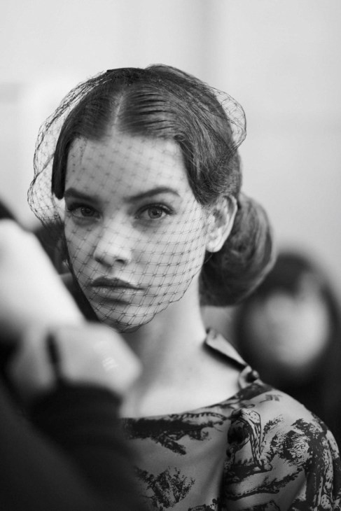
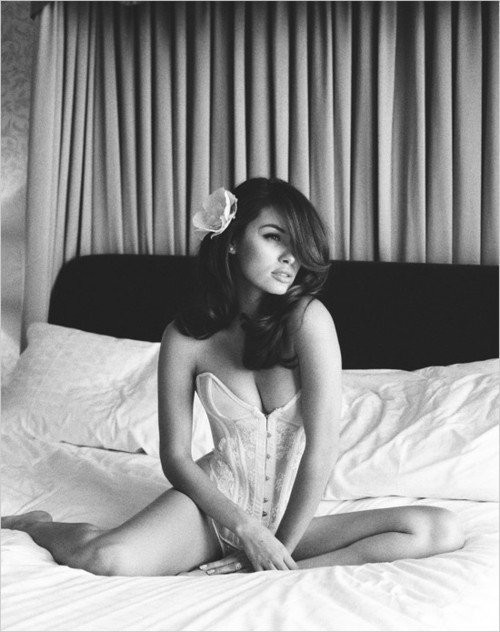
Hair, edges, and graphic design
When color is removed, hair becomes line and mass. A sharp silhouette against a pale field turns the portrait partly into graphic design. Loose strands across the face can soften severity or create intentional mess that feels modern. The risk with flyaways in black and white is distraction: bright backlit hairs become white scribbles; dark hairs against mid-tone skin become scratches that pull the eye away from expression.
Styling for monochrome beauty often means deciding whether hair is architecture or atmosphere. Architecture is sleek parts, controlled volume, clean edges that read at thumbnail size. Atmosphere is movement, softness, a sense that air is present in the frame. Mixing both in one image can work—smooth crown with softer ends, for example—but accidental mixtures look unfinished, as if the session ended mid-brush.
Background separation is part of hair design. Dark hair on a dark field needs a rim or a tonal step so the silhouette does not dissolve. Light hair on a pale field needs the opposite care. Several images in this set succeed because the hair mass is treated as a second subject, not as leftover detail after the face was lit.
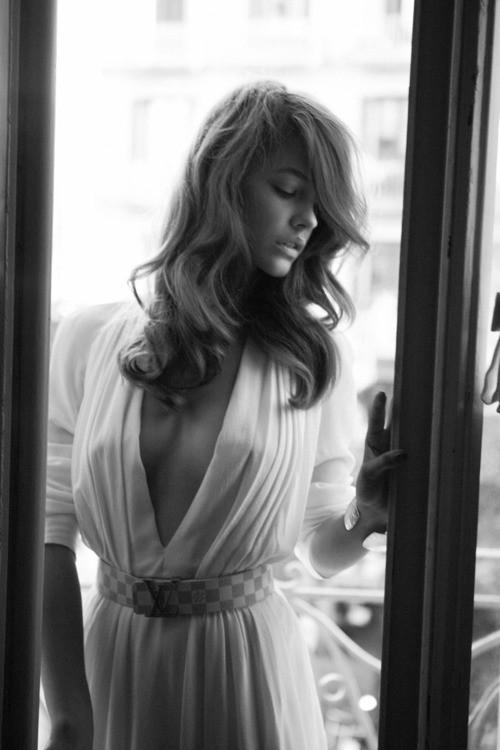
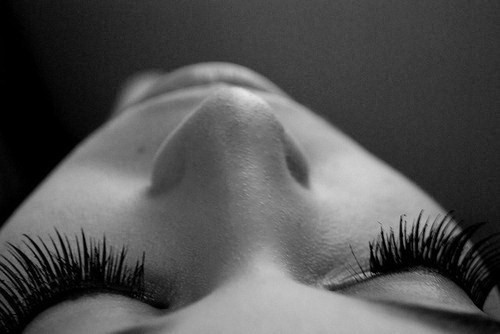
Horizontal versus vertical storytelling
Most beauty portraits default to vertical because magazines, phones, and portfolio grids favor tall frames for faces. A horizontal crop changes the grammar. Negative space becomes a character. The subject may sit off-center; the empty field can feel like quiet, luxury, or isolation depending on its tone and how hard the edges fall to black or white. In a series otherwise full of upright frames, one landscape orientation can act as a breath—if exposure and contrast still belong to the same family.
Vertical frames, meanwhile, emphasize length of neck, fall of hair, and the tunnel of attention from forehead to chin. They also punish awkward headroom: too much empty ceiling makes the subject sink; too little clips the hairstyle’s intention and makes the crop feel accidental. Check the top edge before you fall in love with an expression. Beauty editors have killed many otherwise strong frames for a careless millimeter above the hair.
Aspect ratio is not decoration. It is part of how mood is paced across a gallery. If every frame is the same tall crop with the same head size, even excellent light starts to feel like a loop. Varying orientation—with purpose—keeps the eye awake.
Editorial distance and viewer ethics
Beauty photography always negotiates power: who looks, who is looked at, how much of a person becomes surface. Monochrome can intensify that negotiation because it echoes historical art photography and classic Hollywood stills—forms loaded with ideals about femininity, glamour, and who gets to be called beautiful. A careful reading of a gallery like this keeps craft in view without pretending portraits are neutral documents.
Practically, for makers, that means collaborating on expression rather than extracting it; being clear about retouching expectations before the shoot; and avoiding the habit of “fixing” every face toward one narrow template of bone structure and skin smoothness. Different faces need different light heights, reflector angles, and camera distances. The goal of beauty work can be celebration without erasure—showing a person at their most considered, not replacing them with an average.
Subjects also deserve clarity about where images will live. A private portfolio test and a public editorial gallery are different agreements. Mood is easier to achieve when trust is already settled.
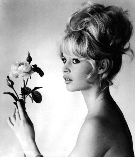
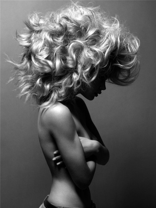
Printing and screen: where mood survives
Black-and-white beauty images often look different on glossy phone screens than in matte print. Screens compress blacks and exaggerate sharpness; prints reveal dithering in smooth cheek gradients and show whether you crushed shadow detail you meant to keep. If a portrait’s mood depends on delicate gray transitions, soft-proof or make a small test print before declaring the edit finished. Many “almost” images become clear failures—or quiet successes—only on paper.
Grain is another mood tool. Fine grain can feel photographic and alive; heavy noise from underexposure looks like a mistake wearing an aesthetic costume. Adding grain in post to unify a set is common; overdoing it turns skin into asphalt. Match grain size to viewing distance. A web gallery tolerates less aggressive texture than a large print viewed from several feet away.
Also watch local contrast on eyes and lips. Over-sharpening in monochrome creates white halos that scream digital. Under-sharpening makes a carefully lit face feel soft in the wrong way. Aim for clarity that disappears into the picture rather than announcing itself as an effect.

Among the frames in this third set, notice which ones still feel specific after you squint—when detail collapses and only large shapes of light and dark remain. Those are usually the images with clear tonal design. Squinting is an old painter’s trick and a useful editor’s trick. If the portrait disappears into mush when reduced to blobs, the mood was never structurally there, no matter how lovely the expression seemed at full size.
Keep the ones that hold their shape. Let the rest teach you what to light, crop, or convert differently next time you chase atmosphere instead of mere prettiness in gray.

Comments
Continue reading
Black and White Beauty Portraits, Part 2: Distance, Gesture, and Contrast
A second monochrome beauty gallery read like a contact sheet—framing distance, hand gesture, wardrobe tone, and contrast recipes for your next shoot.
Depiction of Reflection: Women, Mirrors, and Doubled Selves
A photography gallery on women and mirrors—where reflected eyes, ornate frames, and surreal “back-side” glass images explore the gap between outer face and inner feeling.
Black and White Beauty Portraits: Light, Tone, and Expression
A gallery of monochrome beauty portraits with notes on lighting, pose, conversion, and how grayscale changes what flattery means.