
Black and White Beauty Portraits: Light, Tone, and Expression
A gallery of monochrome beauty portraits with notes on lighting, pose, conversion, and how grayscale changes what flattery means.
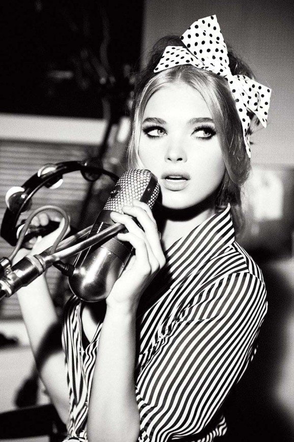
Black-and-white beauty portraits do not ask color to do the flattering. They ask light, tone, and expression to carry the whole argument. Without lipstick hue or wardrobe palette, the photograph lives or dies on how gray values separate skin from hair, how a catchlight sits in the eye, and whether the pose feels chosen rather than merely held.
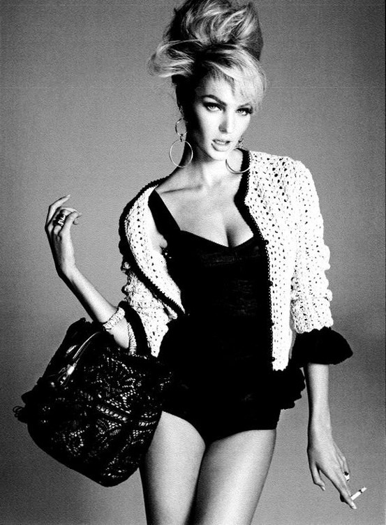
This gallery gathers monochrome portraits of women in that spirit: close studies of face and gesture, softer three-quarter frames, and a few wider compositions where fabric and negative space matter as much as the features. Treat it as a working mood board for anyone who shoots beauty, edits for print, or simply wants to understand why some black-and-white portraits feel timeless while others feel merely desaturated.
What monochrome actually changes
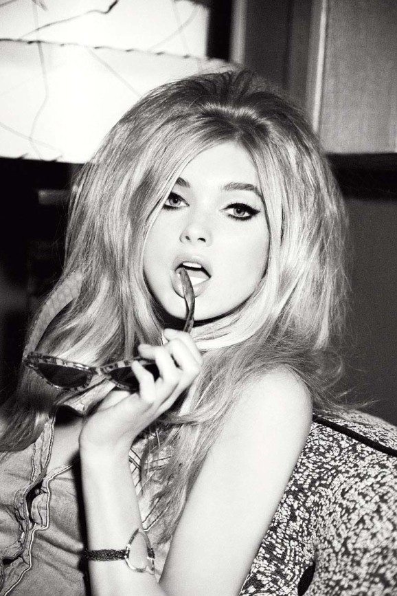
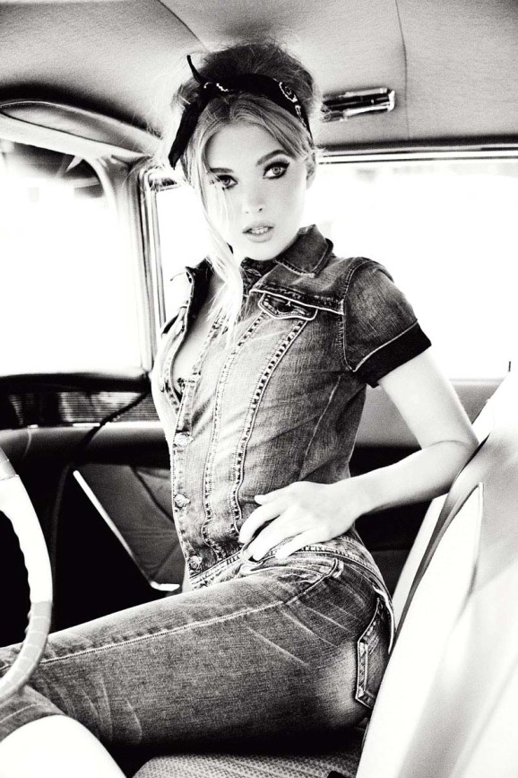
Color photography often hides weak lighting behind attractive hue. Monochrome removes that safety net. A flat overhead bulb that looked “fine” in color becomes a dull mid-gray mask. Side light that felt harsh in color can suddenly look sculptural once the eye stops chasing lipstick and nail polish. The conversion is not a filter trick; it is a different contract with the subject.
Beauty work in black and white also changes makeup strategy. Contour that relies on warm versus cool pigments can disappear or turn muddy. What survives is shape: cheekbone planes, brow architecture, the edge of a lip. Many strong monochrome beauty frames use less makeup than a color editorial would—cleaner skin, defined brows, a matte or softly reflective lip—because the camera is reading value, not brand palette.
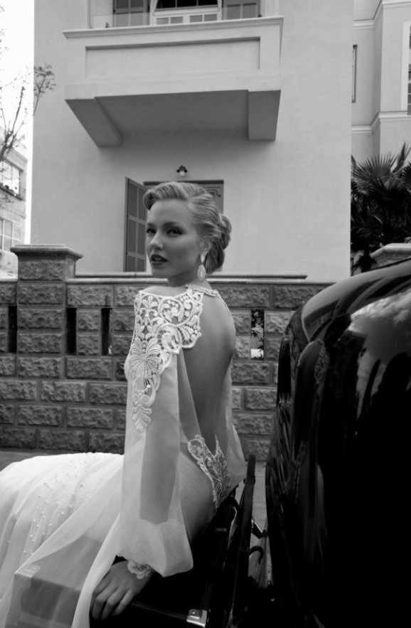
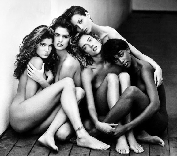
Hair becomes a tonal mass. Dark hair against pale skin creates a graphic silhouette; light hair against mid-tone backgrounds needs careful separation so strands do not dissolve. In several frames here, hair is treated almost like a second subject—volume, edge, and fall matter as much as the eyes.
Light that sculpts, not just illuminates
Classic beauty lighting still works in monochrome: a key light slightly above eye level, a soft fill that keeps shadows readable, and optional hair or rim light to separate subject from background. What changes is tolerance. You can often accept deeper shadows in black and white because the genre has a long history of chiaroscuro. You cannot accept blocked shadows that erase the jawline or blown highlights that erase forehead texture entirely—unless that erasure is the deliberate look.
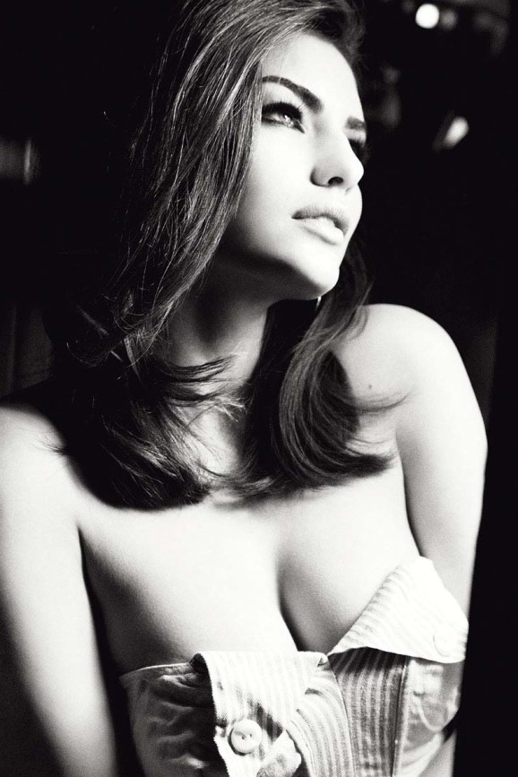
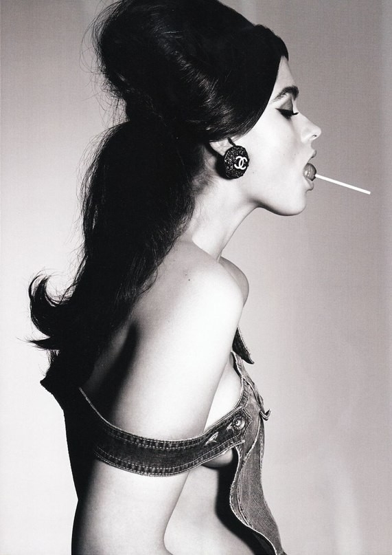
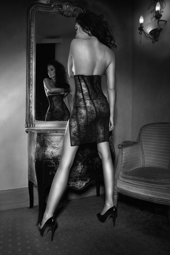
Window light remains one of the most flattering tools for this genre. Place the subject near a large soft source, turn the face until one cheek holds a gentle gradient, and watch the far eye for a catchlight. Reflectors—white foam board, silver for more snap, or a pale wall—fill without introducing color casts that later confuse a conversion.
Harder light has a place too. A narrower source can carve cheekbones and make lashes print as decisive marks. The risk is unflattering texture: every pore and dry patch becomes a landscape. Skin prep, careful retouching philosophy, and distance from the lens matter more when contrast climbs.
Pose, gaze, and the quiet performance
Beauty portraits succeed when the subject looks occupied by a thought rather than by the camera’s countdown. A slight turn of the chin, a lowered shoulder, hands that frame without clawing—these small decisions keep the frame from freezing into a passport stare. Monochrome intensifies that reading because there is less costume noise to hide behind.
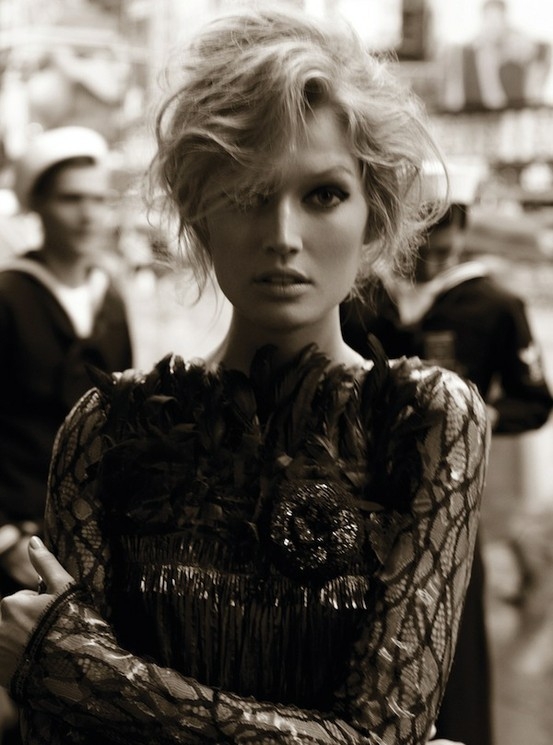
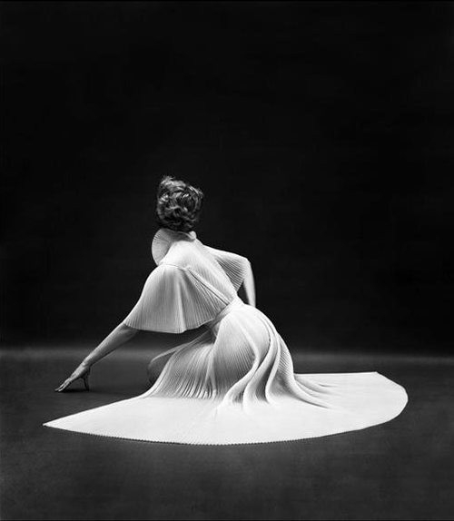
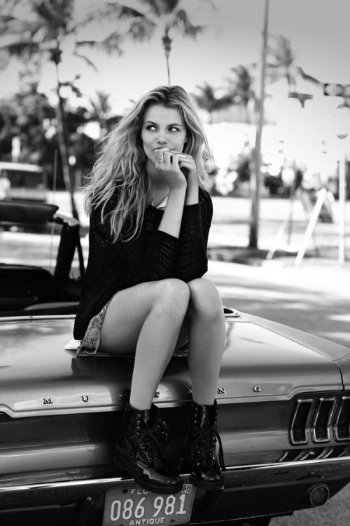
Direct gaze can feel confrontational or intimate depending on aperture, distance, and how much of the torso is included. Looking away—past the lens, toward a window—often softens the mood and lets the viewer study the profile without feeling stared at. Both approaches appear across this set; neither is automatically more “beautiful.” The better question is whether the expression matches the lighting’s severity.
Hands are frequent problem areas. Clenched fingers near the face read as tension; limp wrists read as unfinished. If hands enter the frame, give them a job: resting lightly at the collarbone, supporting the jaw without pressing, or disappearing into hair with intention. In black and white, hand skin tone must sit in a believable relationship to the face—overexposed hands look ghostly; underexposed ones look like dark mittens.
Background, crop, and tonal separation
Busy backgrounds punish monochrome beauty work. Patterned wallpaper, cluttered shelves, and mixed mid-tones compete with facial values. Many of the strongest images in collections like this use simple fields—near-black, soft gray, pale seamless—so the face remains the brightest or most detailed region.
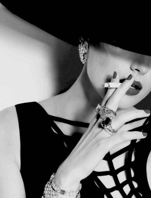
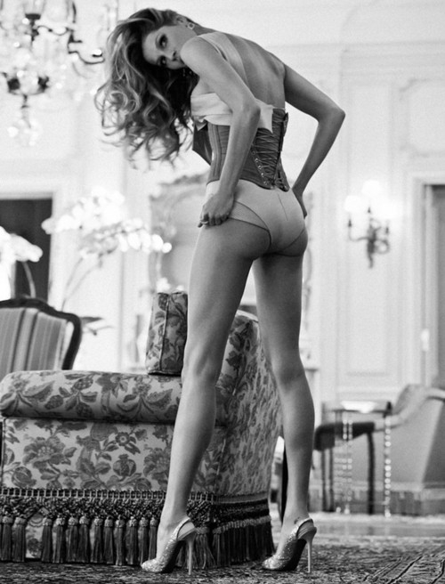
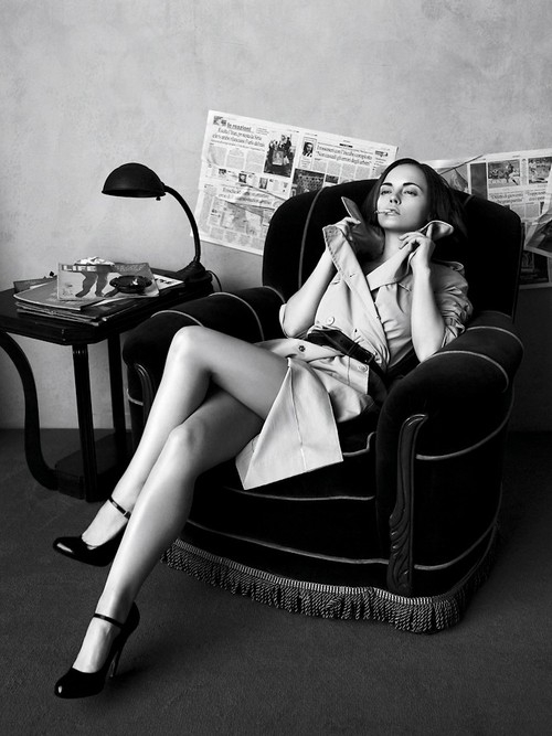
Cropping is a second lighting decision. A tight crop on eyes and mouth can feel editorial and modern; a longer crop that includes shoulders and hair fall feels more classical. Leave room above the head when hair is part of the design; crop decisively through empty space when the face alone is the story. Avoid cutting at joints in awkward ways—mid-forearm and mid-shin crops often feel accidental.
When converting color files, do not rely on a single global desaturate. Channel mixers, luminance adjustments, and selective dodging of eyes and teeth (with restraint) keep skin luminous without plastic glow. Preserve some texture; beauty that looks airbrushed into porcelain often fails in print, where grain and micro-contrast reveal the lie.
Building a coherent set
A gallery of black-and-white beauties works best when contrast language stays related. Mixing extreme high-key frames with crushed-black noir frames can feel like two different magazines stapled together unless you intend that clash. Sequence by mood: softer open light first, denser drama later—or the reverse, if you want the eye to settle after intensity.
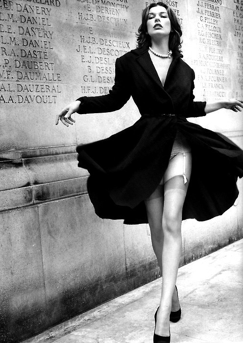
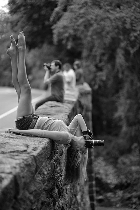
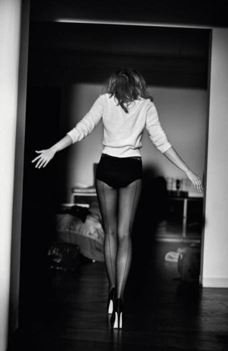
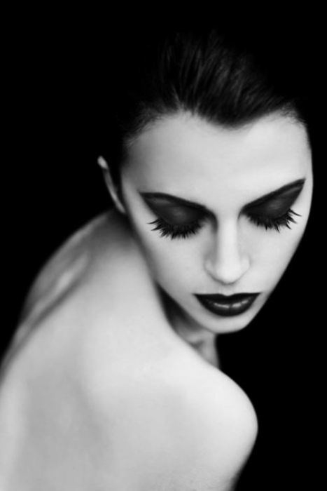
For photographers shooting their own versions of this look, a short practical checklist helps more than another filter preset:
- Place a catchlight in at least one eye before you chase pose variety.
- Check separation: hair edge against background, jaw against neck shadow.
- Decide how much skin texture you want visible at the intended print size.
- Convert with luminance control, not autopilot grayscale.
- Edit the set as a sequence, not as eighteen unrelated heroes.
Monochrome beauty is not nostalgia by default. It is a discipline of values. When the light is honest and the expression is alive, gray is enough.

Comments
Continue reading
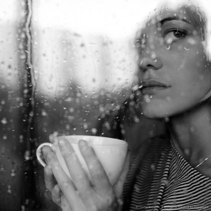
Black and White Photography of Beauty and Solitude
Monochrome frames that treat solitude as presence—not pity—through light, space, and the quiet beauty of being alone.
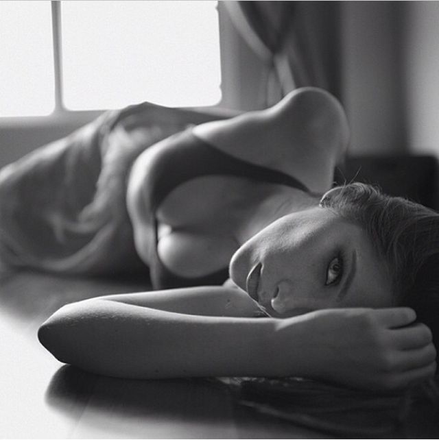
Black and White Boudoir Photoshoot Ideas: Light, Consent, and Tasteful Framing
Respectful monochrome boudoir ideas—consent and comfort, wardrobe and fabric, posing without stiffness, privacy-minded crops, and a practical session checklist.
Black and White Beauty Portraits, Part 3: Mood, Shadow, and Editorial Distance
A smaller monochrome beauty set focused on atmosphere—shadow language, hair as graphic design, crop orientation, and which frames still hold when you squint.