
10 Minimalist Children’s Story Posters by Christian Jackson
Chicago designer Christian Jackson’s hyper-minimalist posters distill Rapunzel, Oz, Pinocchio, Snow White, and more into a single iconic motif each.
Chicago designer Christian Jackson built a series of hyper-minimalist posters that treat classic children’s stories the way a good logo treats a brand: one motif, almost no clutter, and enough cultural memory for the viewer to finish the picture. His Square Inch Design work from the early 2010s became a small internet classic for that reason. You do not get cast portraits, magical forests rendered in watercolor, or Disney house style. You get a braid, a bitten apple, a grin in the dark—and a title set in quiet sans-serif type that names the tale and its literary source.
That approach suits stories most people already know. Fairy tales and childhood films survive by repetition. Jackson’s posters lean on that shared vocabulary. They also tip toward the darker edges of the Grimm and Andersen traditions, where danger is part of the charm. The result reads as wall art for adults who grew up with these plots, not as nursery decoration that softens every threat.
Below are ten posters from the series, kept in the order they appear here, with notes on what each symbol does and why the reduction works.
Rapunzel
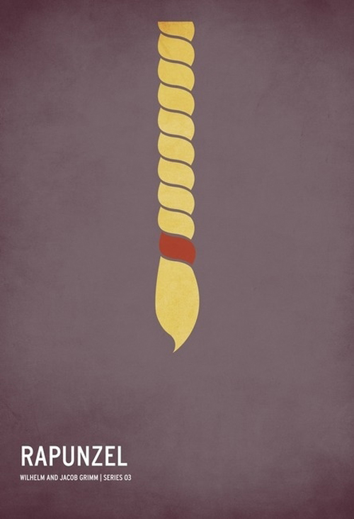
Rapunzel needs almost nothing on the page. A single golden braid hangs against a plum-dark field, tied with a small red band near the tip. The Grimm brothers’ tower story is already about length, isolation, and the body as ladder. Jackson isolates that one prop and lets negative space do the rest. The braid is thick, rounded, and slightly imperfect, so it still feels handmade rather than vector-perfect. The credit line names Wilhelm and Jacob Grimm and places the piece in the series numbering that runs through the set.
What makes the design stick is restraint. There is no window, no witch silhouette, no climbing prince. If you know the story, the hair is enough. If you do not, the title supplies the key. That two-step recognition—image first, label second—is the engine of the whole collection.
The Wizard of Oz
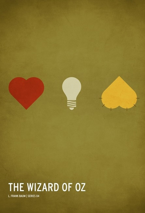
L. Frank Baum’s road to the Emerald City becomes three icons on an olive field: a red heart, a cream lightbulb, and a yellow badge of courage. Dorothy herself is absent. So is the Wizard. The poster trusts that viewers will map the companions—Tin Man, Scarecrow, and Cowardly Lion—onto those tokens without a single face. It is a clever refusal of yellow-brick literalism. Instead of a path or a tornado, Jackson shows what the travelers want.
The muted background keeps the three shapes from looking like emoji stickers. Texture in the paper-like ground softens the flat color and hints at vintage print culture. The composition is almost heraldic: three charges, one field, one title. For a story thick with spectacle, the quiet is the point.
Pinocchio
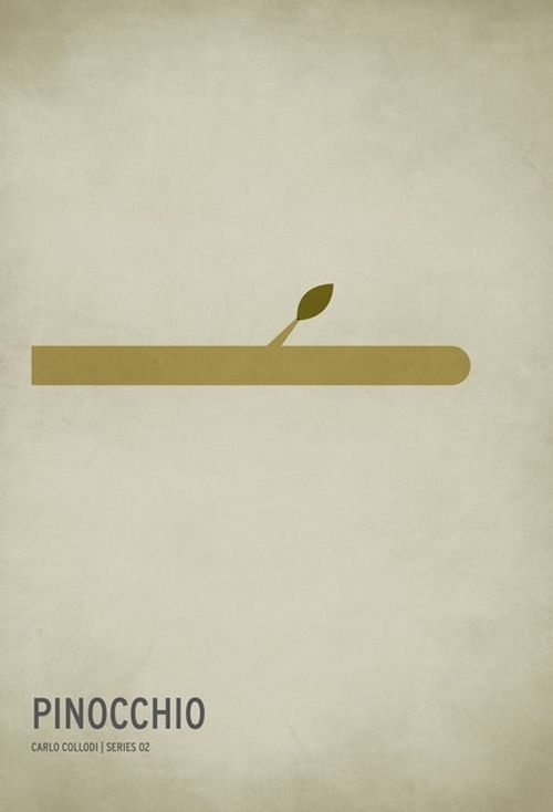
Carlo Collodi’s wooden boy is reduced to a horizontal nose that grows out of the left edge and ends in a rounded tip, with one small green leaf sprouting from the top. The beige ground is nearly empty. Lying, transformation, and the joke of an extending nose all sit inside that single bar of wood. Jackson does not draw Geppetto’s workshop or a cricket conscience. He draws the consequence that everyone remembers.
The leaf is the detail that keeps the gag from feeling cruel. Growth is not only punishment; it is life insisting on itself. That double reading—lie and living timber—gives the poster more weight than a punchline alone would carry. Series numbering and Collodi’s name keep the piece anchored in the literary source rather than any one film adaptation.
Snow White
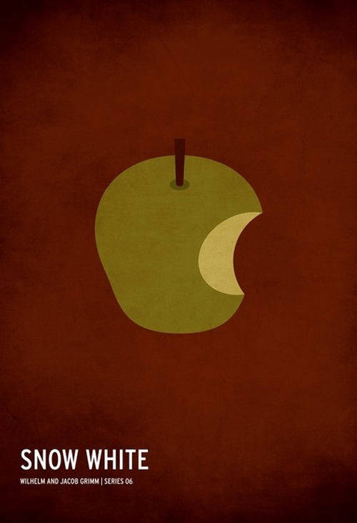
A bitten apple on a dark reddish-brown ground is almost too familiar, which is exactly why it works. Jackson’s apple is not candy-red. It sits in a muted olive tone with pale flesh inside the bite, as if poison and temptation share the same fruit. The Grimm tale’s queen, mirror, and glass coffin stay offstage. The object that ends the first act of the story becomes the whole poster.
Minimalism here depends on cultural saturation. An unexplained bitten apple could mean anything; labeled “Snow White,” it means one thing. The design tests how little a designer can show before recognition fails. In this case, very little.
Little Red Riding Hood
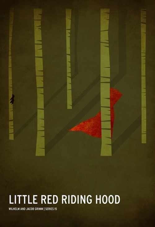
Among the ten, this one uses more environment. Thin tree trunks rise through a deep forest green. A red hood-and-cape silhouette moves between them, half hidden, with long shadows that lean the scene toward dusk. The wolf is not drawn. The path is not labeled. Threat lives in the color contrast and the sense that the forest is taller than the figure.
Jackson’s Grimm credit reminds viewers that the tale was never only a cute costume story. The red shape is vivid and small; the woods are large and quiet. That scale relationship does narrative work without a single speech balloon or caption beyond the title. It is one of the more atmospheric pieces in the set—still minimal, but closer to a stage set than a logo.
Hansel & Gretel
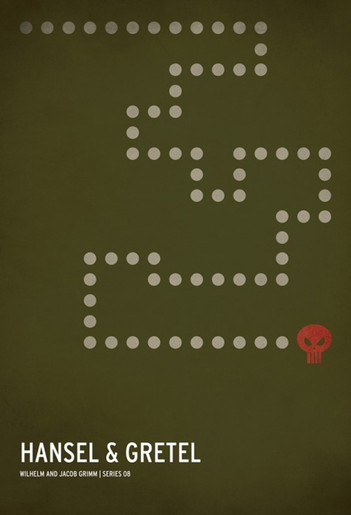
A breadcrumb trail zigzags across olive space and ends at a small red skull. The path’s right-angle turns feel slightly game-like, almost like a maze map, which suits a story about getting lost on purpose and then for real. The skull refuses to soften the witch’s house into gingerbread tourism. Danger is the destination.
Compared with Rapunzel’s single object, this poster shows sequence: start, wander, arrive. Minimalism still rules—no children, no oven, no candy architecture—but the dots imply time. That is a useful lesson for designers who think “minimal” always means one centered icon. Sometimes the spare elements need a path.
The Ugly Duckling
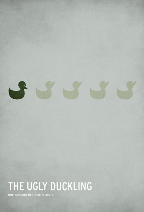
Hans Christian Andersen’s transformation tale becomes five duck silhouettes in a row. One is dark and solid; the other four are pale and almost translucent. Difference is not explained with a swan reveal. It is shown as contrast in a lineup. The pale gray ground leaves huge empty space below, so the birds float like a quiet accusation.
The poster’s power is social, not magical. Belonging and exclusion are visible at a glance. For a children’s classic often reduced to a feel-good ending, Jackson’s freeze-frame stays with the mismatch. The later swan is implied by cultural knowledge, not illustrated. That choice keeps the design honest to the discomfort that makes the story matter.
Robin Hood
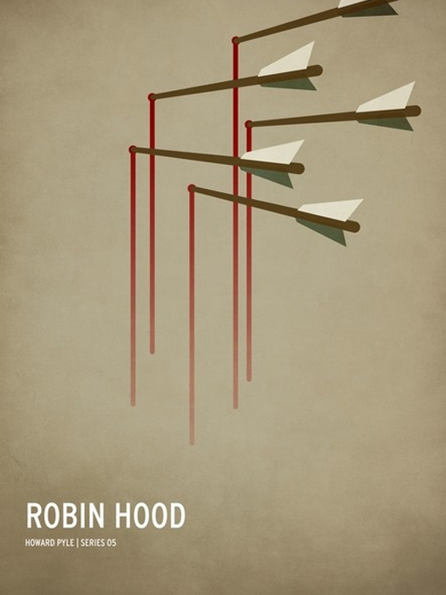
Five arrows hang in staggered depth on a parchment field, each tip feeding a thin red line that falls like a drip. Howard Pyle’s merry outlaw tradition is present in spirit, but Jackson skips the green tunic and feathered cap. Skill and consequence replace costume. The red lines are the sharpest color note; everything else stays earthy.
The arrangement suggests volleys already spent, not a single heroic pose. Robin Hood as legend is often about justice theater; this poster is about marksmanship abstracted into geometry. It is also one of the more adult-looking pieces—still tied to a childhood story, but comfortable on a living-room wall beside contemporary graphic prints.
Alice in Wonderland
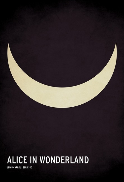
Lewis Carroll’s Wonderland collapses into the Cheshire Cat’s grin: a cream crescent floating on near-black. No Alice, no rabbit hole, no tea party clutter. The smile is enough because it is already the story’s most portable emblem—presence that can vanish, mischief that stays. High contrast makes the curve feel luminous, almost like a cutout in a theater curtain.
Minimal posters live or die by whether the chosen symbol is unique. A grin this shape, in this context, belongs to Carroll’s cat. Jackson’s series repeatedly makes that bet, and Alice is one of the cleanest wins. The emptiness around the crescent is not unfinished design; it is the void Wonderland keeps offering.
Goldilocks and the Three Bears
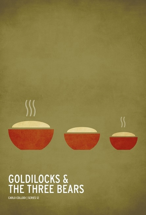
Three red bowls hold beige porridge on an olive ground. Steam marks differ: the largest bowl reads hottest, the middle cooler, the smallest somewhere between. Goldilocks herself never appears. The household test that structures the tale—too much, too little, just enough—becomes a still life. Scale and vapor do the storytelling.
The empty upper half of the poster is deliberate. It gives the bowls room to feel like evidence left behind after an intrusion. You can almost invent the chairs and beds from the same logic. That invitational quality is why these designs circulate so well: they are puzzles with friendly answers.
Why the series still reads clearly
Christian Jackson’s children’s-story posters succeed because they respect the audience’s memory. They do not explain plots. They point at the one object or arrangement that carries the plot’s reputation. Hair, apple, hood, breadcrumbs, grin, porridge—each is a key, not a synopsis. The textured grounds and modest type keep the set cohesive, so ten different tales still look like one designer’s argument about how much a poster can refuse.
For viewers who collect minimal film and literary art, the pleasure is double. First comes recognition. Then comes the small aftertaste of how strange these stories are when you strip away cute retellings. A skull at the end of a crumb trail, a bitten fruit, a cape alone in the trees—none of that is soft. Jackson’s Chicago-born series lets the classics keep their teeth while living as clean, modern graphics. Hang one, and the title does less work than the symbol. Hang several, and the wall becomes a quiet quiz about which childhoods you still remember by shape alone.

Comments
Continue reading

Still-Life Photography by Margareth Perfoncio
São Paulo photographer Margareth Perfoncio’s still lifes of food and flowers—Old Master light, dark wood, and tables that feel inevitable.

Meaningful Love Quotes for Inspiration (and Ink)
Meaningful love quotes that still feel true — short lines for tattoos, gifts, and everyday reminders, with placement and wording tips.
Christina Hess’s Animals From History: Costumed Pets as Playful Portraits
Illustrator Christina Hess reimagines historical icons as ornate animal portraits—Elvis Petme and friends—mixing puns, costume detail, and soft history lessons.