
Nicholson Residence by Matt Gibson: Melbourne’s Treetop House
A Federation terrace renovation in Middle Park, Melbourne—timber cantilever, garden light, and a cut-steel forest screen by Matt Gibson Architecture + Design.
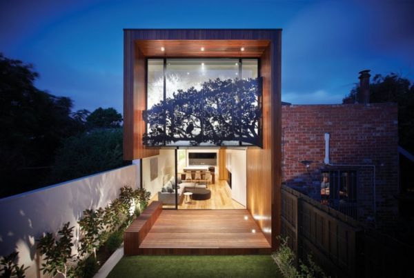
On a narrow Middle Park street in Melbourne, the Nicholson Residence—better known in design circles as the Treetop House—proves that a heritage terrace does not have to stay dark, deep, and polite. Matt Gibson Architecture + Design renovated a Federation single-fronted house under a heritage overlay and pushed a timber-clad first-floor volume out into the rear garden, where foliage, glass, and a cut-steel forest screen do the storytelling.
The project is a family home first: open living that meets a small lawn, restrained finishes that leave room for art, and a master bedroom that looks into a graphic canopy rather than into a neighbor’s window. The photographs below walk the house from dusk exterior to interior detail—useful if you are studying how Melbourne terraces grow without losing their street manners.
Heritage front, modern rear
Federation terraces in Melbourne often present a polite street face and a compromised plan behind it: long corridors, dim middle rooms, and a garden treated as leftover strip. Gibson’s brief was renovation plus extension—keep the protected character where it mattered for the overlay, then reorganize the rear for light, outlook, and contemporary family life. That split is common advice; fewer projects make the new work feel as considered as the old shell.
The rear addition reads as a long, tall timber-clad tube wrapped around surviving boundary walls and a cleared ground-floor interior. Vertical boards warm the boxy geometry and soften what could have been a cold glass box. Floor-to-ceiling glazing opens the living level to a timber deck and a compact green rectangle of lawn. At dusk, recessed lighting under the overhangs turns the extension into a lantern; the steel tree appliqué on the upper floor becomes a silhouette against the glass.
That contrast—aged brick beside honey timber, heritage restraint beside new volume—is the project’s public argument. The house does not pretend the old and new are the same material or the same century. It lets them sit in conversation, which is usually more honest than a fake-uniform cladding job that erases time.
Cantilever into the trees
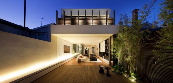
First-floor spaces cantilever deep into what had been a heavily treed rear yard. The move is practical as well as poetic: it gains room on a tight site without chewing the entire garden into building footprint. From the outside, the upper volume floats over the deck; from the inside, the master suite engages foliage and sky rather than a blank fence line or a direct sightline into adjoining yards.
Gibson has described the artistic treetop graphic as a way of bringing the garden inside and looking over canopy. Externally, a cut sheet-metal screen filters views and light. Internally, a forest transfer on the glazing continues the idea so the bedroom remains part of the same narrative after dark. Coverage of the house often mentions the cinematic night mood—owl included—while still satisfying planning rules about overlooking. Decoration and privacy screens are frequently treated as afterthoughts bolted on late; here the screen is the signature and the compliance tool at once.
For architects and renovators working under similar overlays, that double duty is the lesson. Whimsy that only decorates rarely survives value engineering. Whimsy that solves overlooking, glare, and identity tends to stay in the built work.
Light down the long plan
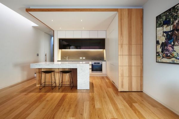
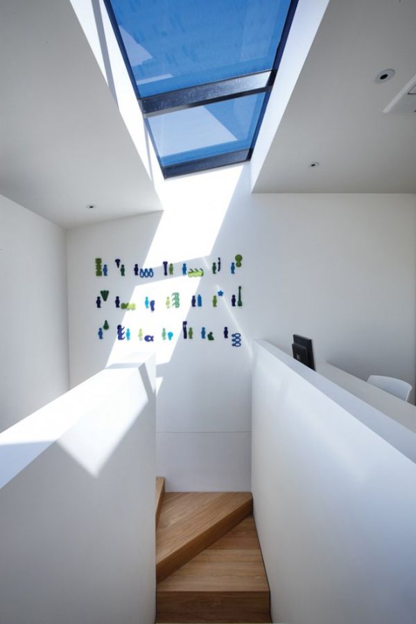
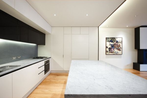
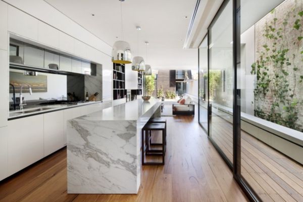
Single-fronted terraces starve middle rooms of daylight. Gibson’s team shifted and clarified the plan so a long skylight—reported around ten metres—could pull sun deep into the house. Unobtrusive cabinetry keeps circulation clear; the light run widens the perceived width of a naturally narrow plot. Anyone who has lived in a Melbourne terrace knows the cave problem; this renovation attacks it with geometry rather than with more lamps.
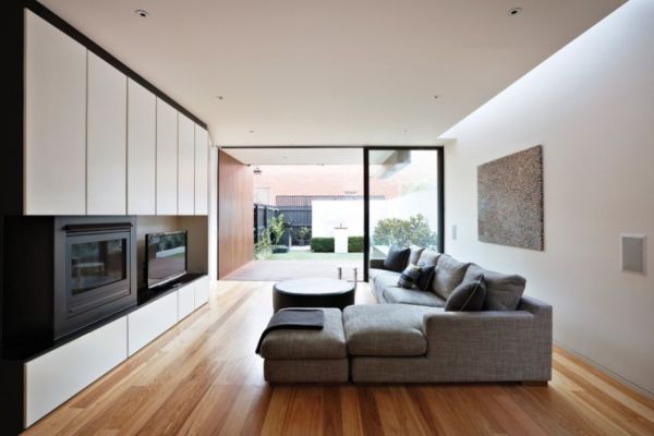
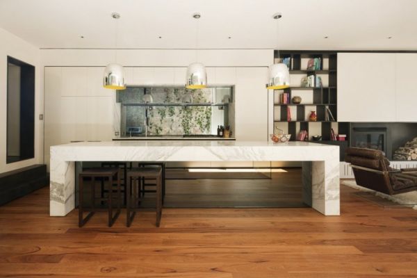
Material continuity helps the eye travel. Timber cladding outside finds echo in floors and joinery inside. Glass is used less as spectacle and more as a hinge between rooms and garden. The palette stays deliberately quiet so the family’s art and furniture remain the loudest objects in the room. Architecture that competes with its own occupants rarely ages well; this one leaves wall and shelf space for life to accumulate—books, paintings, the uneven evidence of use.
Budget talk around the project has often stressed a tight spend relative to the visual impact. The photographs support that claim indirectly: invention is concentrated at the rear interface and the screen, not scattered as expensive gestures in every corner. Editing the ambition is part of the craft.
Indoor–outdoor living on a tight lot
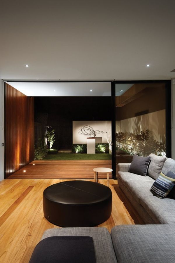
Australian residential modernism often sells the indoor–outdoor dream on wide suburban blocks with pool setbacks and side yards. Middle Park offers less generosity and more neighbors. The Nicholson Residence answers with continuity rather than acreage: same timber language from cladding to deck, sliding glass that can disappear on mild evenings, a built-in bench along the edge, and a lawn sized for use rather than for magazine emptiness.
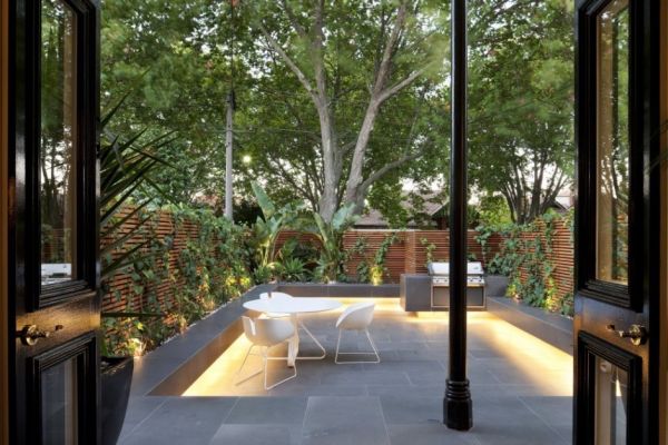
Low garden lighting along the boundary wall extends evening use without turning the yard into a sports field. Neighbors remain close—you can see the adjoining brick—so the design leans on screening, planting, and careful openings instead of pretending the site is isolated. Privacy is earned through detail, not distance. That is a useful corrective for anyone importing coastal-open-plan clichés onto a terrace parcel.
The deck also works as a thermal and social buffer. In warm months it becomes the first room outdoors; in cooler weather it still visualizes garden from the sofa. Thresholds matter as much as square metres.
Sustainability woven into the build
Coverage of the project has consistently noted practical environmental choices: recycled timber products, materials with lower embodied energy, efficient appliances, water-saving fittings, efficient lighting, and locally sourced components where possible. None of that reads as a manifesto plastered on the façade. It sits inside the same quiet ethic as the color palette—do the responsible work without turning the house into a brochure.
On a renovation under heritage control, sustainability also means keeping the street shell alive instead of demolishing for a clean slate. The Federation front continues to belong to Middle Park’s urban grain; the rear carries the new life. That split is often the most honest green strategy available in established suburbs, where embodied carbon already sits in bricks and floor plates that would be wasteful to discard casually.
Small gardens still matter environmentally. A usable lawn and planted edges support outdoor living that reduces the urge to flee the house for leisure, and they soften stormwater and heat compared with a paved court. The Nicholson yard is modest, but it is not an afterthought slab.
Reading the photographs
Photographers such as John Wheatley, whose images helped circulate the project, show the house at its most persuasive in transitional light—when interior warmth meets evening blue, and the cut metal reads as both ornament and filter. Walk the sequence from garden lantern to quiet interiors and you see a family house that happens to be sharp architecture, not architecture that happens to tolerate a family.
Notice how often the camera stands in the garden looking back. That viewpoint sells the cantilever and the screen as the public face of the renovation, which matches how neighbors and guests actually encounter the new work. Interiors then confirm that the drama outside did not empty the rooms of comfort. Soft seating, dining within sight of glass, and walls calm enough for art complete the pitch.
What to steal for other narrow lots
Plenty of Melbourne terrace extensions chase volume and glass. Fewer give the addition a memorable character that is still useful day to day. The Nicholson Residence works because the whimsy of the forest screen solves a planning problem, the timber tube solves a spatial problem, and the skylight solves a light problem. Fantasy and function share the same drawing set.
If you are studying narrow-lot renovations, steal the priorities rather than the silhouette: keep the street honest, spend invention where the garden and the upper rooms meet, pull daylight the full length of the plan, and let one strong graphic idea do privacy work. Match materials across threshold so indoor and outdoor feel continuous. Leave the palette quiet enough for people and paintings. The owl in the steel canopy is memorable. The daylight and the usable lawn are what make the house livable on an ordinary Tuesday.

Comments
Continue reading
Beverly Hills Villa by William Stephenson
A renovated 1956 William Stephenson villa in Beverly Hills—four bedrooms, five baths, gallery hall, garden pool—documented from its early-2010s listing era.
Willoughby Way by Charles Cunniffe Architects in Aspen
Heavy timber, stone, and glass on Aspen’s Red Mountain—Charles Cunniffe Architects’ Willoughby Way as a mountain-modern house of volume, views, and hospitality.
Exotic Modern Villa in Kamala, Phuket
A Kamala hillside villa shaped for Andaman light—open pavilions, pool horizons, tropical materials, and the slow daily rhythm of indoor-outdoor living.