
Gustav Klimt’s The Kiss: History, Gold, and the Art It Still Inspires
How Klimt’s Golden Period icon was made, bought for the Belvedere, and why artists keep remaking its pose, pattern, and shimmer.
Gustav Klimt’s The Kiss (also known as The Lovers) is one of those rare paintings that seems to live everywhere at once: museum walls, museum gift shops, dorm-room posters, fashion editorials, and endless digital remixes. Painted at the height of Klimt’s so-called Golden Period, roughly between 1907 and 1909, the square canvas—about 180 by 180 centimeters—wraps two figures in patterned robes, gold leaf, and a meadow of flowers that feels half garden, half dream. The Austrian state bought the work soon after it appeared at Vienna’s Kunstschau in 1908, and it has remained in the Belvedere’s care ever since, today a centerpiece of the Upper Belvedere’s Vienna 1900 galleries.
That permanence matters. Many modern icons travel constantly; The Kiss largely stayed put. People come to Vienna for it. Artists, designers, and hobbyists remake it. The painting’s fame is not only about romance—it is about ornament, surface, and a particular moment when Viennese modernism turned intimacy into architecture of pattern.
What you are looking at
Two lovers kneel on a flowering ledge. The man leans in; the woman turns her face toward the kiss while her body remains upright, almost ceremonial. Their robes do different visual jobs. His garment tends toward rectangles and harder geometry; hers toward circles, flowers, and softer motifs. Critics have long read that contrast as masculine and feminine design languages meeting in one golden field. Whether or not you accept that reading, the craft is unmistakable: oil paint, gold leaf, and metallic flakes that make the surface behave like both painting and mosaic.
Klimt’s gold was not a gimmick borrowed from greeting cards. It grew from his interest in Byzantine mosaics and icon traditions, and from a broader Vienna Secession appetite for craft, decoration, and total design. Around the same years he worked on related golden-period landmarks—think of the jeweled intensity of Portrait of Adele Bloch-Bauer I—and on decorative commissions such as the Stoclet Palace frieze in Brussels. The Kiss sits at the peak of that vocabulary: love staged as sacred object, yet still recognizably human.
Rumors have always trailed the couple. Some viewers want them to be Klimt and Emilie Flöge, his lifelong companion and fashion collaborator. Museums and historians treat that identification carefully; the painting does not document a portrait sitting so much as it invents an emblem. The power of the image comes less from biography than from how completely Klimt fused bodies, textiles, and metal into one continuous surface.
Vienna, 1908: debut and acquisition
When The Kiss first appeared publicly at the Kunstschau Wien exhibition, it was shown under the title Lovers. The show itself was a major event for Klimt’s circle and for young Viennese modernists. Reception of the painting was warm enough that the Imperial-Royal Ministry of Culture and Education purchased it for the Moderne Galerie at the Lower Belvedere—an early institutional vote of confidence that later generations sometimes forget when they treat the work as eternally “popular” rather than historically contested modernism.
Purchase numbers from the period are often cited around 25,000 crowns, a serious sum for the time. Completion and delivery continued into 1909. From there, the painting’s biography is almost unusually quiet: it remained in Belvedere collections, shifting display context as the museum complex evolved, and eventually becoming the work visitors plan their Upper Belvedere route around. That calm institutional life is part of why the image feels available for endless quotation—its ownership never fractured into scandalous auction theater the way some other Klimt portraits did.
Why the image keeps traveling
Three qualities make The Kiss unusually adaptable for later artists and designers.
First, the square format. It reads like a tile or icon, easy to crop, print, embroider, or map onto packaging without losing the couple’s silhouette.
Second, the pattern logic. Klimt already treated clothing as a field of signs. Anyone remaking the painting can swap rectangles for florals, gold for neon, mosaic for pixel, and still keep the compositional handshake intact.
Third, the emotional clarity. Even people who know nothing about Jugendstil understand an embrace. The painting’s accessibility is not a flaw; it is the reason high culture and mass culture keep sharing it.
Those same qualities explain why anniversary moments—Klimt was born in 1862, so milestone years such as his 150th birthday in 2012—produce waves of tribute. Online communities, including illustration forums and portfolio sites, fill with recreations: digital paintings that chase the gold leaf shimmer, photographs staged with metallic fabrics, fashion looks built from circular motifs, ceramics, tattoos, and collage. Some tributes are reverent copies. Others are playful translations: cats as lovers, city skylines as robes, contemporary couples in Klimt’s pose, or flat graphic posters that reduce the meadow and gold to a few hard shapes.
Ways later makers borrow from The Kiss
If you look across inspired works rather than only museum reproductions, several recurring strategies appear.
Surface homage. Artists keep the pose and spend their energy on texture—foil, glitter, embroidery, mosaic tile, or digital brushes that simulate leaf. The goal is the shimmer, not a new story.
Costume swap. The robes become runway clothes, bridalwear, or street fashion. Because Klimt already designed garments as abstract fields, stylists can update fabrics without breaking the silhouette.
Medium shift. Photographers recreate the kneel and kiss with real models, then push color grading toward amber and black. Illustrators flatten everything into poster Art Nouveau. Craft makers translate the couple into clay, wood, or paper cut.
Parody and remix. Pop culture versions trade reverence for recognition. The kiss remains; the context becomes meme, advertisement, or fan art. Even when taste fails, the experiment proves how strong Klimt’s diagram is.
Detail isolation. Some of the most interesting contemporary pieces ignore the faces and enlarge a patch of pattern—circles against rectangles, flower against gold field—as if the painting were a textile sample book.
None of these approaches requires pretending to be Klimt. The better tributes treat The Kiss as a score that can be played in another key.
Looking with a maker’s eye
Whether you are studying the original in Vienna or sketching a response at home, a few looking habits help.
Notice how little empty air there is. Klimt fills the square until the couple and the meadow press against the edges. That density is part of the intensity; thin backgrounds often make copies feel weaker.
Watch the woman’s hand. Small gestures—fingers against the man’s neck, the angle of her face—carry as much emotion as the gold.
Compare the two pattern systems instead of treating “gold” as one effect. The painting’s drama is contrast inside harmony.
Remember scale. In reproduction, everything looks intimate. In the museum, the square is large enough to feel architectural. Inspired works that forget scale sometimes become jewelry charms of an idea rather than rooms you can enter.
From Belvedere wall to living motif
The Kiss belongs to a specific historical moment—fin-de-siècle Vienna, Secession craft ideals, Klimt’s golden technique—and also to a long afterlife of quotation. That double life is why the painting still matters to people who will never write art history papers. It offers a clear pose, a memorable surface, and a permission structure for ornament in an age that often distrusts decoration.
If you are collecting or making work inspired by it, keep the historical facts close enough to stay honest: dates around 1907–1909, Kunstschau debut, Belvedere ownership, gold-and-oil craft. Then decide what you are actually borrowing—pose, pattern, palette, or myth. The most lasting tributes are usually the ones that choose one of those clearly, rather than pasting gold leaf over a vague idea of romance.
Stand in front of the painting when you can. Then look again at the copies that circulate online. The gap between them is where Klimt’s design still teaches: how much emotion can live inside pattern, and how eagerly later hands keep trying to answer.

Comments
Continue reading

Still-Life Photography by Margareth Perfoncio
São Paulo photographer Margareth Perfoncio’s still lifes of food and flowers—Old Master light, dark wood, and tables that feel inevitable.

Meaningful Love Quotes for Inspiration (and Ink)
Meaningful love quotes that still feel true — short lines for tattoos, gifts, and everyday reminders, with placement and wording tips.
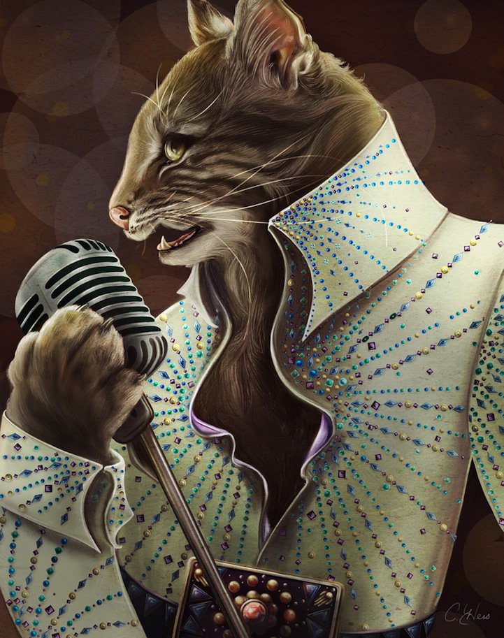
Christina Hess’s Animals From History: Costumed Pets as Playful Portraits
Illustrator Christina Hess reimagines historical icons as ornate animal portraits—Elvis Petme and friends—mixing puns, costume detail, and soft history lessons.