
White Winter Creamy Tablescapes
Ivory runners, candlelight, and pale centerpieces — how to build a creamy white winter table that feels seasonal without crowding every place setting.
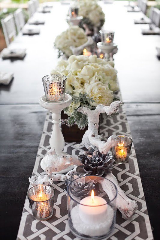
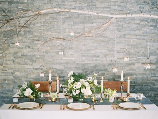
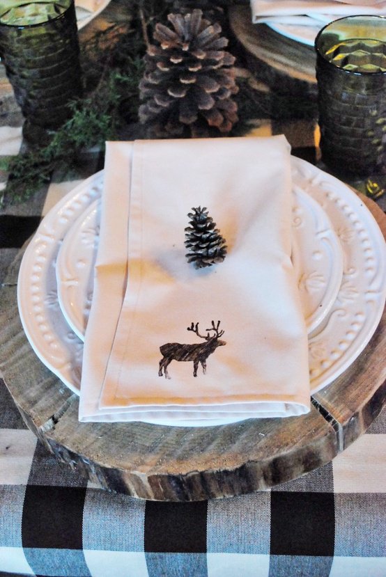
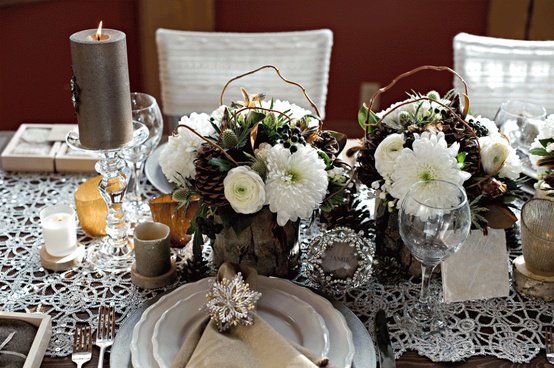
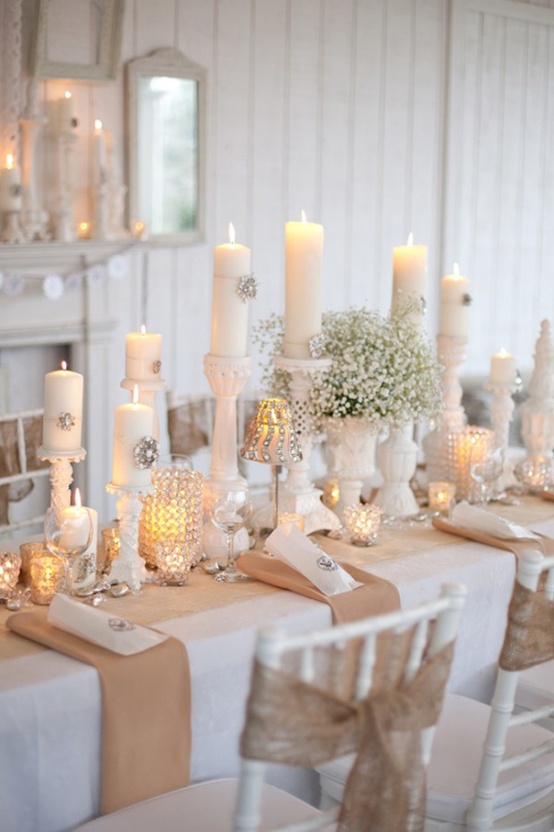
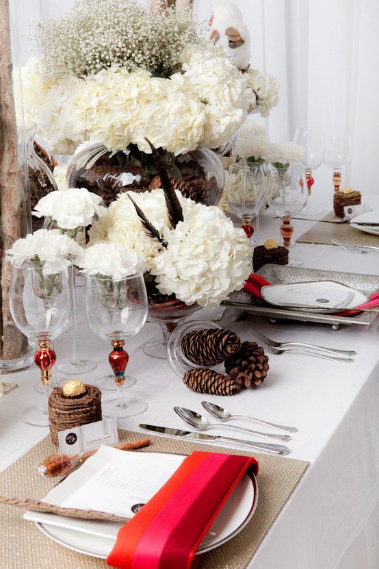
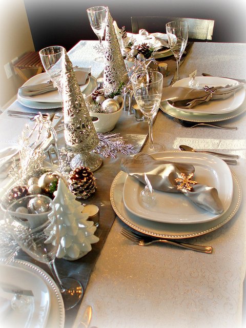
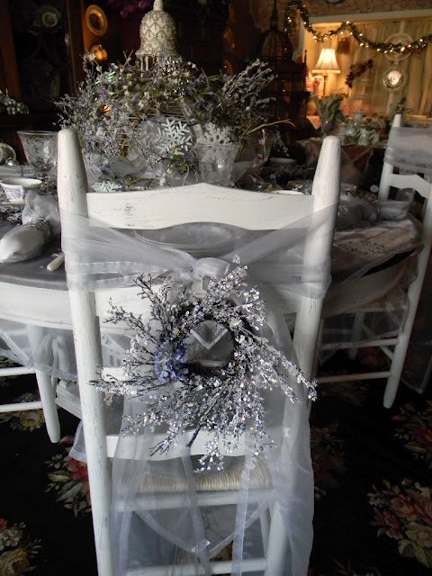
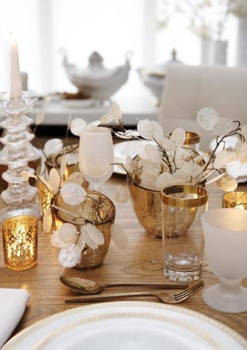
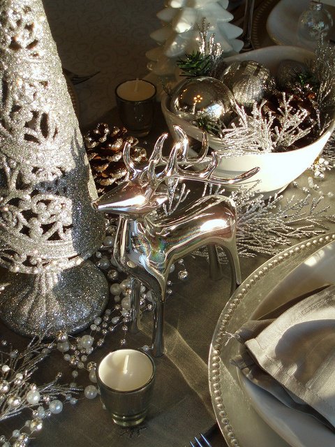
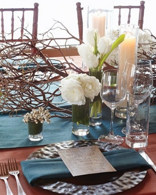
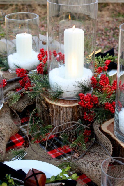
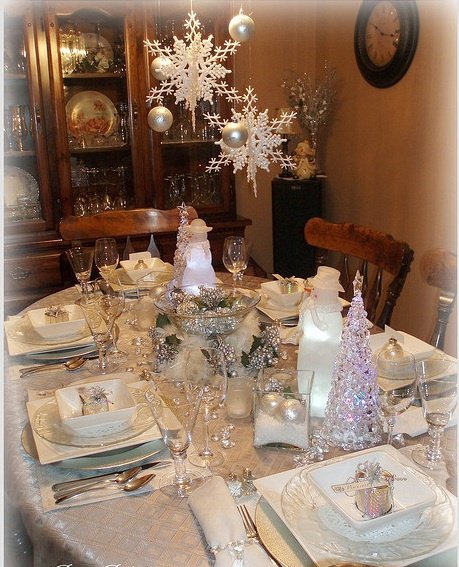
A creamy winter tablescape is a mood before it is a shopping list: soft whites, ivory textiles, clear glass, and candlelight that makes even a weeknight roast feel intentional. The look borrows from snow and frost without needing fake glitter drifts on every plate. Pale ceramics, linen, bare branches, and one restrained accent metal are usually enough. The photographs collected here stay inside that white-and-cream winter register — useful references for holiday dinners, New Year’s Eve, or any cold-month gathering that wants atmosphere more than a crowded prop table.
What separates a calm winter table from a cluttered one is editing. Choose a narrow palette, layer texture instead of color, keep centerpieces low enough for conversation, and let light do half the decorating. Guests remember how a room felt when the first course arrived; they rarely inventory every object you placed between the water glasses. If you take nothing else from these images, take the temperature: pale, soft, and lit from within.
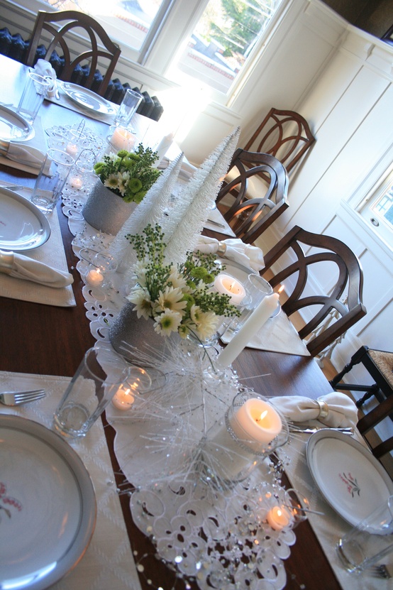
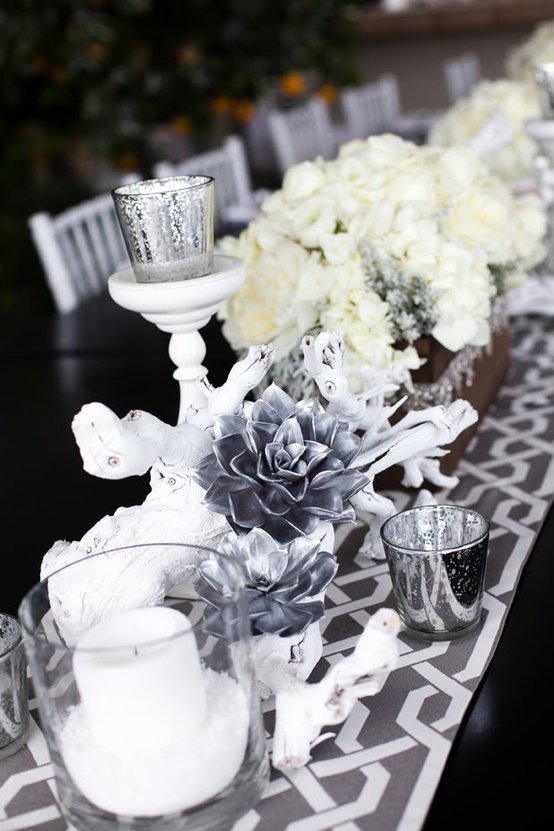
Start with cloth, not ornaments
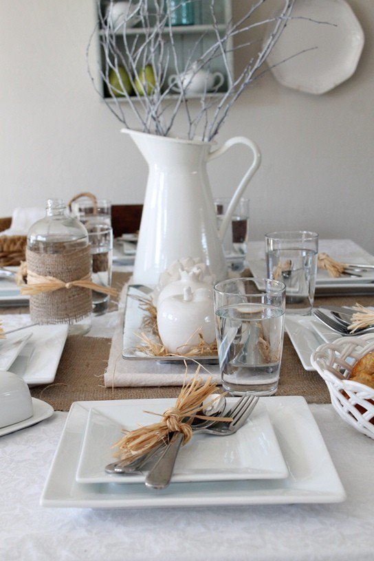
Begin with the largest quiet surface. A white, bone, or oatmeal cloth sets the temperature of the whole table. If full cloths feel formal for your space, a wide linen runner on bare wood still reads winter when the runner is pale and the wood grain stays visible at the edges. Mix whites on purpose: a cooler sheet under warmer ivory napkins creates gentle depth that a single stark white can miss under cool LED bulbs.
Texture matters more than pattern in this scheme. Basketweave runners, washed linen, lightly wrinkled cotton, and matte ceramic all photograph and feel richer than shiny polyester trying to look like satin. If you want pattern, keep it tone-on-tone — subtle damask, embossed chargers, or a faint stripe — so the table stays creamy rather than turning graphic. A cloth you can launder after red wine is worth more than a pristine rental look you are afraid to use.
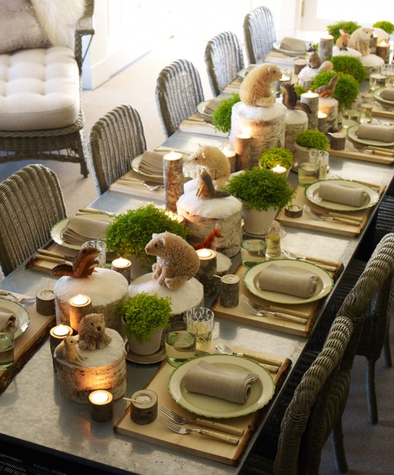
Build a palette with one accent, not five
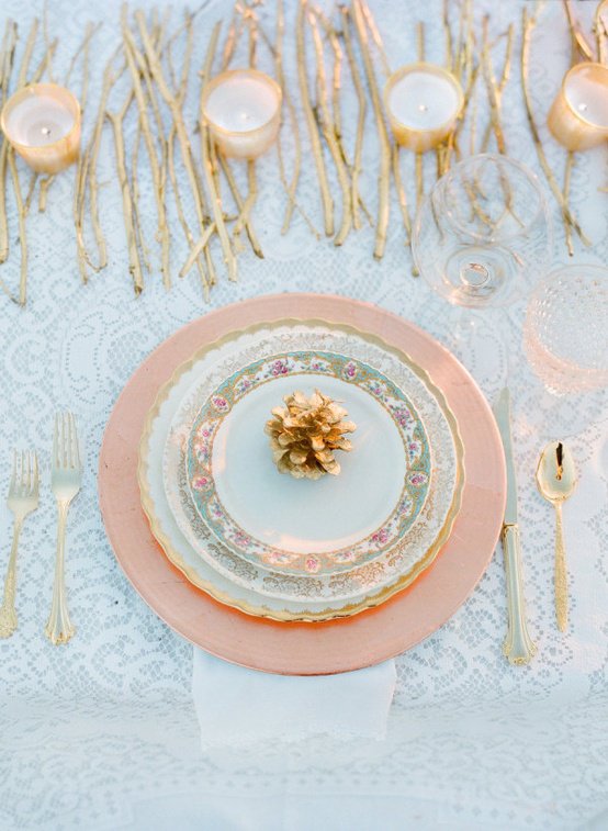
White-plus-cream is the spine. Add at most one quiet accent family: brushed silver, soft gold, clear “ice” glass, pale blush blooms, or a whisper of evergreen. Metallic chargers and mercury glass catch candlelight; stoneware and unfinished wood keep the look from floating away into pure bridal-white formality. Too many accents — gold and silver and blush and forest green and red berries — breaks the creamy winter promise and starts looking like a mixed holiday bin.
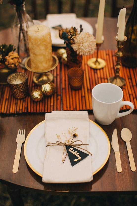
Place cards work best in simple stock with handwriting or a clean serif. Oversized glitter stationery fights the restraint that makes this style feel expensive even when the pieces are thrifted. Napkin rings can be plain metal, twine, or nothing at all; a sprig tucked into a fold often replaces the need for another manufactured object. The discipline of one accent is what keeps a pale table from feeling unfinished — contrast is present, just not noisy.
Centerpieces guests can talk across
Low bowls of white flowers, frosted or bare branches, cotton stems, pine tips, or pale berries keep sight lines open. Tall dramatic arrangements belong on a buffet, entry console, or the far ends of a very long table — not in the middle of every conversation. Odd numbers of candles or small vessels usually look more natural than a perfect mirrored pair.
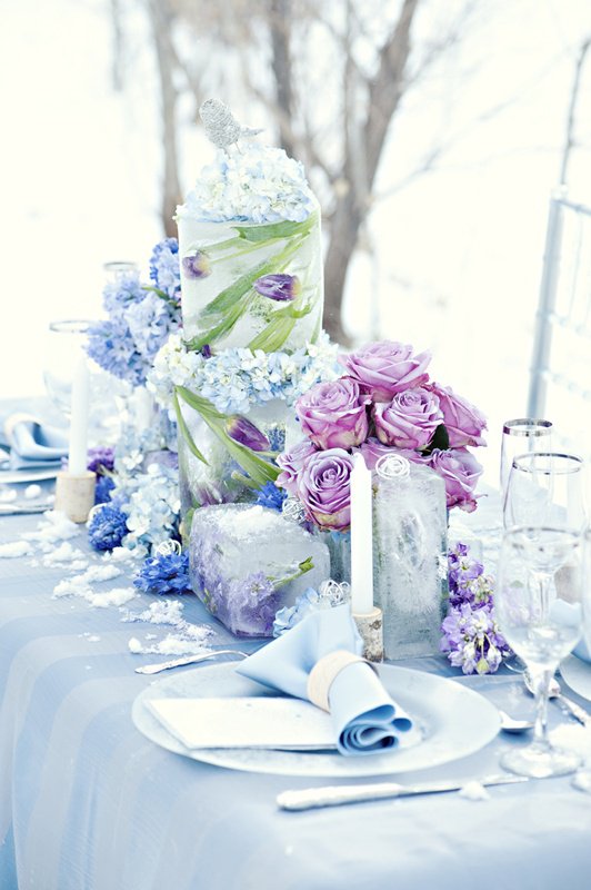
Natural materials earn their keep here. Wood slices, stone, linen, twigs, and clear glass sit comfortably in a winter-cream story. Artificial snow powder is optional and easy to regret after it migrates into sleeve cuffs and soup. A few glass ornaments or ice-inspired vessels usually read more elegant than foam “snow” scatter. If you love height, put it behind the dining chairs on a console rather than forcing guests to lean sideways to speak.
Place settings: stack gently, then leave air
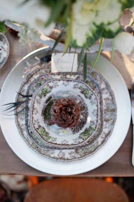
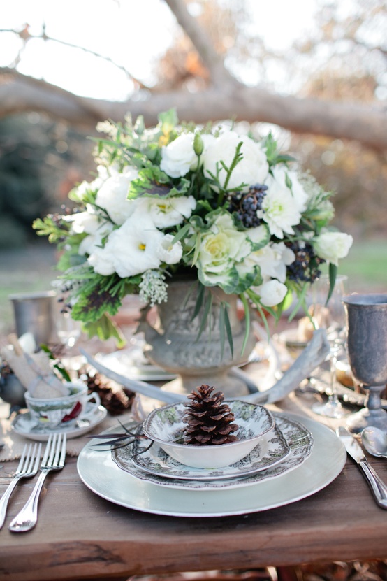
A charger, dinner plate, and soup or salad bowl in related whites create soft concentric rings. Clear stemware keeps the palette airy; cut crystal adds sparkle when overhead light is already dimmed. Match flatware metals to candlesticks and napkin hardware so the table does not accidentally host three competing finishes.
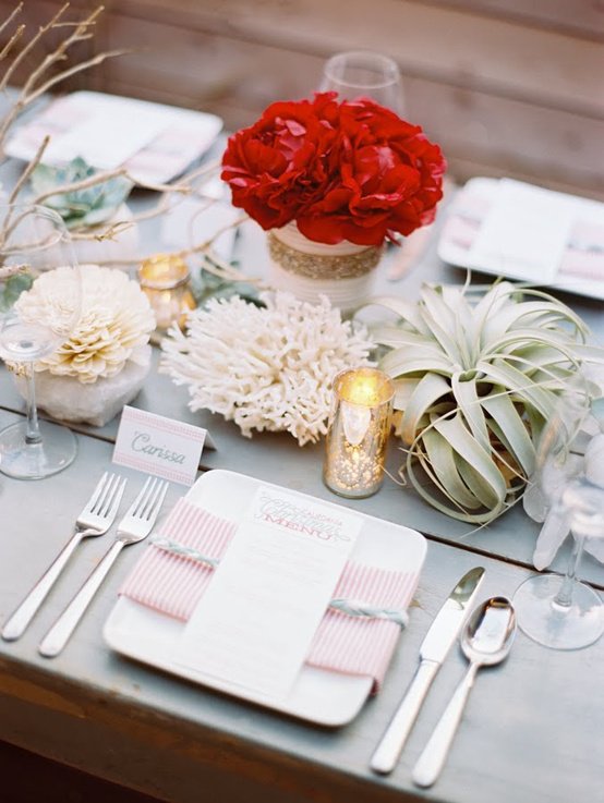
Negative space is part of the design. Crowding every inch with votives, scatters, and mini trees makes people afraid to move their elbows. Winter creamy tables need intervals of plain cloth or wood so glaze, glass, and flame can register. If you collect beautiful objects, rotate them across evenings instead of deploying the full archive at once. A place setting should feel like an invitation, not an obstacle course to the bread plate.
Light does more than any centerpiece
Dim ceiling fixtures and lean on tapers, votives in hurricanes, or a nearby lamp with a warm bulb. Cool bright LEDs bleach cream into chalk and flatten faces in photos. Warm, dimmable light flatters ivory textiles and skin alike. A mirrored tray under a cluster of candles multiplies glow without adding color. With children or pets around, favor enclosed glass and keep open flames toward the center, away from sleeve reach.
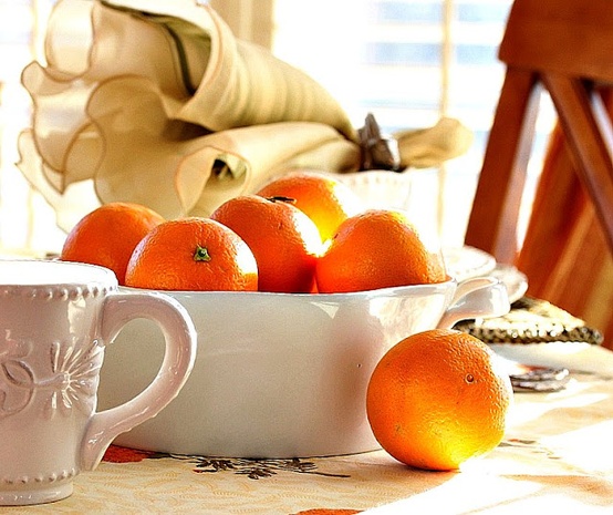
Daylight setup photos are useful if you want a clear record of the arrangement; evening shots will be softer and more atmospheric. Take both if the table took real effort — one for memory of the composition, one for how it felt when people sat down. Scent should stay light: unscented or barely scented candles are kinder beside food than heavy pine or vanilla columns that compete with dinner.
Hosting realities that protect the look
Choose fabrics you can wash. Keep a spare napkin set folded nearby. Serve large platters from a sideboard or kitchen pass so the centerpiece survives the meal. If your dining table is small, scale ruthlessly: one runner, two or three candles, good plates, and a single low bowl of white stems will read as the same creamy winter idea without the studio-prop density shown in larger setups. A small bundle of rosemary or eucalyptus in water can add a clean green note without perfume overload.
Timing helps too. Set the base layers earlier in the day — cloth, plates, glassware — and add candles and flowers closer to guest arrival so nothing wilts or looks dusty under afternoon sun. Walk around the table once at seated eye level; anything that blocks a face across from you should move to the buffet.
- Pick three constants before you decorate: cloth or runner, candle plan, one centerpiece material.
- Limit accents to a single metal or soft botanical family.
- Keep the middle low; move height to the edges or a buffet.
- Warm the light; cool glare fights cream.
- Leave empty cloth between clusters so the table can breathe.
Use the images as a temperature check, not a shopping mandate. If your version has fewer objects and still feels pale, soft, and lit from within, you have the creamy winter tablescape — and dinner can start without clearing half the décor first.

Comments
Continue reading
Dream Wedding Tablescapes: Color, Height, and Place-Setting Ideas
Inspiration for reception tables - blush-and-black place settings, purple banquet florals, candlelit outdoor orchids - plus practical notes on contrast, sightlines, and guest comfort.
Glamorous Winter Wedding Decoration: Styling Criteria
Build a snowy, romantic wedding with a clear palette, candlelight, texture, and edited gallery ideas that fit short winter days.
Easter Table Decorations: Linens, Low Centerpieces, Place Settings
Build a whimsical spring Easter table from the ground up—linens, conversation-friendly centerpieces, one cue per place, and a calm color story.