
Dream Wedding Tablescapes: Color, Height, and Place-Setting Ideas
Inspiration for reception tables - blush-and-black place settings, purple banquet florals, candlelit outdoor orchids - plus practical notes on contrast, sightlines, and guest comfort.
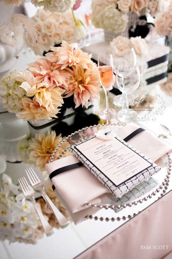
A wedding tablescape is the guest’s longest view of your design. They will stare at it between courses, photograph it before the speeches, and remember whether the table felt lush, calm, playful, or formal. Dream wedding tablescapes do that work with intention: color stories that hold together, height that creates drama without blocking faces, and place settings that feel like a gift at every chair.
This gallery is a set of ideas—fashion-forward blush and black, purple banquet luxury, candlelit outdoor orchids—not a mandate to copy every object. Steal principles. Leave the rest. The empty-table hero shot taken before doors open is useful for vendors; the real test is whether the table still feels generous when plates, elbows, and water glasses arrive. Plan for both photographs, or you will design for a moment guests never experience.
One strong contrast beats ten soft pastels
Blush napkins, peach and cream florals, mirrored chargers, and a black ribbon or tweed-framed menu create tension that reads as chic rather than sugary. Soft color alone can dissolve into the tablecloth. A dark accent—ribbon, type, frame, chair detail—gives the eye a place to land. If your flowers are romantic, let stationery or napkin styling carry a sharper line. Fashion references work here when they stay subtle: a bouclé menu frame can nod to classic Parisian tailoring without turning the dinner into a costume party.
Menus are an underrated design tool. A framed card with clear courses turns the place setting into a small welcome. Guests feel informed; photographs gain a graphic rectangle among petals. Keep type readable in low light. A beautiful menu nobody can decipher is decoration that fails hospitality. If printing budgets are tight, a single shared menu stand per table can still give the graphic beat without a card at every seat.
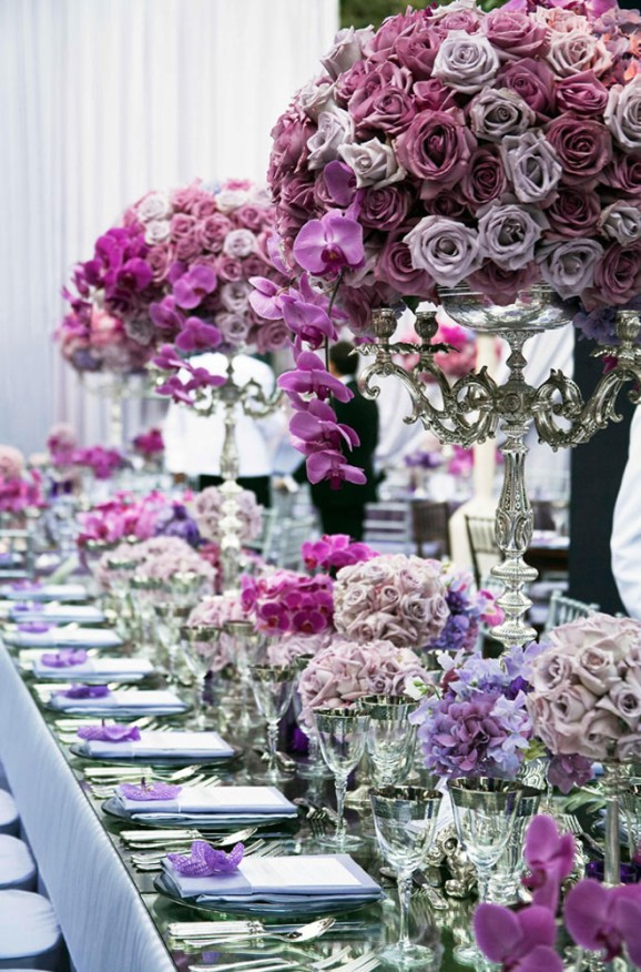
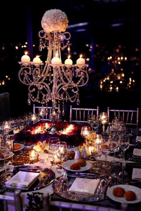
A single-color banquet—lavenders, mauves, cascading orchids on silver candelabras—proves monochrome can still feel abundant when you vary height and bloom size. Low clusters keep conversation possible; tall arrangements create the dream corridor down the table. Ask yourself which experience matters more for your guest count: eye contact across the table, or a tunnel of flowers in photos. Many long tables do best with alternating heights so neither goal fully loses.
Silver and crystal multiply purple tones; they also show fingerprints and water spots, so staffing and polishing plans matter. Dream tablescapes are partly operations. Beauty that wilts under service stress is not a finished design. Confirm with your caterer how often glasses will be cleared and whether tall centerpieces interfere with tray paths. A gorgeous aisle of candelabras that forces servers into awkward zigzags will look less dreamy by the entree.
Ceiling and air are part of the table
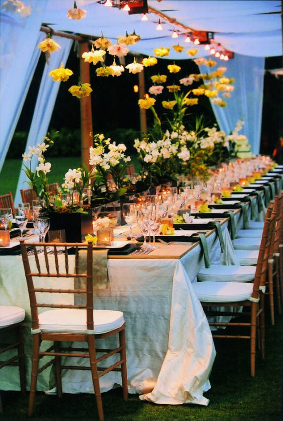
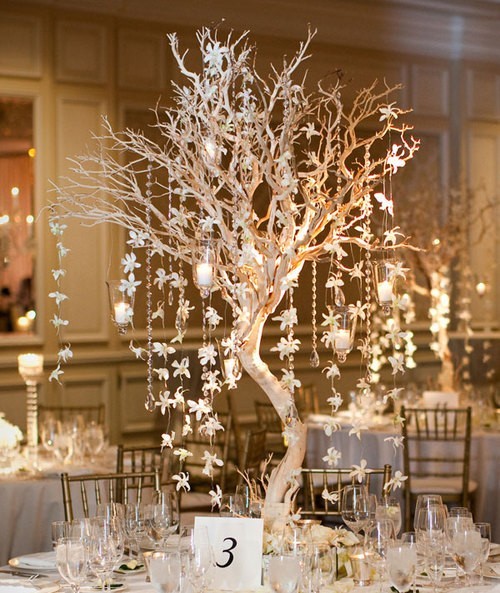
Outdoor night tables under a canopy can borrow the sky. String lights, hanging blossoms, and votives turn the space above the plates into decor. Guests feel enclosed without walls. Sage napkins and wooden chairs warm the white-and-cream base so the look does not freeze into hotel blandness. Yellow orchid accents keep the palette from becoming only candle amber. The hanging flowers do emotional work: they make the table feel chosen rather than merely covered.
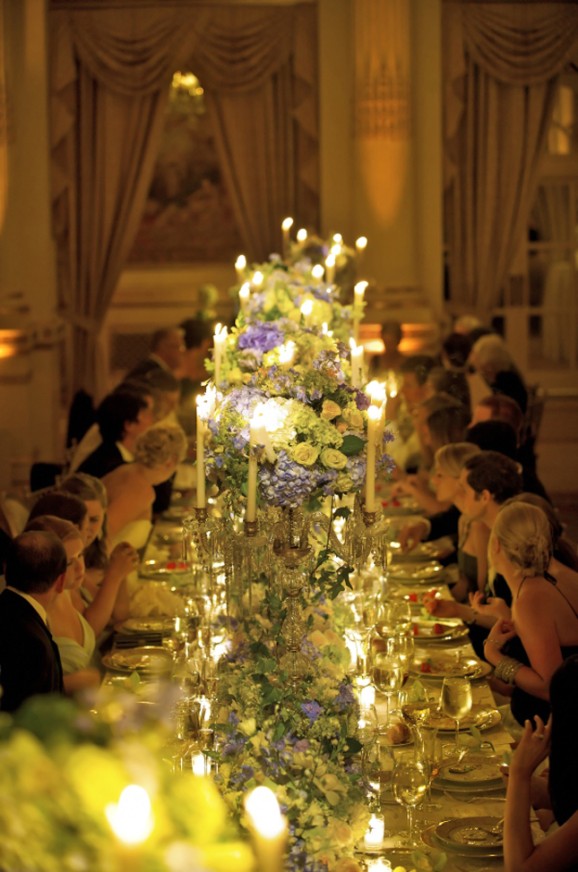
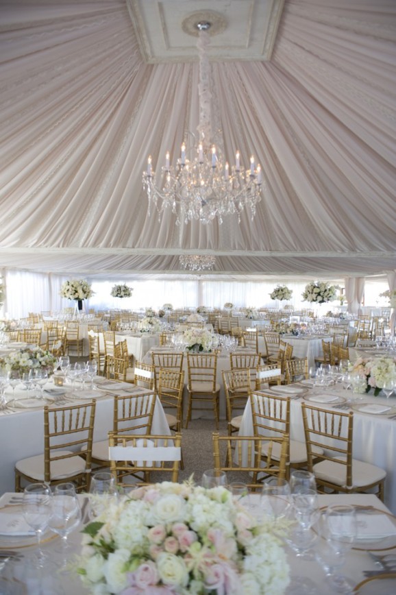
If you are indoors with a high ceiling, consider hanging elements or tall taper candles so the design does not stop at centerpiece height. If the ceiling is low, keep drama in runners, chargers, and low gardens instead of fighting the architecture. Dream tablescapes succeed when they negotiate with the room rather than ignoring it. Measure clearance for hanging installs the way you measure for a chandelier—heads, cameras, and HVAC vents all count.
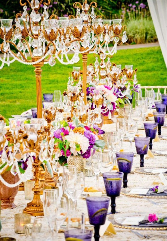
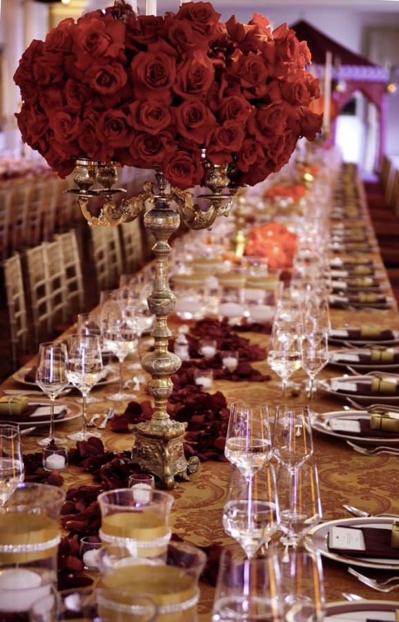
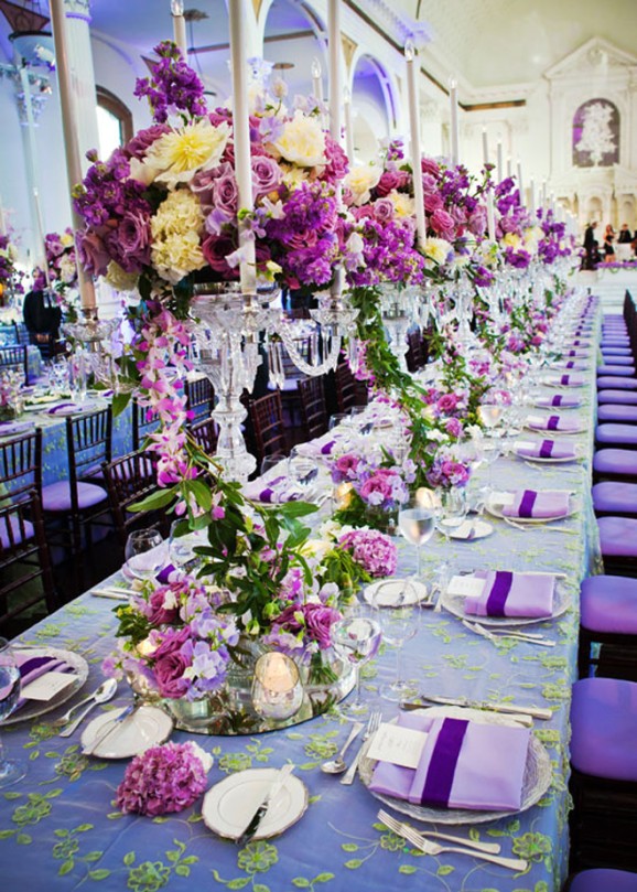
Layering is the practical craft under the romance: charger, dinner plate, napkin, menu, glassware. Each layer should earn its keep. A mirrored charger multiplies candlelight. A fabric napkin softens hard china. Extra glassware looks abundant until servers have nowhere to set wine. Count pieces against the menu and the size of the table. Remove anything that only exists for the flat-lay photo. If a prop makes cutting food awkward, it does not belong at a dinner seat.
Florals: density, scent, and sightlines
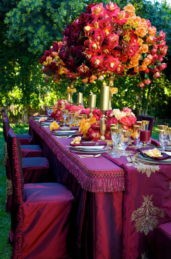
Lush, low gardens of roses, dahlias, hydrangeas, and tulips feel abundant in close shots. Tall candelabra arrangements feel ceremonial in wide shots. Mix both on long tables if budget allows; alternate on rounds if not. Keep heavily scented blooms away from plated food if fragrance bothers you or your guests. Beauty that competes with dinner is not hospitality.
Containers matter as much as stems. White vessels with a black stripe can echo napkin ribbons. Silver elevates purple and jewel tones. Black planters under white orchids modernize a classic flower. Choose vessels that match your metal story—flatware, candleholders, chair finishes—so the table does not accidentally wear three eras at once. Ask your florist for a sample place setting photo under similar light to the reception, not only a daylight studio mockup.
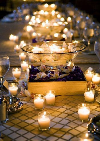
Candlelight is often the cheapest dream upgrade. Votives along a runner soften faces and hide minor linen wrinkles. Tapers add vertical sparkle. Confirm fire codes and breeze plans outdoors; nothing kills romance like candles extinguished every three minutes or, worse, an unsafe setup. Battery tapers can solve wind without surrendering the glow, as long as the color temperature stays warm.
Linens, chairs, and the quiet frame
Tablecloths and chair choices set the frame before flowers arrive. Floor-length cloth in cream or white is a classic dream base; textured or subtly shimmering fabric photographs richer than thin polyester. Wooden Chiavari chairs warm an outdoor night look; slipcovered chairs push formality. Seat cushions in white keep long dinners kinder. Guests forgive a lot when they are physically comfortable—and remember discomfort longer than they remember a perfect charger.
Think about sound and spacing too. Crowded place settings make generous florals feel aggressive. Wide gaps can make a sparse table look unfinished. Your rental house’s recommended place-setting width is a useful starting map; adjust only when you have a reason. If children or elders are at the table, avoid precarious glass towers and dangling crystals at elbow height.
A compact tablescape checklist for planning meetings:
- Pick a color story with one contrast accent.
- Decide height strategy: low garden, tall drama, or alternating.
- Confirm guests can see across or along the table as you intend.
- Match metals across flatware, vessels, and candleholders.
- Budget candlelight; it is often the cheapest dream upgrade.
- Edit objects that only exist for Instagram and annoy elbows.
- Plan how the table looks after the first course lands—not only before doors open.
- Walk a mock place setting with a dinner plate and wine glass before you approve the final sketch.
When that first course lands, the tablescape should still feel generous and leave room for plates, hands, and conversation. That guest-hour reality is the real finish line for dream wedding tables.

Comments
Continue reading
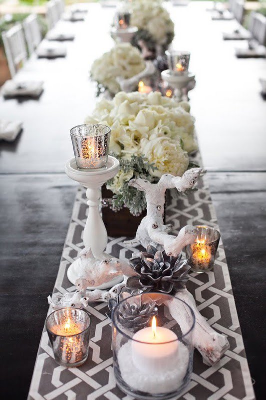
White Winter Creamy Tablescapes
Ivory runners, candlelight, and pale centerpieces — how to build a creamy white winter table that feels seasonal without crowding every place setting.
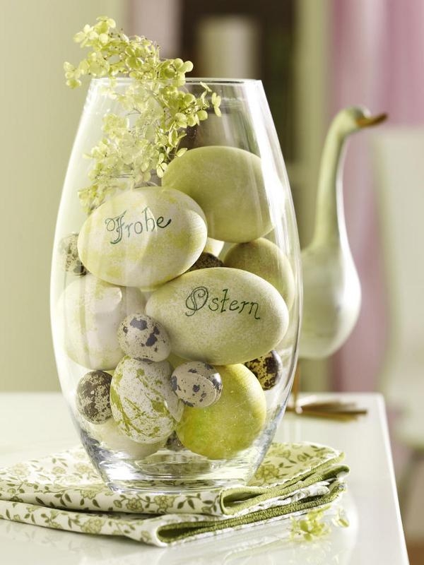
Easter Table Decorations: Linens, Low Centerpieces, Place Settings
Build a whimsical spring Easter table from the ground up—linens, conversation-friendly centerpieces, one cue per place, and a calm color story.
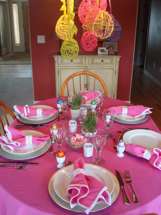
More Easter Table Ideas: Moods, DIY Details, Material Mixes
Alternate Easter tablescapes—garden, rustic, and polished moods, handmade place details, glass-wood-ceramic mixes, and when to edit bold color.