
Visual Travel to the Black-and-White Era
A monochrome photography feature on portraits, streets, and travel mood—how black-and-white edits place, light, and gesture, with a nod to Marilyn Monroe’s iconic frame.
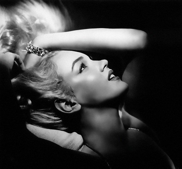
Black-and-white photography does not erase a place; it edits it. Without color, streets, faces, and coastlines reduce to light, edge, and gesture. A visual journey through that palette is less about dressing up in nostalgia and more about how monochrome still teaches the eye to travel—across decades of images and across cities that look newly unfamiliar when hue drops away.
The pictures gathered here lean into that mode: portraits with soft grain, avenues that feel older than their pavement, and quiet scenes where smoke, fabric, or fog do the storytelling. Marilyn Monroe appears as a reminder that some faces became icons in black and white long before color film was ordinary—proof that charisma survives the loss of lipstick red.
“I believe that everything happens for a reason. People change so that you can learn to let go, things go wrong so that you appreciate them when they’re right, You believe lies so you eventually learn to trust no one but yourself, And sometimes good things fall apart so better things can fall together.” — Marilyn Monroe
Why monochrome still feels like travel
Color locates you in a season and a brand of tourism—turquoise water, neon signs, autumn leaves. Black and white relocates you in time. A modern café can look mid-century; a rainy avenue can look like a film still. That temporal slip is useful for photographers and useful for viewers who want atmosphere without a checklist of attractions.
Travel in this sense is perceptual. You move from highlight to shadow the way a traveler moves from station to street. High-contrast scenes punch like noon in a stone city; low-contrast fog reads like an early departure. Grain becomes weather. Blur becomes motion through a crowd. Once you start reading photographs that way, even familiar neighborhoods regain a sense of arrival.
Archives help train that eye. Mid-century reportage, classic cinema stills, and early travel albums show how much empty space older frames allow, and how seldom they rely on saturated distraction. Studying them is not about copying costumes; it is about borrowing patience.
Portraits that carry a place
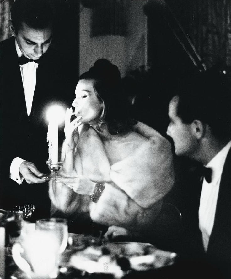
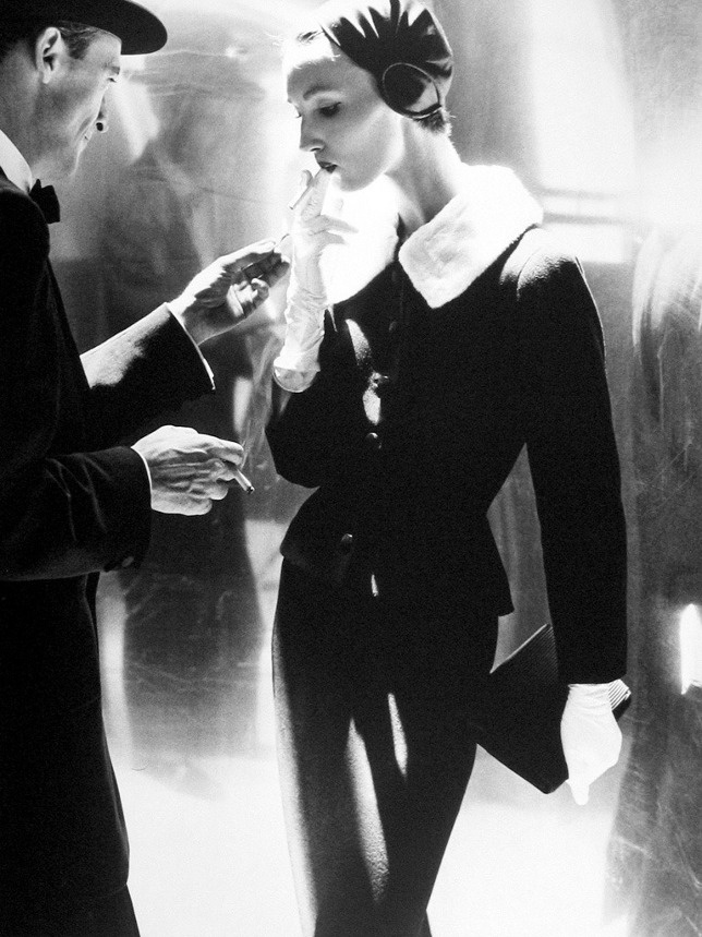
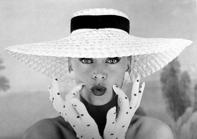
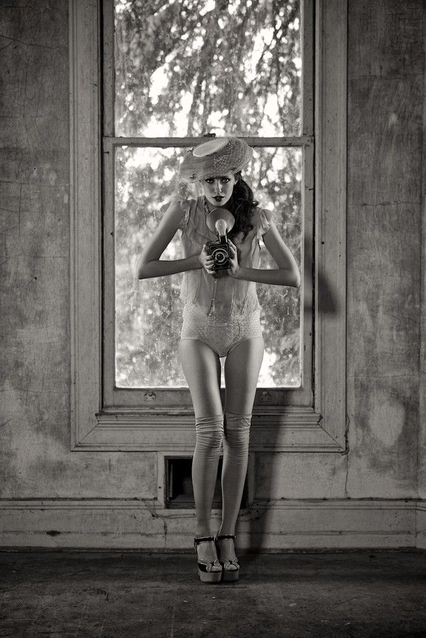
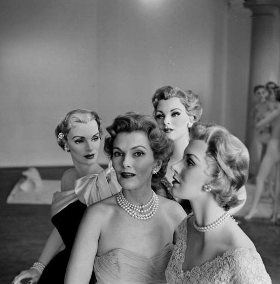
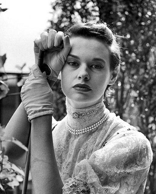
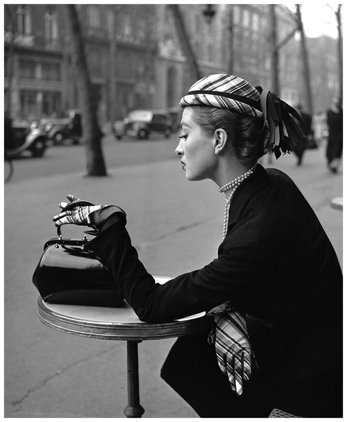
Strong monochrome portraits do more than flatter a face. Clothing textures, cigarette smoke, hat brims, and window light imply a room or a sidewalk even when the background is soft. Classic Hollywood lighting—key light, gentle fill, careful catchlights—still influences how we read glamour and vulnerability. Monroe’s image belongs in that lineage: the face is the destination.
When you look at era-spanning images, notice where the frame cuts. Tight crops feel intimate and contemporary; wider environmental portraits feel documentary. Both belong in a visual travel set. The point is not to fake the 1940s, but to notice how limited tone forces attention onto posture and expression. Jewelry, lace, and wool all become tonal maps instead of color stories.
If you make portraits on a trip, ask subjects to stand near a single strong light source—a doorway, a lamp, an open shade under a tree. Let the background fall away. In black and white, a simple wall often works harder than a famous landmark packed with tourists in bright jackets.
Streets, stations, and public life
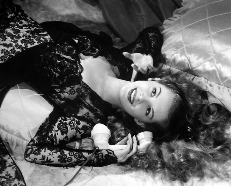
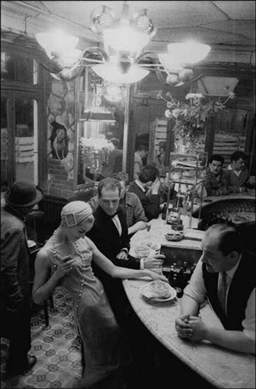
City travel in black and white thrives on repetition and interruption: rows of windows broken by one open shutter, a crowd broken by one turned face, rails broken by a single figure. Architecture becomes geometry. Signs become shapes before they become words. Wet pavement turns into a mirror that doubles lamps and shoes.
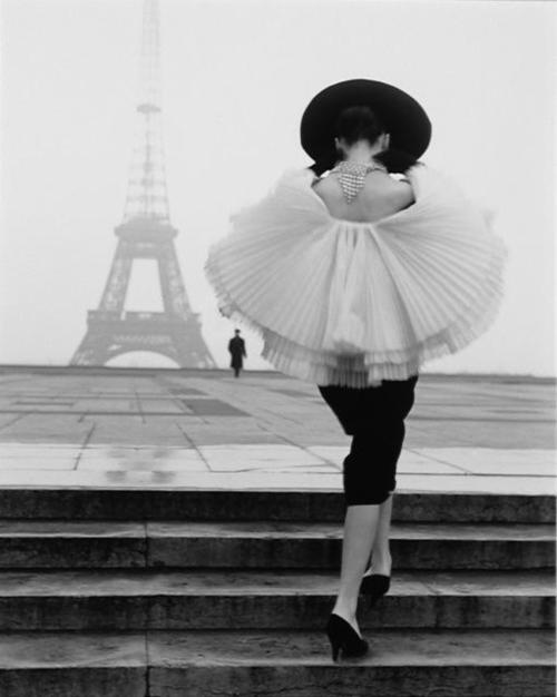
Photographers working this way often wait for a human scale marker—someone crossing, waiting, looking up. Without that marker, monuments can feel empty. With it, even a famous square becomes a lived minute. That is the difference between a postcard and a travel frame. Stations, ferries, and hotel lobbies are especially rich because they already exist as thresholds; monochrome underlines the in-between.
Try walking one route twice: once hunting color landmarks, once hunting tone. The second walk usually yields fewer “pretty” shots and more durable ones—shadows under bridges, reflections in tram glass, a vendor arranging crates. Those are the frames that still feel like going somewhere months later.
How to shoot a modern trip in an older key
You do not need film to chase this mood, though film grain has its own honesty. In digital work, expose for highlights you want to keep, then decide how deep shadows should go. Slight underexposure can protect bright skies; lifting shadows later can reveal detail without turning the file muddy. Watch blinking highlights on shiny cars and white shirts—they become chalky fast in conversion.
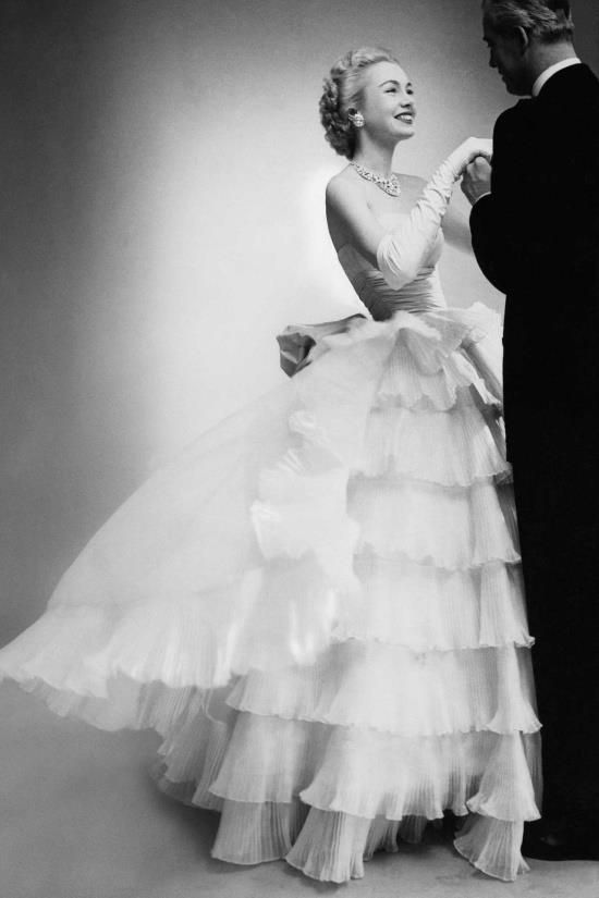
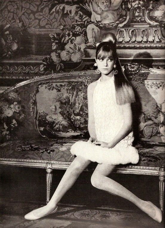
Convert with intention. A flat desaturation often looks dull. Channel mixers or dedicated black-and-white tools let you darken skies or lighten skin selectively—the digital cousin of colored filters on film cameras. Keep skin tones believable unless stylization is the goal. A little grain can unify a set shot across mixed lighting; too much grain becomes a filter costume.
Compose as if color will not rescue you. Seek leading lines, frames within frames, and clear subject separation. Midday sun can work if you embrace hard shadows; overcast days give soft tonal ramps ideal for quiet portraits. At night, sparse lamps create pools of light that behave like destinations on a map.
Subjects that thrive without color
- Steam, rain, and sea spray—texture that color often overpowers
- Stone, steel, and worn wood—surfaces with inherent contrast
- Night streets with sparse lamps—pools of light as destinations
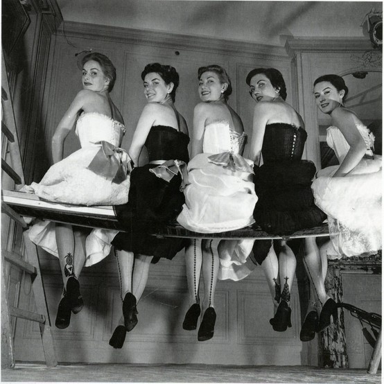
- Hands, hats, and shoes—small human details that travel well across eras
- Empty chairs and waiting rooms—liminal travel spaces
- Smoke, fog, and dust in shafts of light—atmosphere you can almost touch
Subjects that struggle include gardens in peak bloom and food photography, where hue carries meaning. If a scene’s story is “this paint is cobalt,” keep color. If the story is “someone waited here,” monochrome may be enough. Markets can go either way: piles of fruit beg for color; faces and gestures often prefer black and white.
Editing a set so it feels like one journey
A gallery works better when tonal range is consistent. Mix a few high-key frames with many mid-key images, and let one or two deep, ink-dark frames act as punctuation. Avoid every photo hitting maximum contrast; fatigue sets in fast on a long scroll. Sequence by rhythm: wide establishing shot, closer gesture, portrait, detail, then another wide. Think of it as walking a city block rather than dumping a folder.
Captions can stay light. Name a city or a decade when it helps; otherwise let the image travel on its own. The Monroe lines at the top of this piece are not a location caption so much as a mood board in words—acceptance, change, and rearrangement—which mirrors how black-and-white editing rearranges a scene’s priorities. What falls apart in color sometimes falls together in tone.
Print a small contact-style sheet or make a simple PDF. Seeing images side by side reveals which frames are tourists and which are companions. Cull ruthlessly. A short, coherent set travels farther than a long, uneven one.
Bringing the lesson home
You do not need a passport for the next exercise. Take one ordinary errand—market, commute, evening walk—and shoot it only in monochrome. Limit yourself to a small number of keepers. If those frames still feel like going somewhere, the palette is doing its job. The black-and-white era is not a costume party; it is a way of seeing that still works on a phone screen at a bus stop, and still rewards anyone willing to wait for the right shadow to cross the street.

Comments
Continue reading
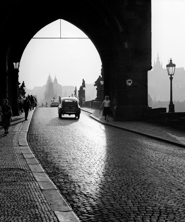
World’s Famous Cities in the Past
From Prague 1964 to Paris 1948 and Las Vegas 1959, a photo tour of well-known cities as they looked in earlier decades—streets, crowds, and transit before today’s skyline.
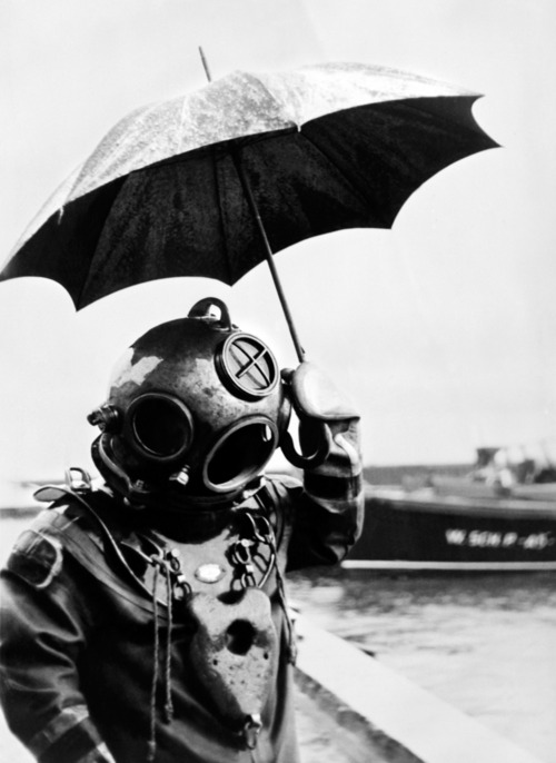
24 Extremely Weird Vintage Photos That Still Stop You
From divers with umbrellas to mistletoe gas-mask kisses—twenty-four odd historic images where one wrong detail makes the whole frame unforgettable.
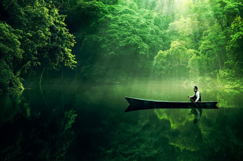
Dramatic Photo Art by Sukron Ma’mun (Ipoenk Graphic)
Cirebon, Indonesia photographer Sukron Ma’mun uses theatrical natural light to frame village life, play, and place in lyrical photo art.