
The Sugar Series by Emily Blincoe
Austin photographer Emily Blincoe’s Sugar Series sorts candy by color into calm still lifes—nostalgia, bulk-bin texture, and the same organizing eye behind her broader neat-color work.
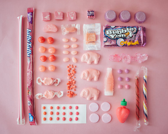
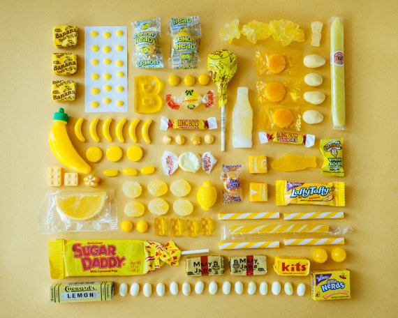
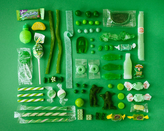
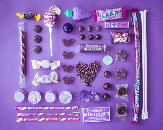
Emily Blincoe’s Sugar Series is a simple premise executed with unusual patience: candy, sorted by color, arranged until the frame feels inevitable. Sour belts, chocolate bars, wax bottles, gum, and nostalgic bulk-bin oddities become a palette. Soft painted backdrops—sky blue, blush, gold, mint—turn confectionery into still-life furniture. You do not need a caption to understand the game. The eye does the sorting for you.
Blincoe, born and raised in Austin, Texas, was already known in the early 2010s for portraits, landscapes, and conceptual arrangements when the candy work traveled through design and photography blogs in 2013. On Instagram she posted as thuglifeforevs; online, the series sat beside her broader “colors organized neatly” experiments—objects, foods, and small collections disciplined into grids and gradients. Sugar is the sweetest chapter of that habit, and still one of the clearest introductions to how she sees.
The photographer’s eye for order
Blincoe has described her arrangement practice as something that began almost accidentally: gather what is around the house, put it into a grid, notice that the photograph becomes more than inventory. Over time the habit moved through household objects into food and then into sweets—the longest-running series in that lineage. The pleasure is dual. There is the childlike recognition of wrappers and textures. There is the adult satisfaction of taxonomy.
That combination explains why the images spread so easily across Colossal, Fast Company, and countless smaller design blogs. Sites could treat them as graphic composition. Casual viewers could treat them as candy nostalgia. Both readings are fair. A Mary Jane beside a modern gummy is a timeline of sugar culture. A row of identical reds against a red wall is a lesson in value and hue. The photographs hold still long enough for either conversation.
She has said she was never a true candy obsessive. The project’s fuel was collecting and styling—the hunt through Austin bulk candy shops for shapes, foils, and half-forgotten childhood textures. Waxy soda bottles and paper-dot candies matter here less as snacks than as miniature industrial design: typography on a wrapper, the matte of chalky buttons, the shine of a hard shell. Shopping became research. The studio became a sorting room.
How the frames are built
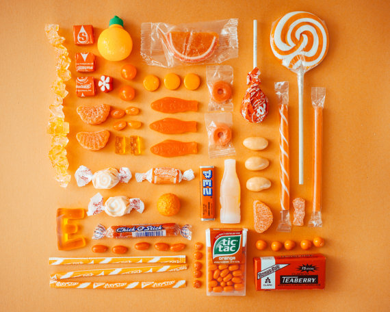
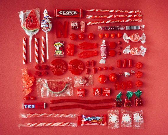
Most images in the series behave like controlled flat lays or shallow tabletop stages. Candies are grouped into chromatic families—yellows with yellows, pinks with pinks—then tuned for rhythm. Size variation keeps the grid from feeling dead. A long sour strip can act like a brushstroke. A cluster of small hard candies can act like pointillism. Negative space is intentional; the background color is a cast member, not wallpaper.
Light stays friendly and even, the better to honor wrapper print and sugar texture. Shadows are soft enough not to turn the scene into drama lighting. This is not food photography chasing steam and bite marks. It is closer to product still life with a sense of humor—especially when an unexpected object interrupts the edible cast. The series knows it is playful. It never apologizes for that.
Sequence matters when you view several frames together. Moving from cool blues to warm oranges feels like walking a candy aisle redesigned by a color theorist. Monochrome sets make you notice form: cylinders versus squares, translucent versus opaque, branded versus generic bulk. Once branding falls away into pure color blocks, the photographs become almost abstract—then a familiar logo snaps them back into autobiography. That snap is part of the charm. Abstraction and memory keep trading places.
Look closely and you can sense decisions about edge and density. Some frames pack the field until the color hums. Others leave breathing room so a single chocolate bar or ribbon of taffy can act as a protagonist. Neither approach is “more Blincoe” than the other; the series thrives on that range inside a single rule set.
Nostalgia without syrup
Plenty of candy photography leans on overload—piles, chaos, sugar rush as aesthetic. Blincoe’s alternative is discipline. Nostalgia arrives through recognition, not through mess. You spot a childhood staple and feel the tug; the composition immediately re-routes that feeling into design appreciation. The work trusts viewers to hold both responses at once.
That trust aligned with a wider early-2010s internet taste for “things organized neatly,” rainbow gradients, and satisfying order. Blincoe’s contribution is photographic rather than purely curatorial. The camera’s edge, the painted wall, the slight imperfections of real wrappers—these keep the images from looking like clip art. You can sense a person arranging under daylight, adjusting one piece by a centimeter, shooting again. The labor is quiet, but it is visible if you know how to look.
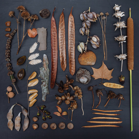
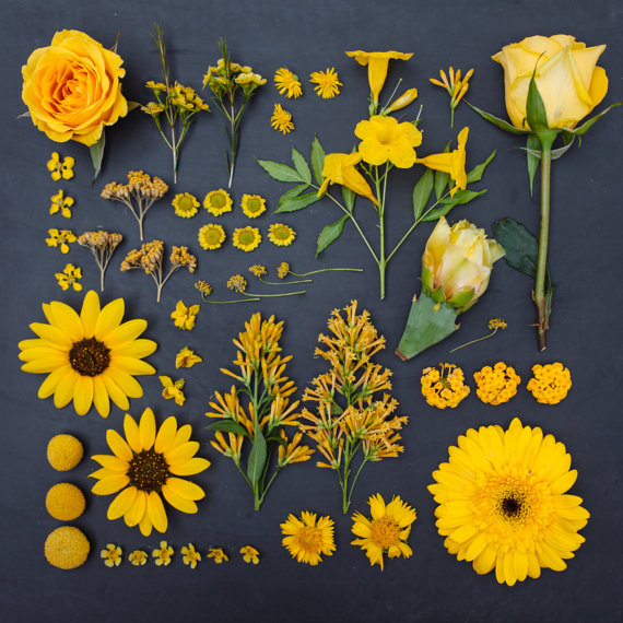
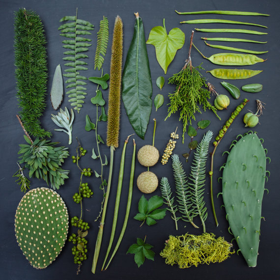
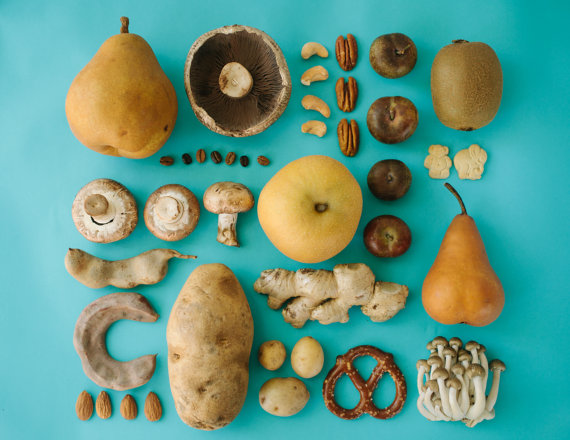
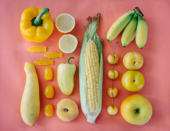
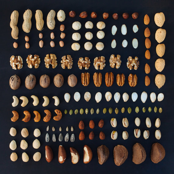
Her parallel projects with produce and other objects sharpen the point. After a run of sweets, fruits and vegetables read like a palate cleanser: same organizing intelligence, different material culture. Color remains the grammar. Subject matter changes the dialect. Viewers who found her through candy often stayed for the wider neat-color universe, which is exactly how a personal series becomes a recognizable practice.
Austin roots, freelance range
Context helps. Blincoe’s public biography has long emphasized Austin beginnings, a freelance practice spanning portraiture and conceptual series, and an eye for faces, places, shapes, light, and quiet moments. The Sugar Series is not a detour from that sensibility; it is the sensibility applied to the candy aisle. Quiet moments, in this case, are rows of sugar waiting in formation.
Freelance photographers often live between assignment work and personal projects. Personal projects are where a visual thesis can stay consistent long enough for strangers to recognize it. By 2013, if you saw a Blincoe arrangement—whether sweets or another sorted collection—you could often name the author before you read the credit. That is a rare clarity in a feed culture that flattens every pastel flat lay into the same mood.
Prints and shop links circulated with the series at the time, but the photographs do not depend on merchandising to make sense. They work as a portfolio chapter: proof that constraint, repetition, and careful styling can turn everyday merchandise into a coherent body of work.
Looking slowly
These photographs reward the kind of looking people usually reserve for paintings. Pick one hue family and inventory the materials inside it: chocolate versus taffy, foil versus paper, sphere versus brick. Notice which pieces break the pattern on purpose. Notice where the edge of the set meets the wall color—sometimes matched, sometimes complementary, always decided.
If you make pictures yourself, the series is also a prompt with a low barrier. Choose one color of anything inexpensive. Arrange until the frame feels calm. Shoot. Move one object. Shoot again. The lesson is not “photograph candy.” The lesson is that attention plus constraint can turn ordinary goods into a study of form. Blincoe’s gift is making that study look inevitable after the fact.
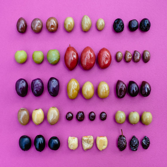
Somewhere between the bulk bin and the painted wall, order becomes the treat. The candies remain candies. The photographs remain rigorous. That double allegiance—delight and design refusing to cancel each other—is why the Sugar Series still feels fresh whenever a new viewer meets Blincoe’s neat rainbow for the first time.

Comments
Continue reading
Dramatic Photo Art by Sukron Ma’mun (Ipoenk Graphic)
Cirebon, Indonesia photographer Sukron Ma’mun uses theatrical natural light to frame village life, play, and place in lyrical photo art.
Bird’s-Eye Views: Florian Beaudenon’s Instant Life
Paris photographer Florian Beaudenon’s Instant Life series captures people in their rooms from above—intimate, collaborative overhead portraits of everyday joy.
Abandoned Cars Reclaimed by Nature: Rust, Growth, and Quiet Ruin
When neglected vehicles are left outdoors long enough, rust, moss, and trees rewrite them into strange still lifes—sad, photogenic, and slowly returning to the ground.