
20 Creative Advertising Moves Worth Studying
Twenty craft principles behind ads that stop the scroll—visual puns, medium-as-joke, scale, silence, honest demos, and endings where the brand is the punchline.
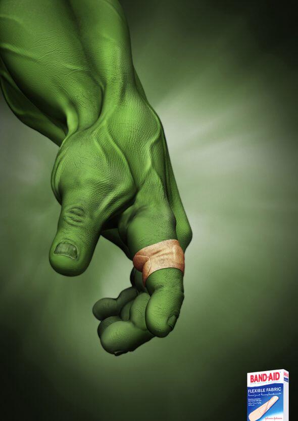
A strong advertisement does more than deliver a product name into someone’s peripheral vision. When the message is clear and the craft is sharp, the ad itself becomes memorable—sometimes more memorable than the thing it sells. Campaigns built for promotion and campaigns built for public awareness both depend on the same scarce resource: a viewer’s willingness to stop scrolling, stop walking, or stop flipping pages long enough to feel something.
This collection is a working tour of twenty creative advertising moves worth studying. The surviving frame below is a reminder that clever ads are usually visual first. Copy supports the punch; it rarely carries the whole idea alone.
1. Lead with one unforgettable claim
Creative ads that dazzle usually refuse to multitask. They pick a single promise—safety, freshness, speed, belonging, thrift—and dramatize it until nothing else is needed. If a second benefit requires a footnote, the first idea is unfinished. Sketch the concept until a stranger can retell it in one sentence after one glance.
2. Make the format do the joking
Bus shelters, bottle necks, elevator floors, and magazine gutters can all become props. When the medium participates, the ad feels invented rather than pasted. Ask what only this placement can do that a generic banner cannot, then build the gag out of that constraint.
3. Prefer visual puns to lectures
A picture that completes a double meaning will outrun a paragraph of claims. Both readings must be fair: the literal image and the brand meaning should click together. Forced wordplay with no visual support ages into a groan; earned puns become the ads people photograph and share.
4. Surprise without punching down
Humor that humiliates a stereotype rarely becomes a classic. Surprise can be sharp; cruelty usually just looks cheap on a second viewing. Aim for recognition—“I’ve felt that”—instead of a laugh that requires someone else to be the butt of the joke forever.
5. Play with scale
Giant everyday objects, miniature monuments, and extreme close-ups reframe attention fast. Scale tricks are old, but they still work when tied to a product truth: big appetite, small price, huge relief, tiny detail that matters. Scale without meaning is carnival décor.
6. Leave the last beat for the viewer
Ads that finish every thought feel like ads. Ads that invite the audience to complete the idea feel like creativity. A missing word, a half-open metaphor, or a silent reaction shot can persuade harder than a slogan that shouts the answer in advance.
7. Treat white space as a tool
Emptiness is not wasted inventory. In print especially, calm fields of negative space can sell exclusivity, clarity, or dread. Crowded layouts signal insecurity—too many claims fighting for the same square inch. Let the product or the punchline own the silence around it.
8. Compress a story into three seconds
Outdoor boards and social stills rarely get more than a glance. Design a micro-arc: setup in the image, twist in the juxtaposition, brand as the reason it matters. If the story needs a paragraph to unlock, it will fail at street speed.
9. Borrow culture carefully
Memes, film references, and seasonal rituals turbocharge recognition—and date an ad overnight. Use culture when it clarifies a brand truth, not when it costumes a weak idea. Timeless craft outlasts last week’s joke format.
10. Make demonstration witty
Before-and-after, stress tests, and “watch this work” demos do not have to be dull. A clever demonstration is still honest about what the product does; it is playful about how you show it. Wit without proof is decoration. Proof without wit is a manual nobody finishes.
11. Use contrast as strategy
Black beside neon, silk beside grit, luxury beside mess—contrast creates meaning faster than adjectives. Pair opposites that illuminate the promise: tough but gentle, fast but precise, cheap but proud. Random contrast is noise; purposeful contrast is branding.
12. Let typography carry the idea
Sometimes the creative leap is lettering itself: a word that becomes a shape, a headline that acts out the benefit, type that melts, breaks, or stacks into a visual. If removing the type destroys the idea, design the type with the same care as a photograph.
13. Sell feeling before features
Specs convince buyers who already care. Feeling recruits the ones who do not yet. Creative ads often show the emotional outcome—relief, pride, belonging, mischief—then let the product sit quietly as the cause. Feature lists belong in brochures; moods belong on the board.
14. Respect the product’s honesty
The cleverest campaigns still tell a truth the brand can defend. Exaggeration for comedy is fine; lying about performance is not craft, it is risk. Viewers forgive jokes. They do not forgive bait-and-switch once they open the box.
15. Design for two distances
Great outdoor and print work reads from across the street and rewards a closer look. A bold silhouette or color block stops the eye; a small detail pays off the pause. If the ad only works zoomed in on a phone, it is not ready for the city.
16. Turn constraints into concepts
Tiny budgets, banned claims, awkward package shapes, and strict brand colors are not excuses—they are prompts. Some of the most memorable ads exist because someone was forbidden to do the obvious thing and had to invent a smarter route.
17. Use silence and sound thoughtfully
Even still ads imply sound: a scream you can almost hear, a quiet you can feel. Motion and radio spots that understand pacing—when to stop talking—often outperform wall-to-wall voiceover. Creative advertising is as much about when not to speak as what to say.
18. Build series, not one-offs
A single clever execution is a spark. A series with a shared logic becomes a language people recognize before they read the logo. Campaign thinking asks whether the idea can flex across seasons, markets, and formats without collapsing into repetition.
19. Aim for shareability without begging for it
“Share this” is not a creative strategy. Shareability arrives when the idea is clear, surprising, and easy to retell. If people need a caption to explain why the image matters, the share will die in the draft folder.
20. End with the brand as the punchline
The logo should feel inevitable, not stamped on. When the reveal lands—when the product is the only object that could complete the gag—the ad has done its job. If you could swap logos and the joke still works for a rival, the idea is not finished yet.
What to take into your next brief
Look at ads the way a maker looks at tools: what is the one idea, what does the medium contribute, and where does the viewer do the last bit of work? Keep a swipe file of executions that made you smile or stop, then reverse-engineer them without copying surface style. Craft travels; stolen layouts do not.
Whether you are pitching a client, studying for a portfolio, or simply collecting work that impresses, judge campaigns by clarity under pressure. A creative ad that only dazzles in a quiet gallery of other ads is decoration. A creative ad that still works on a noisy street, between two unread emails, is the kind other companies quietly study—and try to live up to next quarter.

Comments
Continue reading

30 Interesting Ad Ideas Worth Studying for Craft and Catchiness
Thirty advertising craft moves—visual puns, placement tricks, scale, typography, and honesty—paired with a gallery of clever ads built to stop the scroll.
24 Clever Print and Ambient Ads That Trust the Viewer
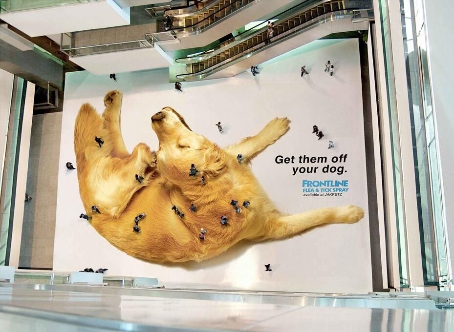
From Frontline’s mall-floor fleas to LEGO shadows and Jeep parking stunts—twenty-four print and ambient ads that finish the idea in the viewer’s head.

Faber-Castell True Colours: Pencils Sharpened from the World
Serviceplan’s True Colours posters for Faber-Castell turn fire engines, sharks, and more into colour-matched pencil tips—an art-materials idea told without hard sell.