
Faber-Castell True Colours: Pencils Sharpened from the World
Serviceplan’s True Colours posters for Faber-Castell turn fire engines, sharks, and more into colour-matched pencil tips—an art-materials idea told without hard sell.

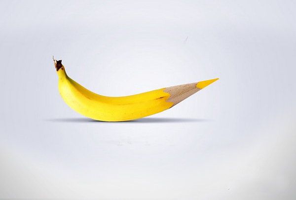
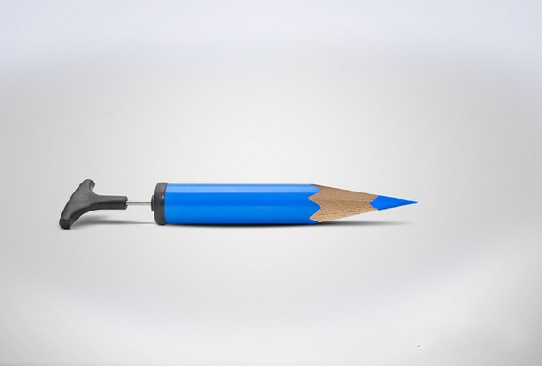
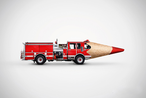
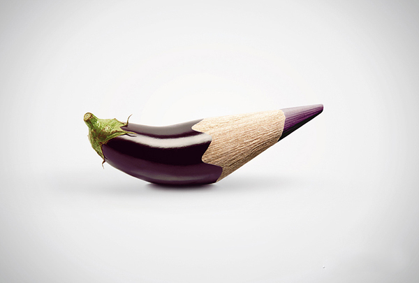
Faber-Castell’s “True Colours” print campaign is one of those rare advertising ideas that still looks fresh years after it first appeared: everyday objects sharpened into the tips of colour-matched pencils. A fire engine, an aubergine (eggplant), a shark, a dachshund—each form melts into a pencil point so cleanly that the product claim becomes visible rather than spoken. The pencils are true to life, the posters say without a paragraph of copy, because colour here is continuous with the world.
German agency Serviceplan developed the campaign for the historic pencil maker around 2010–2011. Credits commonly listed for the Munich team include executive creative direction by Matthias Harbeck, chief creative direction by Alex Schill, art direction by Andreas Balog and Marijo Sanje, copy by Nicolas Becker and Lorenz Langgartner, and graphic design by Fabian Halder. The work traveled as magazine and print advertising and later kept resurfacing in design feeds precisely because the idea is self-explanatory: you understand it in a second, then enjoy it for minutes.
What the campaign is really selling
Faber-Castell has manufactured writing and drawing instruments since the eighteenth century; coloured pencils sit at the heart of how many people first meet the brand. “True Colours” does not argue with charts or ingredient lists. It argues with resemblance. If a red fire truck can become a red pencil tip without breaking visual logic, then the colour of the lead is being treated as equal to the colour of the subject. That is a materials claim dressed as wit.
For artists and students, the subtext is practical. Colour accuracy, pigment quality, and consistency across a set matter when you mix skies, skin, fabric, or product illustration. The posters never lecture about binders or lightfastness. They simply stage fidelity as a visual joke you can trust. Humor carries the craft message farther than a technical brochure usually can.
Reading the posters as design
Each execution follows a clear grammar. Isolate one object. Match its hue to a pencil barrel and core. Carve or morph the object so that the sharpened tip feels inevitable. Keep the background quiet enough that silhouette and colour do the talking. The shark head is often remembered because the pencil point completes the form with almost anatomical inevitability. The dachshund is stranger: length becomes shaft, and the absurdity of the metamorphosis is part of the charm. The fire engine and aubergine play the same game with industrial red and deep purple—familiar things made briefly uncanny.
That uncanny edge is useful pedagogy for anyone who draws. Artists already know that colour is relational; these ads make relation literal. Object and tool share one continuum. The campaign also models restraint. There is little typography fighting the image, little lifestyle staging, little celebrity. The product is the punchline and the hero at once.

Art materials culture, without the hard sell
Print ads for art supplies often slide into affiliate tone: buy this set, unlock this skill, click this kit. “True Colours” resists that pressure by staying conceptual. You can admire the craft of the campaign whether or not you own a particular pencil tin. The useful takeaway for makers is not a shopping list; it is a reminder that materials branding works best when it shows what colour can do, not when it shouts discounts.
Still, the campaign sits inside a real materials conversation. Coloured pencils reward layered pressure, paper tooth, and patient builds from light to dark. Brands compete on core strength, blendability, and how honestly a named hue behaves on the page. Faber-Castell’s long reputation in graphite and colour instruments gave Serviceplan a credible platform for a fidelity joke. Without that heritage, the same morph might feel like empty cleverness. With it, the joke reads as confidence.

Why the idea keeps circulating
Design communities return to “True Colours” because it is teachable. Students of advertising can diagram the insight (true-to-life colour), the demonstration (object becomes tip), and the tone (playful, not preachy). Students of illustration can study how silhouette and hue carry meaning when text is minimal. The campaign also aged well visually: clean shapes, limited clutter, and a product form—hexagonal or round pencil geometry—that remains iconic even as digital tools dominate many studios.
Award circuits noticed the work in its day, including recognition in major advertising showcases, but lasting fame came from shareability. A poster that can be understood without translation travels. Fire truck, eggplant, shark, dog: the cast is international enough to survive caption-free posting. That universality is rare in product advertising and part of why the set still belongs in conversations about print craft.
A small studio exercise inspired by the ads
If you work with coloured pencils, try a quiet exercise borrowed from the campaign’s logic. Choose one object on your desk. Match it as closely as you can with a single pencil from your set—no blending first, just honesty. Then make a small study where the object and the pencil share a composition, even if you do not morph them photographically. Notice where the manufactured hue fails the real thing and where it surprises you by succeeding. That gap between world and tool is exactly the territory “True Colours” dramatizes.
You can also reverse the game: pick a pencil first, then hunt for a subject that deserves its name. Scarlet, indigo, ochre—each label is a promise. The Serviceplan posters exaggerate that promise into surreal continuity. Your page can test it with quieter accuracy.
- Look at each poster for silhouette continuity before you look for brand marks
- Note how little copy is required when the visual claim is complete
- Compare which morphs feel seamless (shark) versus delightfully broken (dachshund)
- Treat the set as a materials idea, not a shopping cart
- Try matching one real object to one pencil hue without mixing
Next time a coloured pencil feels “close enough,” remember the fire engine dissolving into a tip. True colour is not a slogan in these posters—it is a visual contract between pigment and the world, drawn sharp enough to make you smile and then, maybe, sharpen your own point and try again.

Comments
Continue reading

30 Interesting Ad Ideas Worth Studying for Craft and Catchiness
Thirty advertising craft moves—visual puns, placement tricks, scale, typography, and honesty—paired with a gallery of clever ads built to stop the scroll.
24 Clever Print and Ambient Ads That Trust the Viewer
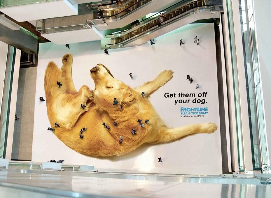
From Frontline’s mall-floor fleas to LEGO shadows and Jeep parking stunts—twenty-four print and ambient ads that finish the idea in the viewer’s head.
20 Creative Advertising Moves Worth Studying
Twenty craft principles behind ads that stop the scroll—visual puns, medium-as-joke, scale, silence, honest demos, and endings where the brand is the punchline.