
Stunning Tattoo Ideas For Women #2
Lettering and script tattoo ideas for women—typography on skin, reading order, mottos like La bella vita, and how to choose a lasting sentence.
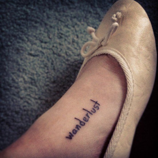
Some tattoos speak in pictures. This gallery speaks in type. The ideas gathered here for women lean into lettering, scripts, and short statements—phrases that sit on ribs, spines, wrists, and collarbones like private headlines. “La bella vita,” lines about living without regret, and couplets about standing your ground are not decorations that happen to include words; the words are the design. Typography becomes body architecture.
Use the set as a lettering mood board: how script flows with bone, when a stacked phrase needs breathing room, and how to choose a sentence you will still want to read in ten years. Practical notes stay on craft and clarity. No medical claims—just design talk and looking.
Why lettering is its own genre
A floral can hide a weak line in petals. A misspelled or cramped sentence cannot. Lettering tattoos expose spacing, kerning, baseline wobble, and whether the artist understands how skin stretches along a curve. That honesty is why script pieces feel so decisive when they work—and so loud when they do not.
Script, print, and mixed-case each carry a voice. Flourished calligraphy reads romantic or ceremonial. Clean sans lettering reads modern and poster-like. All caps can feel like a stamp; lowercase can feel like a whisper. Match the voice to the sentence before you fall in love with a font screenshot. A fierce mantra in candy-loop cursive may fight itself. A soft motto in heavy block may shout when you meant to murmur.
Language choice matters too. Italian, Latin fragments, English couplets, and bilingual mixes travel differently with friends and strangers. If you love a phrase for sound more than meaning, get a reliable translation check from a person, not only a search box. Permanence rewards precision.

Reading order on a moving page
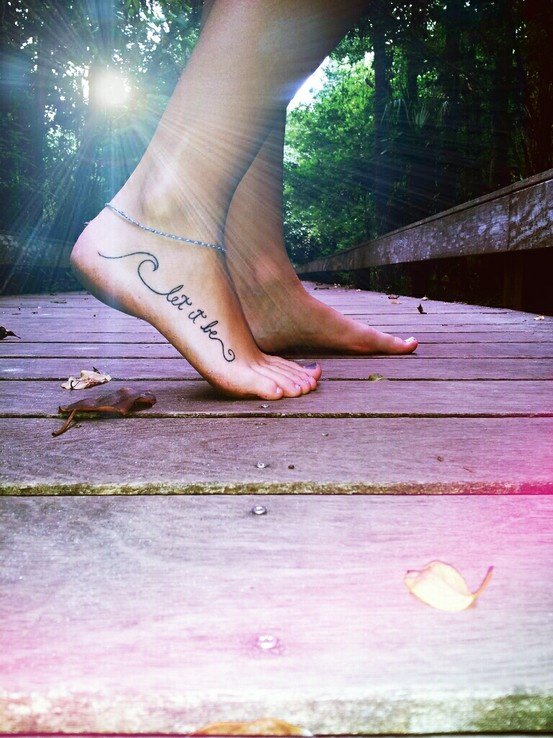
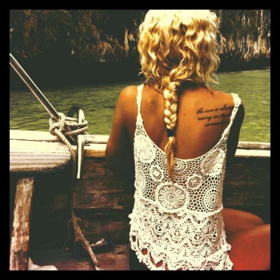
Skin is not a flat poster. Ribs curve. Spines lengthen when you bend. Wrists rotate into view and out again. Before you approve a stencil, stand, sit, and raise your arms. Ask whether the first word still leads the eye. Stacked lines should keep a clear hierarchy: title line, supporting line, maybe a small closer—not three equal ribbons competing.
Vertical spine lettering turns the body into a column of text. It photographs dramatically and asks for careful letter height so the phrase does not look stretched or timid. Side-rib scripts often run with the body’s length; they can feel intimate because clothing covers and reveals them in daily life. Inner-arm sentences stay closer to the wearer. Outer-arm sentences enter conversations sooner. Choose the social distance on purpose.
Negative space around lettering is part of legibility. Crowding a long quote into a small ankle panel forces hairline strokes that blur sooner. Better to shorten the text, enlarge the type, or move to a broader canvas. Editing a sentence is design work, not betrayal of the original poem.
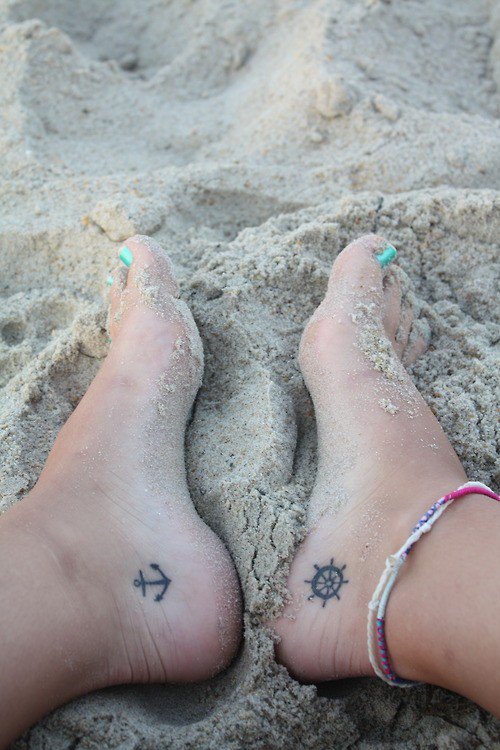
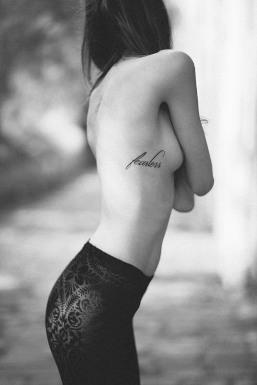
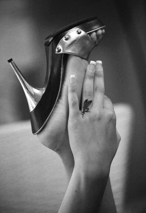
Phrases as objects: looking through this set
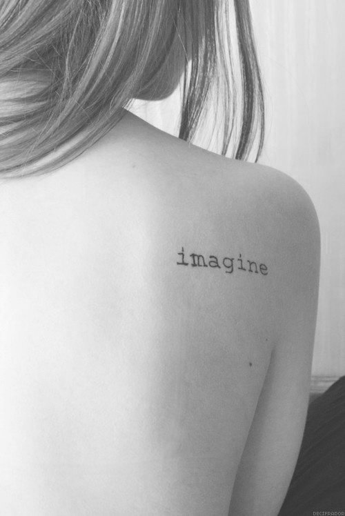
Move image by image and read aloud once. Sound changes preference. A line that looks elegant may feel clumsy in the mouth; a plain sentence may land with unexpected weight. Then look again without reading—treat the letterforms as abstract shapes. Do the ascenders and loops balance? Does the composition sit centered or intentionally off? Good lettering tattoos survive both tests.
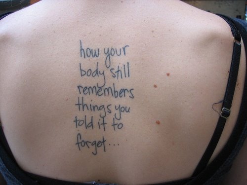
“La bella vita” (the beautiful life)
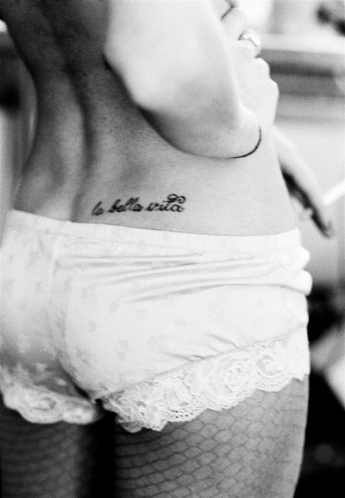
Short mottoes like La bella vita succeed when the calligraphy has a clear entry and exit—the eye knows where the phrase begins and ends. Flourish should support the words, not strangle them. If every letter wears a decorative loop, none of them feel special.
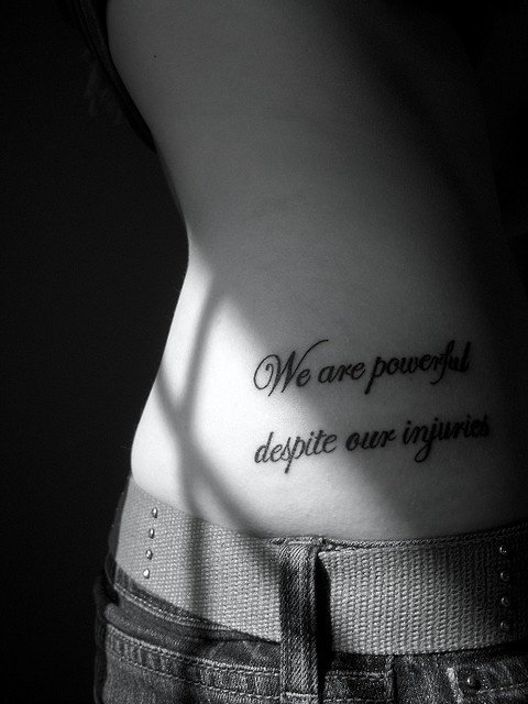

live die without regret; strength perseverance sacrifice
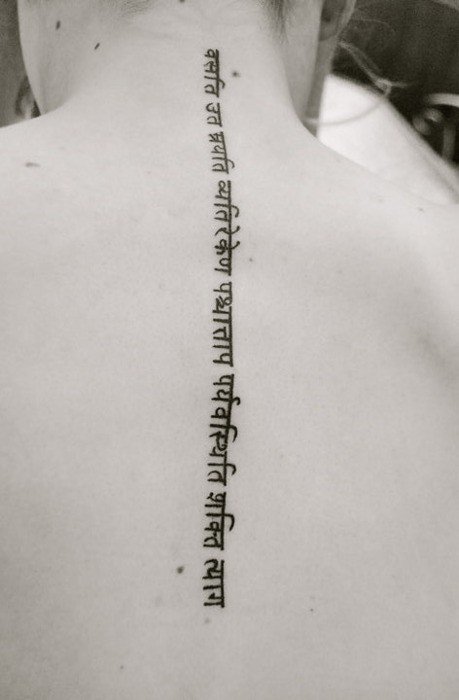
Lists and paired ideas—“live / die without regret,” “strength / perseverance / sacrifice”—ask for structure. Separators, line breaks, and weight changes do the editorial work that commas do on paper. Without structure, a powerful list becomes a pile. With structure, it becomes a small manifesto you can scan at a glance.
let no foot mark your ground – let no hand hold you down
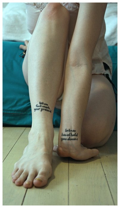
Couplets and parallel lines reward mirroring: two clauses, shared rhythm, balanced length. If one line is much longer, the stencil may need a different break or a different body site. Parallelism is not only poetic; it is compositional.
Working with a lettering-minded artist
Bring the exact spelling you want, including accents and punctuation. Bring a few type directions—not fifty fonts. Ask to see healed lettering, not only fresh black shine. Discuss whether you want custom calligraphy drawn for your body or a refined version of an existing hand style the artist already owns. Custom takes time; rushing custom is how baselines drift.
If you already wear botanical or ornamental work elsewhere, decide whether this text piece should match that line weight or deliberately contrast it. A script rib under a soft floral shoulder can harmonize; a heavy blackquote beside hairline vines may need a planned bridge or more space between them. Collections look intentional when type and image negotiate.
Budget for the length of the sentence. More characters mean more time. Editing a paragraph into a couplet is often the kindest design choice you can make for your future self.
Proof the stencil like an editor. Check every letter, every accent, every dash. Take a phone photo of the placement and read it later in different light. Ask a trusted friend to read it cold. Catching a swapped vowel in the shop chair is ordinary; catching it after healing is a harder story. Lettering’s power is also its risk: the message stays legible to strangers as well as to you.
If you are building a text-heavy collection, keep a simple inventory—phrase, date, artist, body site—so new lines do not accidentally repeat an old idea in weaker form. Journals help; memory alone often does not.
Close the book on one sentence
Unlike a floral gallery that invites a bouquet of options, lettering asks for commitment to language. Leave this page with one candidate phrase, one preferred hand style, and one body site. Live with that trio for a week. Write the words on paper and tape them where you would see the tattoo. If they still feel like yours—sound, shape, and placement—you are ready for a consult. If not, keep hunting. The right sentence tends to arrive quieter than the trendy one, and it reads clearly long after trends move on.

Comments
Continue reading
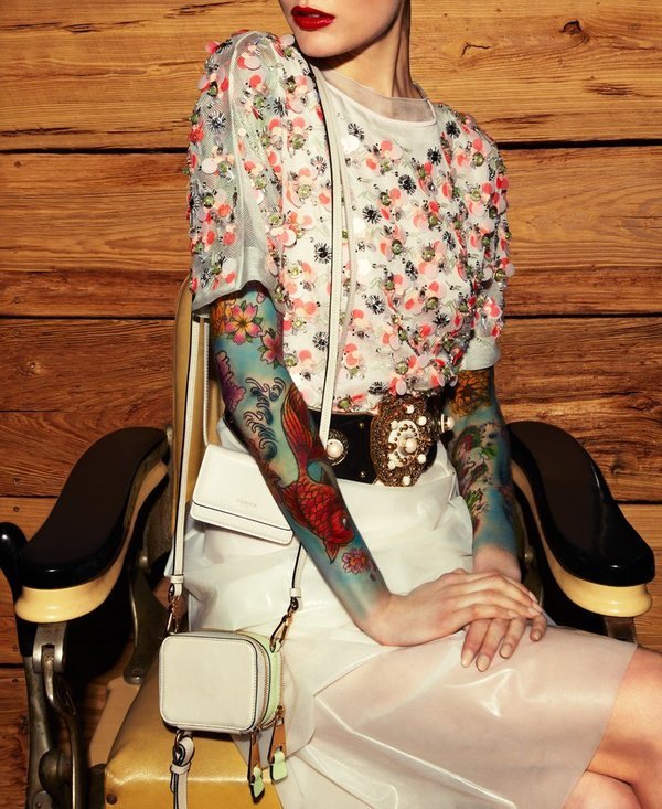
50 Sleeve Tattoo Ideas for Women: Floral, Blackwork, Color, and Ornamental Designs
Full, half, and quarter sleeve inspiration for women—florals, black-and-grey, geometry, animals, color, and script—with planning and healing notes.
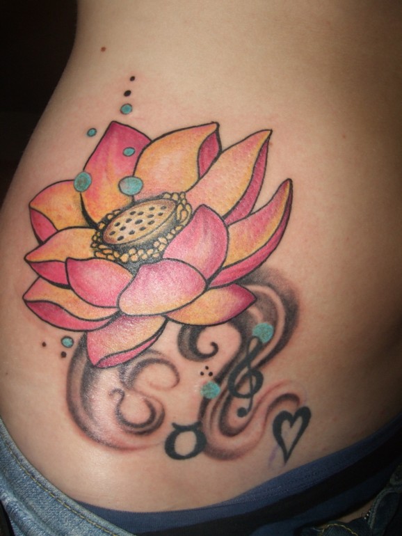
Stunning Tattoo Ideas For Women
Botanical and ornamental tattoo ideas for women—placement as composition, motif families, and consult tips in a practical gallery tone.

Meaningful Love Quotes for Inspiration (and Ink)
Meaningful love quotes that still feel true — short lines for tattoos, gifts, and everyday reminders, with placement and wording tips.